SlideMagic Blog

Frequent updates about all things presentations since 2008. Subscribe to never miss a post.

RSS
·Software

Agario-style

This amazing visualization shows the history of Europe and the coming and going of various empires in the style of the Agario video game, where bubbles collide and merge.

This video was made using Adobe After Effects. In theory you could do something like this in PowerPoint: a slide for every year with animations and then loop the whole thing. It is a lot of work though.

·Story

Nudging the center

The people you are most likely to convince to change their mind, are the ones who are in the center. It is virtually impossible to argue successfully with people who sit at the far end of the spectrum, basically telling them that everything they believe in is wrong.

So this Tweet is a smart communication strategy. Whether he is right and/or you agree with him, I leave up to you.

·Concepts

Mismatch

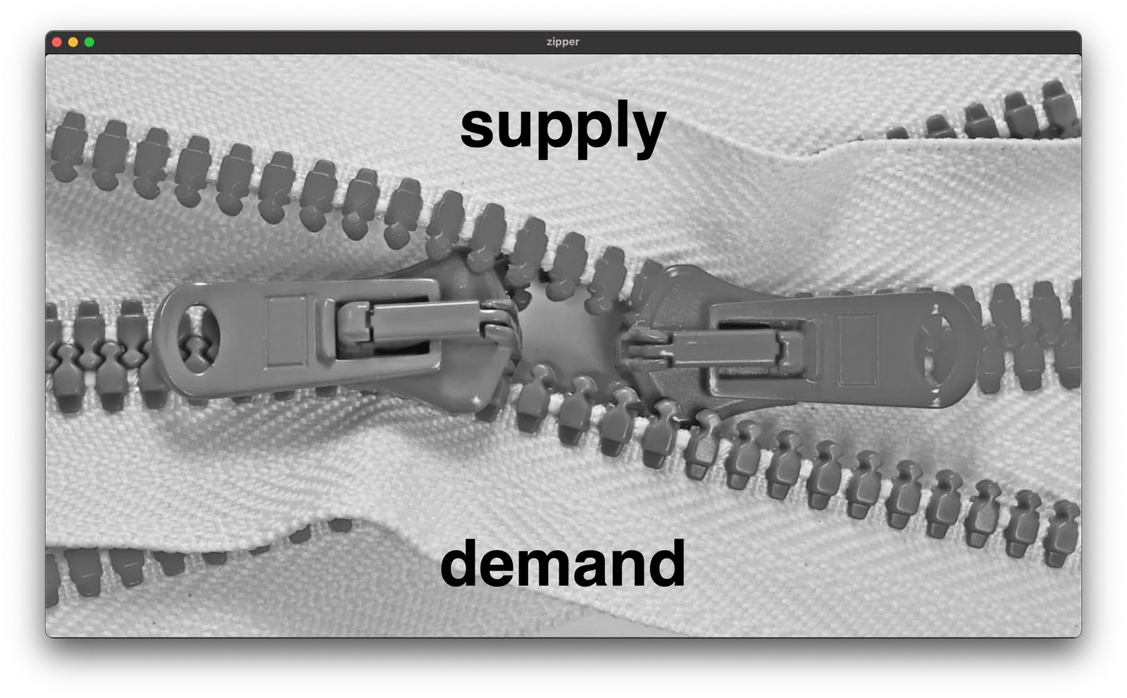
I am working on a deck for 9xchange (my other venture) at the moment, and I will post some concepts that I am using here on the blog (and add them to the SlideMagic library as well). Today, a nice zipper image to show some kind of disconnect between 2 things.

Search for “zipper” in the SlideMagic app and you can use this chart in your own presentations.

·Layout

First meme in a deck

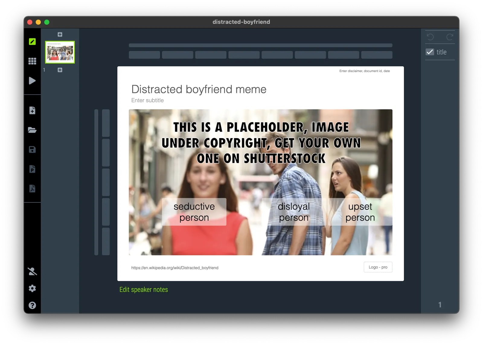
It took a bit of time, but I finally included a meme in an actual presentation…

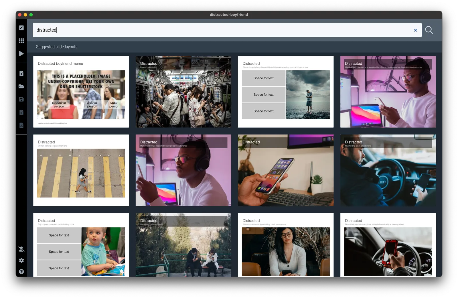
I will add this chart to the SlideMagic slide library, search for “meme” in the app and it will show up for your to use. It is tempting to try to adjust the image, for example by removing the background, but the color scheme is actually an integral part of the visual concept. For people who are not familiar with this, some background on Drakeposting.

·Creativity

Memorizing things

This is an interesting video in which a bass player (Cici) explains how she copes with memorizing dozens of (cover) songs that she has not heard before in a short period of time. The lessons here can be applied to any performance, including a presentation.

The key is the memory shortcut: compressing lots of information into something short and “catchy” that is much more easy to remember than the individual bits and pieces. Examples:

  • Grouping individual notes into shapes on the fretboard of a bass guitar
  • Inventing an unusual description for the sound of a song (‘the carnival song’)
  • Quick reminders of where songs are unusual, i.e., a break in a completely different musical style
  • Reminders that are critical for the performance and hard to cover up: i.e., the whole bands needs to stop exactly at the same time on bar 64, or your instrument is actually starting the song solo, without the musical reference of the band to help you along.
·Delivery

The basics

Leaving political viewpoints aside, Obama did a great speech yesterday. This short clip starts about 30 minutes into a 1 hour speech.

·Data visualization

Failing the 10 second test

It is tricky to understand this stacked column chart I found here on Twitter, given the negative, below the horizontal axis boxes.

After a bit of studying, I get it (I think). Categories below the axis show a decline. But what does the height of the column above 0 represent, and the height of the total column (the sum of the absolute values of all the boxes).

Eventually, you will figure it out, but “eventually” takes too much time to put in a live presentation.

·Design

Car dashboards

I grabbed this screenshot of the evolution of dashboard design in Mercedes cars (can’t find the source anymore). I think the fake “analogue” looking displays do not look good at all in modern cars. On top of that, information that you don’t always need is screaming at you. combined with shiny interior materials and LED lighting makes the whole cabin look cheap. It does not look good today, for but will for sure age pretty poorly.

(The first one though would look a lot better without the wooden background though).

·Software

SlideMagic 2.6.41

A new version of SlideMagic is deployed, and should automatically install. This version includes security patches, and a slightly less strong background color difference between the main slide and the explanation box view.

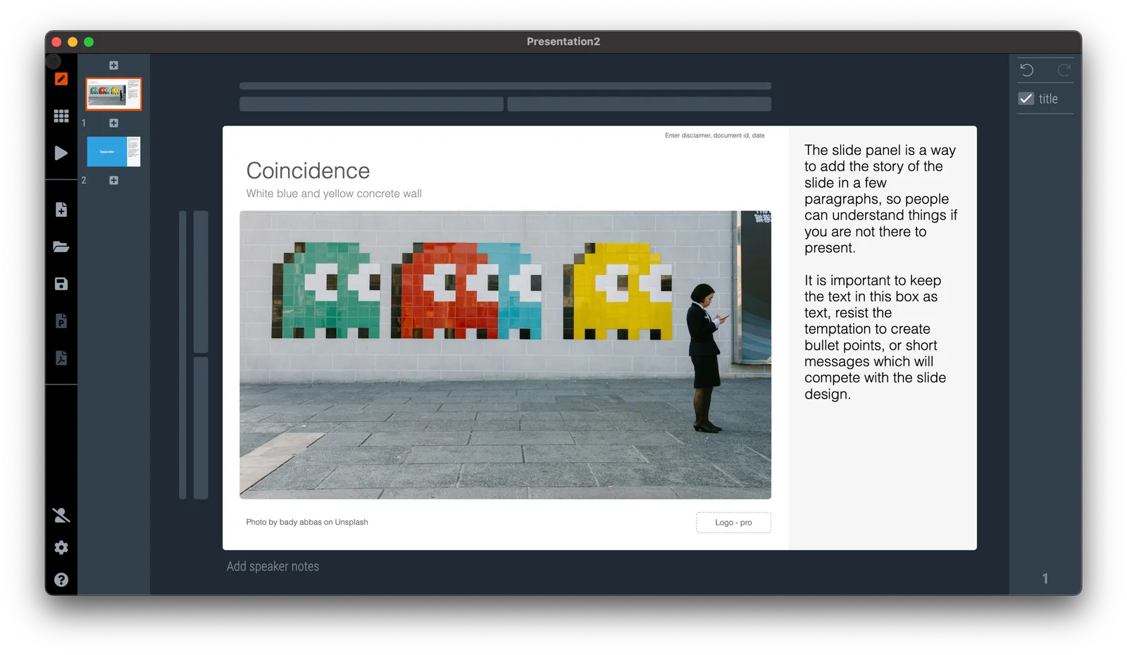
The explanation box is one of 4 views of SlideMagic:

  1. Narrow 4 x 3 aspect ratio
  2. Wide 16 x9 aspect ratio
  3. Title on the side
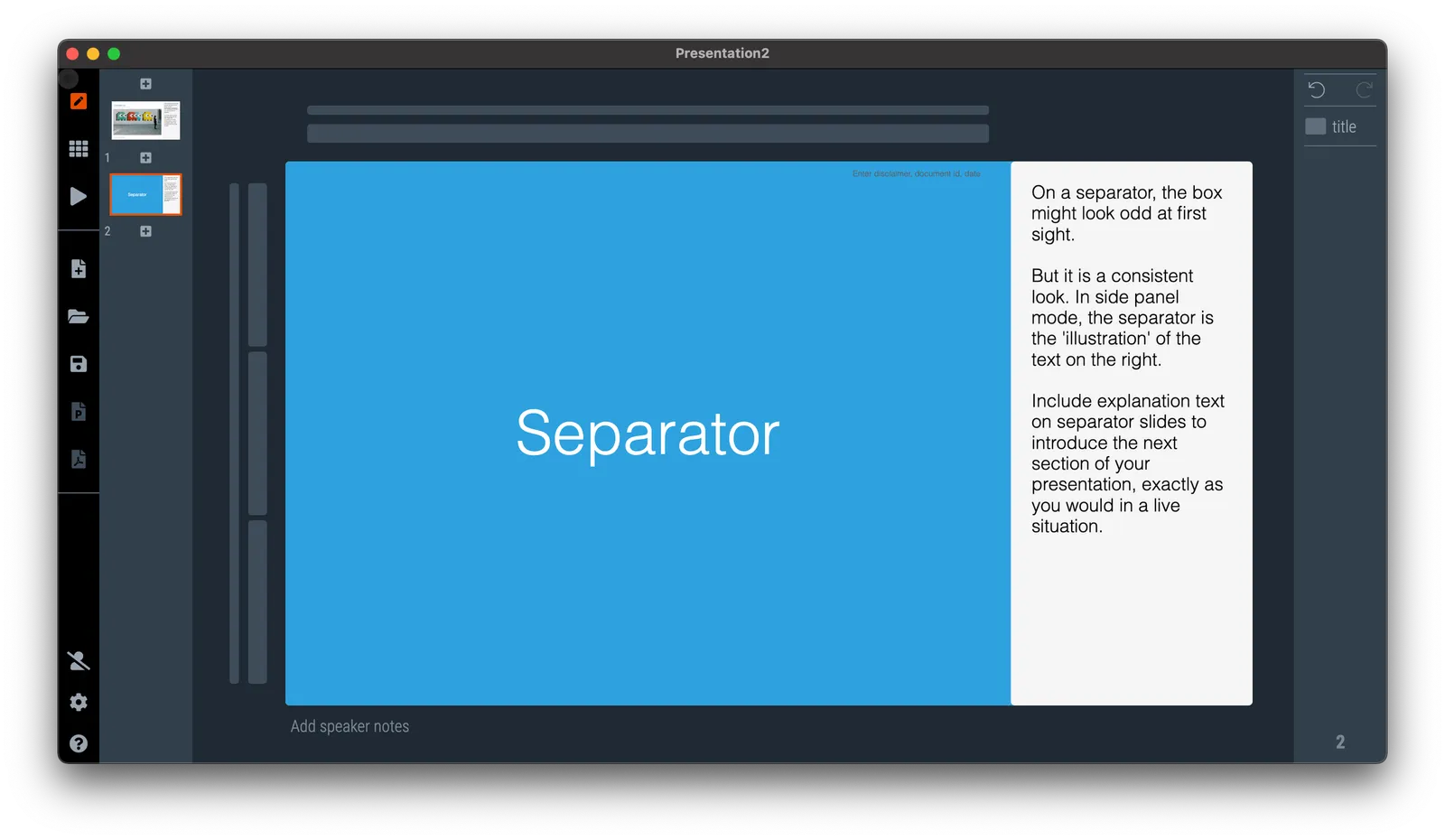
  4. Explanation box view, which creates space for an extra text box where you can enter a few paragraphs to explain a slide in case you send the deck without being present yourself.

The text in the side panel stays saved in the file even if you go to another view, so you can decide when you want to show it, and when to hide (for example in a live presentation).

·Software

Skipping the presenter mode

Presentation software like PowerPoint or SlideMagic have 2 modes: one for slide editing, and one for showing the presentation to an audience. In video calls, I often see the presenter leaving the presentation in edit mode. The slide is visible, but with all the edit controls around, plus grid lines and other markings. On the side is a list of thumbnails of all the slides in the presentation. For the presenter, this can be handy. She knows the deck in and out and can quickly jump around the slides.

For the audience it is confusing.

  • The slide in edit mode looks unfinished.
  • Often the thumbnails on the left are so big that you could actually read them, distracting attention away from the main slide.

In SlideMagic, presentation view creates 2 separate windows: one for the slide to be shown to the audience, one with the controls for the presenter. So in Zoom, or other video conference tools, you can share just the slide, while staying in full control of the presentation in a window that is not visible to the audience.