SlideMagic Blog

Frequent updates about all things presentations since 2008. Subscribe to never miss a post.

RSS
·Images

Leading the eye

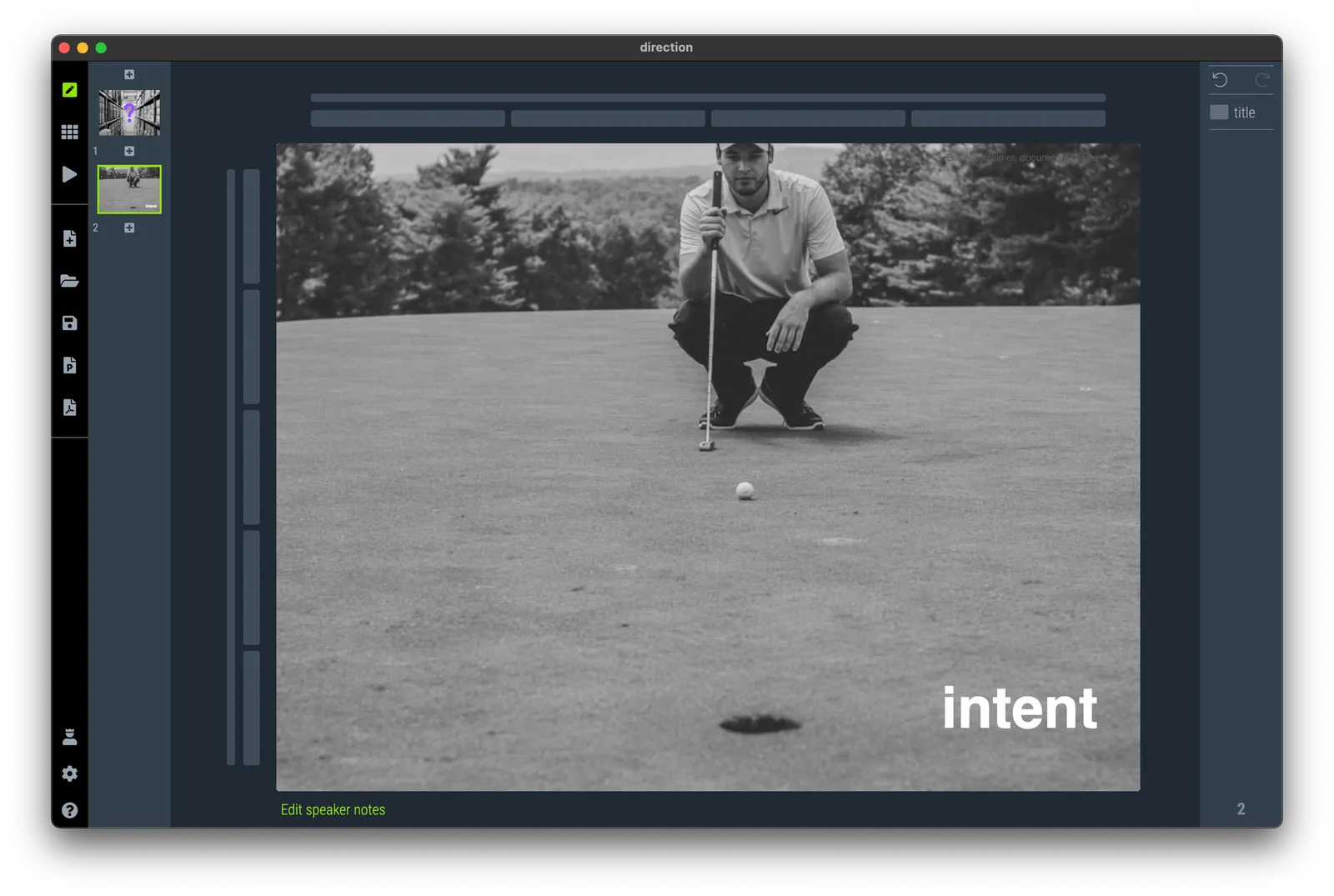
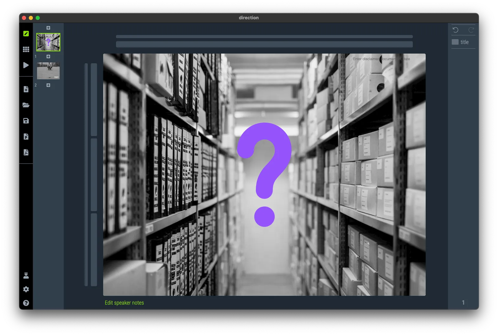
When looking for images, pay attention to how they can lead the eye of the audience. Below are 2 examples of images that draw the eye to a certain spot. (RSS email readers might have to open the link to the blog post to see the images).

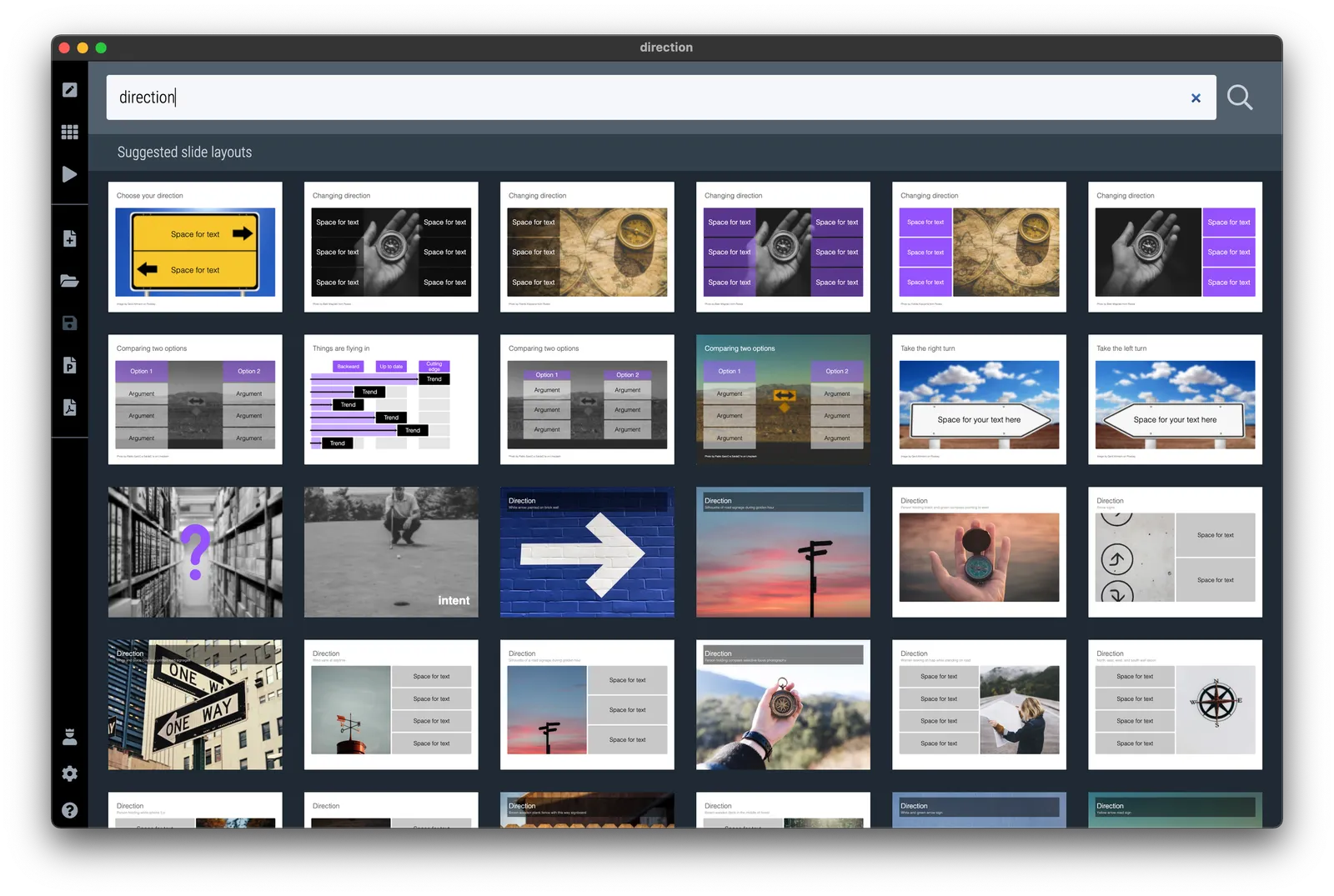
I have added the images to the SlideMagic slide library so you can use them in your own presentations. (Search for example for “direction” and they will show up, see the example image below).

Pro users can convert these slides to PowerPoint or PDF

·Delivery

A small break

My daughter’s school concert was disrupted by a small toddler in the audience that ran out of patience and starting screaming. The chorus teacher decided to press on while the embarrassed parents tried to leave the audience with the kid (who got even more upset). The whole operation took 2 minutes out of a 4 minutes performance

I would have paused the concert for two minutes and continue with a relaxed audience. Presentation interruptions happen…

·Investor presentation

Send a different deck?

After the meeting you promised to send the slides of your presentation in an email. But the deck you used, was the short one, and you have a better/longer one sitting on the shelf. It does have a different structure and graphical look and feel though. Should you send it instead?

Probably not. The slides you send are a quick reminder of the meeting, a permission to email the meeting attendees with your follow up question. Very few people might actually look at the slides in detail. And if they do, each slide is a visual placeholder for the story you told in the meeting. Sending a completely different deck might confuse them.

If you want to send the other presentation, do so in addition, and clearly mark it as something different from what they have seen.

More pro tips for follow up decks:

  • If slides contained semi-confidential information that was OK to show for 5 seconds, you can take them out in this version to prevent people from studying things in detail (financials, roadmaps, etc.)
  • Always send things in PDF, not the source file (PowerPoint .pptx, or SlideMagic .magic)
  • If you are using SlideMagic, consider expanding the explanation panels on each slide, and write the summary of the messages of the slide in a few paragraphs, handy for people to understand a page better when you are not there in the room to explain things verbally.
·Layout

Fixed slide titles

PowerPoint slide templates originate from the 1980s. “Slides” would mainly be data charts: graphs and tables to show information. At the top of these pages would be a descriptive title (Economic output in the EU), and the subtitle would give the unit of measurement ($ billion).

Slide templates evolved. Business school professors and management consultants invented frameworks, more conceptual slide layouts, and people started using presentation software to layout their entire story on the big screen, often in bullet points. Descriptive titles became messages.

In most cases the title stayed. Every slide always has a title at the top. But this layout does not always work. People started adding a big arrow, with another big message next to it to make sure that the audience gets the point (it is spelled out 2x on the slide).

Titles take up valuable screen real estate, especially on widescreen 16x9 layouts. They make the chart body space even longer, more stretched. A loooong sentence in small font across a 16x9 slide can be hard to read.

I have become more flexible when it comes to titles. Data charts still have them. But other slide layouts might have none, instead, just an image, or a big text box somewhere else on the page. Or a message that is actually a few paragraphs long, on the side of the slide.

In SlideMagic, you can instantly change the layout of slides, and switch the fixed title on or off. It is time to let go of the obligatory title. See the the examples below. (If you are reading this as an email blog update, you might have to click through to the original post to see).

Continue reading →
·SlideMagic

Graphical language

Make sure you maintain a consistent graphical language throughout your slides. Here is a thumbnail view of a section of a deck I used in recent meetings.

Here are the guidelines I used:

  • Dark background, white text, purple accent
  • Page-filling, black and white images
  • No capitals
  • Selectively bolding a word in a sentence
  • No slide titles in a fixed position

Every slide blends right in without, complicated graphics, and SlideMagic makes it really easy to apply this style.

·Sales presentation

Scripted improvisation

I just came back from an industry conference that involved all day, back-to-back, 25-minute meetings in small hotel rooms. Professional speed dating. Very similar in setup to the days I spend interviewing MBA graduates for roles at McKinsey at INSEAD.

These meetings are a challenge. You get tired (especially if you are jet legged), the setting is repetitive, and very unpredictable meeting dynamics and energy in the room. The setting is not right for a formal presentation. You have very limited time, the room is tiny without a screen to project slides, and the setting is very informal. The risk in this setting is that you never get to get your point across in the middle of small talk, room changing logistics and/or the distraction of cleaning staff replenishing the soft drink supply in the room.

In this informal setting, most presenters would “wing it”. Start a pitch in a conversational, improvised way, and see where it takes you.

I would recommend to do the opposite. Have a super tight, very short story, completely engrained in your mind. It is super-scripted, 100% the same in every meeting, and hits exactly the points you want to hit, in the right order. You have practiced and used the script so many times, that you can deliver it jet lagged, distracted without thinking, and most importantly, sounding completely non-scripted. It may sound strange, but the more you practice delivering a these short pitches, the more natural they sound.

As the story goes on auto pilot, you are sure that your messages get delivered, and your brain can focus on reading body language, and connecting with your meeting guests in pre- and post small talk. And remember, in these short meetings, your objective is to get to the next interaction, rather than landing the whole deal.

·Concepts

Joking about your own cliche slide

It happens to the best of us. Using a cliche chart. In a recent presentation, I had to refer to the so called “patent cliff”, a number of very big selling drugs will come off patent and become vulnerable to low cost generic alternatives. Everyone in the audience knows what it is.

I put an empty image (see below) of a cliff without any data or text, and literally apologized for the cliche visual. A 1 second reminder and *** click *** I could continue with the story

I have added this image to the SlideMagic slide library, search for “cliff” in the SlideMagic app and you can use this slide in your own presentation.

·Concepts

Related images

A well-chosen image creates a “visual shortcut”. While you explain your idea, the visual of the image gets stored in your brain alongside your story. Seeing the image again, immediately makes the whole idea pop up again, including its more complex nuances.

You can use this in presentations. Obviously on one slide. But it can also be very effective to use similar (or the same) image to make a connection between multiple slides. You introduce a concept early on (let’s say a problem) and when you get back at it later (with the solution), a related image can quickly pull back up the original story.

As an example, two slides I used in a recent presentation. The first image introduces the concept of FOMO (fear of missing out), in this case of a business that becomes wildly successful after you spun it out. The second image relates back to the slot machine / lottery concept.

If you are reading this blog post via an email update, you might have to open the link to the blog post to see the images. My email service can only take a limited amount of images from the blog feed (I am working to fix this).

I have added these slides to the SlideMagic template library, for example search for “gamble” in the SlideMagic app and the slides will pop up for you to use in your own presentation. Pro users can covert the slides to PDF and/or PowerPoint.

·Software

Side panels in separator slides

The slide panel is a way to add the story of the slide in a few paragraphs, so people can understand things if you are not there to present. It is important to keep the text in this box as text, resist the temptation to create bullet points, or short messages which will compete with the slide design.

On a separator, the box might look odd at first sight. But it is a consistent look. In side panel mode, the separator is the ‘illustration’ of the text on the right. Include explanation text on separator slides to introduce the next section of your presentation, exactly as you would in a live situation.

See the example below:

If you switch to another view mode, the side panel will disappear, but the app keeps the text, so you can switch them back on at a later stage.

·Images

Placeholders for images with copy right in SlideMagic

All the images and icons that are available in SlideMagic are royalty free, without copy right. For some memes that I have been adding recently, there are copyright issues. To solve it, I added a giant water mark over the image so you can replace it with your own. This placeholder is useful thought to get the positioning of boxes right.

You can download the slide template for the distracted boyfriend meme online, but it is even simpler to search for “distracted” and get a number of layout suggestions directly in the app.

SlideMagic Pro users (free for students) can convert slides in the SlideMagic app to PowerPoint.