SlideMagic Blog

Frequent updates about all things presentations since 2008. Subscribe to never miss a post.

RSS
·Story

Brain variables

In computer programming (and math), things are stored in variables. A variable has a name and can point to pretty much anything. A numerical value, a user, another piece of code, a device, a map, an image library.

The variable is a little memory shortcut to access information. In the world of presentations, our brain works with variables as well. Visual symbols that are a shortcut to a fragment of a story.

Used in a bad way. After you have given a presentation dozens of times, the slides in your deck become ‘variables’. The page becomes a trigger for you to deliver a piece of the story. It does not really matter what the slide actually says. The audience who sees this for the first time however, misses this context.

Used in a good way. When brainstorming a story line, I often write down pieces of my store on stickers. Each sticker contains a fairly cryptic description. “The lazy point”. “Flipping is not possible”. Meaningless to anyone but me. For me however, it is a very condensed way of putting a label on a section of my story, and enables me to move things around to try out different story lines quickly.

I tried the above brainstorm a few times in a group: writing very simple text bullets in an email and move things around. The other members of the group missed the context, started editing the bullets into full sentences, discuss these, and before you know it, you have a 5 page document that is worse than the original you wanted to improve.


·Story

Dismissing the competition

If you are pitching someone who is making a choice between you and your competitors, chances are high that that person in the end will have a better understanding of the competition than you, so be careful when describing them.

I am evaluating some SAAS vendors and over the past week I asked two companies to give their perspective on each other:

  • Company A about B: ‘People who want something cheap, pick them” [In a second call I found out they are not cheaper]
  • Company B about A: A pretty accurate description of pros and cons of each, a good prediction of how company A would pitch, and why in my situation, company B is the better choice.

Guess which company scored higher on credibility.

·Concepts

Chart template for a macro economic tree

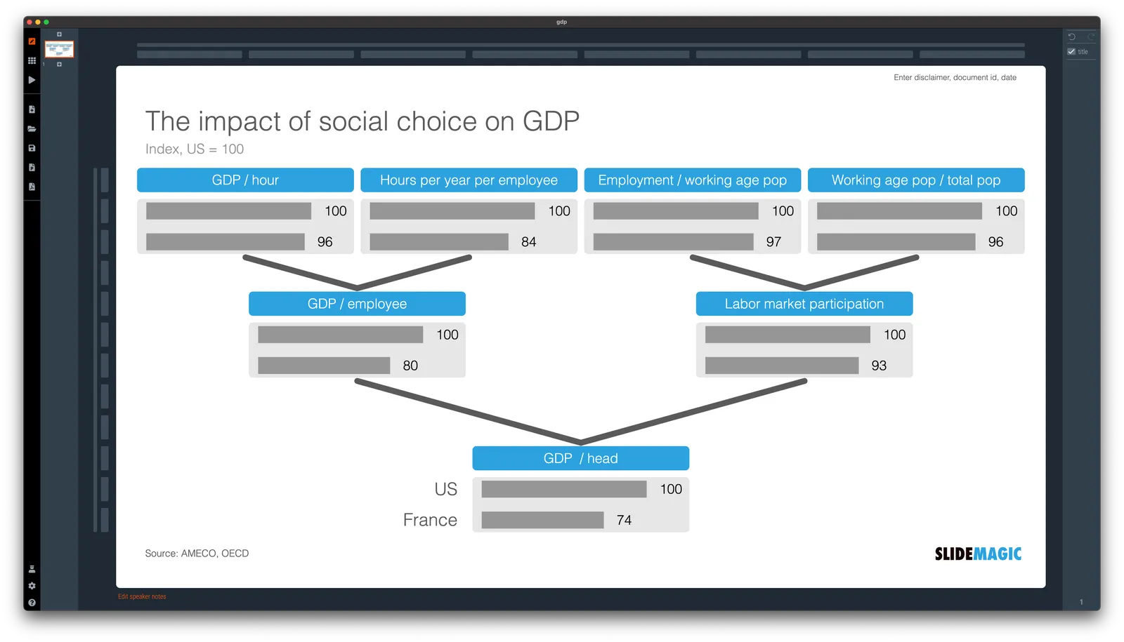
A quick make over of a chart that flew by on Twitter, explaining differences in GDP / capital between France and the US.

In SlideMagic, it is very easy to replace tabular data in bar charts. I have added [this slide](

) to the SlideMagic slide library, search for ‘GDP’ in the app and it will show up for you use in your own presentation.

·Story

"Our industry speaks like that"

Each industry has its own jargon, the way people like us say things. If you are sitting in a meeting and trying to pitch your services as a senior management consultant or lawyer, lowering your voice and using the jargon will show that you are one of them.

But being one of them is only one part of the pitch. Being understood is the other one. And for this purpose, it is probably better to keep things human. Especially if you do not have a lot of time: the cover email of a pitch deck, the description paragraph of a conference panel.

Be understood first, then worry about blending in.

Back

There are many holidays in Tel Aviv in the autumn, and this year they lined up to form more or less one big break. (There are years where they fall exactly on weekends). I am back at work and hope to pick my posts soon.

·Story

Executive summary degradation

Hundred pages is a bit long, let’s add an executive summary

Hmm, this chart should go in here as well, and this, and this, and this one (that analysis took a long time)

The summary needs some structure, let’s add tracker pages

Wait, is this thing we are actually saying, let’s change the recommendations in the summary

Shouldn’t we change the full document as well?

Maybe the summary has become the document, but it is a bit long…

Let’s add a summary

·Story

Writing it down

Summary presentations of strategy projects are usually a ‘greatest hits’ of slides that were produced during the project. Copy, paste, shuffle, done.

Project working document slides are not the same as final results communication slides.

It can be good practice to write out the story behind your conclusions on 1 page. Don’t summarize the analytical work, but explain why the action your recommend is the smart one. Now go back to your slide pile. You might find that not all subjects need to be covered, not every subject needs a slide, and that the order in which you tell your story might be different from the contents page of the project working document.

Grounded in reality

Economic forecasting models can get very complicated and it is easy to lose touch with reality. Assumption on assumption gets added, new market segments come in, then your manager asks you to bump up that growth by 5% per year.

Your survival? Take the current year as a starting point, and break down your total market in actual physical drivers. Then check whether these same drivers still make sense 10 years later.

Let’s take the example of the coffee market. $ spend by customer segment that growth at a certain rate over time are abstract concepts. Cups, liters, people, price per cup are things you can touch and relate to. If you think there is a premium market segment that pays double the price per liter, then you need to back out the opposite segment that pays a lot less to get back to the average. Does that reverse engineered price make sense? If the coffee market doubles, but people pay the same price, and the population isn’t really growing, where do these liters come from?

  1. Break down today’s total market into factors you can touch
  2. Forecast these factors (not the total numbers)
  3. Build up the total market from these factors
  4. Sanity check and go back to 1

In most cases, you will discover that only a factors really make the difference. And if you keep yourself grounded to reality, you can pretty much include any breakdown, split, scenario, as long as the totals and averages stay the way they were.

·Design

Perceived quality

The real quality of a car is expressed in how little time it spends in the repair shop. You are unlikely to be able to figure this out in the showroom, or in a test drive. Problems will only show up after a few months of driving.

The perceived quality of a car is a different story. The sound of a door closing, little rattles. They might have nothing to do with the actual quality of the car, but have a huge impact on how we perceive things.

Car manufacturers spend a lot of time and money on ironing out this little imperfections. Testing, testing, and testing at different speeds, different surfaces. As soon as the tiniest noise is heard, take out the statoscope (the passenger tester), locate the sound source and fix things. (A heavier material, some padding, a different screw).

There is a parallel here for your slide deck. The actual quality of the raw story, and the perceived quality of its presentation.

·Typography

Being too bold

Smart use of bold text can help make a slide clearer. Overdoing it takes out the whole effect.

Why do people fall for this? If you start at your own chart for hours, rereading it, changing the line breaks, bolding and un-bolding text, you become convinced that the text is super clear. It is, for someone who has studied it for a long time. Not for someone who looks up from her phone and sees it for the first time.

P.S. Use ctrl-B (Windows) or cmd-B on selected text in SlideMagic to make things bold.