SlideMagic Blog

Frequent updates about all things presentations since 2008. Subscribe to never miss a post.

RSS

Connect, understand, agree

Thinking back at last week’s pitch meetings in San Francisco:

  • Connect. In some meetings there was instant personal connection with the other side, in some meetings completely none of that. Usually, in the first minute of a meeting you know in which category you are.
  • Understand. Most people got our idea, some actually did not. Because of different factors: language, the required background and context, and probably our presentation skills
  • Agree. Even if people understood everything, some people did not actually agree with us. Fair enough.

You don’t always need a connection for people to understand and/or agree. Getting someone to agree without understanding is a challenge though…
·Concepts

Table makeover: car emissions

SlideMagic is back in 2023 after the holidays, and a very intense, exhausting and drenched JP Morgan Healthcare Conference in San Francisco (I will share some insights about pitching from this event over the coming days).

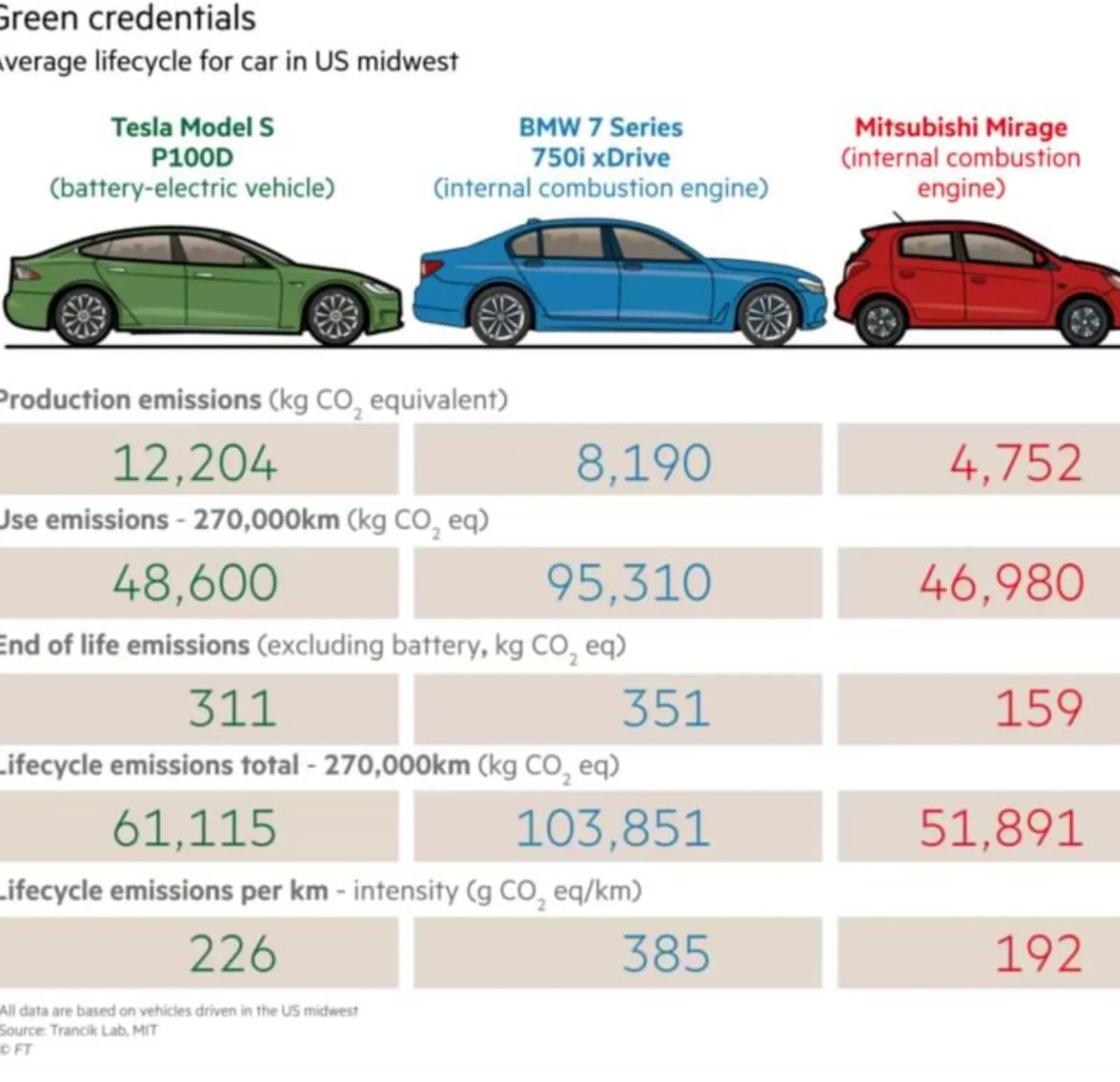
The starting point is this table:

What I did:

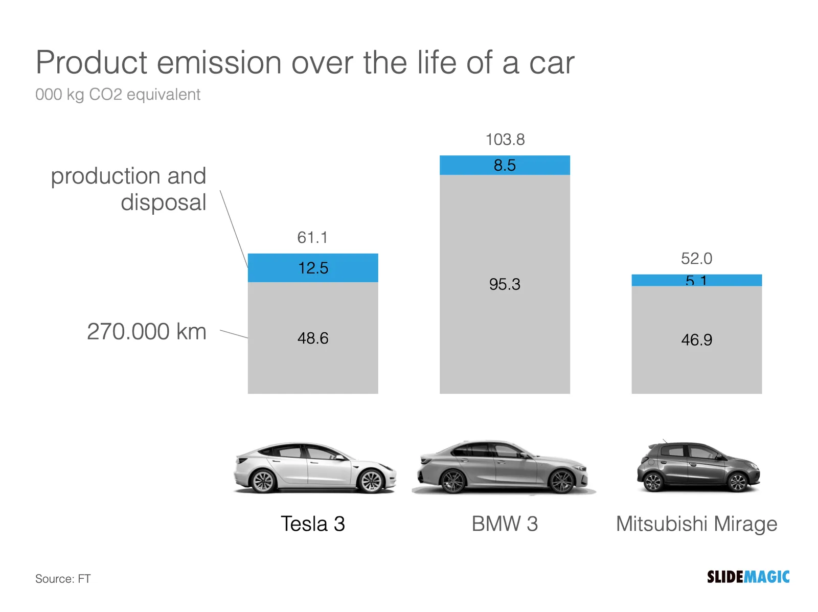
  • Use a stacked column chart instead of a table
  • Simplified the data to boil it down to what matters
  • Some fiddling to get the car images to a comparable scale (I hope I did it right)

The result is below:

I have added this slide to the SlideMagic template database so you can use it in your own presentations. Search for something like ‘BMW” in the app and it will pop up. Pro subscribers can convert slides like these to PowerPoint or PDF. SlideMagic has a free Pro plan available for students.

Happy 2023!

I am off the grid for a few days (finally had a chance to see the northern lights, see the image below). All the best for 2023!

·Layout

Showing busy bios on a web site

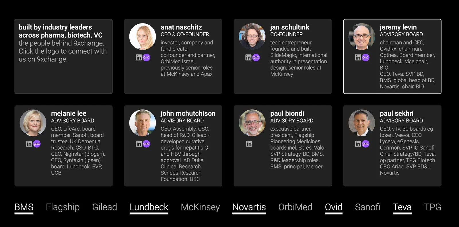
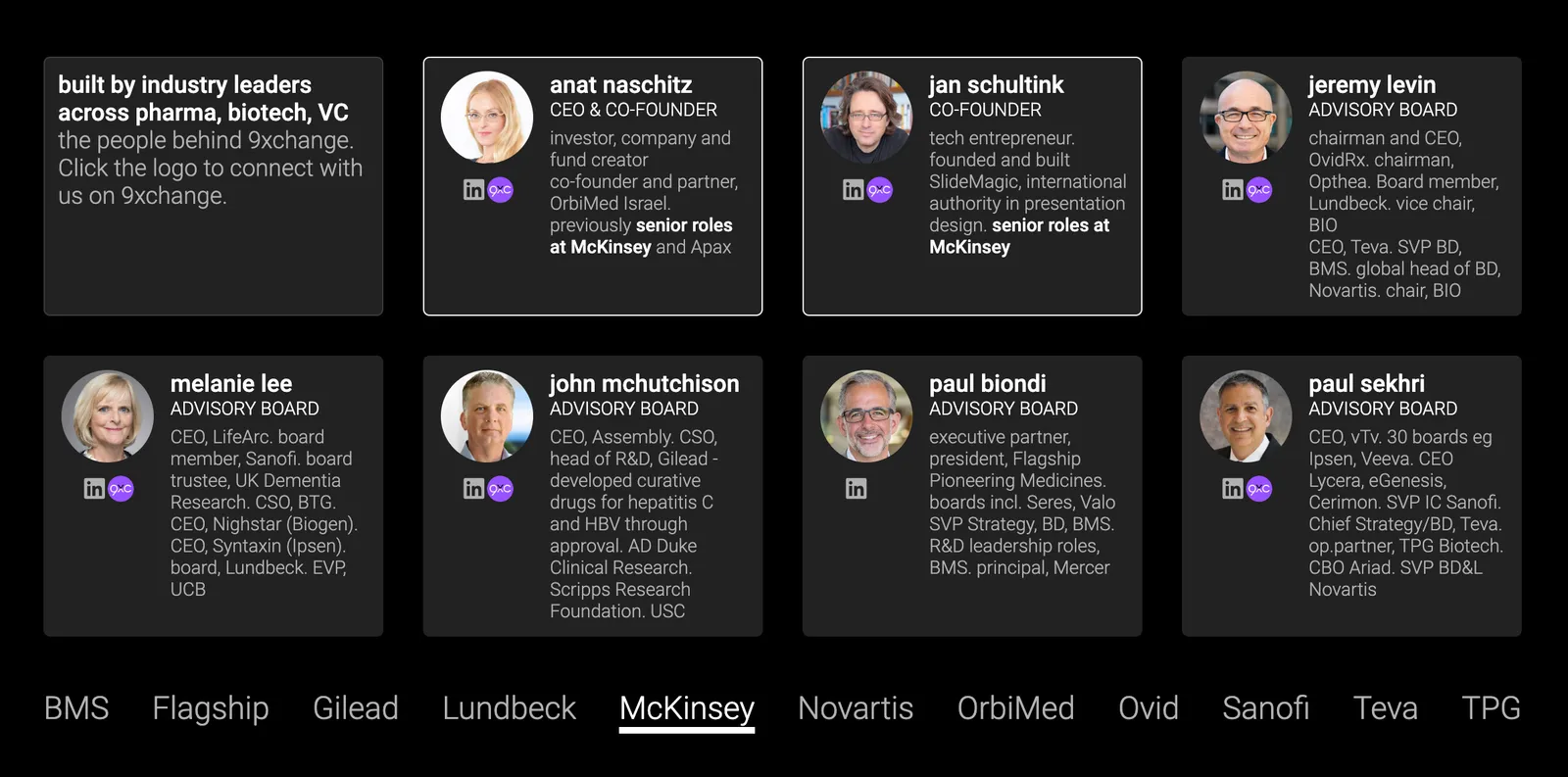
My venture 9xchange is new in the world of healthcare, wo we need to establish credibility by showing that we have significant experience and are backed by significant people. Here is what I came up with (see the 2 screenshots below).

I put up a dense grid with the bios of the people involved. Below this table, are a few recognizable brands from the world of healthcare. When you hover (or click on a tablet) over a person’s bio, a relevant subset of the brands light up.

Alternatively, when you hover over, or click the brands at the bottom, relevant people get highlighted, including the relevant small print in their CV.

You can check out the progress of the work on the 9xchange website.

·Images

Showing screen shots in a pitch deck

In most cases, it is not worth the time and effort in a short presentation to take the audience through a demo or a series of screenshots of your application. At this stage in the pitch process, understanding the exact flow of your application is not critical.

What can matter though is the simple question of whether you have a decent product or prototype or not. The role of a screen shot here is not to show the exact detail of your app, but more a proof point.

One way to make this point is to use an office background with some screens, and paste a number of screens on the monitors. That’s what I did in a recent deck for my other venture 9xchange. I made the office background black and white, to make the screens pop a bit more.

(Look how I managed to Photoshop the screen shot behind the standing desk light)

·Delivery

What does this marketing agency do?

I find the world of marketing and branding agencies very confusing. You ask them what they do, and you get a description of a process that sounds and looks very similar to everyone else you ask the same question. But in practice, people are actually very specialized. Defining the personality of a brand, creating the competitive strategic positioning of a company, making the pitch deck, generating leads, designing ads, running online campaigns, designing logos, etc .etc.

The best strategy to find out what people do is to ask them to describe a project, and see where in this whole jungle they played a role, and most importantly, at what stage in this description see you light up the eyes of the person you are considering working with.

·Design

How do people glance over a corporate web site?

There is a lot of science and analytics available for eCommerce web sites. Changes in layout, design, and content immediately translate into changes in clicks and sales. The story is a bit different for a corporate web site that is not transactional, it does not sell anything, it does not have a big signup button, but plays the role of a digital business card for a company. Let’s say the first web site of a startup aimed at investors and the first enterprise customers.

Some things to look at:

  • The most important aspect is probably the look and feel of the site, regardless of the content. Does it look professional and serious (as in of a serious company). If that funky or complex graphic somehow does not look quite right and you can’t put your finger on the spot why, take it out. A professional looking simple graphic is always better than a botched attempt at a complex one. Make sure that copyright year is the current one.
  • This seems obvious, but is often lacking, the site should actually state what it is you do. Try it on people that have no background at all in the market you work in, try it on people that love to put you in well known boxes (i.e., venture capitalists)
  • Different companies need to emphasize different things. For most companies, the founding team and its head shots will be buried in some ‘about’ section of the web site, for very early stage startups, it might need to feature prominently on the first page since it is basically the only asset it has.
  • No one reads a web site top to bottom like a newspaper article. Instead, people glance. Read a headline, look a the small text below a photo, read a random paragraph. Don’t arrange content in order of importance solely, but think about the visual hierarchy. A small picture might grab more attention than the big cliche headline.
  • It is tempting to lift stories from presentations and translate them to the web site. The founding story of how it all began to where you are now including that big pivot in 2020, the market gap analysis that is the start of your investor pitch deck. These stories need a place, but maybe not on the home page of your web page.
  • Avoid jargon. “Ah, this site is filled with blah blah” and people will stop reading. But do include language that is common in the industry you are working in.
  • Make sure that the site has the details that should be there: contact details, etc.
·Story

How to use ChatGPT creatively

Most people visit ChatGPT, create an account, type in something, are amazed by the results, and then move on. But how could you actually use it for real?

One obvious use case is “homework cheating”: copy-paste entire pieces of text to save time and effort. But the results will still be a bit impersonal. (I suspect that in future versions of the program, you could feed it your own writing style so that the bot adjusts to you personally, the back archive of my blog since 2008 would be great for that :-))

But there are a few others:

  • The bot answer might be a great way to get a basic structure/setup for your text. You copy they layout of the argument to start, but then fill in the paragraphs with your own language.
  • The algorithm can create a check list to see whether you covered everything that should be covered
  • ChatGPT can be better than Google to get tutorials or “how to” articles. At the moment the pages that are best optimized for search engines float to the top. This might not always be the best articles. ChatGPT has read them all and will summarize them for you.
  • The software can be a great source of examples or analogies that you would not have thought of.

“Google it” is now an essential part of writing pretty much anything. “ChatGPT it” will have to be added to the list.

CONFESSION: Yesterday’s post about the use of humor in presentations was a complete homework cheat…

·Delivery

Using humor in a presentation

Using humor in a presentation can be a great way to engage your audience and make your message more memorable. When done correctly, humor can help to break the ice, lighten the mood, and make complex concepts easier to understand. However, using humor in a presentation can also be risky and, if not done well, it can easily backfire and make you appear unprofessional or insensitive. Here are a few tips for using humor in a presentation:

  1. Know your audience: Before incorporating humor into your presentation, it’s important to understand your audience and what they find funny. Different people have different senses of humor, so what may be funny to one group may not be funny to another. Consider the demographics, cultural backgrounds, and experiences of your audience when choosing your jokes.
  2. Be appropriate: It’s important to remember that humor is subjective and what one person finds funny may be offensive to another. Avoid using humor that is based on stereotypes, is sexually explicit, or is overly political. Stick to jokes that are clean and relatable to a wide audience.
  3. Use humor sparingly: You don’t want to overdo it with the jokes in your presentation. A few well-placed jokes can add some levity to your presentation, but too many can become overwhelming and take away from the overall message. Use humor sparingly and strategically, and save the majority of your presentation for the information and insights that you want to share.
  4. Practice: Before delivering your presentation, make sure to practice your jokes and delivery. This will help you to feel more comfortable and confident when presenting, and will also allow you to gauge how your audience reacts to your humor. If a joke falls flat during your practice, consider leaving it out of your final presentation.
·Layout

Subway maps for cars

People accept that subway maps do not reflect the topographical reality of a city. They show how to travel from A to B, which lines you should take, and where you should switch stations.

The generation of my children has grown up with navigation apps and when they are behind the wheel of a car, they actually have very limited awareness of where things are, the only thing they know well is how much time it roughly takes to get to different places.

This map of Tel Aviv and its surroundings might be a useful too for them (credit: Yaron Shemesh)

This is actually how your brain likes to store information in general, not just maps