SlideMagic Blog

Frequent updates about all things presentations since 2008. Subscribe to never miss a post.

RSS
all posts

Search results for “web design”

·Images

A team photo shoot in 2021

My wife and I organised a team photo shoot for the web page of our upcoming business. It had been a while since I did one.

Nice pictures can add greatly to the quality of your web site and/or presentation. Head shots are up to date, all look consistent, and best of all, you have an opportunity to take an image of the entire team together, given you the opportunity to show the energy that you are radiating as a group of people.

We decided to bring the professional photographer into our home rather than venturing out to her studio. Luckily, she was flexible enough to bring the required equipment. A photo shoot at home has the advantage that you feel more comfortable, and that you unlimited access to your wardrobe incase certain outfits/colours do not come across very well.

Ten years ago, many professional photographs were taking in front of the “gradient grey” screen. Fast forward to 2021, with Zoom calls in front of blurred bookcases, these backgrounds look very staged and dated. It makes the photo look like a high school yearbook picture.

They key thing the photographer brings is no longer the camera. It is the ability to engineer a relaxed pose of you, and even more importantly, get the correct light. A was amazed by how a modern “umbrella flasher” can give great image results in pretty much any lighting condition (so no longer the need for the studio).

While a woman can still dress up in a great outfit, I find that for men (me), wearing a full suit looks awkward, you get the “wedding groom” look on your corporate web site. Jacket/no tie, or a turtle neck work great.

Continue reading →
·Story

Demo versus manual

Giving a demo of your application or web site to an investor or potential partner is different from teaching a new user how to use it by herself.

For the user:

  • Where do all the buttons sit
  • How to log in
  • How to update settings
  • Where to find your account details
  • How to create a project from scratch
  • Etc.

For the investor / partner:

  • What does the app do?
  • Show me a walk through of a “story” or use case
  • Have a project ready to show
  • Look, there is actually a piece of software that is working…
  • Etc.

In presentations, you are most likely to deal with scenario 2. Do all the prep work (logging in etc.), and design a very clear script of what you want to show, cutting out any tangents and other delays. Keep it short and focused. Rehearse your walk through, and as a backup, have a series of consecutive screenshots ready just in case Murphy’s law kicks in.

·Data visualization

Trying to understand vaccine effectiveness

Here in Israel we are ahead of most other countries in terms of vaccination and the prevalence of the delta variant. After almost zero cases, the count is starting to creep up again. There is a lot of confusing data going around and it is surprising to me that the scientific community does not have a generic approach to evaluate the effectiveness of vaccines.

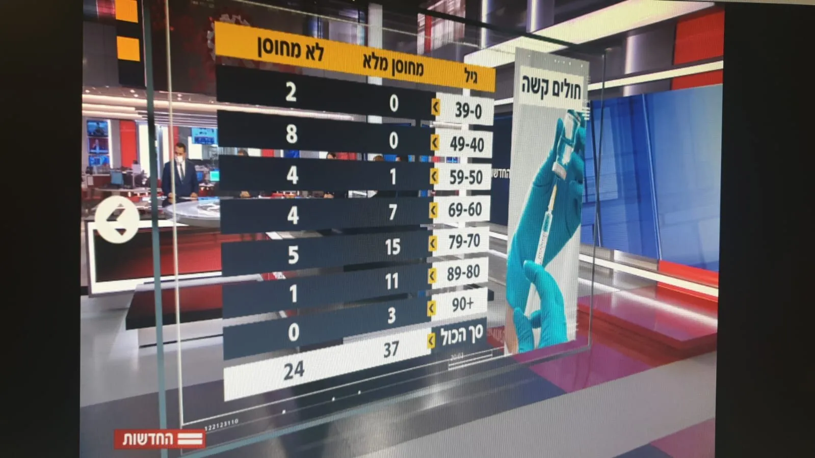
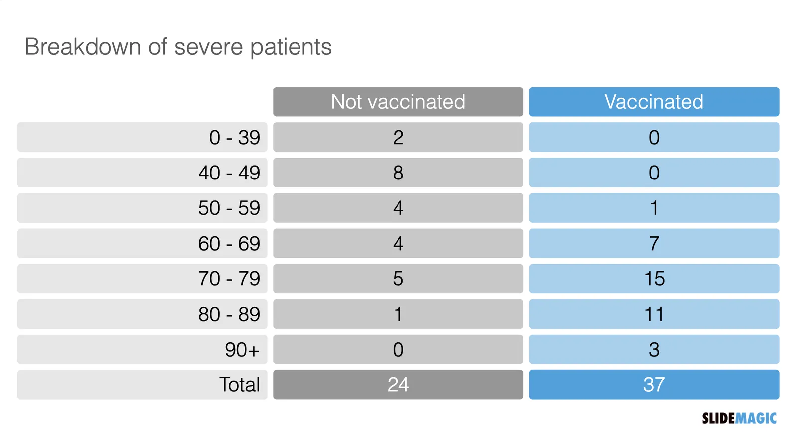
Last night the following table appeared on the TV news. Severe cases by age category and vaccination status. But these absolute numbers cannot be taken at face value.

  Source: https://twitter.com/arad_nir/status/1416832997597265933/photo/1

Source: https://twitter.com/arad_nir/status/1416832997597265933/photo/1

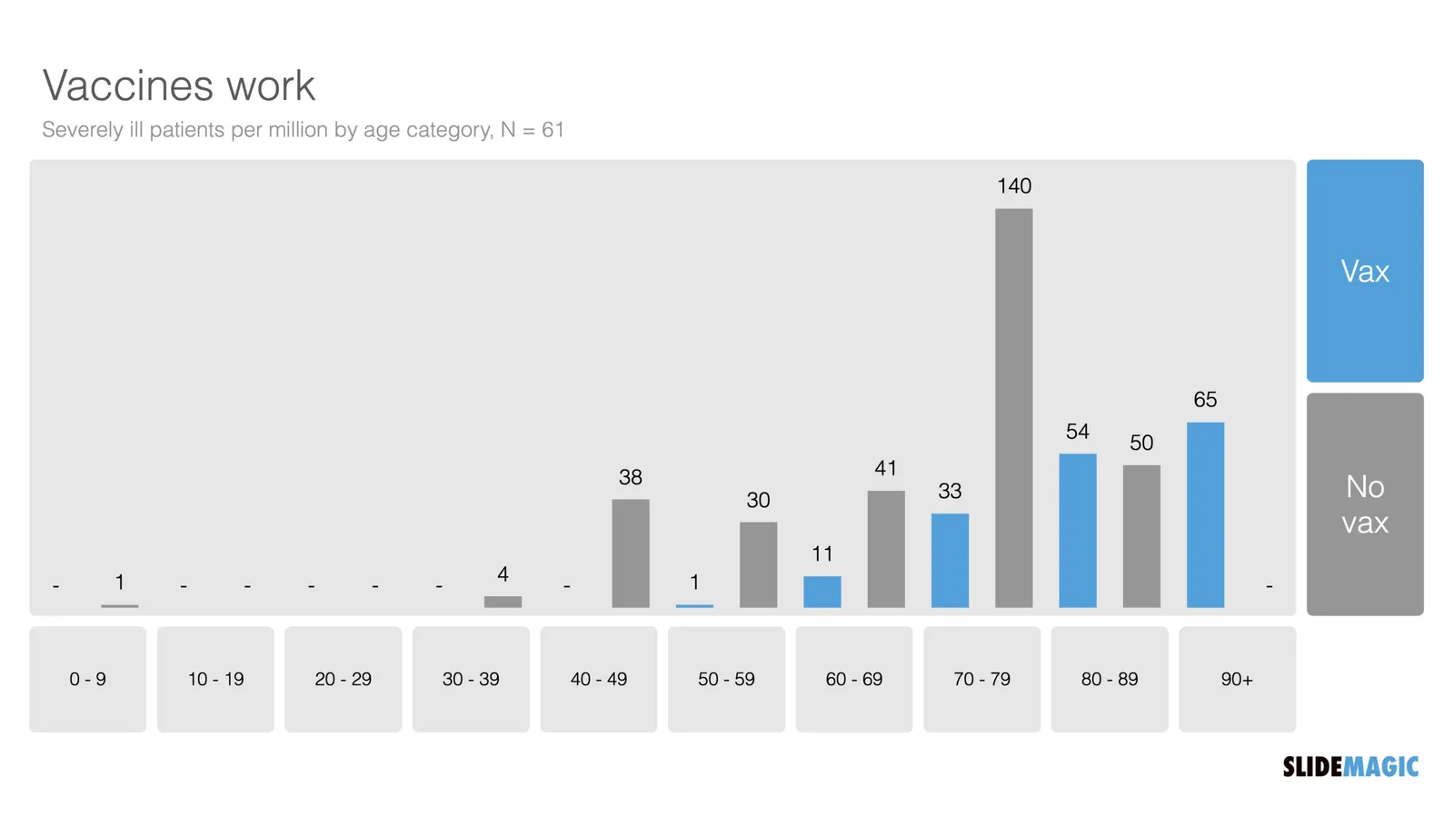
“Open source” statisticians went to work and made some adjustments. The population categories are not equally big (there are more young people than old people), and the vaccination rate is not the same (older people vaccinate more). So the correct approach is to look at severe cases / million, split by vaccinated and unvaccinated. I put the results in the graph below and added the chart to the SlideMagic library.

I put the results in the graph below and added the chart to the SlideMagic library. Search for “vaccine’ in the SlideMagic app and the designs will pop up, either for use in a COVID-related presentation, or maybe something completely different that requires a similar layout.

·Templates

An actual presentation as a template

Most companies have some sort of corporate PowerPoint presentation template sitting on the file system. It consists of a title page, some trackers, some bullet point layouts, some picture slides. The template probably looks ago, but as soon as employees start to use it, this is no longer the case.

Why?

  • Most templates are designed as an afterthought, after the logo, web site, letterhead and business card have been approved
  • PowerPoint templates are created by designers who understand graphics design, web/print design software, but NOT PowerPoint and as a result a lot of technicalities go wrong
  • But most importantly: templates are designed on a blank canvas, encouraging the designer to “do something” with all that white space.

A better approach: start with an actual presentation. The general company introduction, a product sales pitch, last quarter’s analyst presentation. Make that deck look perfect and put on the on the file system as a starting point.

  1. The template is designed around actual content, rather than content being forced to fit around a template
  2. Most companies need very specific templates. Consumer goods companies: products/packaging demos, market shares and sales across many channels, consumer research data. Pharma: scientific clinical trial data. Chemicals: process layouts, project maps. Consulting firms: fancy frameworks.

I am contemplating some new ideas for SlideMagic to make the above all a bit easier.

Photo by MagicPattern on Unsplash

·Data visualization

Tiny data labels

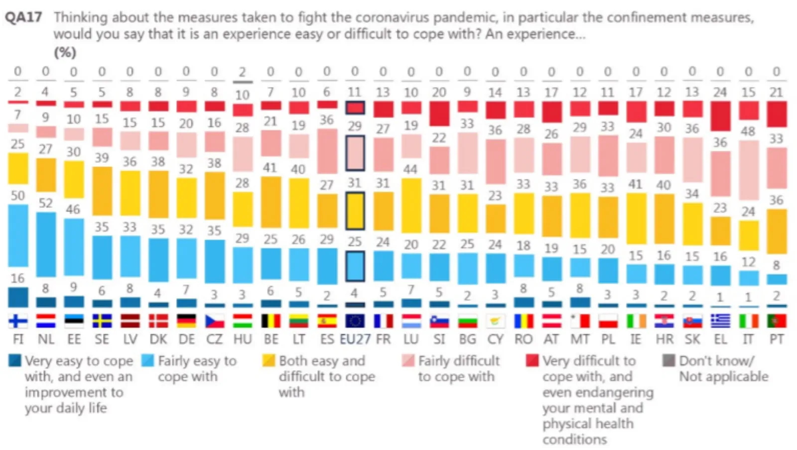
This chart shows 2 interesting things. One, Finland was pretty happy under lock down. Two, an interesting way to put data labels on a stacked column chart. The small boxes are always a problem in a regular format. Here you get the combination of the visual effect of the size of the boxes, versus the table of the actual information. This could be inspiration for a future SlideMagic expansion.

I would do some things different though. That row of zeros at the top does not add much. The flags make the whole chart even more busy. And given that this is a comparison, I would have shown the data as a stacked bar chart.

If you were to use me as a bespoke designer, I would actually show this data on a map of Europe, color-coding different countries with maybe only the some of the 2 blue data series. The geographical clustering of the countries is interesting. In addition, I would combine it with one stat about the health impact of COVID in these countries.

If you do not have the software and/or the time to make a chart like this, the solution is easy, take off the data labels completely and make a straightforward stacked column chart.

I found this chart on Twitter, without quoting a source, the format looks like a page in some document by the European Union though.

·Software

Google Docs moving to canvas

A bit of a technical post. Google Docs is changing the way it renders documents. Instead of HTML, it will move to something called “canvas” (no, not Canva, the design platform), partly because of the same limitations of web page layouts that I have been battling with SlideMagic.

HTML was created in the 1980s to render text and links in web browsers. Over the years many features were added that improved its graphics capabilities. The result are the modern web pages, mobile apps, and desktop apps such as SlideMagic that we know today.

HTML is great for displaying content on a huge range of devices, different sizes, different process speeds, different resolutions, different generations of technology. The NYT front page will look great on all these screens.

But graphics applications require more than that. Specifying the exact crop of an image, exactly setting the font size to prevent an orphan word of a title dropping to the next line. What-you-see-is-what-you get editing. Copy-pasting of text or images. Exactly scaling up or down a layout rather than changing the point sizes of fonts with steps.

In SlideMagic, I had to apply a lot of tricks to get things to work, and basically created my own (x, y) coordinate space to do what I want. It looks like Google is going a similar way. My approach is to use vector graphics, that can scale to any size you want while being able to detect mouse clicks on elements.

Google is taking it further and moving to a complete blank “canvas”. Everything is “painted” bit by bit, letters are drawn, images are merged in, selection boxes are merged in with the document. To drag a box of text, Google will have to write software that fills the pixels of the box with the underlying pixels, then redraw all the pixels a bit to the right.


Continue reading →
·Layout

Slide layouts and aspect ratio

The aspect ratio of a slide influences the type of layout you come up with. Over the years, presentation slide aspect ratio tend to follow the dimensions of computer screens. The first computers typically had a 4x3 screen ratio (80 x 25 characters of a punch card, sort of resembling an A4/letter format, and probably easier to design when you need to redirect electromagnetic beams in pre-LCD traditional televisions/monitors), while modern machines have wide screens in 16 x 9 ratios (the preferred format in movies).

A 4x3 canvas is very different from a 16x9 canvas when it comes to design (spoiler, I prefer the 4x3).

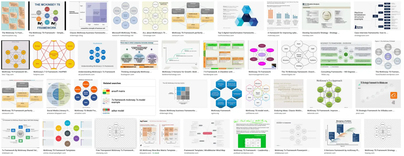
Most diagrams and frameworks work best when width and height are about the same. When you look at many of the classical management consulting frameworks, you can see that they were originally designed in a 4x3 aspect ratio. Modern interpretations simply stretch them out, making the whole thing look unbalanced.

Process diagrams and tables on the other hand, work great in widescreen format. There is a lot of space for left-to-right steps or columns with information.

What to do?

  • There is nothing wrong with white space. If your diagram needs a 1x1 aspect ratio, put it in the middle of your 16x9 slide and resist the temptation to fill the left and right sides with text or other distracting clutter
  • Alternatively, consider putting the titles of your slide on the side, creating a mover vertical canvas for the body of your slide (SlideMagic can switch seamlessly between different slide title layouts).
Continue reading →
·Creativity

"Producing yourself"

I just returned from a short Passover holiday, a first in a year. (Hotels, restaurants, here in Israel are now completely open while virus cases continue to fall towards zero).

During the break I watched a Master Class series by Alicia Keys about “producing yourself”. In music production there are usually 2 roles: the creative contribution of the artist, and the editing and arranging part by a producer. They usually happen in 2 spaces, the artist is in the recording part of the studio, the producer sits on the other side of the glass in the control room.

There is an interesting parallel to presentation design: I think most presentation designers are producing themselves, doing both the creative and the editorial part, pretty much like Alicia does.

At least, they are supposed to do so. In practice, when it comes to presentations, people are more arrangers than creators.

How does Alicia go about balancing both side of the process?

  • She creates to completely different mindsets, amplified by the different locations: the vocal booth, the control room
  • In creative mode she lets herself go completely, mistakes are OK, crazy things are OK (similar philosophy to corporate brainstorming sessions)
  • But, she actually prefers to be totally alone, in order to “embarrass” herself freely, and to avoid being put in the position of an artist who has to entertain and perform (completely the opposite of a corporate brainstorming session).
  • She records and captures everything, if you want to capture a creative idea in the flow / moment, you are too late. (As opposed to the brainstorm flip chart where someone else tries to capture and rephrase ideas that multiple people are “shouting” out).
  • After all this, she takes a break, goes to the control room, and listens back with a completely different mindset.
Continue reading →

PPT templates: adding 1 more person to "The Night Watch"

Prefab PowerPoint templates can look incredibly pretty. The problem is editing and customizing them. It is easy to change text, but if your message requires 5 instead of 4 bubbles, you need to make drastic changes to the layout of a slide.

  • There are the technical skills of duplicating and placing that shape.
  • There are design skills, “somehow the proportions of the slide don’t look right anymore and I can not pinpoint what causes it”.
  • There could be a more fundamental problem, maybe a 5 bubble chart requires an entirely different slide than a 4 bubble one
  • There is the problem of fitting things in with the right fonts and colors that fit your corporate identity (corporates usually do not use the cute fonts found in powerpoint templates).

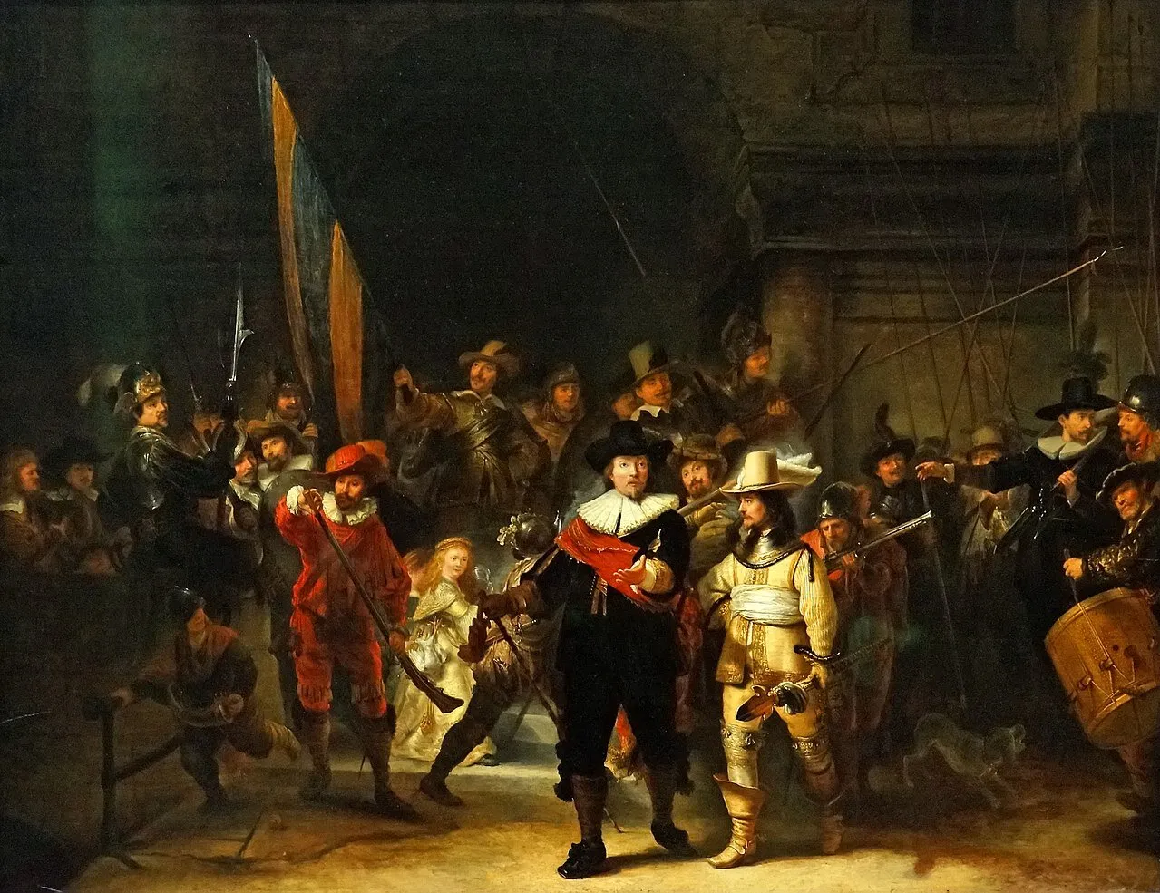
Changing a PowerPoint template is a bit like handing a paint brush to a random person with the request to add one more person to The Night Watch on the canvas, and change the coloring from dark to light (the scene is set in the middle of the day, but got darker over the years).

What I am trying to achieve with SlideMagic:

  • Lower the ambition on the complexity of slide designs, and make sure that the designs that do make the cut look pretty good
  • Offer an editor that makes it easy to change layouts without leaving any traces
·SlideMagic

Limited time...

This chart lays out the philosophy behind SlideMagic: spend more time pitching, less time editing. There are only a limited number of productive hours in a day, it is a waste to spend them on slide design…

  • If you are preparing for an all-or-nothing pitch, you free up time to really, really rehearse your story.
  • If that quarterly report is sitting on the top of the to-do list and preventing your from doing other things, get it out of the way quickly.

P.S. I have add this slide to the database here, or search for ‘slidemagic’ in the desktop app to use it in your own presentation