

The aspect ratio of a slide influences the type of layout you come up with. Over the years, presentation slide aspect ratio tend to follow the dimensions of computer screens. The first computers typically had a 4x3 screen ratio (80 x 25 characters of a punch card, sort of resembling an A4/letter format, and probably easier to design when you need to redirect electromagnetic beams in pre-LCD traditional televisions/monitors), while modern machines have wide screens in 16 x 9 ratios (the preferred format in movies).
A 4x3 canvas is very different from a 16x9 canvas when it comes to design (spoiler, I prefer the 4x3).
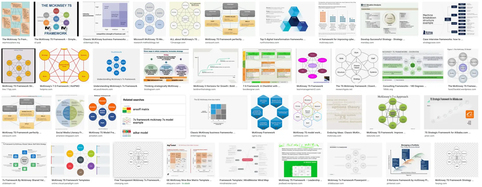
Most diagrams and frameworks work best when width and height are about the same. When you look at many of the classical management consulting frameworks, you can see that they were originally designed in a 4x3 aspect ratio. Modern interpretations simply stretch them out, making the whole thing look unbalanced.
Process diagrams and tables on the other hand, work great in widescreen format. There is a lot of space for left-to-right steps or columns with information.
What to do?
- There is nothing wrong with white space. If your diagram needs a 1x1 aspect ratio, put it in the middle of your 16x9 slide and resist the temptation to fill the left and right sides with text or other distracting clutter
- Alternatively, consider putting the titles of your slide on the side, creating a mover vertical canvas for the body of your slide (SlideMagic can switch seamlessly between different slide title layouts).


Photo by Mattia Astorino on Unsplash