SlideMagic Blog

Frequent updates about all things presentations since 2008. Subscribe to never miss a post.

RSS
all posts

Search results for “web design”

·Advertising

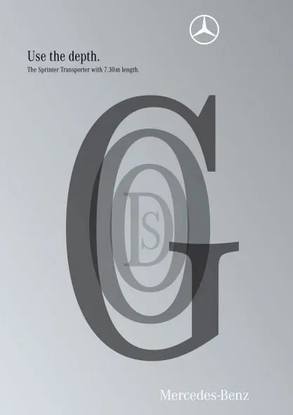
Here is a new way to look at 3D typography

This ad uses 3D typography in a way that is obvious, but only after you have seen it. The letters are positioned and sized in such a way that it creates a sense of depth, semi-transparent fills add to the effect. Very well done. It works best for short words that have lots of “open” characters in it, for example “goods”. Via Ads of the World.
·Design

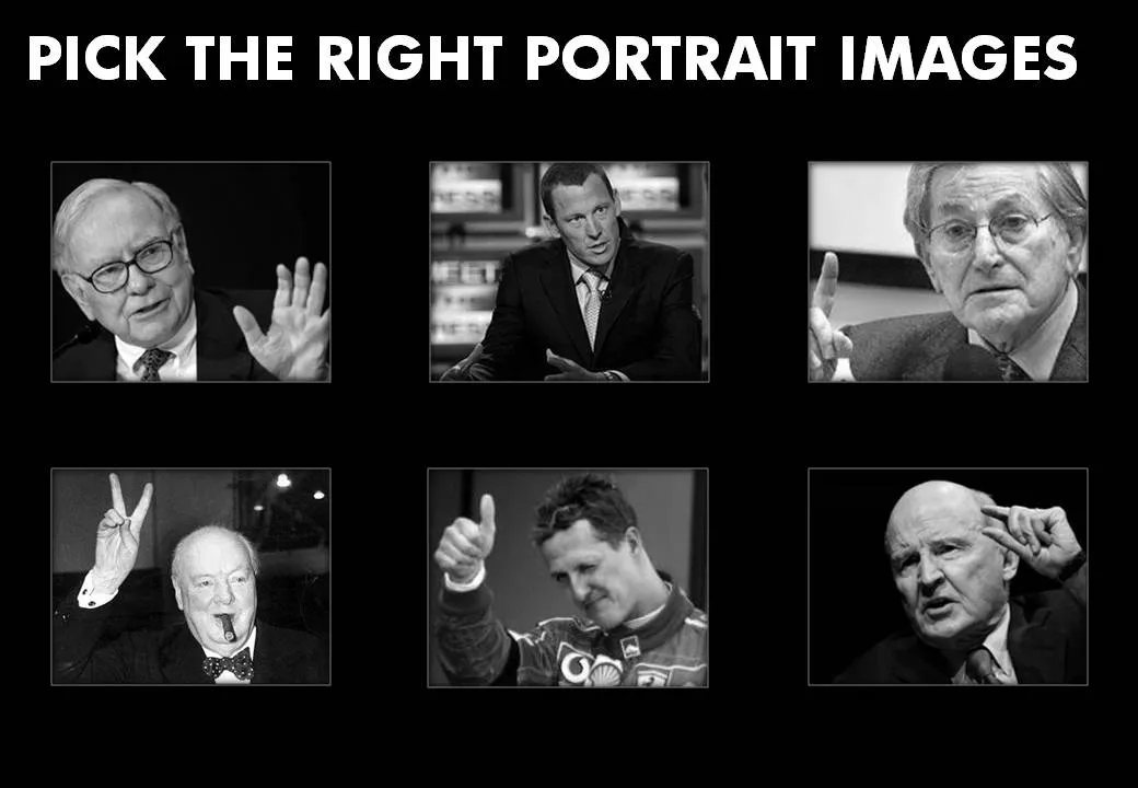
Picking the right portrait images

Images of celebrities are like corporate logos: recognizable from a long distance. When selecting images for your presentation, think of the following:

  • Re-size and crop the images in such a way that all of them have roughly the same scale, and that the eye line more or less lines up
  • Choose active pictures: people pointing, making a gesture
  • Have people look towards the center of the page
  • Harmonize the background (light or dark)
  • Harmonize the color, make them black and white if necessary

I stuck to most of these suggestions (not all) in the example slide below:

·Design

Chart concept - a variation on the Venn diagram

Venn diagrams

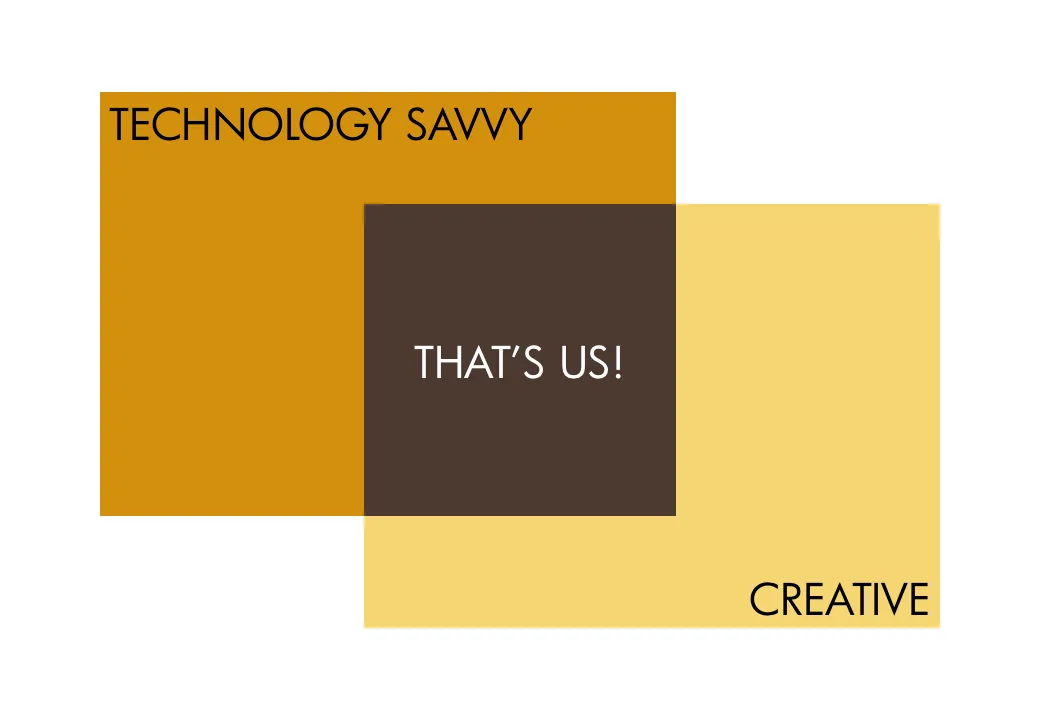
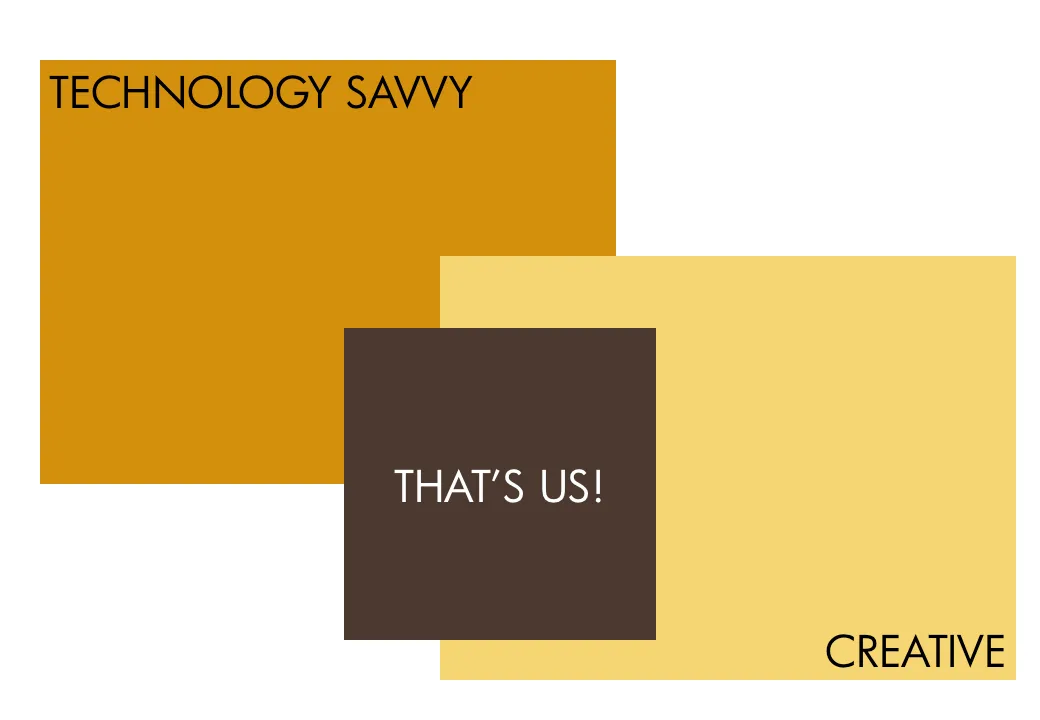
are great to show overlapping features. In practice however, it can be hard to position text in the circular shapes. I often use an adjusted version of the Venn diagram, one based on boxes. Boxes are easier to draw, and especially, you can make the center box (the most important one) really large.

As you can see below, I did not rely on semi-transparent colors to create the overlap effect. Rather, I just drew the third box in, giving me complete flexibility to decide on colors. Again something that would be hard to do in a circle Venn diagram.

UPDATE February 2018: I have now added a number of Venn diagrams in PowerPoint to the SlideMagic store, including the rectangular ones that are described above.

·Concepts

Chart concept - confusion

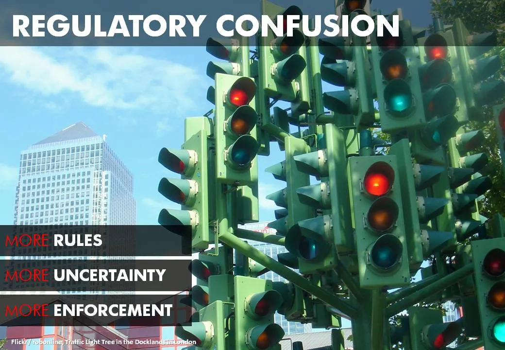
A client needed to visualize the regulatory uncertainty in his industry after the financial crisis. This traffic light tree in London is a very useful art installation that you can use in many other confusing situations. The high rises of large financial services firms in the back help complete the picture (my client works in that industry).

The Internet is full of images of the sculpture. Try searching Flickr for images with a Creative Commons license.

·Data visualization

Sometimes a simple table is best

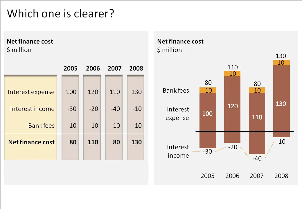
I have been thinking hard about how to incorporate negative numbers in stacked column and bar charts. The example below shows that it is possible. However, it might be the exception of the rule that graphs are usually better at presenting data than tables.

  • The chart takes a bit of time to figure out. “It’s about cost, so income is negative”. “Ah, the negative offset of the chart is revenues”.
  • The chart goes against common practice of accountants and other financial professionals to look at annual financial data in tables.

What do you think?

·Art

Finding inspiration in CD cover images

More and more, I am trying to make each presentation in a unique style that is consistent on each slide. Paintings are a good source of inspiration, but so is cover art of CDs/LPs. Today I used this one from Remastered: The Best of Steely Dan - Then and Now

Steely Dan used an image of “Carhenge”, an art installation by Jim Reinders, somewhere in Nebraska, a modern-day version of Stone Henge in England.

It provides all I need for a presentation with a consistent accent:

  • A slightly apocalyptic theme (this presentation was for a client in the asset management industry talking about changes since the economic meltdown of 2008)
  • Cars, especially vintage cars, a rich hunting ground for images expressing all kinds of concepts
  • The large bold font with a blank fill
  • Blues and yellow/oranges as colors.

Disclosure: I earn a small commission if you purchase products on Amazon through links on this site.

·Concepts

Chart concept - in the spot light

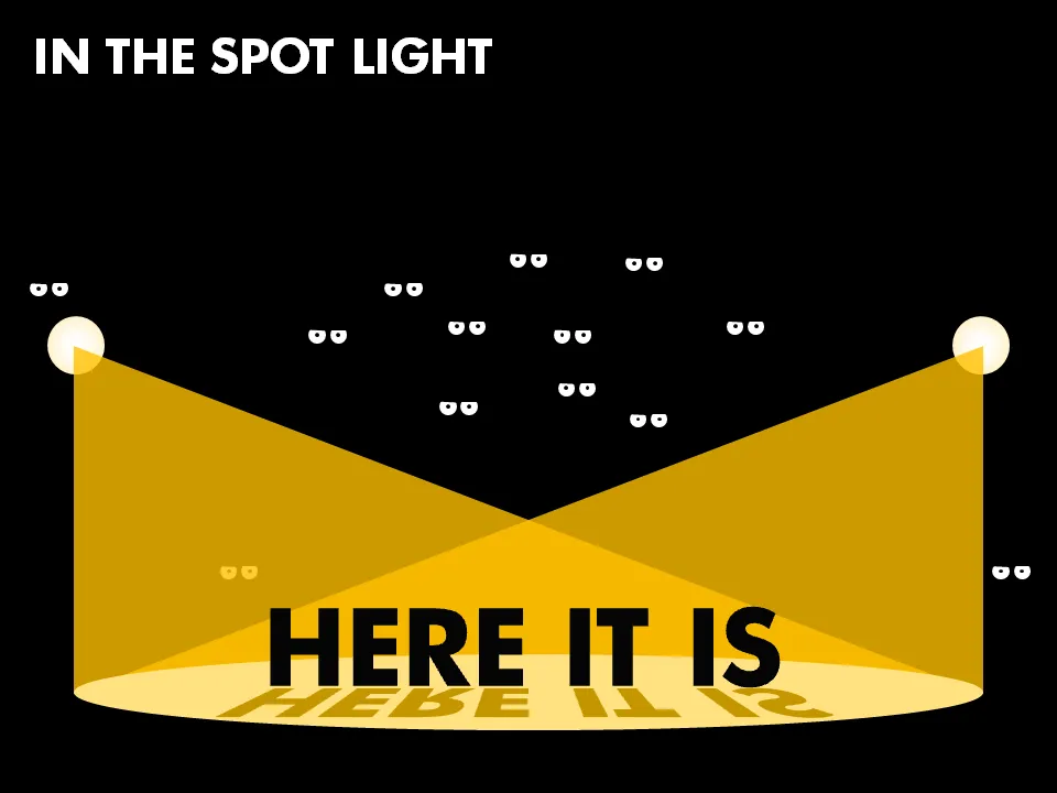
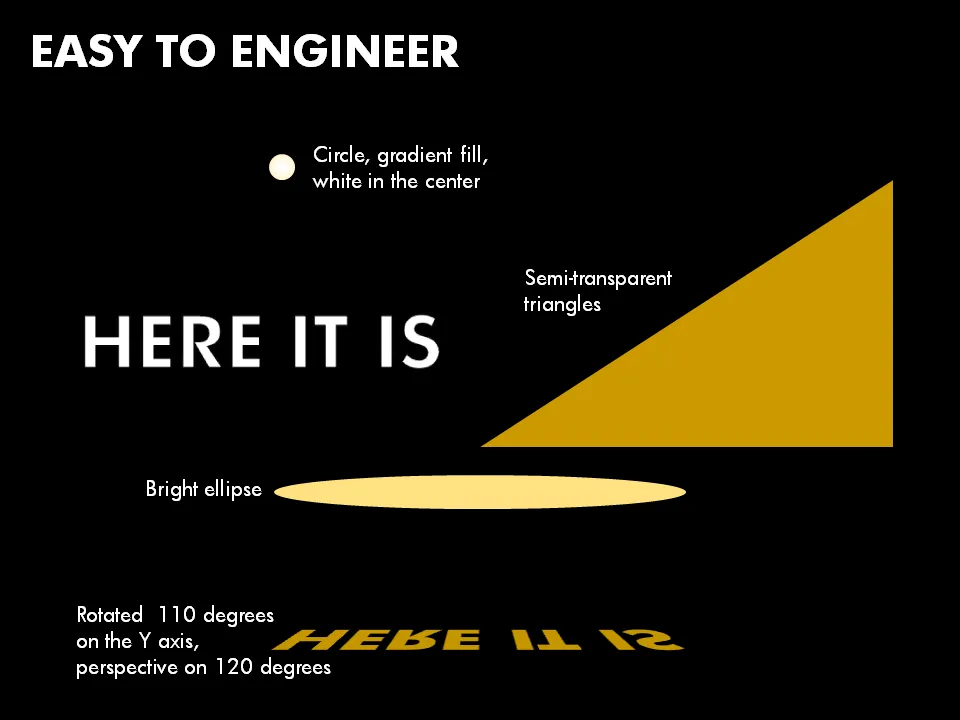
I saw this spot light concept in an invitation for an event. It can easily be recreated in PowerPoint, ideal for a chart to make a big announcement. Click on the second image for some more explanation about the shapes to use. And if you like those tiny eyes, you can read more about them in one of my previous posts.

·Design

Blending PowerPoint shapes into your image

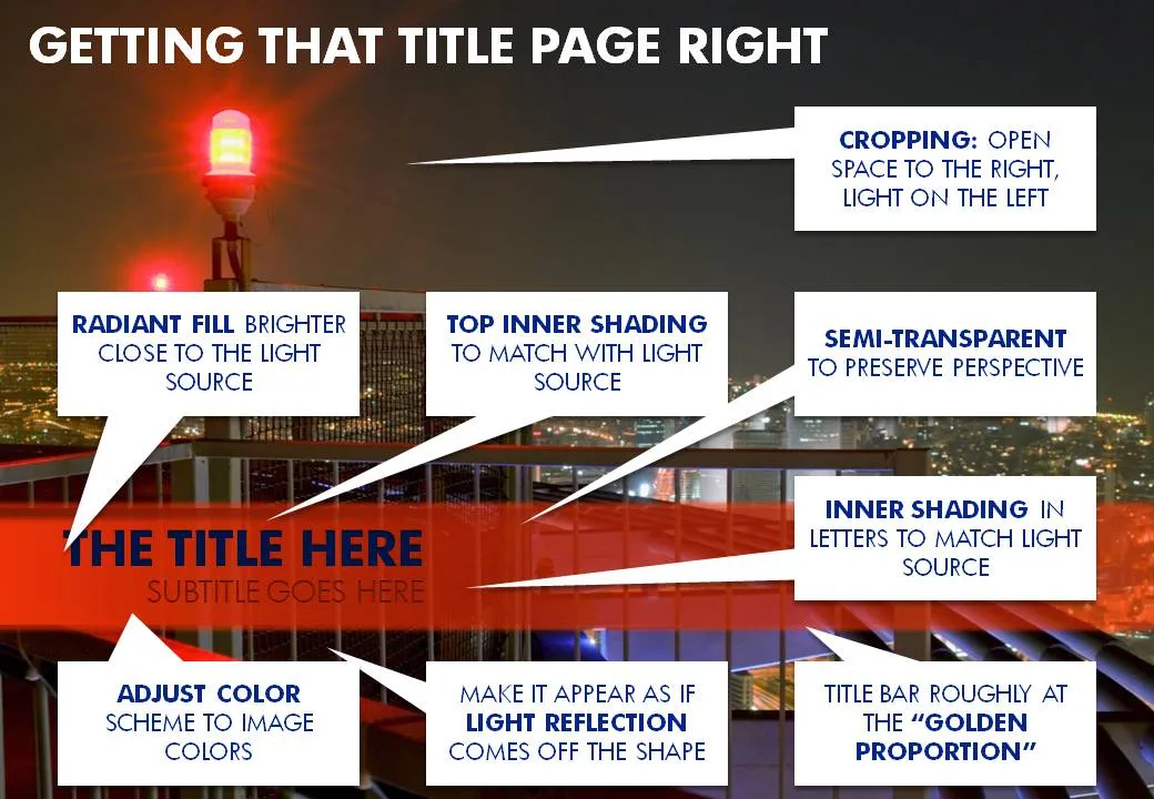
A recent image I used for a cover page of a presentation provided some excellent opportunities to blend PowerPoint text and shapes into the image. Use the strong red light source to create matching shadows and colors. Click on the image with the boxes to get a larger picture.

·Data visualization

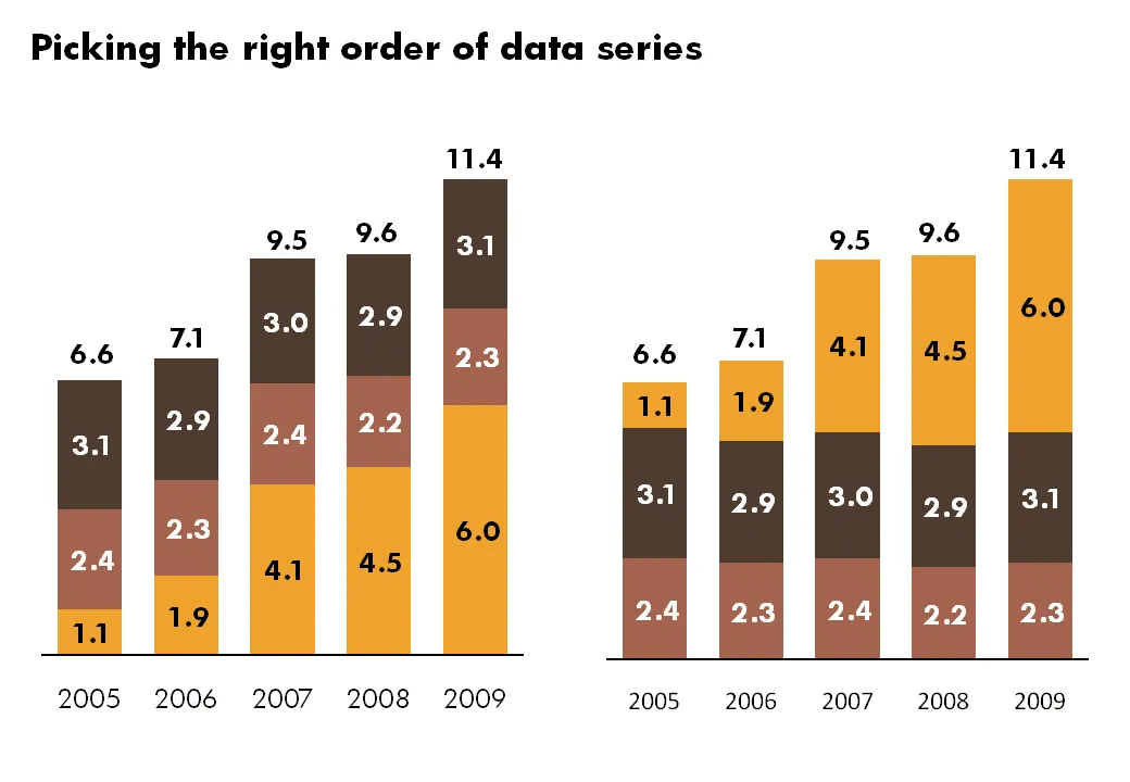
In what order to display data series?

Look at the data of your stacked bar and column charts. I prefer to put the series that changes the most last, so it becomes very clear what variables are changing, and what variables not.

·Advertising

Keep your text trapped in its box

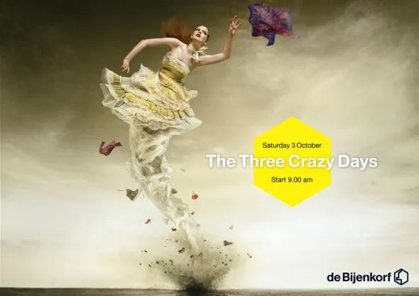
The elaborate tornado illustration of this ad is pretty, but it looks like there was not much time left to think of a good place for the punch line and the dates of the event. Eyes and brains do not like reading text over fluctuating backgrounds.

Via Ads of the World.