

Color theory provides us with a clear set of rules of colors that go well together. Kuler has them even built in: complementary colors, triad, monochromatic, etc. But hey the world would be boring if everyone would follow the rules.
Look at the world of music for example. Jazz drummers only really start to swing when they go slightly off-beat. Many R&B songs have their drum computers programmed with delayed beats, providing a punch a fraction of a second too late.
If not, the music would sound like a 1980s Casio keyboard.
In my presentation work I recently stopped using these color composition rules. Instead I often look at a beautiful image or a powerful painting to design the color scheme of my presentation. Find a painting that provokes an emotion, load it up in kuler, and use it as the basis for the colors of your next presentation, even if it does not exactly follow the rules of color composition…
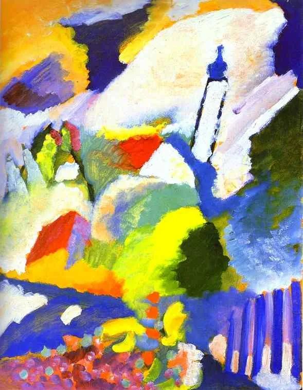
Wassily Kandinsky. Church in Murnau. 1910. Oil on cardboard. 64.7 x 50.2 cm. Städtische Galerie im Lenbachhaus, Munich, Germany