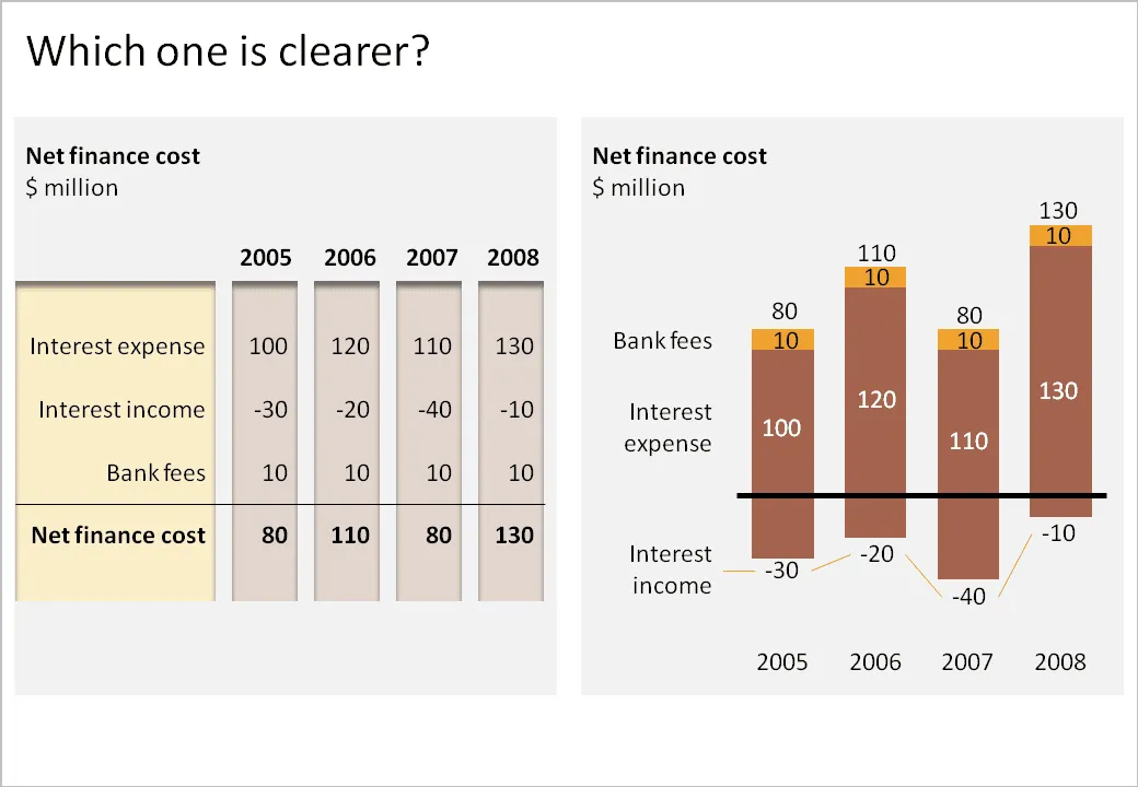
I have been thinking hard about how to incorporate negative numbers in stacked column and bar charts. The example below shows that it is possible. However, it might be the exception of the rule that graphs are usually better at presenting data than tables.
- The chart takes a bit of time to figure out. “It’s about cost, so income is negative”. “Ah, the negative offset of the chart is revenues”.
- The chart goes against common practice of accountants and other financial professionals to look at annual financial data in tables.
What do you think?