SlideMagic Blog

Frequent updates about all things presentations since 2008. Subscribe to never miss a post.

RSS
all posts

Search results for “web design”

·Design

Turning any image into concrete

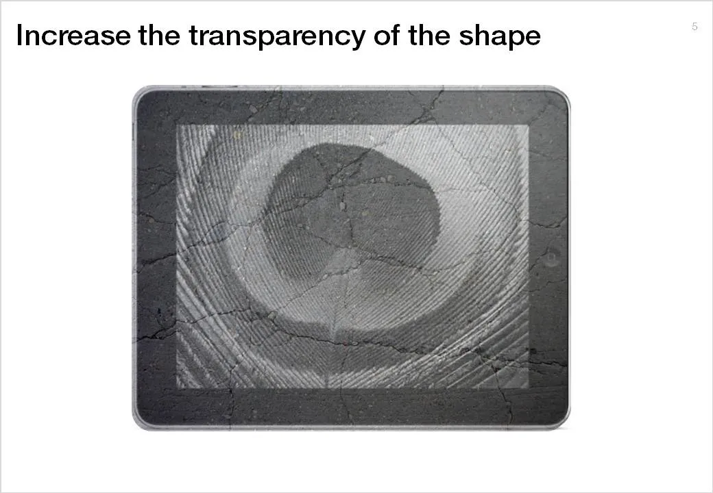
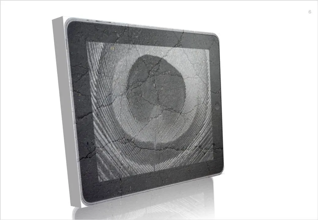
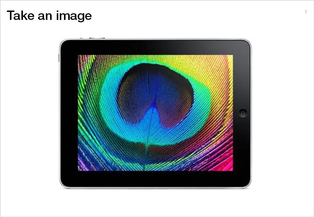
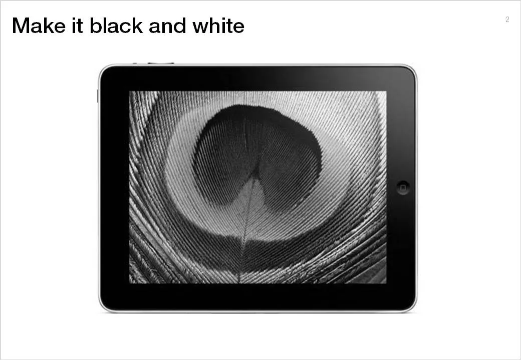
Here is a simple trick to turn any image into concrete. As an example I took an iPad and turned it into an iSlate, but it might actually work better with other images (you can turn portraits into statues for example).

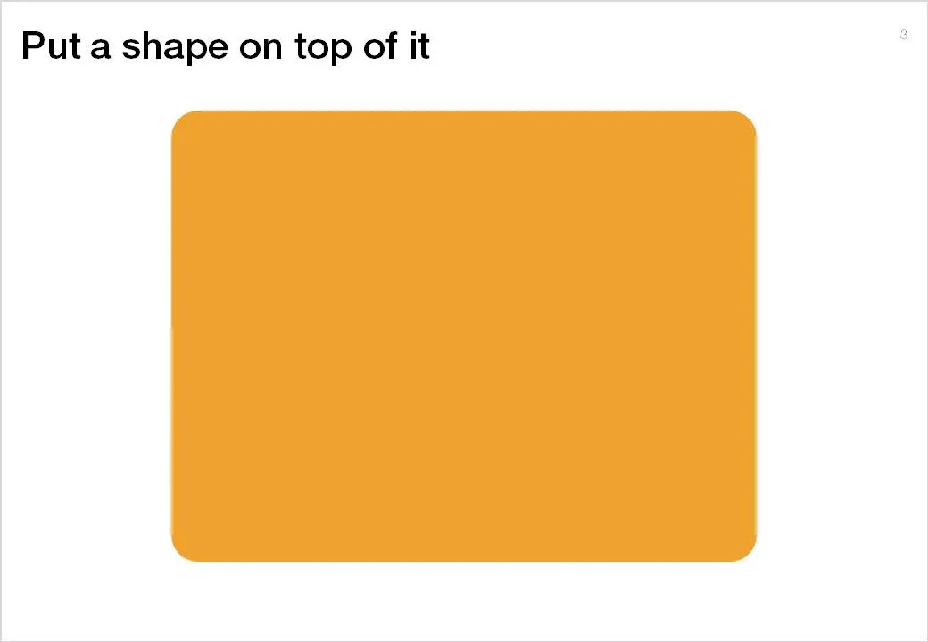
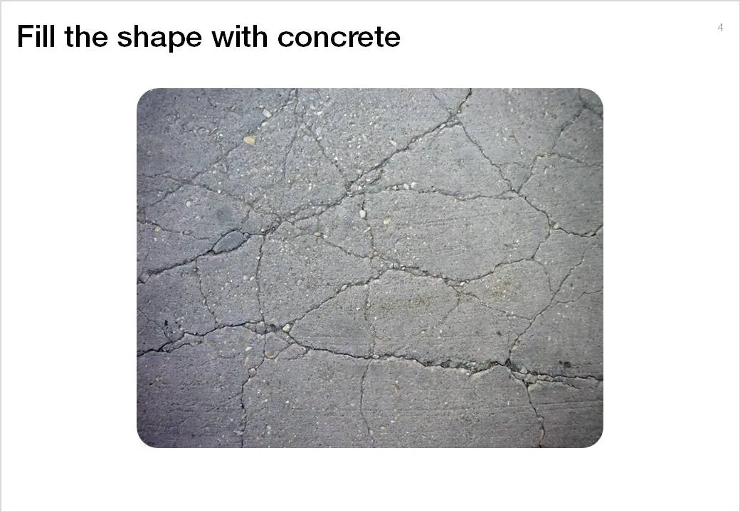
To do this in PowerPoint without the help of advanced image manipulation software you need to add a shape on top of the target image, fill the shape with an image of a concrete texture (available on any stock image site) and make that shape with the concrete texture semi-transparent.
·Advertising

Message arrived - nobody understood it

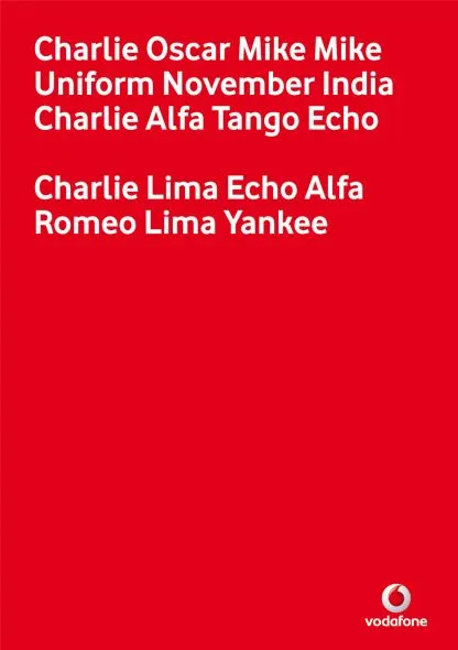
My attention was drawn to this Vodafone ad that uses the NATO alphabet to say C-O-M-M-U-N-I-C-A-T-E  C-L-E-A-R-L-Y. An excellent example of the difference between delivering a message (i.e., writing your bullet points on a slide) and getting someone else to understand/internalize what it says.

I am not sure yet how to use it yet, but this NATO alphabet is a good thing to remember when thinking about chart concepts.

Via Ads of the World.

·Delivery

The audience wants you to succeed

Fear of public speaking often stems from the speaker thinking that the audience’s main objective is to criticize her performance. The opposite is true: the audience wants you to succeed. First of all because of selfish motivations; nobody wants to be bored.

But there is an emotional driver as well. People (in the audience) do not like to subject themselves to an embarrassing situation. Watching this movie clip from the film “About a boy” creates that exact feeling in your stomach (I cannot embed it for some reason).

The book “Confessions of a public speaker” has a great section on public speaking anxiety. Seth Godin thinks that fear of public speaking is the a prime example of our lizard brain at work.

·Advertising

Chart concept - word find

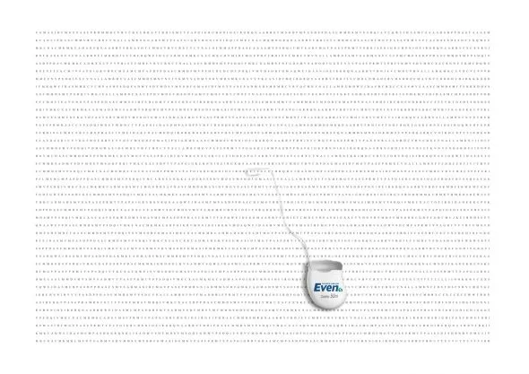
The concept of this ad for a dental care product can be very useful for a slide conveying “solution x helps you see the forest through the trees”. It is a bit tedious to generate rows of random words, but the end result will be effective.

A larger image can be found on here on Ads of the World.

I discussed similar concepts earlier here and here.

·Design

First thoughts on the Apple iPad and presentations

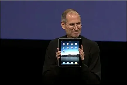
Apple launched the iPad yesterday (watch Steve Jobs present here): a device positioned in between a smart phone and a laptop computer. The big differentiator is a very large screen and a user interface that can be manipulated using the touch of a finger, exactly the same way you interact with an iPhone.

Would could this new device mean for presentations? My first thoughts:

  • The iPad runs the iPhone operating system, which means that you cannot simply port PC or Mac applications on it. Apple announced a version of iWorks (including Keynote) for the iPad, but for now it is impossible to run Microsoft PowerPoint on it.
  • The devices seems like a great presentation tool for one-on-one meetings. A bright, big screen and an informal user interface enable a dialogue-style presentation.
  • The need for an application like Prezi becomes more urgent. Prezi seems made for the iPad: easy zooming in and out of slides, and a non-linear way to move between slides. I have not seen the details of iWorks for iPad, but I assume that Apple is going down the track of creating a Prezi-style user interface for office productivity applications.
  • It would be great if you could use a virtual marker during your iPad presentation: drawing circles to emphasize elements, adding comments, pretty much in the style of the napkin presentation I talked about a while ago.

I am very excited about the iPad. The geek reviews might have found technical imperfections (no multi-tasking for example), but the fundamental revolution is the big touch-based user interface that have brought computing in general and presentations specifically a bit closer to a natural human interaction.

·Data visualization

Measurements that people can visualize

Mathematics has given us the ability to perform complex calculations, reducing real world quantities to simple numbers and variables that can be manipulated without interpreting what they actually mean.

In your presentations, try to go back to the stage of a child before the first mathematics class. Describe measurements and quantities in a way that they can be visualized, internalized.

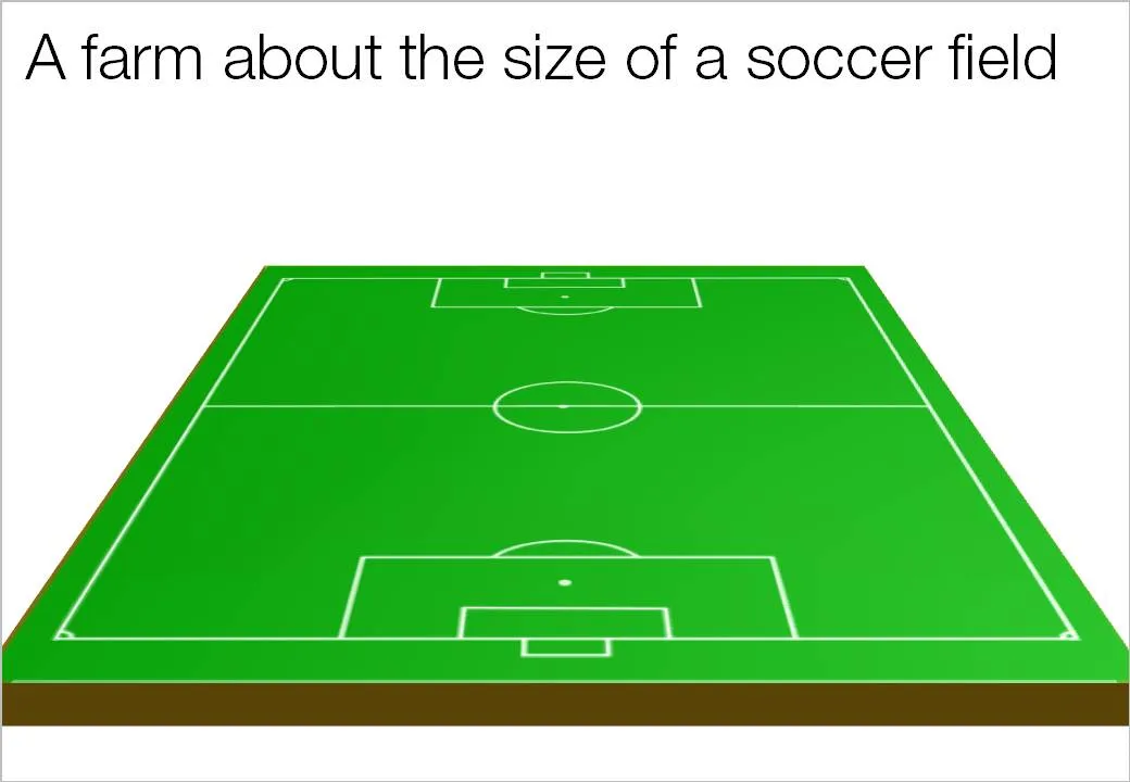
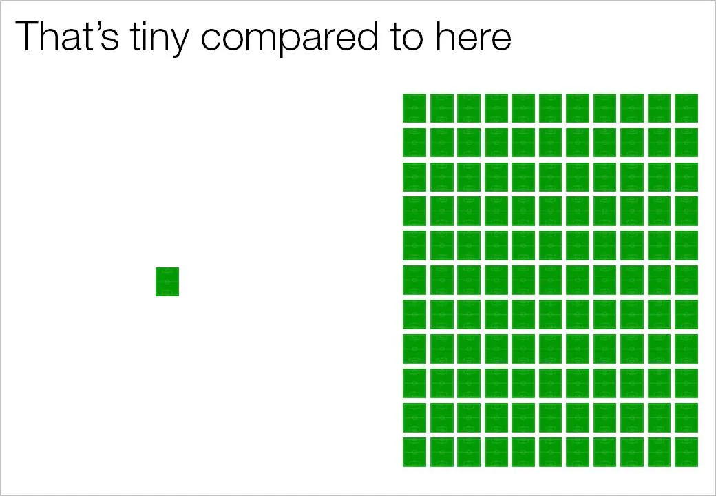
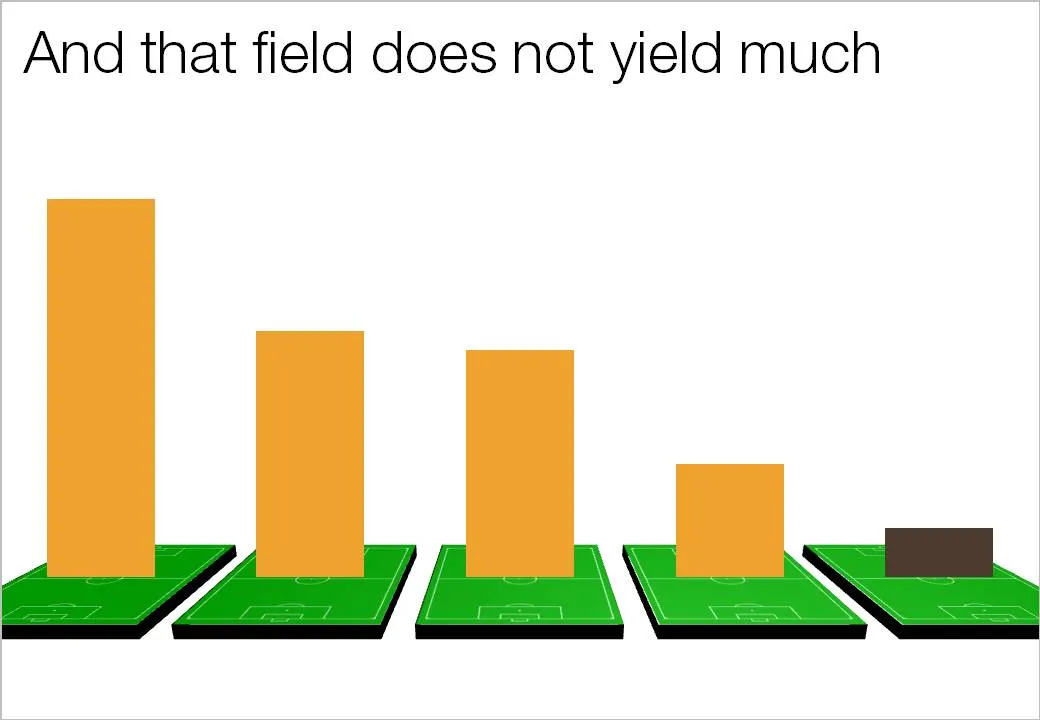
Recently, one of my presentations covered agricultural land yields in emerging markets. Rather than using abstract hectares and tons, I decided to use the soccer field analogy. It is easy to re-calculate figures from tons per hectare, to tons per soccer field, and maybe even going further: truck loads per soccer field.

You can even use the visual of the soccer field:

·3D

Maintain one vanishing point when rotating 3D PowerPoint objects

3D effects can add impact to a PowerPoint slide if used at the appropriate occasion.

  • 3D for the sake of 3D adds complexity: the slide becomes harder to understand, the only thing you showed is that you know where to find advanced formating buttons of PowerPoint. 3D data charts are a good example of this
  • 3D adds value if you need to convey distance: I use 3D for what it actually is, a way to add a third dimension to your slide, to show depth… (Notice in the previous post I linked to that you often do not need to use sophisticated 3D effects to create depth, colors or differences in size can do the trick equally well).

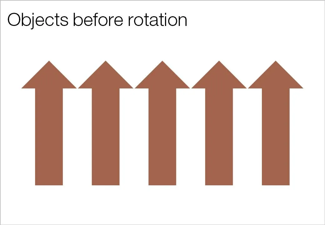
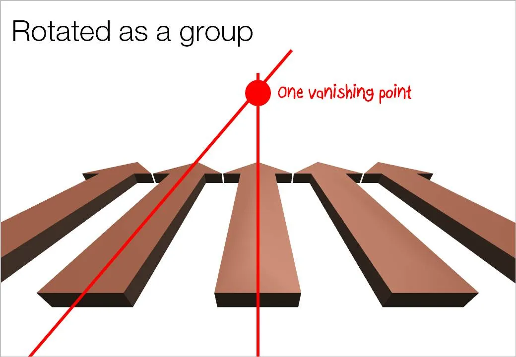
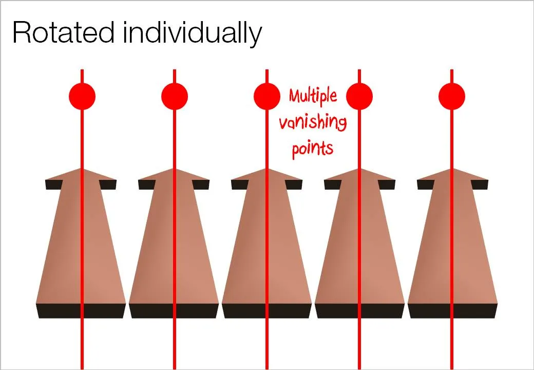
Here is an important thing to remember when using 3D rotations in PowerPoint: rotate a composition of objects as a group, rather than a collection of individual objects. Grouping them preserves one vanishing point in your slide composition. An example:

·Design

An unusual take on typographic color...

Typographic color is the apparent level of black (or color) that appears to you when looking at a block of text.

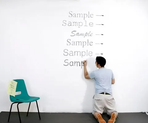
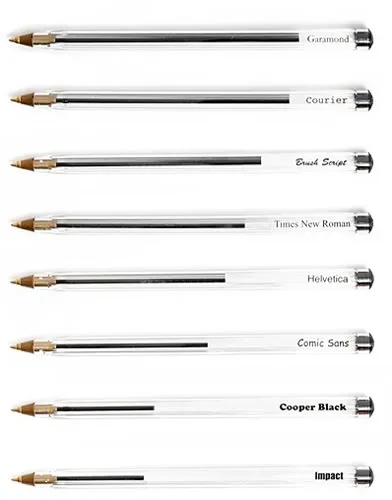
Matt Robinson engineered an interesting experiment to test it. Take low-cost, transparent ball points, use them to write the same text in different fonts on a a wall, and see how much ink is left in them afterwards. A quantification of typographic color use (and/or) waste of ink.

Courier comes out really environmentally friendly in this test. It might be true in terms of ink, but this is definitely not the case of you measure the amount of paper used.

I am a bit late to discover this via Ministry of Type.

·Design

Google Street View - a great source of presentation images

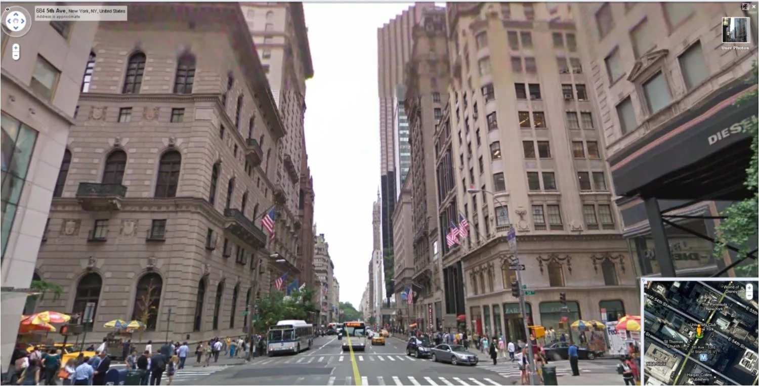
For those who do not know: Google Street View lets you look at images taken in the streets of more and more cities. You walk around, look up, down, sideways. Like Google Earth (see an earlier post about how to tilt Google Earth maps), this is a fantastic source of images for presentations.

  • Images of landmarks that are much more natural and real than the ones you can find in stock image sites.
  • The ability to take unusual photo angles, most stock images are taken looking straight ahead.
  • Ultra-local: if your presentation somehow is set in a certain location, go there!
  • If your presentation is in the area of retail, urban planning, Street View is a great way to give examples of let’s say Starbucks stores in a few different cities, in a few different formats
  • People shots: doing a presentation about mobile phone use, youth fashion trends? Google Street View enables you to walk out in the streets of Paris and see what’s going on.

·Design

The vertical center that feels right to the eye

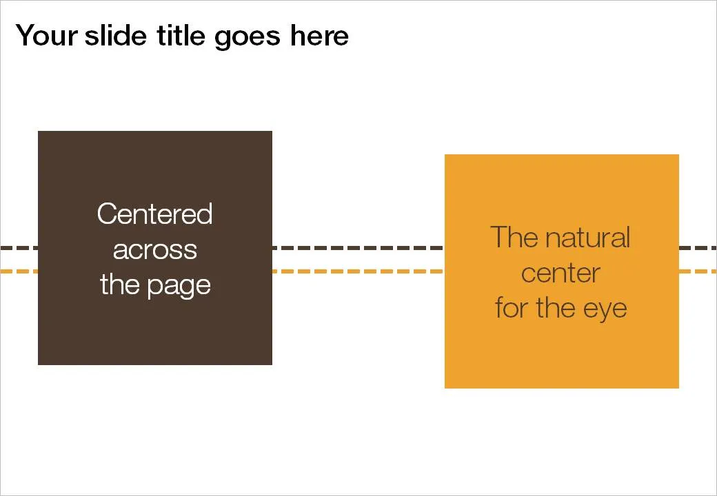
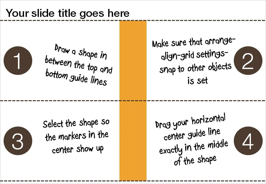
If you use big title headings on your PowerPoint slide, the exact vertical center of the slide might not feel natural to the eye. I suggest centering items slightly lower. Here is how you can find the exact location where to set your drawing guides.

  1. Draw a random shape in between the top and bottom drawing guide
  2. Switch on “snap to other objects” (arrange-align-grid settings-snap to other objects)
  3. Select the shape to make its center marker visible
  4. Drag the middle horizontal drawing guide to the center of the shape, it should “snap”