SlideMagic Blog

Frequent updates about all things presentations since 2008. Subscribe to never miss a post.

RSS
all posts

Search results for “web design”

·Design

A different perspective

Most images have the perspective of someone who, well, stands up and look around. These 2 different ads (one here, and another one here) reminded me to look out for unusual compositions to keep your slides interesting.

Via Ads of the World.

·Delivery

No point in arguing

Watching the disputes between players and the referee in the soccer worldcup reminds me of corporate negotiations. After the pitch presentation people start discussing the terms. Often, they are so preoccupied with their own viewpoint that they forget to listen or try to understand what the other party is saying. The same points get repeated, and repeated, and “let me explain to you one more time…”. Nobody is listening, everyone gets annoyed.

·Design

But what is it?

Here is a big sentence on the front page of a new web site targeted at iPhone users:

[Company] develops real-time personal discovery and contextualization technologies that leverage semantics and social attention to make social streams more relevant.

Industry insiders might understand what it means, but most people will not. I am not a big believer in mission statements. Often, the big wordy sentence that covers all will be the most compact way you can describe your business to yourself, but as you suffer from the curse of knowledge, other people will not get it.


·Data visualization

Relating the oil spill to your city of choice

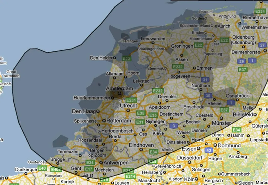
More maps today. This simple site ifthiswasmyhome puts the size of the oil spill in perspective… using a town of your choice. It would cover pretty much the entire Netherlands (the country where I grew up).

An excellent visualization, making people internalize what big numbers mean.

·Design

Clip art comeback?

I have been avoiding clip art for many years in my presentations. The graphics look clumsy and cliche compared to a high quality stock image. (Sometimes I am longing for that screen bean though).

After reading a few posts on Tom Kuhlmann’s Rapid e-learning blog I might change my mind though, maybe. All these big image, big text slides start looking sort of the same. Some ideas by Tom:

  • Edit your clip art to make it interesting. Dramatically scale them up, so they become huge on the slide. Ungroup the object and remove items you do not need, or even swap heads on characters.
  • Keep the style of your clip art consistent. I did not know that you can search for specific consistent clip art styles, this one for example: style 802. More examples here.
  • Clip art is a good source to make black silhouette characters.

Add Tom’s blog to your RSS reader if you are interested in this.

·Data visualization

Telling a story with an interactive map

This interactive map is amazing: click a US county and it shows you were people who live their move to, and from where people are moving into this area. This is a (very cool) tool, but some serious DIY analysis is required to tell the story though.

I clicked around a bit and discovered some patterns:

  • Lots of people are moving back and forth between big cities
  • In the mid west, people move within a short radius
  • Upper east coast people move (retire?) to Florida
  • Etc.

To use this in a presentation there is no avoiding to going back to a series of screen dumps to take people by the hand through the data. (I am not a big believer in live demos during short presentations.

·Data visualization

Maps: an increasingly important visualization tool

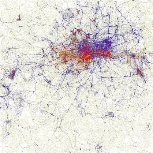
Look at this beautiful visualization of images taken in London. Blue: images taken by locals, red: ones by tourists (more cities here).

I am using maps more and more in my presentations. A map with color-coded segments is a much more powerful way to visualize data than a bar chart with a ranking of variables. I am still struggling to find good tools. There are very few good editable PowerPoint maps available, and Google maps screen shots are a bit cumbersome for large volumes of data points. Suggestions?

·Cartoons

Google assumes you are smart enough to understand their technology

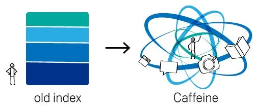
The recent post on the Google blog about an update to the search algorithm is an excellent example of how to explain technology:

  1. No apologies or “I will not bother you with the detail”, or “this is kind of complex and only an engineer (read someone more intelligent than you) will understand”. No instead, explain things clearly, but without oversimplifying.
  2. A simple graphic supports the verbal/written explanation

In case you missed, an earlier post on how Google uses cartoon characters to explain why its Chrome browser beats the competition.

·Design

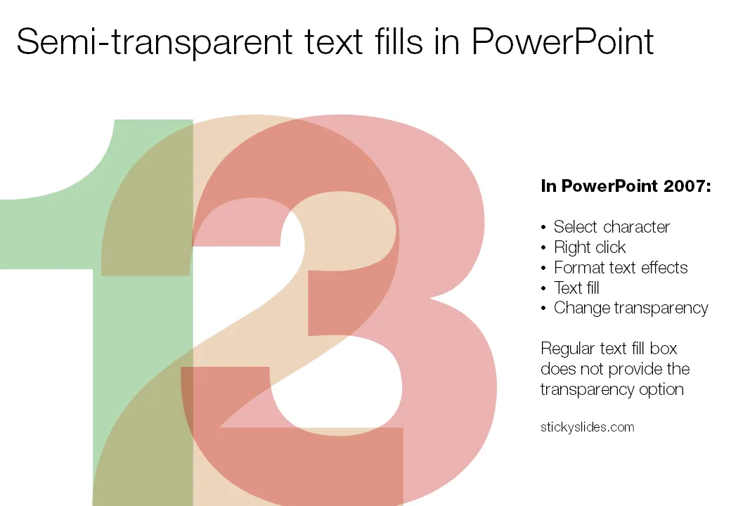
Semi-transparent text fills in PowerPoint

When you pick a color for a shape, PowerPoint gives you the option to set its transparency. However, when you select a color for your font, this dialog box does not appear. How to recreate this effect

in PowerPoint? Here is the work around (PowerPoint 2007).

  1. Select the text
  2. Right click
  3. Format text effects
  4. Text fill
  5. And now you can change the transparency!
·Design

VC pitch: talk about the elephant in the room

One of the new slides I included in my presentation lessons for entrepreneurs deck: talk about the elephant in the room. Some issues are just so obvious that you have to address them (Mark Suster gives a few examples here).

OK, you can decide to ignore them. The potential investor will say “thank you very much” and mentally shelf your pitch already while shaking your hand on the way to the door (peaking over your shoulder to that enormous animal standing in the corner).

Image via David Blackwell