

Blog post

Relating the oil spill to your city of choice

June 23, 2010 · by Jan Schultink
← all posts

More maps today. This simple site ifthiswasmyhome puts the size of the oil spill in perspective… using a town of your choice. It would cover pretty much the entire Netherlands (the country where I grew up).
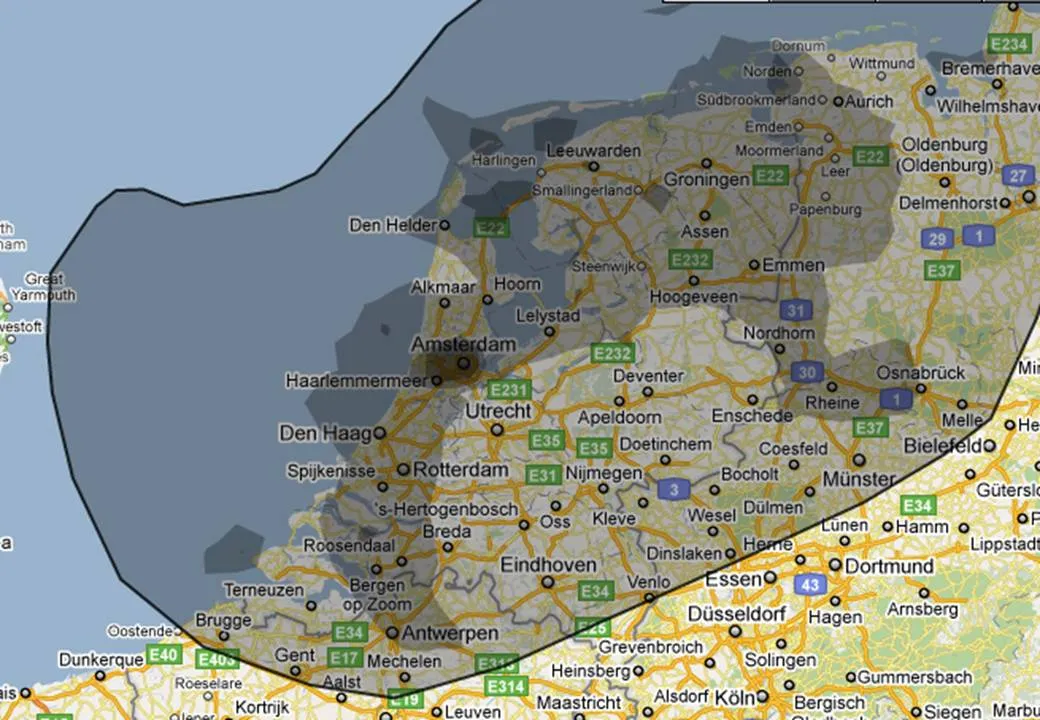
An excellent visualization, making people internalize what big numbers mean.

Data visualizationDesignPowerPointPresentation designPresentation

About this blog

Notes on all things presentations — design, storytelling, and AI workflows.

Subscribe now to never miss a post.

RSS

About SlideMagic

A platform for business presentations.

A free student plan is available.