

This interactive map is amazing: click a US county and it shows you were people who live their move to, and from where people are moving into this area. This is a (very cool) tool, but some serious DIY analysis is required to tell the story though.
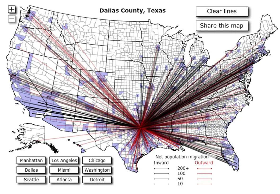
I clicked around a bit and discovered some patterns:
- Lots of people are moving back and forth between big cities
- In the mid west, people move within a short radius
- Upper east coast people move (retire?) to Florida
- Etc.
To use this in a presentation there is no avoiding to going back to a series of screen dumps to take people by the hand through the data. (I am not a big believer in live demos during short presentations.