

Look at this beautiful visualization of images taken in London. Blue: images taken by locals, red: ones by tourists (more cities here).
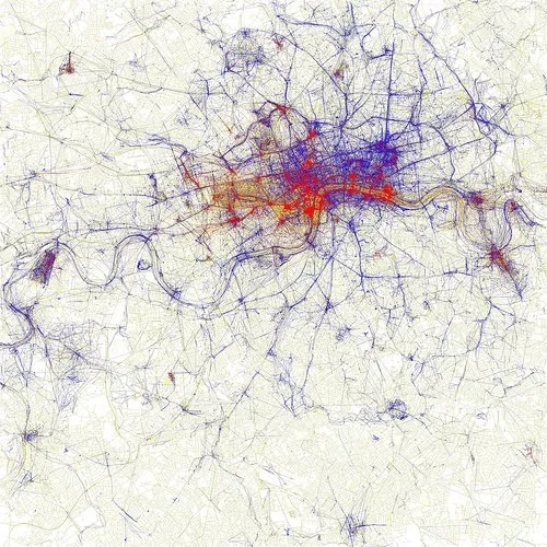
I am using maps more and more in my presentations. A map with color-coded segments is a much more powerful way to visualize data than a bar chart with a ranking of variables. I am still struggling to find good tools. There are very few good editable PowerPoint maps available, and Google maps screen shots are a bit cumbersome for large volumes of data points. Suggestions?