Movie posters
The site of the IMP Awards has an excellent database of movie posters, searchable by year, title, actor. Useful inspiration.


Frequent updates about all things presentations since 2008. Subscribe to never miss a post.
The site of the IMP Awards has an excellent database of movie posters, searchable by year, title, actor. Useful inspiration.
I am making a second attempt to master the art of motion graphics, this time through Apple software. It is much easier to use than Adobe’s. The more I think of it I come to realize that the ability to replicate objects infinitely and from different 3 dimensional angles could be as useful as flying and bouncing text in presentations (regular readers know what I think of over used animation features). With a good replicator, PowerPoint could produce slides like this:
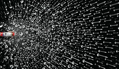
Via Ads of the World.
Gary Vaynerchuk spoke live at an event organized by the Tel Aviv office of advertising agency McCann Erickson last night, and it was the first time that I got to see him on stage in person.
Gary became an Internet celebrity after he started using wine reviews in video format to transform his family liquor business from a mom and pop store to a major force in the US market. Since then, he he broadened his activities. He is a well-known author of books, runs a marketing consulting firm, and is a sought after speaker.
The one thing that got him were he is, is for sure his passion and energy that shines through in his presentation style. One of his opening statements was that every single brand that has been successful over the past 150 years has been one that managed to tell its story well.
Gary delivers a great performance in a unique style while breaking many of the rules of presentation delivery. And maybe that is what makes it interesting. He can pace back and forth, looking at the floor while speaking. His story line is an improvised sequence of stories. But these stories are memorable and delivered well.
Gary is good at building up tension in a talk. He is hinting at a crucial question he will ask you, or that he is about to reveal a major insight (what do I think that the Old Spice guy campaign was a failure), but he waits and waits with giving the answer.
Hand drawn graphics can work great together with images in slides. As an example, see these ads below. (I am not sure whether these ads do a good job in selling markers, they are great though in warning you to take care of your health).
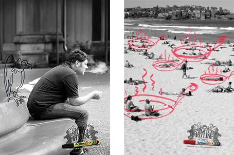
It is possible to draw shapes using a mouse or a drawing pad in PowerPoint, but I always find it hard to replicate that marker effect. Instead, I scan in real hand writing using a scanner, and then kill the white background with the Photoshop color range filter.
Most slides with images work best when you scale up the photograph until it bleeds of the page.

Making the image a bit smaller leaves a distracting white border around your slides that does not look good when projected on a big screen.
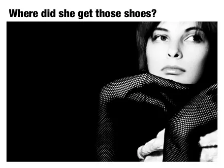
However, recently I started using a layout that is very often used in print advertising. An image which is more horizontally cut and more white space above and below the image. It is maybe not the best for large on-screen key note presentations, but it looks great for corporate decks that are discussed in a smaller setting.
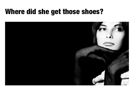
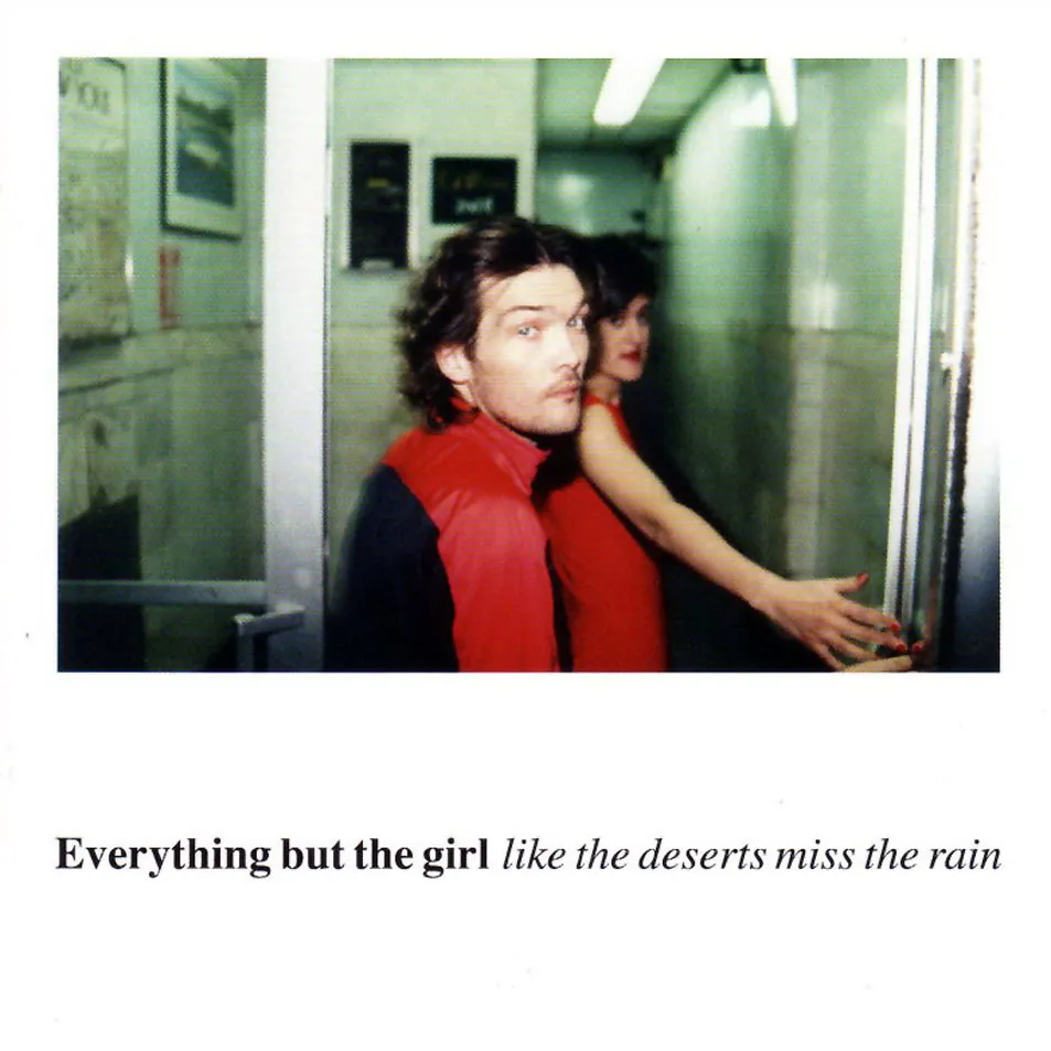
This layout is often used in CD covers, see Similar to this album cover of a 1990s hit by Everything but the girl:
Finally I spotted a newspaper ad of the store that I often drive by in the morning. A mix up of typography that hurts the eye. Here in Israel, many people might not notice since they are used to seeing a different character set all together.
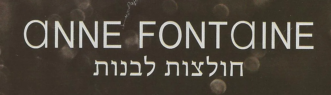
Update: this company actually operates stores all around the world, with the same logo…
Nature and artists are still better at producing certain colors than computers. Look at the famous painting Poppies at Argenteuil by Monet. If you were the pick the blue green color and copy the RGB values into your PowerPoint presentation, the result would be dull. The rhythm of the brush strokes adds something.
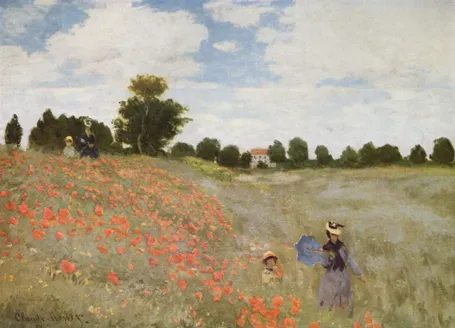
In spring, there are many flower fields like these in Israel. The green blue color is created by the contrast between the top and the bottom of the leaves: grey green and yellow green. The wind moving the leaves creates the color effect. In an earlier post I discussed a painting by Jan van Eyck with a similar effect of alternating and interacting colors.
This painting is also a great example of how to create movement in a static image. The horizon and the diagonal line between the two ladies set the composition. Look how the red flowers are blurry dots of paint without much detail, and how they get incredibly big close to the front. Flowers in the wind never sit still, but rather we watch them go round, leaving a much bigger impression than the space they actually occupy.
This painting has multiple levels of experience, an almost impossible feature to recreate in a PowerPoint slide, but a reminder about what visuals ultimately are: pieces of emotional input. First you see a landscape, then you see things moving in the wind, hear the wind whistling, feel that spring sensation when you venture out of your cold house into the sun and sense your skin warming up from the outside. The bright red, blue green contrast, plus the movements of the children running down the hill might just remind you that life is all about those simple pleasures and moments of beauty.
In pie diagrams, the small pieces always come in last, and end up close to the top of the pie chart. Adding readable labels becomes difficult as the horizontal space for them is small.
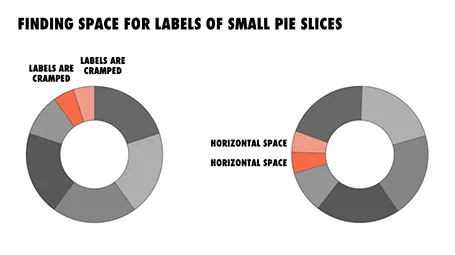
I find it better to rotate the pie chart in such a way that the smaller pieces get in a horizontal position, so you have space to write out the labels of them. The illustration shows an example.
The Visual Dictionary of Typography (affiliate link) is a nice little book that explains 250 concepts in typography, each using a visual example. Dictionary is the wrong title, this is not a reference book, but rather something to browse through and explore. I stumbled on many terms that I have never heard of before. On the other hand, the book also contains some entries that are a bit forced: music for example.
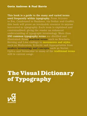
Here are the entries for the letter V to give you an example of the contents:
All in all a nice little book, I would get it in print rather than as an eBook.
I reviewed Art Authority, this great art catalogue for iPad earlier, and I just bought the same application for the Mac.

The bad news, the user interface is a lot worse than the iPad. You browse art in finder windows, sometimes via HTML pages.
The good news, working with the images is a lot easier. Since a good keyword search mechanism is still missing, a very large monitor makes it easier to browse icons of paintings. You can have multiple thumbnail windows open, and leave them open for a long time.
Ten dollars well spent. Twenty dollars well spent if you buy the iPad app as well.