

Blog post

Font mix up that hurts the eye

June 13, 2011 · by Jan Schultink
← all posts

Finally I spotted a newspaper ad of the store that I often drive by in the morning. A mix up of typography that hurts the eye. Here in Israel, many people might not notice since they are used to seeing a different character set all together.
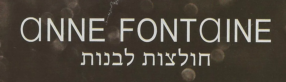
Update: this company actually operates stores all around the world, with the same logo…

PowerPointPresentation designTypography

About this blog

Notes on all things presentations — design, storytelling, and AI workflows.

Subscribe now to never miss a post.

RSS

About SlideMagic

A platform for business presentations.

A free student plan is available.

2 comments

Jan Schultink2011-06-15 03:53:42
Thank you, i fixed the typo.
Just Another Abused Air Traveler2011-06-14 17:20:11
Not sure that you get to criticize font choices when you say "this company actually operators stores ..."! How exactly do you operator a store?

:)