SlideMagic Blog

Frequent updates about all things presentations since 2008. Subscribe to never miss a post.

RSS
all posts

Search results for “web design”

·Keynote

Scientific slide analysis

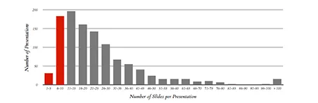
Here is a piece of research that extracts the font sizes, fonts used, lines per slides, slides per presentation of a 1,000 random presentations downloaded from the Internet. Lots or Times New Roman, lots of text, tiny fonts, endlessly long presentations. We knew it intuitively, but now there is the hard data to back it up. Research by Tim Theman.

·Art

Presenter backgrounds

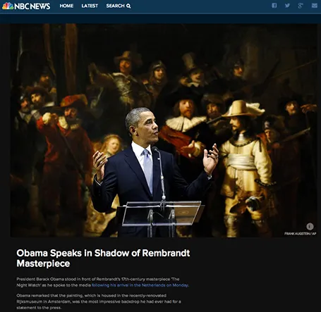
The Obama press conference yesterday in front of Rembrandt’s The Night Watch is an example of how a nice presenter background can make a big visual impact. The dark painting background looks great in close up photos, although less interesting from a distance.

Conference organisers should think beyond the curtain, blank wall, or list of sponsor logos.

·Images

Historical images - CC

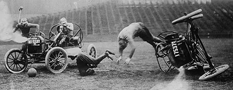
Another source of images that are in the public domain: the publicdomainreview.org You could pick one set of images and use them throughout a presentation to get a consistent look and feel of all your slides. Below a preview of a car polo game in the early 1900s.

Thank you Joann Sondy

·Images

Unsplash: CC image library

Unsplash is a frequently updated blog of creative commons images. Mostly background and nature shots. Via Orli. Image by Dyaa Eldin Moustafa.

·Investor presentation

Should we do a video?

I get this question often from startups who are in the process of fund raising. If you are on a tight budget, you might be able to hold off the big expense of producing a video.

  1. There are videos and videos. Many of the animated videos you see today on the web (“So, you want to [FILL IN UNMET NEED]”) are presentations in disguise: an animated sequence of static slides. For some products, showing moving footage of the product is really useful. Examples are gadgets and other hardware that you often see on sites such as Kickstarter. If your product does not depend on a live demonstration, a sequence of presentation slides can be as effective.
  2. Unlike consumers, investors are usually perfectly happy to click through a sequence of slides instead of playing a video
  3. Videos are permanent and very hard to edit. Startup stories always evolve and change.

So, the best approach might be to start with an animated series of static slides. You perfect the flow over time and if you really feel you nailed the story flow (and you have the budget), you can make the expensive of creating a pitch video.

·PowerPoint

PPT for Mac colour bug workaround

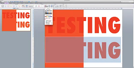
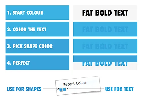
Microsoft PowerPoint 2011 for Mac renders colours of shapes and text differently, it has given me many headaches and inspired many blog posts over the years. So - finally - here is the simplest fix: create a thin outline in the same colour as the text around your characters, done!

The screen shot below shows how normally text get rendered differently even if you apply the same colour code to it (#!@$#@). Below that, the same text, with the same colour, but now with a tiny outline (same colour) around it. In the small preview window at the right you can see that the text and the shape have the same colour.You can see how I selected the text, and picked the line option from the format ribbon to do it.

Microsoft, please acknowledge this as a bug and not a feature (which you suggested in the past) and fix it in the next Office 2011 patch.

·Creativity

Scribling

I keep on looking for a good electronic solution for note taking, doodling, and scribbling. None of them are perfect. A new option has been added recently.

A good note taking solution needs to combine a number of things:

  1. No paper to keep
  2. Natural writing interface
  3. Good filing and search
  4. Minimal hardware to carry
  5. A simple user interface

See my highly sophisticated analysis below.
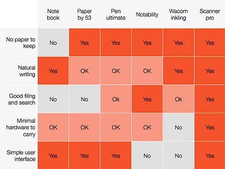
The new option is a smartphone-based scanner. Scanner Pro is a brilliant app. It takes photos, and lets you easily crop the image. You can keep the image as a photograph or flatten it to bold, fax black and white. Then upload the scan to Dropbox or Google Drive where you can store and search things.

So the best note taking might be scribbling on a piece of paper, scanning it, and throwing away the paper.

PS: earlier review of the Inkling, Penultimate,Paper and styli (?) for iPad.

·Colors

Fix the PPT for Mac colour bug

The colour rendering bug in Microsoft PowerPoint 2011 for Mac is highly annoying. Here is fiddly a trick to get around it. You basically need to goal-seek the text colour into something you like.

  1. Pick a colour you like, draw a shape and fill it with the colour
  2. Write some text in a big bold font and set it to the same colour: PowerPoint will render it incorrectly
  3. Here is the fiddly part: repeat steps 1-3 until you are happy with the TEXT COLOUR.
  4. Now, use the Apple colour picker to strip the colour of the text

Save your colour template with 1 accent colour for text, and one accent colour for shapes. In your drop down menu they will look different, on screen they will look the same.

Note 1: I tested the PowerPoint RGB colours as well in Photoshop and Illustrator, and it turns out that PowerPoint renders the shape colours incorrectly, the text is correct.

Note 2: There is a more analytical way to get your desired colour than simply trial and error. You can analyse the RGB codes of the background colour and the text colour. So, set the shape colour to something that you would like. Write down the RGB codes. Colour the text with that colour, and pick its colour with the colour picker. Write down the text RGB codes. Analyse the difference between the two colours and create a third colour by adding/subtracting the R, G, and B differences between the colours. This will be your text colour that renders the same as the desired shape colour. It all sounds more complicated than it is.

Continue reading →
·Colors

PPT 2011 for Mac color bug

Microsoft PowerPoint 2011 for Mac has an annoying bug: when you apply a colour to a font, it comes out slightly differently than when you apply the exact same colour to a shape. One: it looks bad on slides, two: it gives surprises when you open a PowerPoint file created on a Mac on a Windows machine (which does not have the same issue).

When I posted about this somewhere on a Microsoft forum I got the response that this was done on purpose; to make text readable against a coloured background. This does not make sense, if I want to make the text readable, I will put in a different colour myself, and definitely not the one that Microsoft is using. See below, the letter colour is a completely different type of blue than the background.

(Geek alert). There is a complicated way to get around it. Type some text, change it to the desired colour. Now select the desired text (not the entire sentence) and bold it: the right colour appears… But, as soon as you do anything else to your text box, the wrong colour gets put in. Annoying…

·Delivery

Minority report screen

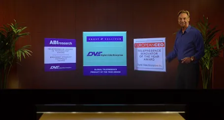
See this presentation screen by DVE Telepresence (auto-play alert), it allows you to move PowerPoint slide objects in the style of the film Minority Report. What do you think? I am afraid that more sophisticated screen technology will not turn humans into better story tellers.

What would be useful though is to have a technology that allows you to write on a transparent whiteboard in front of an audience where technology takes care of mirroring your writing, so it becomes readable by both you and the audience.

Secondly, having a camera hidden inside a screen is great for creating natural eye contact.