SlideMagic Blog

Frequent updates about all things presentations since 2008. Subscribe to never miss a post.

RSS
all posts

Search results for “mckinsey”

·Design

Going analogue with mechanical pencils

Most of my charts start with a pencil sketch. I burn literally through piles of paper when designing a presentation (a good use of those 1-sided print outs you do not need anymore). So what are my favorite pencils?

When I started at McKinsey, the Pentel P205 was my initial favorite. Per pencil, it is actually very cheap. That was exactly the problem, people considered it cheap enough to borrow it all the time. I kept on buying new ones.

I experimented with various much more expensive pencils only to discover that these are actually pieces of jewelry rather than sketching instruments. Beautiful to look at, but not very useful. Check out the site of Joon Pens in New York to see some examples.
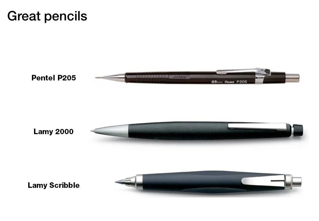
Recently I discovered Lamy pencils as the perfect in-between. Two pencils are my favorite. First there is the classic Lamy 2000. Designed at the end of the sixties, and still in production pretty much unchanged. A beautiful minimalist look, very light and a nice, almost wood-like feel. People say that over time the mat finish will wear off at those spots where you hold the pencil though.

I use a 0.7mm pencil for regular writing. But when it comes to sketching a wider pencil is much better. The Lamy Scribble comes in a version with a 3.15mm fill. It has a very nice grip and is beautiful to let your creativity go.

(All links to Amazon are affiliate links).
·Design

My top 10: most popular posts of the year

·Design

Fixating jumping objects

In the 1990s, when we were still relying on print documents at McKinsey, I would hold the deck against a strong light source to look through it to see whether repeating elements such as titles and page numbers were lined up properly. (Something like this cartoon machine)

“Jumping titles” are the result of slightly misplaced items on a slide sequence: when you hit page down and scroll through a series of slides quickly you see the titles moving up, down, right, and left. How to prevent it?

  1. Use drawing guides (excellent post on PowerPoint Ninja)
  2. Control-C object on one page, control-V on the next page. The element will appear in exactly the same location. Good for sequences of diagrams with buildups.
  3. Set the exact location of an object in PowerPoint (format ribbon, size, position)
·Data visualization

Putting data labels where they work best

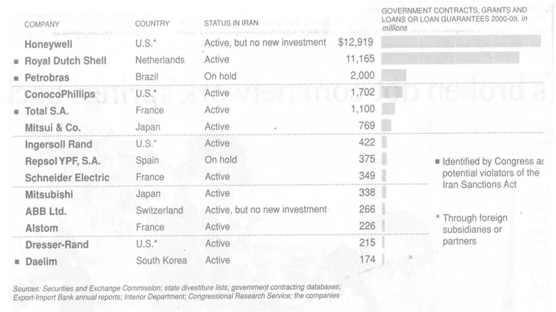
In consulting firms such as McKinsey, there are very strict rules about formating slides. Data labels for example are always placed outside the horizontal bar. The chart below (ripped out of its context from this NYT article) uses a different approach:

The data labels are placed next to the horizontal bars where you would expect the axis labels to be. I am fine with this approach. The relative size of the bars gives a global view of the order of magnitude of the values, and for whomever is interested the data labels provide the exact values.

·Design

How I wrote a recent presentation

I kept track of the phases of a recent presentation design project:

  1. Quickly racing down an existing PPT, checking out the client’s web site (“what is it that they do exactly”?)
  2. Break
  3. Listening to the full pitch via screen sharing software: PPT on screen, client on the phone. Asking naive questions all the time, jumping back and forth between slides and web sites, interrupting the presentation all the time (some people might get offended)
  4. Jotting down all impressions immediately after that, to make sure that I do not lose the richness of the discussion (especially comments and ideas that do not appear on a slide)
  5. BIG BREAK including a night of sleep
  6. Putting together the template, setting fonts, colors, spending time on finding a perfect and beautiful image/graphic for the front page (yes, open up the slideware!). Thinking about a style of images, the style of presentation. Most people might embark on some analogue story boarding exercise here, but I find it useful do dive into the detail of color codes to get my mind focussed.
  7. Break
  8. Start designing a few absolute killer charts that are instrumental in getting the story across without worrying where they exactly fit in the story. In VC pitch presentations, these are usually charts describing the pain that the world-without-this-great-invention is suffering. These will be the most important charts in the presentation.
  9. BIG BREAK
  10. Going analogue to design the overall story of the presentation on a piece of paper
  11. Filling in the blanks with slides, starting on page 1 and working my way through to the end. Finishing each slide to final quality (i.e., I do not create quick PowerPoint dummies)
  12. BIG BREAK
  13. Look at the draft again, make some small changes and send it off to the client
  14. Here is where the regular iteration process with the client starts. Feedback, correction, feedback, correction.
Continue reading →
·Design

Israel, startup-nation, and how it turned me into a presentation designer

A slightly off-topic post today.

Malcolm Gladwell talks about how people are the product of the hours they put into something, plus the privileges of experiences they have been given. I am Dutch, not Jewish, do not really speak Hebrew, but ended up living in Israel somehow.

The Israeli startup environment was the main driver behind me becoming a presentation designer. Countless entrepreneurs pitching me their dreams and asking me to “put it in PowerPoint” gave me a rare opportunity to expand my presentation design skills from structured McKinsey-style Board documents to presentations that need to touch someone’s heart (often the heart/wallet of an investor).

A short video about a new book “Start-up Nation: The Story of Israel’s Economic Miracle” in case you are not familiar with Israel as a hightech center.

Disclosure: I earn a small commission if you purchase items through Amazon links on this site.

·Design

Leonard Cohen building up audience participation

Songwriter / poet Leonard Cohen gave a concert in Tel Aviv a few days ago. In “Tower of Song” he kept the audience craving for The Answer (to all mysteries of life) for almost 2 minutes. The audience got really excited, the backing vocals had to work hard… Listen to the entire song, or skip through to 6:00. No, no spoiler here. The video below is not the Tel Aviv concert, but a different performance in the same tour.

The presentation lesson. Many communication philosophies such as Barbera Minto’s Pyramid Principle (used by McKinsey) advocate to present your conclusion first, then provide backup and logic. Very efficient, at every single point in time, the audience knows the key message of the presentation. Sometimes humor, suspense, drama and good story telling might actually do a better job in getting a message across though. Highly structured presentations are not always the most memorable ones.

·Design

Excel instead of PowerPoint as your presentation tool

Microsoft Office is a tightly integrated application suite. Inside Excel you can find pretty much the entire arsenal of PowerPoint drawing and charting tools.

For certain types of presentations, you should consider using Excel as the presentation tool instead of PowerPoint. Quarterly results presentations are an obvious candidate:

  • Massive amounts of dense data, and a need to switch back and forth between graphs showing trends, and the actual data tables itself
  • Time pressure; the numbers come in fresh from the accounting systems and need to go straight into the Board document, without sufficient time to analyze what actually is going on.
  • Presentations that need to be updated all the time but basically look the same: quarterly results (again), market share movements. Every time the data arrives in the exactly the same format, with a column added. Lots of time is lost with copying and pasting data across. The result is usually ugly Excel tables featuring in a PowerPoint slide.
  • Complex analysis that needs to be redone, i.e., a water fall chart explaining the difference between this quarter and last quarter’s results. Very few know how to do this. Even fewer know how to visualize this in a PowerPoint graph. A smart Excel template can help.

Here is what an Excel presentation could look like. Charts are laid out on the left side, data is put in on the right side. It takes some time setting things up and making all the links work, but once you do, you got yourself a very powerful tool (click image for a larger picture).

Continue reading →
·Design

Best of my little-known yet useful PowerPoint how tos

I have posted a number of PowerPoint how to posts over the past half year, but they disappear quickly to page 2. Here are some of them brought back to the front page:

Continue reading →
·Gadgets

Double productivity - upgrade to a 24" (or more) monitor

The best hardware purchase decision I have made over the past year. Large computer monitors are not a toy or an executive perk anymore but a real boost of productivity.

  • Easier to design PowerPoint slides with big images
  • Space to open multiple applications and copy things across (Excel data into a PowerPoint bar chart)
  • No need to print - easy to read facing pages of A4 (Word, PDF)
  • No need to print - dozens of Excel columns open at the same time
  • Building and debugging Excel models in 50% of the time
  • Less strain on the eyes
  • Faster Internet searches
  • Faster search through hundreds of stock images
  • Easier to design slides for the 16:9 screen

I got an Eizo 24", but Amazon stocks many more (referral program links).

I cannot believe that I actually built most of my Excel models at McKinsey on a 13" laptop screen.