

Inspired by a post on slide:ology today linking to a set of newly released PowerPoint templates with examples of what graphical effects PowerPoint can produce, I decided to start posting some of my own favorites.
Many logos of Web 2.0 companies are examples of how not to use these graphics capabilities: add a “bevel”, “reflection” and “drop shadow” and the result must look good. In graphics design, most of the time, less means more.
But sometimes these effects can help. In my case a client needing to explain software functionality. We decided to go for the metal “HiFi component” look with buttons that can easily activate functions. (Click image for a larger picture)
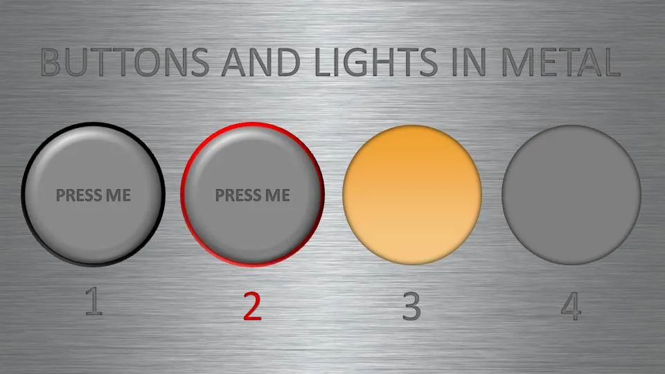
- Metal skin: an image purchased from iStockPhoto
- Metal text: a big font in a similar, but slightly darker color than the background with an interior shadow applied to it
- Button 1 and 2: a circle with a heavy outline (red or black), a simple “bevel” applied to it, but in the tab “3D options” of the bevel functionality I increased the depth to 20.
- Light 3 and 4: a circle without an outline, with an central interior shadow and a color gradient running from a full color to a slightly faded color.
Let me know in the comments if you are interested in the detailed instructions.
9 comments
Thanks for the inputs. I come from a consulting background myself, so I use The Pyramid Principle.
Just curious if there are any other reads that helped you through the proposal writing process (the outward design of the proposal in terms if colors, pictures etc,), the structure, the length.
Let me know if you have come across any good reference material for proposal.
Thanks in advance.
-Shubha
The same story is true for proposals: no standard template. Having said that, a typical consulting (and McKinsey is included) proposal will address the following topics:
- Background of the problem/request
- The key problems that need to be solved
- The approach that you suggest to take
- Credential why you are the right person to do the project
- Practical arrangements (time, cost, who is part of the team, etc.)
Sorry not to be more helpful.
I usually make my exhibits in PowerPoint, save them as a PNG image and insert these as an object back into Word.
I am from a consulting background myself - just trying to see if I can make the proposals stand out in any way.
If you can point to any books that you have used as reference, please do let me know.
-Regards,
Shubha
Thanks,
Shubha
I am looking for a template for a proposal or a report that Mckinsey produces.. Can you point me to some?
Thanks!
-Ria
-Shubha