SlideMagic Blog

Frequent updates about all things presentations since 2008. Subscribe to never miss a post.

RSS
all posts

Search results for “mckinsey”

·Data visualization

The lone column

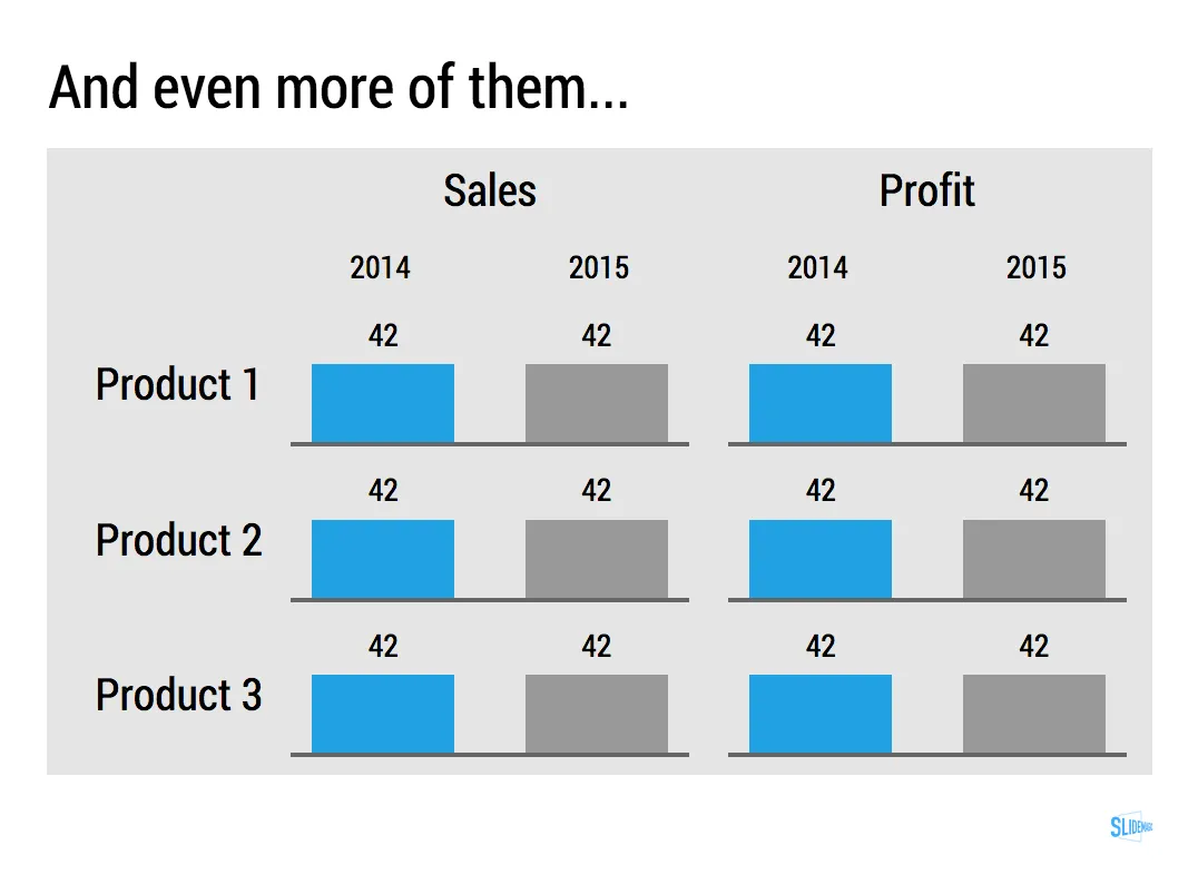
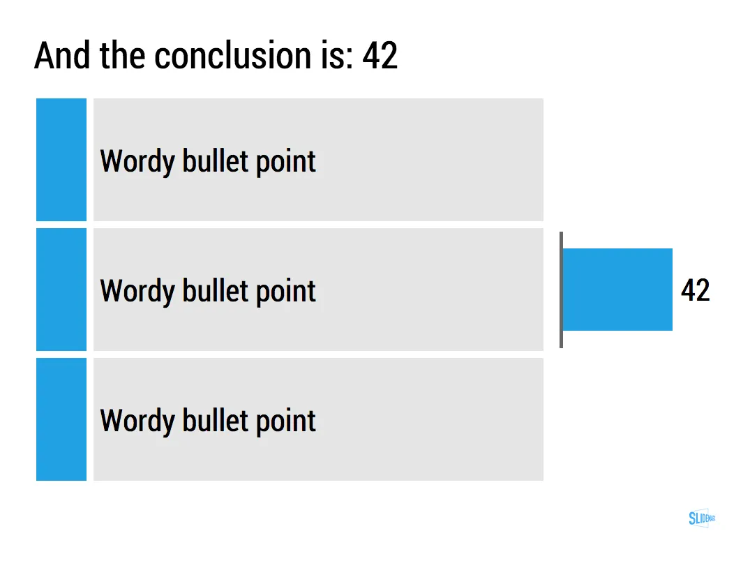
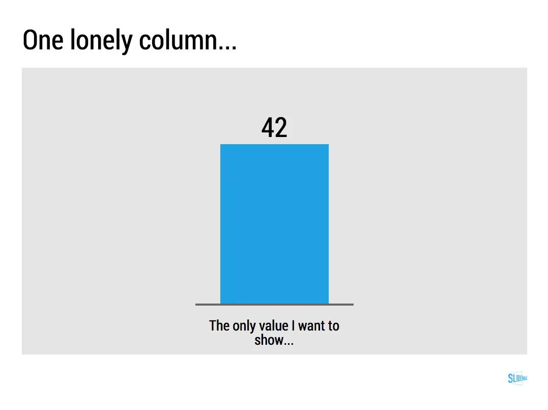
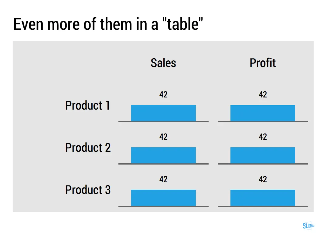
Most of the time, numbers in graphs look better than numbers in a table. There are exceptions though: when there is just one number, and when there is very little variation among the numbers. During my time at McKinsey, I have seen many examples of “lone columns”, column charts with just one number in them, or tables full of tiny column charts with hardly any variations among them.

These charts are not only difficult to read, but they are also very hard to create in PowerPoint or Keynote SlideMagic’s grid structure does it in a snap though, but hopefully users won’t abuse the app for these type of consulting charts. Sign up for SlideMagic here.
Art: Painting of Trafalgar Square (c. 1865) by Henry Pether. Sign up for SlideMagic, subscribe to this blog, follow on Twitter

·SlideMagic

Why SlideMagic is different

I created a quick presentation (hey, in SlideMagic) that highlights some of the features I have put inside that you will not get in other presentation design apps. Some of them you will never find there (even if people try to copy them) because of the fundamentally different way SlideMagic works. Less designer freedom and more uniformity allows you to do great things!

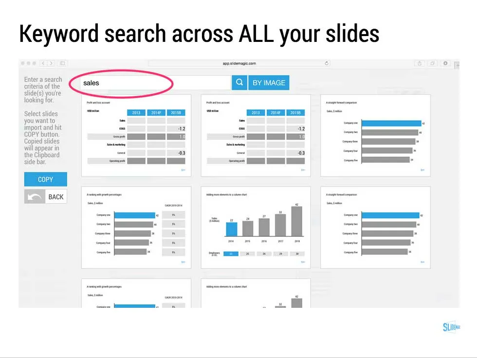
  • Keyword search across all your slides, no more opening and closing files
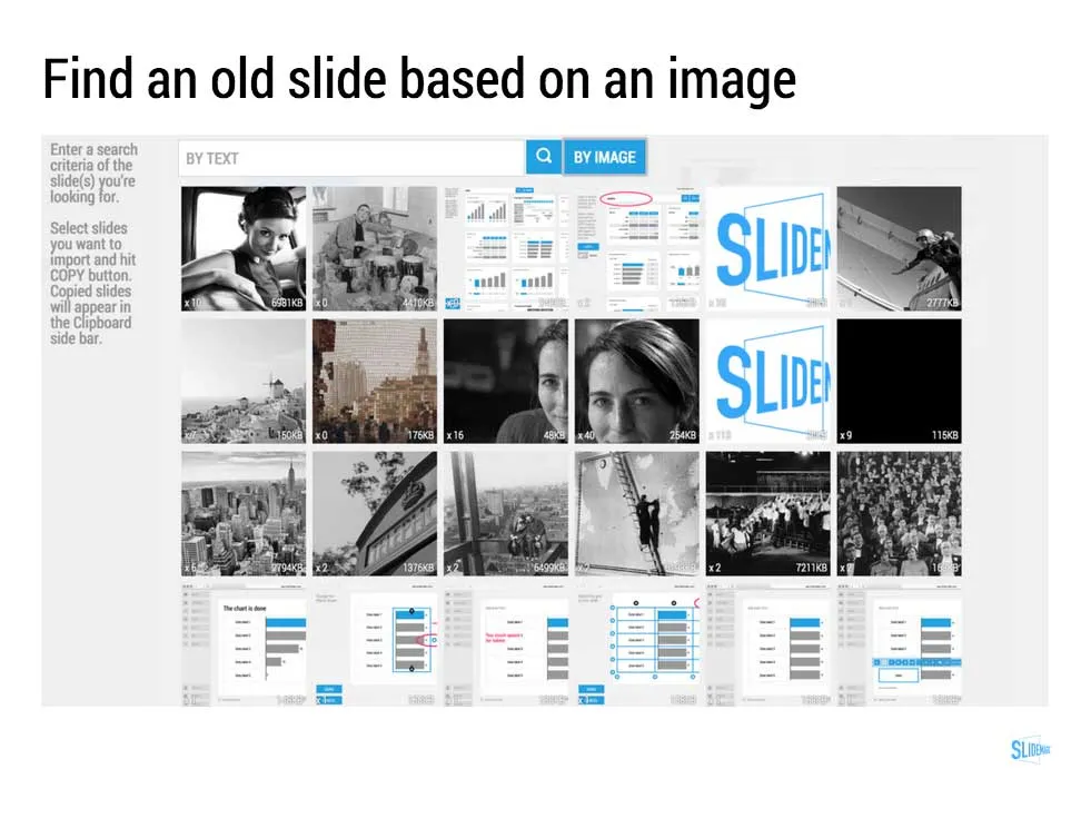
  • Image-based search: “get me all the slides that contain this image”
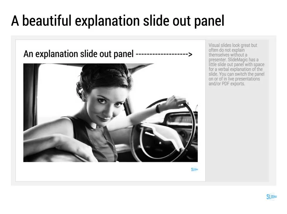
  • Explanation slide-out drawer to turn an abstract visual presentation that needs verbal explanation into a document that you can email.
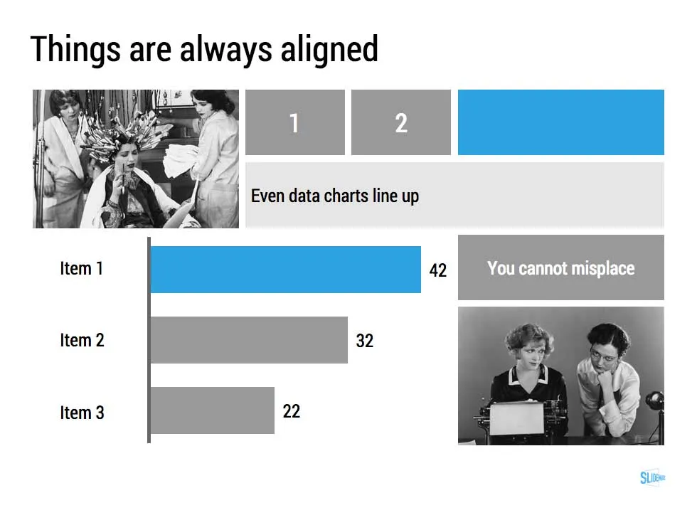
  • A strictly enforced grid that makes sure everything is always lined up and distributed properly. And the most tricky part: that includes the columns and bars of data charts as well.
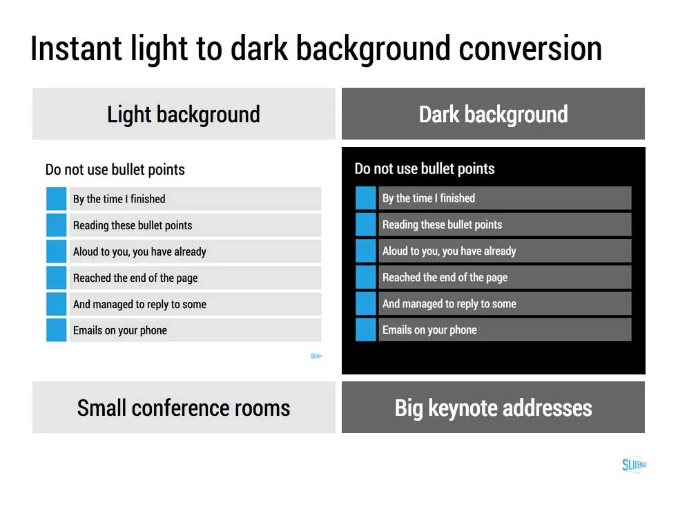
  • Instant conversion from a light to a dark background and back (switch between a conference room and a keynote hall setting)
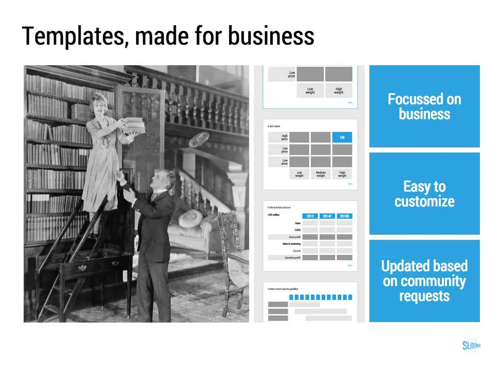
  • And, a template bank that is constantly updated by a McKinsey/Idea Transplant designer!

Give SlideMagic a try yourself, you can request an invite here.

Art: Albert Gleizes, 1912, Les Baigneuses, oil on canvas, 105 x 171 cm, Musée d’Art Moderne de la Ville de Paris. Published in Du “Cubisme” Subscribe to this blog, follow me on Twitter

Going back in time, some popular posts

I have spent a lot of time over the past day redirecting URLs, mapping deep links, moving Disqus comments, rerouting RSS feeds. I noticed that some very old posts (going back to 2008) still get a lot of traffic, and most of them are about PowerPoint tricks, rather than philosophical posts about the future of pitching ideas in business.

Here are some popular links:

P.S. In case you wonder about the 4:05 background image, it was taken from the 24-hour movie “The Clock” by Christian Marclay.

Click here to subscribe to the blog

The truly new idea

When I was a still a junior consultant at McKinsey, one of the senior partners on a team I was working on said that most consulting projects really generate only one truly original new idea/insight. The rest of the hard work is not really that original (**1% inspiration, 99% perspiration**as Thomas Edison put it)). Still, that one insight usually drives the entire recommendation.

At McKinsey, these truly new ideas were often the result of a novel way of combining facts/data sources for the first time and/or being able to quantify/compare things that nobody thought could be quantified.

Looking back at presentations and pitches I have worked on, the on truly new idea concept probably holds. Use it in your presentation design. Facts, and logic flows that everyone is already used to/knows are not interesting. It might be better to go quickly to that unexplored territory that you discovered.

·PowerPoint

CV language

While at McKinsey I spent a lot of time interviewing candidates. The main challenge in a first interview was to cut through the woolly CV language and build a picture of the real person in front of me. Strategic problem solvers, team workers, risk seekers, people persons, big picture people, all these expressions do not mean much since they have been used too many times on CVs.

When designing a slide about your team, it is better to replace the CV language with the actual evidence and cut it down to something that is truly unique about yourself.

·Keynote

Making the story bigger

In projects, I typically help out with 2 things:

  1. Making things look pretty
  2. Lifting the story, making it bigger

I rarely do major surgery in fixing the flow of a story (this is where all time was spent when writing McKinsey documents). In a short 20 minute pitch the sequence of the messages is usually more or less right. What I see often though is that people do not pitch their story big enough, they take out the big picture of how their solution can really change things in a fundamental way. For you, the expert, it is obvious, for the outsider it is not.

·Keynote

Nitty gritty

One of my clients has a technology that can save cost for a retail business. They did a pilot implementation at one retailer and have a lot of cost saving data as a result.

You can present this data to other potential clients (sanitised of course) in 2 ways. Approach one is the absolute number: we helped save $x,000 in costs. But this is hard to relate to for other retailers with different types of businesses. Better is to do it relatively: “we shaved 10% of the cost of item x.”, but it is still a bit generic, any startup with a cost saving technology has a sales pitch deck with these types of numbers. A credibility issue here.

Even better is to go into the nitty detail and highlight simple case examples of things that go wrong every day in a retail store, and how the solution helps to prevent it. It shows that you know what you are talking about, and lends instant credibility to your story.

At McKinsey we used to say: retail is detail.

·Keynote

10 years of independence

As of this month, I  have worked longer as my own boss than as an employee of my (only) employer McKinsey, and it feels great. All around me, I see more and more people taking the plunge and starting a freelance business, including in the world of presentation design. Some thoughts at the 10 year point.

  1. The decision to go freelance is not a permanent or an irreversible one. If you pick the wrong employer, you have something to explain on your CV (why did you leave after 3 months), if you are dipping your toes into the world of freelance, you start with just one project, and if things go well, you do another one.
  2. There is no need to define 100% what you do, in which category you fit in. Job descriptions are very tight and precise, a freelance role is not. You do the project you like, and the projects people want to pay you for. The challenge is to find the overlap between the 2. I started as an independent strategy consultant, and ended up designing presentations. Early on, I was obsessed with what to call myself (for example, what do you put in your LinkedIn profile). Not anymore. Self-selection (picking of clients, projects) will lead you to your preferred work, and it is highly likely that there is no role description for it.
  3. As a freelancer, you will not get instant status that comes with a regular job, company car, and big office. “I design PowerPoint slides” is not instantly greeted at a dinner party with respect. It takes 5 minutes of explanation for people to get the full picture, and then they usually approve. But most importantly, I have stopped caring about that.
  4. Niche design businesses do not scale very well. Super-bespoke presentations are tricky to design and adding a bunch of designers to a team will not recreate the magic with a factor 10. Most bigger presentation design operations fill capacity by slide make-over work that can be scaled up relatively easily.
  5. Niche is the way to differentiatie yourself. Presentation design is broad. Business presentations are still broad. Within that, I have carved out an even smaller niche of the type of projects that work for me and for which there are very few people in the world that can do it. Super specialisation is a great strategy to build a global personal brand.
  6. Once you have worked for a couple of months, a year, you will notice that the combination of new and existing clients will give you a business flow that is actually reasonably recession proof, and a lot more stable than your friends who are subject to continued corporate downsizings and restructuring.
  7. Get a good sense of your pricing potential both from what the value of your services is (usually a lot higher than you think) and what the true costs of running a freelance business is (including office space, hardware, software, holidays, health insurance, pension, lunch breaks, etc.)
  8. You will spend a lot of time working on your own. Personally, I love that quiet and productive time, but there are many people for whom this would be social torture. You know yourself best.
Continue reading →
·Software

Phasing out Excel

In email, I went from Lotus Notes, to Microsoft Outlook, to gmail. And now it is the turn of the spreadsheet: from Lotus 1-2-3, to Microsoft Excel, to Google Spreadsheets.

Excel has too many features. Even at my time at McKinsey where I built very complex spreadsheet models (mostly company valuations), I only used the very basic functions (numerical operators) to ensure that I completely understand what is going on in the model. Bugs could mean billions of dollars for my clients.

The features come at a price, on my Mac Excel 2011 has annoying delays when entering even the most basic of calculations.

The design of the Google apps have come a long way. Especially for spreadsheets, collaboration with multiple people is important. And finally, the Google spreadsheet is perfectly accessible on a mobile device.

Goodbye Excel.

·Keynote

Popular posts in 2012

Here are some posts that people have been reading a lot on my blog in 2012:

For me it is interesting to see that almost none of these posts were written in 2012, and that pretty much all of them are about technical PowerPoint software skills (there is a correlation here, as my posts have evolved a bit over the years). Presumably this is the result of people Googling when they are stuck in PowerPoint.

Anyway, hopefully these posts are useful if you missed them the first time around.