SlideMagic Blog

Frequent updates about all things presentations since 2008. Subscribe to never miss a post.

RSS
all posts

Category Templates

·Design

Meet Mr. Chicken and think about your PowerPoint template

Amazing, there is one person who designed the “logos” and store fronts of almost 90% of all independent fried chicken outlets in the U.K. “Mr. Chicken” is interviewed here, there is even a book available on the phenomenon.
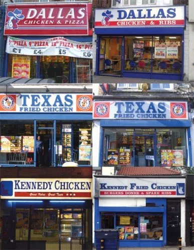
Amusing reading. However, it is not completely justified to pooh pooh these logo designs. Because they all look the same, they are actually pretty effective. If you find yourself in a U.K. high street looking for some fried chicken, you find one of these outlets in 2 seconds.

But, you do not want to be “Mr. Chicken” when it comes to your PowerPoint presentation. Get rid of the generic logo. Free up the screen real estate that is consumed by heavy banners with empty slogans. Instead, let people see the “what you have in store” with great content in your slides, all in a nice and consistent color scheme.


Via Noisy Decent Graphics.

·Colors

PowerPoint template colors and color blindness

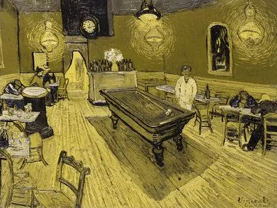
My Vincent van Gogh color set from a few days ago is not very good for people suffering from red-green color blindness.

Use Vischeck to test your own templates. To do so, you need to “save as” a PowerPoint page as “PNG”.

A side-benefit of this test is that you get sense of what happens if someone prints your presentation on a black & white printer. (But hey, the B&W white test is the easiest of all: print preview)

Somewhat related: an earlier post about designing presentations with people suffering from dyslexia in mind.

Via Richard Garber. A more elaborate post on Vischeck and PowerPoint in this post on the Indezine blog.

·Colors

Color mismatches in corporate PowerPoint templates ("Skype" example)

Skype has a beautiful and very strong visual identity. Things start OK on the first page of this presentation by its COO at CES 2009. Then the color coordination gets weaker. Off blue. Pink’s too bright. No greens (Skype’s green “call” button is very strong visual icon returning in the monochrone rainbow).

PowerPoint templates go beyond page 1.

I am sure Skype’s template is OK, the default colors are probably not set in such a way that they are easy to use for people without a degree (or passion) in graphics design. Like in almost all corporate PowerPoint templates, too much screen real estate is devoted to the brand/logo. With its strong blue colors Skype could actually afford not having a logo at all on its presentation pages. People will recognize the company regardless.

Skype COO Scott Durchslag at CES 2009

·Design

Create your own buttons and lights on a metal skin in PowerPoint

Inspired by a post on slide:ology today linking to a set of newly released PowerPoint templates with examples of what graphical effects PowerPoint can produce, I decided to start posting some of my own favorites.

Many logos of Web 2.0 companies are examples of how not to use these graphics capabilities: add a “bevel”, “reflection” and “drop shadow” and the result must look good. In graphics design, most of the time, less means more.

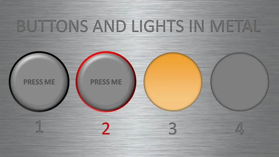
But sometimes these effects can help. In my case a client needing to explain software functionality. We decided to go for the metal “HiFi component” look with buttons that can easily activate functions. (Click image for a larger picture)

  • Metal skin: an image purchased from iStockPhoto
  • Metal text: a big font in a similar, but slightly darker color than the background with an interior shadow applied to it
  • Button 1 and 2: a circle with a heavy outline (red or black), a simple “bevel” applied to it, but in the tab “3D options” of the bevel functionality I increased the depth to 20.
  • Light 3 and 4: a circle without an outline, with an central interior shadow and a color gradient running from a full color to a slightly faded color.

Let me know in the comments if you are interested in the detailed instructions.

·Design

Create a Twitter background using PowerPoint

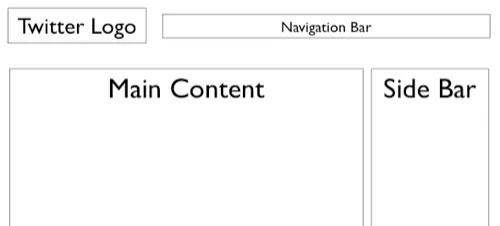
There is a lot of (white) space for self expression on Twitter in its background image. (Not implying that “cluttering it up” will make it look better though) The “The Closet Entrepreneur” posted a tutorial how to create a Twitter background in PowerPoint. It includes a template with the areas you should leave blank for Twitter’s own content.

P.S.: follow me on Twitter. Via Digital Inspiration

·Images

Chart concept - stage curtains waiting to be opened

Although a bit cliche, I like using an image of a red stage curtain about to be opened. They give a sense of anticipation, look beautiful (nice warm colors, lots of detail), but at the same time focus all the attention on you, the speaker, since there is not that much to look at at the projector.

I got the image below from iStockPhoto (referral program link), many other stock photography sites have many, many of them.

·Templates

Chart concept - counting hands

I love these images of hands counting. They are a powerful way for quickly getting across 4 or 5 things: “here are our 4 distinctive features, let’s go into a bit more detail in each one of them”.

Sites like iStockphoto list many, many of these (the image above was ripped from this site).

·Investor presentation

UPDATED - VC pitch advice/templates available on the web

I updated an earlier post with VC pitch templates available on the web:

·Templates

Chart concept - hand-written notes

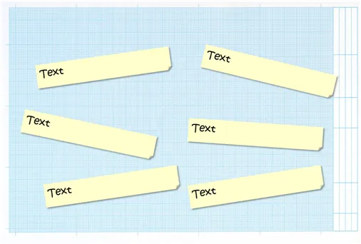
A hand writing style can often be useful in slides describing inputs for product design, or a time line with milestones / todo lists (the latter always runs the risk of looking particularly boring).

This slide was created using a stock image of mm-paper plus the standard PPT “sticky note” shape with a shading put in the back. The font is “Kristen” but it can be any informal looking one.

·Investor presentation

David S. Rose: 10 things to know before you pitch a VC for money

Presentation Zen posted a good review about the presentation aspects of David Rose’s TED video about pitching your company to VCs. I watched the video, and would like to add a summary of some of the content that David is talking about.

  • It’s all about you. The content of the presentation is about the substance of your business. But VCs look for things you are not directly presenting, but convey in between the lines about yourself.
  • Integrity, realism, coachable were 3 characterization that stood out from the 10 or so “you” criteria David was listing (including more obvious ones such as passion, knowledge, etc.). Be a person that stands with both feet on the ground and is open to learn.

After discussing “you”, David moves on to discuss a structure of a pitch presentation. Many elements are not new (market, team, financials, etc. see video for details), but he adds useful thoughts to all of them (I use the words “don’t” alot):

  • Start immediately with a very, very brief description of what you actually do, so the audience is not guessing through your talk but rather can focus on the content
  • Don’t “pop” the buildup of excitement by going back, making a mistake, stalling.
  • Don’t say anything that is not true (linked to the integrity point) above. (My addition, say “I don’t know” if you’re not sure)
  • Don’t make the audience think/wonder about number inconsistences between slides, even if they are not errors (net sales, versus gross sales for example). It distracts, “pops” the flow
  • Use real concepts instead of abstract ones, also in financial forecasts. Instead of cleaming 0.5% of a $1bn market, why would someone buy 1 product, how many customers do you think you can get, hence, what would your sales be.
  • Give the audience a something to compare your idea against, to validate it (a comparable company, etc.(
  • Finally, do a verbal wrapup (maybe with only a company logo on the slide), rather than a crammed slide that invites a repeat of the entire presentation
Continue reading →