SlideMagic Blog

Frequent updates about all things presentations since 2008. Subscribe to never miss a post.

RSS
all posts

Category Templates

·Templates

Chart concept - empty billboard

There are many “empty billboard” images available on stock image sites such as iStockPhoto. Many of them are cheesy, but the more realistic ones could be useful. I use them often in presentations as a place holder for information about a major product (re-)launch, or maybe a final slide to shout the key message home. They look best when you use an actual add containing images instead of just text. Make it look more realistic by using grey scales instead of black, make the image semi-transparent and (for the pros) use a blur filter in PhotoShop. Also, changing to a night setting adds more focus to the image. All the effects below were done in PowerPoint (gradient overlays).

See an earlier post about pasting text on images here.


·Templates

Chart concept - look-through white board

I used this image today in a presentation. Great to put on the side when drawing black shapes, or support informal, hand-writing font text on a white page. Make sure the pen touches the last “shape” or “word” she drew.

·Images

Chart concept - a new beginning

This image from iStockPhoto is great to illustratie “make-overs”. Add minimalist text either in the white or the yellow (depending on whether you want to highlight the old or the new).

Skilled Photoshoppers can change the color into something different than yellow.

To create more yellow space. Make a copy of the image. Crop only the yellow wall, align it to the right of the main image and stretch until the right margin. Again, in PhotoShop this can be done more professionally.

Disclosure: no commercial interest

·Templates

10 steps to clean up a PowerPoint/Excel data chart

When you hit “insert chart” in Excel or PowerPoint, a pretty ugly graph shows up. Here are the steps I take to clean things up:

  1. Horizontal axis: 2pt line instead of 0.75pt
  2. Horizontal axis: smaller font until labels show up horizontally
  3. Horizontal axis: no tick marks
  4. No chart title, instead I use the consistent PowerPoint headings
  5. No grid lines
  6. No vertical axis
  7. No legend (I use PowerPoint boxes to make those)
  8. Data labels on top of the columns
  9. Data label values rounded up
  10. “Gap width” between series 50% instead of 150%

I am not going into the details of PowerPoint menus here, but you can usually change most of these things by right-clicking an element in your chart. (Click on images for larger picture)

·McKinsey

How to create a McKinsey-style waterfall chart

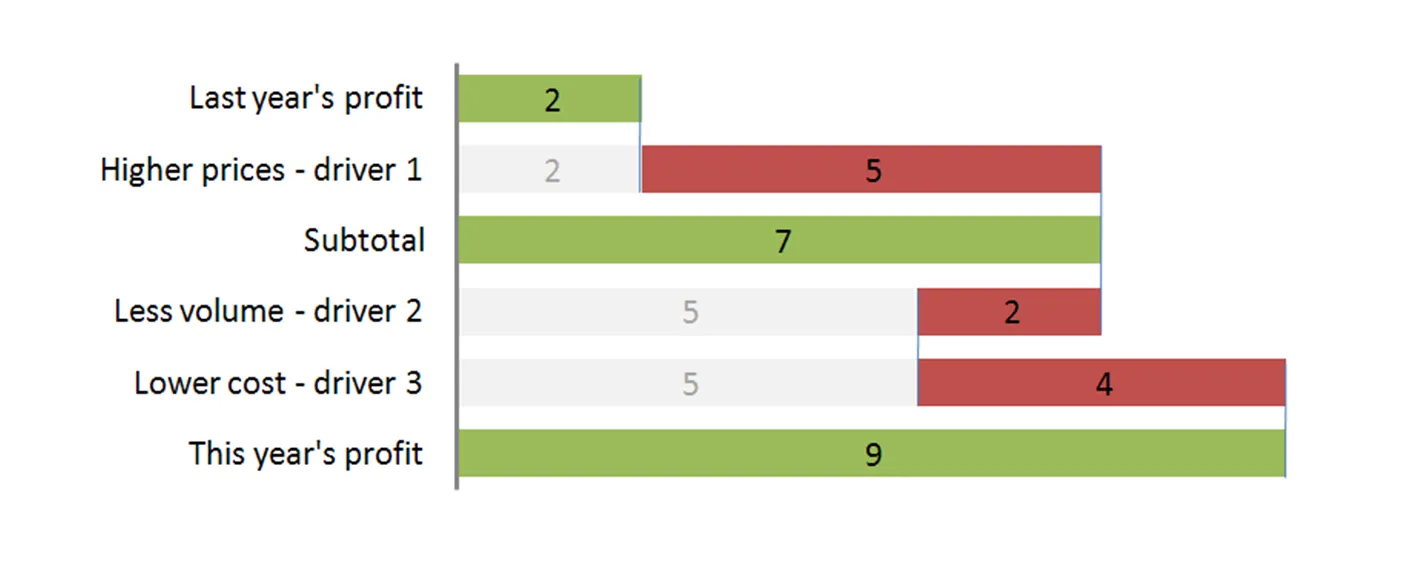
The “water fall” chart is an effective way to summarize the quantitative impact of a number of drivers. For example, you need to put the following story in a chart: “Our profits went up by 7, the positive effect of higher prices and lower cost was offset by a lower sales volume.” A waterfall chart would look something like this:

For illustration purposes I left the light grey color and data labels of the supporting series in so you can see how to make the chart: it is basically a stacked bar chart with 3 series:

  • A “white” series to support the drivers
  • One series for the drivers
  • One series for the (sub)totals

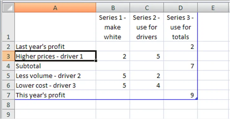
The data table for this chart (Powerpoint 2007):

For a final touch, make the color of the light grey series white, take out the data tables and that’s it. There is the temptation to make automated tools (in Excel) that do the work for you. Like almost all my charts, I start with a piece of paper and make my waterfalls manually, to make sure that they

  • Are correct (negative numbers can make these charts a bit tricky to get right sometimes)
  • The chart tells the story I want it to tell (what subtotals to use, in what order to list factors, etc.).

UPDATE 1: here are two other posts related to McKinsey waterfall charts:

Continue reading →
·McKinsey

Googling for free McKinsey PowerPoint templates

Doing a Google search for “McKinsey PowerPoint templates” highlights many entries that are almost all a violation of copy right. Moreoever, the templates are of little use to someone who is not working at McKinsey team on a client engagement. First of all: presentation starts with substance, then follow the frameworks (if any) A bit of historical context. I recognize the frameworks from my time at McKinsey, almost all of them are from the early 90s, when McKinsey was still working with an early pre-PowerPoint presentation tool called “Solo”. Solo was developed specifically for McKinsey, later marketed as an independent application. It vanished when PowerPoint emerged, not because PowerPoint at that time was neccesarily better, but all of McKinsey’s clients were running it and using it to edit presentations. (A slightly outdated looking site is still offering it for sale?). Your graphics assistant (nobody knew how to make charts themselves then), would dive into the template database to find “something that uses 4 arrows”. All these frameworks were meant to be used in densely written strategy/micro-economics documents, not in convincing on-screen presentations. If you would like to learn about McKinsey’s approach to graphics and presentations, try this:

  • The content available on the McKinsey Quarterly site (most of which look actually better than “day-to-day” work)
  • For the chart “Bible” that was used in the early 90s, flick through a copy of the book “Say it with charts” by Gene Zelazny. (I see he’s updated it since I last saw it).
  • The foundation of McKinsey’s approach to writing logical story lines (but not always the most compelling stories that are important in presentations) can be found in Barbera Minto’s book “The Pyramid Principle
  • UPDATE: I posted about a question I get often: how to make a McKinsey waterfall chart here.
Continue reading →
·Investor presentation

Startup pitch advice available on the web

There is some useful material available on the web for entrepreneurs seeking to pitch their startup to potential investors. I will use this post to bookmark a few of them. Some of these are great, some of these are less good. Anyhow, here we go:

To be continued/updated later.

·Concepts

Chart concept - the final presentation slide

It’s always difficult to leave the audience with a good punch line (chart). Things I prefer not to do:

  • Explicitly ask for questions - there could be none (anymore)
  • Read out “summarizing” bullet points from a slide that re-run the entire presentation in a very boring fashion

Instead, I often put a page-filling “uplifting” picture on the page (or repeat a key image from the presentation) and repeating one key message of the presentation, maybe spiced up with a bit of humor.

As an example, I found the above image of a man sky diving off a sky scraper in Bejing on iStockPhoto.

·Concepts

Chart concept - skipping over a cliche

There is no need to preach to the converted. Obvious points do not need your time, energy and PowerPoint slides. If you have to spend 1 slide, do it almost as a place holder, and add a bit of humor if you can to “pooh pooh” the cliche point you are just making. Next slide! I often use the above image for this using Addletters that allows you to put in any text you want.

·Colors

Avoid pompous templates - colors do the work

Many PowerPoint templates waste a huge amount of screen real estate with big logos and/or graphics. I prefer the opposite approach. Through the consistent use of the template colors on the slide, the audience will immediately recognize the corporate identity of the presenter. As an example, a slide that I use in my own introduction presentation:

Image no longer available