

Amazing, there is one person who designed the “logos” and store fronts of almost 90% of all independent fried chicken outlets in the U.K. “Mr. Chicken” is interviewed here, there is even a book available on the phenomenon.
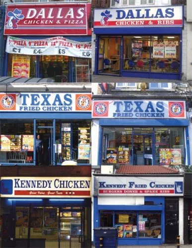
Amusing reading. However, it is not completely justified to pooh pooh these logo designs. Because they all look the same, they are actually pretty effective. If you find yourself in a U.K. high street looking for some fried chicken, you find one of these outlets in 2 seconds.
But, you do not want to be “Mr. Chicken” when it comes to your PowerPoint presentation. Get rid of the generic logo. Free up the screen real estate that is consumed by heavy banners with empty slogans. Instead, let people see the “what you have in store” with great content in your slides, all in a nice and consistent color scheme.