SlideMagic Blog

Frequent updates about all things presentations since 2008. Subscribe to never miss a post.

RSS
all posts

Category Software

·Images

Keynote discoveries

I am a PowerPoint veteran who only recently started to design presentations in Keynote. Here are some of the little things that were hard to find:

  • Connecting shapes with a line: select both shapes go to the insert menu and select connecting lines
  • Remove an image background: go to the format menu and select instant alpha
  • Edit an image (make it B&W for example): select the image and click the tiny button with the levers (next to the stroke buttons).
·PowerPoint

Re-discovering Smart Art

Smart art inside PowerPoint is a semi-automated template engine for diagrams. It easy to add and remove boxes/bubbles, edit text. The idea is good, but I have not used them a lot:

  • The standard out-of-the-box formatting is ugly
  • Although there are many frameworks to chose from, none of them usually really work for my particular presentation problem
  • I have seen them too many times in presentations where designers simply dump in a smart art graphic to replace a bullet point chart (the result is still a bullet point chart that looks a bit different)

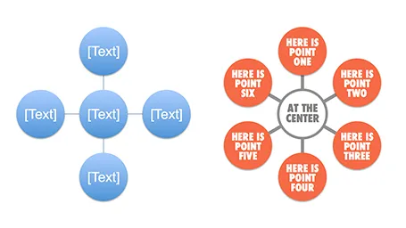
Recently, I have started to use smart art in my presentations, but in a different way. I use them to position objects on a slide by picking only the very basic configurations and reformat the slide items heavily so you can hardly recognize it is a smart art object anymore. An example below:  

Well, I said before: your PowerPoint is really good PowerPoint if your audience cannot tell it is PowerPoint…

More about smart art on the Microsoft site, or over at the PowerPoint Ninja blog.

·Images

Smartphone screen shots

The best way to make a slide with a smartphone screenshot:

  • Get a stock image of a smartphone without the device maker brand (using Google Image search might get you into copy right issues)
  • Take the actual screenshot on your smartphone, in my case I use my iPhone browser to go to the web page and press the home and on/off button at the same time. Email yourself the image
  • And here comes the trick: apply a subtle inner shadow to the image. You see the difference in the image below, the left side one looks a little bit bland, the right side looks much more natural

·Keynote

A Microsoft strategy mistake

This Twitter conversation just unearthed another feature that is missing in the Mac OSX version of PowerPoint:

@ideatransplant Unfortunately no trim video options on PowerPoint:mac - Trim Video Clips bit.ly/MeJKHH — Geetesh Bajaj (@Geetesh) July 10, 2012

There are many more, see older posts about PowerPoint 2011 for Mac versus PowerPoint 2010 for Windows here.

I do not think the reason for this is a technical one, it should be possible to write the same software for both platforms. Hence, Microsoft must be thinking that by making PowerPoint 2010 for Windows just that tiny bit more feature rich, it will convince users to stay on the Mac platform.

I think this will be backfiring: Mac users will simply switch to Keynote. Microsoft should create an organizational separation between the Windows and Office business, the latter should consider the Mac a highly profitable platform for selling software.

·Keynote

PowerPoint as a word processor

PowerPoint or Keynote are perfect alternatives to word processing applications to write documents that are primarily intended for reading and not for presenting on-stage. Corporate executives are so overloaded with information that the memo written in long-hand text is making way for a more visual way of presenting that is somewhere in between a dense text and a keynote presentation. If you write a book or a complex legal contract you probably rely on some of the more advanced word processing functionalities (style sheets, numbering, revision marking, etc.) For all other situations, PowerPoint or Keynote work fine.

The first and most important thing to do is to realize that you are writing a document for reading not presenting and adjust your style accordingly:

  • Reduce your font size to make space for more elaborate sentences. You will not be there to present the document, so the text should be self-explanatory. Big bold fonts work great for catchy headlines, for actual reading a smaller font size is more readable (a bit counter intuitive).
  • Don’t make your sentences to long. A book has only 7-10 words on a line, and newspapers use columns to keep lines short. The eye can get lost if it needs to make left-to-right movements over longer distances. Consider using a column layout of the page as well, either across the page, or one column at the side of the page and an illustration covering the rest.
  • Add tracker pages, page numbers, and other reminders of where the reader is in the document. I believe that in short stand up presentation these elements just add clutter, when we sit down to read, we need to bring them back in.
  • Maintain white space on the page, use wide page borders to create a calmer look. It is better to shrink the text and give it space to breath, rather than increase the font size until you covered the entire canvas.
  • Use very subtle techniques to highlight text. Too many bolds, italics, and underlines create clutter. Only use a few different font sizes.
  • Make sure that objects and text columns are properly aligned on each page.
  • Dark background are usually not very readable with smaller text, and are definitely a problem when your document has to be printed. Go for a light background instead.
Continue reading →
·Images

Cropping a composition

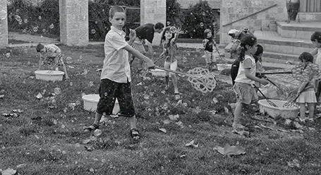
The 2 photos from a birthday party below show what an impact cropping a good composition can have on the quality of your images. I used the iPad app Snapseed (affiliate link) to do the following:

  1. Cut out the eating man, cut out the light/bright parts of the image at the top to focus on the boy in the foreground and the girl reaching fro the bubble in the back
  2. Take out the color since the composition of the greens and the clothing of the kids does not really look interesting. The B&W image enhances the texture of the bubbles, leaves, and grass
  3. Selective up the brightness around the faces of the boy, the girl, and the boy back to the left
  4. Up the sharpness and structure of the image

The result is a transformation from a bland image to one that looks like a Matrix-style freezing in time. I am constrained here by the 455 pixel limitations of Blogger, the final image looks better at its proper resolution.

·Animations

Creating cartoons with PowToon

PowToon aims to enable you to create cartoon-style, animated presentation and video clips without professional illustration and motion graphics software. I test drove the beta version.

When you look at many cartoon-style videos you see that they are actually not that complicated from a graphics point of view. Usually they involve a number of scenes (slides), they use static characters, basic entrance, exit, and emphasize animations and sometimes a cute hand that puts items on the slide, all accompanied by some simple music.
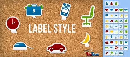
And this is what PowToon does. The edit interface looks Windows blue, it allows you to place items in a slide and specify the animations. In theory, PowerPoint or Keynote can do the same things, but it requires a deep understanding of the software, plus a library of characters.

There is definitely a market for a tool like PowToon. I do not envision these type of animations to be used in a stand-up presentation, but rather they could be useful to create demo videos on web pages, or presentations for emailing to prospects.

The basics of PowToon work great. I spent 10 minutes to stitch together this video based on a pre-defined template. PowToon is still in beta, and there are a number of features that I would recommend the team to incorporate:

  • Invest in the object library, and make them look less clip-arty (the picto character has some resemblance to the 1990s screen bean), this could also be a good revenue model: premium illustrations
  • Create the ability to export the presentation as a movie and embed them in a regular PowerPoint or Keynote file, this will make adoption in corporate environments a lot easier.
  • Make it easy to embed presentation videos in sites (I am sure the team is working on this)
  • Find a way to let the hand draw shapes and write text, so everyone will be able to make animations in the style of RSA Animate.

Continue reading →
·PowerPoint

PowerPoint guides using xScope

One of the most annoying shortcomings of PowerPoint 2011 for Mac is the inability to lock drawing guides. An external app can solve the issue.

A guide is a thin blue line on your design canvas along which you can align slide objects. If you drag an object close to the line, the object snaps into place. In this way objects on multiple pages are positioned in exactly the right place. I use them to mark slide borders, and more importantly the vertical center of my drawing canvas when it does not coincide with the center of the screen.

It is very important that these drawing guides stay exactly in the right location, and this is the issue. As soon as your cursor comes anywhere near a drawing guide, PowerPoint will make moving the actual drawing the priority. So if you try to straighten out an object that is a little bit off and want to fixate it against the guide, PowerPoint moves the guide rather than moving or resizing the object.

xScope (affiliate link) is an app for Mac that allows you to draw screen guides independent of the underlying application. The good news: PowerPoint does not move your guides anymore. The bad news, objects do not snap, you have to make sure manually that they are perfectly aligned. One other comment, the app lets you decide where to draw lines and where not when you use 2 screens. xScope does not allow you to manage this on 3 screens.

Continue reading →
·Gadgets

Content creation on iPad

I have been experimenting a lot with using my iPad as a laptop replacement. It boils down to getting used to a new user interface: designing slides in Keynote works fine, and even building a spreadsheet in Numbers might be more intuitive on a touch interface, it is easier to navigate around cells. Strangely enough picking up a regular pen and paper feels a bit weird the first second after all that digital handwriting.

There is a very big issue though, an issue that was solved on the PC in the mid 1990s: multiple application windows. Quickly getting the data out of a PDF, running a side calculation in a spreadsheet, browsing through your images before putting them in a deck is simply not possible yet.

Here are some features that should be baked into a future tablet operating system:

  • Touch-friendly application switching that does not create the cluttered window mess of regular computers
  • A universal file format so you do not have to worry about in which application to open what
  • A new clever archiving system that is not (only) dependent on file names and directories, maybe find files based on the time you were working on them, based on the people you cooperated with.

Maybe the successor to Microsoft Office is not a new series of software, but a standard file format that covers text, graphics, and calculations on top of which everyone can build applications.

·PowerPoint

Photoshop/Illustrator CS6

Adobe has released its new Creative Suite 6 software (Photoshop, Illustrator, etc.). I am only a casual user of this software, my core design work is in PowerPoint and Keynote. Still now and then, I need capabilities that are not available in these slideware solutions and dive into the world of Adobe. I have been working with the software for a week now, and here are some of the features that might be interesting for a presentation designer:

In Photoshop CS6

  • Better context-aware fill and the ability to take objects entirely out of an image (not very useful), or move the object around in an image (very useful). I am desperately looking for a way to extend the background of an image, stock image photographers always crop to narrowly around a subject, leaving no space for text. The current tools are not there yet.
  • Sometimes it might be the hidden things that are best. I have just the impression that the general selection engine to isolated subjects from their backgrounds is better.

In Illustrator CS6

  • The pattern generation engine is much better. It is cumbersome to generate patterns of repeating objects in PowerPoint or Keynote. In Illustrator it is easy, and you can apply them to any shape as a fill.
  • Photo tracing. It is now very simple to turn a photo or hand-drawn sketch into a scalable vector image. This will make it easy to convert images into more neutral silhouettes in presentations.

There are a lot more new features that will appeal to heavy users of both programs. Should you upgrade as a casual user? Your call. Since I am a professional presentation designer, I just install the latest software without really making the trade off every time. What do you think, if you have upgraded, was it worth the investment?