SlideMagic Blog

Frequent updates about all things presentations since 2008. Subscribe to never miss a post.

RSS
all posts

Category Software

·Keynote

iPhone mock ups

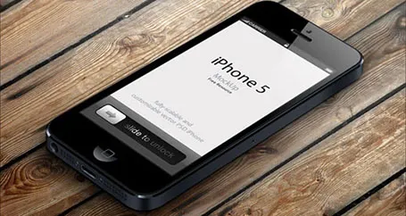
Many high-tech presentations involve some sort of show casing of a mobile phone app. This site has a number of iPhone mock ups that could work great in presentations. With elementary image editing skills, you can take a front-facing image and past your device screen shot in. More advanced Photoshop users can probably get the 3D tilting to work.

The full list of iPhone mock ups are here on Design Beep.

Someone suggested this link on Twitter, but I forgot who it was… If it was you let me know and I will give you credit.

·Keynote

Saving time with files

An annoying part of my workflow is clicking through file hierarchies to open and save documents and images. I do not understand why it took me around 20 years to figure out to pin the folders of the current projects I am working on to left of my file open menu. On the Mac, you simple dag a folder onto the side bar (you can do something similar in Windows as well).

·PowerPoint

First impressions of Windows 8

Although I have switched to a Mac, I dip into the world of Windows now and then on a virtual machine, for such things as running .EXE CD ROMs with medical images on them, or editing a chart for a client still on PowerPoint 2003. The latter is no longer necessary, and that is a good thing, since Windows 8 is no longer supporting PowerPoint 2003.

So, I took the plunge and installed Windows 8 on my Parallels 8 virtual machine. I ignored all the scary warnings on the Parallels web site and managed to get a perfect install.

As a non-Hebrew speaker in Israel I always have an additional issue when installing new software. Trying to change the system language on a computer without being able to read most of the text on the screen. Gambling, plus comparing English and Hebrew screen shots finally did the job, but my computer science undergraduate degree came in handy. Not something for novice computer users as languages for application screens, keyboards, user accounts and welcome screens all seemed to be controlled in a slightly different way.

OK, back to the software. I will not describe the ins and outs of the new operating system here, but stick to my personal impressions. Detailed descriptions can be found in other reviews.

I really like the new Microsoft graphical look and feel of the new Metro interface. It is calm and clean, with simple clean graphics without shadings, gradients, drop shadows and near-realistic leather or paper effects. Some of the tiles on your home screen update in real time with weather, stock market information and a flow of pictures of your facebook and Twitter friends. I switched these live updates off, too distracting.


Continue reading →
·Delivery

4:3-ing that LCD screen

Most people design their slides for a the 4:3 aspect ratio of older TV screens and computer monitors (I still think it is actually better than 16:9).

Increasingly conference rooms are using large 16:9 LCD screens that are much brighter than the traditional on screen projectors. And most of these 16:9 screens are set to stretch 4:3 input signals. As a result your slides will look bloated.

Grab that monitor remote (you cannot control this from your computer) and set the aspect ratio to 4:3 before you start presenting. The tech person present usually will say “What, you want those black bars?”. You can answer affirmative. Your slides will look much better, and if you use a black slide background, no one will even notice the black vertical bars.

P.S. Ancient post that touches on slide backgrounds.

·Keynote

The screen shot workflow

On a Mac, you can create a screenshot of a specific part of your screen. Pressing CMD-SHIFT-4 brings up a cross hair and you can select the area you want to capture.

Screen shots have become an essential part of my workflow. Rather than worrying how import PDF files, web sites, video stills, or other images into my presentation I just snap a picture of them. The same for exporting PowerPoint slides, the images on my blog are usually screen shots.

No more looking for files, no more worrying about file formats. I heart screen shots.

·Gadgets

Trackpad U-turn: back to the mouse

With the advent of Mac OSX Lion I moved to using a track pad for all those fancy swiping features. However, I am back to a regular mouse. For intensive design work, a track pad strains my wrist too much. You constantly need to lift your hand slightly above the track pad, which starts to hurt. Using a mouse, I can put my hand and wrist in a completely neutral position without straining any muscle.

·PowerPoint

PowerPoint 2013 mini review

Everyone can install a preview of the new and upcoming Microsoft Office 2013 free of charge. Follow the process outlined here, and take into account some of the health warnings by Geetesh Bajaj (be especially careful with Outlook). I installed my version on a Parallels virtual PC on my Mac and limited my mini review to PowerPoint.

Probably on purpose, Microsoft made very little changes to the menu structure of PowerPoint. Anyone using PowerPoint 2010 will feel at home immediately. Everything stayed in the same place. The look and feel of Office 2013 has improved a lot: clean lines, fewer gradients, fewer shadows, light fonts. The UI radiates calm and good taste. Almost a bit too calm, as it can be hard sometimes to see the contrast of white slide backgrounds against the background of the design canvas. But overall, very good.

Microsoft has made the 16:9 aspect standard in PowerPoint 2013. This will work well with modern computer monitors, but I am actually not a big fan of designing slides in 16:9. It works great for movies, but for visuals I find a wide screen somewhat limiting. Also, old VGA conference room projection screens have a 4:3 ratio, and more importantly, I do not expect tablet devices to go to a 16:9 screen ratio.

If there is one criticism for Microsoft, it would be the bullet point template: it is still there. You insert a new slide, and the bullets are waiting for you to be filled in. The entire slide master is still the messy collection of bullet point-based slide layouts with big page numbers and dates on every page. Maybe with PowerPoint 2016, this will be eliminated…

Continue reading →
·Images

Crappy paste-as-image

If you use a custom font just on one page of your presentation, it is better to use the text as an image, so viewers of your presentation do not have to install that font on their computers in order to see it. Microsoft PowerPoint gives the option of paste special, past as image but - at least on a Mac - the resulting graphic looks horrible. I simple make a screen shot of the text and paste that in.

·PowerPoint

Changing PowerPoint shapes

Another hard to find feature in PowerPoint. It is possible to change a shape, for example turn a rectangle into an oval. Select the rectangle, go into the SmartArt menu, select the shapes button, and the select the shape you want instead.

·PowerPoint

Office 365: not there yet

I signed up for a trial of Microsoft Office 365, the cloud-based version of Microsoft Office to see whether it could be a work-around to get the Windows version of PowerPoint to run on my Mac. (There are a few bits missing in the Mac-version of PowerPoint).

Not every Office user is the same. For the corporate user that needs access to files on any device, plus the ability to make some small edits to Office documents that are created on desktop applications, the Office 365 offering makes perfect sense.

But Office 365 is not ready yet to become a core design platform. I tested only PowerPoint, and ran the web app in Google Chrome on Mac OSX, please correct me if some of the limitations were due to hardware/software issues:

  • The availability shapes and functions in PowerPoint are extremely limited when compared to the desktop version. Now, I am all in favor of cutting PowerPoint features but here basic elements were left out (creating data charts  or cropping pictures for example)
  • Fonts are a big issue, if purchased custom fonts that are installed on my computer, but they are not present on Microsoft’s Office 365 server, so your presentations become garbled
  • The preview of slides are low-res and slightly blurry (I am using a 2500 pixel monitor), only when you click to edit an object does the full resolution kick in.

In a few years from now, Microsoft Office applications will run smoothly across devices and platforms, we need a little bit more patience.