

SlideMagic Blog

Frequent updates about all things presentations since 2008. Subscribe to never miss a post.

RSS
all posts

Category Software

·Keynote

OS X - Windows compatibility

Now that the installed base of Macs is growing, especially outside the large enterprises, you need to take into account that your PowerPoint presentation is likely to be opened on both machines.

There are obvious differences to be aware of. The key one is fonts: there is a large set of fonts that are available on both operating systems, but very obvious ones are not always part of the overlap (Helvetica for example is not available on a standard Windwos machine, and Calibri gets only installed on a Mac once the user buys Microsoft Office).

But here are the less obvious ones. Even if you stick to standard fonts, there are still tiny differences in how both operating systems insert line breaks. Watch out especially for tight text in boxes.

Also, there is an annoying difference in the way PowerPoint for Mac colors text and shapes. You pick the same colour for both, but they look different. A design can look perfect on a Windows machine, but off on a Mac.

There is no quick solution to all of this. Installing a second virtual machine on your computer might be a bit overkill. I guess there is no alternative but to ask a friend or the recipient of the presentation to send back a quick PDF file to double check, especially for important presentations that will be presented on screen (as opposed to a document meant for reading).
·Gadgets

Designing on a MacBook Pro

After a second hard disk crash (long live Dropbox) I decided to write off my 17" MacBook Pro, and upgrade to the new 15" one with a retina display.

Buying a new computer used to generate the same level of excitement people experience when upgrading their mobile phones today. Used to, because buying a new computer now mainly is buying a new utility. Re-install your apps, sync Dropbox, and things are pretty much business as usual (albeit a bit faster).

This 15" retina display though slowly lured me into something I have not done in years: sit in a sofa and do serious design work. The amount of screen my laptop covers is tiny compared to my Thunderbolt screen (you see this when dragging a laptop window across), but the incredible pixel density makes the whole experience wonderful.

·Keynote

Demos are stories, not feature lists

A 20 minute presentation is usually to short to carry a live product demo. You might run into technical difficulties, and you are losing time/attention with banal product features such as logging in, etc.

In those cases it is better to use application screen shots, rather than the real thing. You can still point at your computer and say that there is a working prototype, and that you are more than willing to take people through in a separate, longer meeting.

The next level up is to crop/magnify the screen shots and focus only on those aspects you want the audience to see. Your Skype window, menu bars, and all other unnecessary screen real estate can be cut out.

Next level up: put big, bold, explanation arrows explaining what the user should see. Say that it is a really minimal UI, if it is minimal.

Now here is the big difference. Do not just structure your product demo alongside the feature list of your app. Instead, create a user story and let the app screens flow with the story. You can also include visual images that are not screen shots into this story board. Even better, link back to story elements you have used elsewhere in the presentation.

A product demo is a user story, not a list of features.

·Design

Leading

One of the typography elements I play with all the time is leading, the space between 2 lines of text. PowerPoint sets the leading standard to 1.0, or 100% of the typeface size. What leading looks good depends on:

  1. The typeface you use
  2. All caps, sentence caps or lower case
  3. And most importantly: the size of the font, bigger fonts need less leading

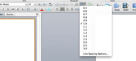
There is no general rule here, you need to fiddle and see what looks best. On a Mac, there is a button that controls the leading of your paragraph, see the screenshot below. It is one of the buttons I use most.

·Colors

PowerPoint template mix up

Copying PowerPoint slides from one presentation to another can have disastrous format implications. Some survival advice.

  • When saving/defining a new PowerPoint theme, stick to the suggested colour uses that PowerPoint suggests, i.e., text/background dark should be a dark colour for example. If you move slides across between templates in properly defined colour schemes, the damage will not be that big
  • Make sure you copy slides into the file with the desired template and not the other way around. Sometimes this might require you to create a 1-slide presentation in your preferred template, and then copy the 35 other slides into it.
  • There is a way to merge PowerPoint slides and keep their original formatting, see an old blog post on the subject.
  • At the top left corner of the ribbon is a layout button that opens a drop down menu of slide formats that are present in the master. Use to to correct disasters.

Good luck!

·PowerPoint

Hidden Microsoft Office data

Take care when sending Microsoft Office files to outsiders, you might send hidden confidential data with it.

  • The presenter notes fields in PowerPoint might contain notes you do not want others to read
  • Taking out the data labels with confidential numbers from a data chart does not remove the actual data in the underlying spreadsheet
  • The PowerPoint sticky notes links are very small, which is great so they do not obstruct the design of the slide, on the other hand, you might just forget to remove them.

PDF-ing your document will solve most of these issues.

·Keynote

PowerPoint web app

After my quick review of Keynote and its new web app version, I went back to check out the Microsoft PowerPoint web app, which is free to use for anyone with a Microsoft Sky Drive account.

Overall the look and feel of the app is similar to the desktop version, interactions are reasonably snappy, but there are a few very simple roadblocks towards making this a credible alternative to the desktop version. I did not bother to go into a more detailed review at this stage:

  1. Fonts. If you used custom fonts in a presentation designed on your desktop, they will not show up in the web app (I use a Mac so I cannot embed fonts inside a PowerPoint file). This is a showstopper: it is very difficult to edit a presentation when you cannot see what you are doing, and completely kills the option of using the browser to present your slides.
  2. Data chart. You cannot edit or create them. No use for a business presentation.

 We are heading in the right direction, but are not there yet.

·Keynote

New Keynote - first impressions

Together with a whole range of other product updates, Apple released a new version of iWorks (including Keynote) last night. I installed the Mac OS X Mavericks (warning, this will take your computer down for an hour) and played around with the new software. Observations in random order.

All iWorks apps are now free for people buying new Macs. iWorks was already a lot cheaper than Microsoft Office, but now the economic argument against enterprise adoption has been removed completely. Still, the huge installed base of both Windows hardware and PowerPoint with its familiar user interface will make it hard for Apple to make an inroad here.

What could help them is the cross platform compatibility. As of today, there is one file format both for desktop and mobile versions of keynote. I still do not fully understand iCloud, where my files are, where things get saved or not, but the duplication of a file when opening it on your mobile phone is gone. A step in the right direction, but not all the confusion has been removed.

Apple has also launched their suite of iWorks web apps. You can now edit and present Keynote presentations right from your browser. You can simply share a link to the presentation with your co-workers, rather than sharing heavy email attachments. More than one person can edit the live presentation. Many other services offer this feature, but personally I find it a bit scary when I loose control of how makes what edits (including deletions) in the master document. Anyway, that the feature is available does not mean that you have to use it.

Continue reading →
·Data visualization

Powerpoint vs Keynote - redux

It is a question that comes back all the time: PowerPoint or Keynote. I have given my opinion in the past.

After I got my first Mac, I was really excited to be able to design in Keynote. Now, a few years later, I must say that both products are more or less the same to me. Keynote is cleaner, auto-aligns and distributes objects when you drag them, and does not have the problem of drawing guides that you move by accident, and has a tight integration with the iPad. PowerPoint has a more convenient photo cropping UI and a much better data chart engine (Excel).

But workflow is a very important consideration as well. If the people in your organisation find it difficult to get up the learning curve with Keynote, why torture them? This is especially true if people need to do a lot of copying back and forth between Excel and PowerPoint. Probably 90% of presentations are quick and dirty documents to discuss business data, and in those cases tight integration between the 2 programs is a big time saver.

In the end both applications can deliver exactly the same look and feel of presentations. When I tell clients that Keynote presentations do not automatically look better than PowerPoint ones, they are surprised.

So in short, it actually does not matter what software you use, it is your design that matters.

·Keynote

Using Prezi sensibly

For people bored with PowerPoint, Prezi can be an alternative presentation design platform. It is web-based, has powerful zoom effects and enables non-linear presentations. I would suggest to keep the following in mind when using Prezi for a business presentation:

  1. Stick to a linear story line, especially for larger audiences. If you have 20 minutes in front of 500 people, it has hard to get your message across using a random and unpredictable flow.
  2. Use the Prezi zooming and moving effects where you really need it, and not just for spectacular slide transitions. The audience will get motion sickness, or worse, will start giggling when you discuss your very serious business topic.
  3. Try to bring the look and feel of your Prezi in line with your regular PowerPoint colours. You will not have time to design Prezis for every presentation you do.