SlideMagic Blog

Frequent updates about all things presentations since 2008. Subscribe to never miss a post.

RSS
all posts

Category Software

·Keynote

Web site = company presentation

Now and then I get stuck on the border of web site design and presentation design. And increasingly, the border is blurring. I am not talking about big eCommerce sites or sophisticated web applications here, I deal with a straightforward web presence for a high tech startup.

How can a presentation designer be helpful here?

  1. There is hardly any need for extensive technical content. Viewers are looking for a simple and professional looking page that quickly answers a few basic questions: what do you do and who are the people behind the company. If your page looks like a 800-pixel wide website from 2002, your company is probably from that time as well. If I cannot find details and names of the management team, nor a postal address then the company might actually not be real.
  2. Web-based presentations and web sites have the same audience: click, click, click-ing to find out what you were looking for. Elaborate text, buzzwords, spectacular videos, auto-play music all distract and delay in exactly the same way as animation and bullet points do in a PowerPoint deck.
  3. There are great what-you-see-is-what-you get tools out there for novices to build web sites. Wix has a very consumer non-professional feel, Webydo is like Adobe InDesign put online, and my favourite is Square Space. My own web site is still based on Wordpress, which missed a great opportunity I think to become a simple web site creation platform.

Basic web presence design will become increasingly standardised, but I still encounter many web designers who continue the bespoke route of the past decade. Prediction: something similar will happen to presentation design and enterprise communication: you can instantly recognise two types of presentations: 1) the bullet list by the non-designer, 2) the presentation that is prettied up by a professional graphics designer (icons, banners, logos, effects). I am working hard to eradicate both.
·Keynote

Icons in PowerPoint

With smaller screen sizes, icons are becoming an increasingly important element of user interface design. Not everyone of you is likely to be using PowerPoint to design a web app (hey I do), but icons can also be useful in regular presentation design.

I am not talking about floppy disks and other ancient icons we still use, but stylised symbols that can be an effective visual short cut to a category of (pick the appropriate) products, benefits, user problems, etc.

One option is to create your own icons in PowerPoint, set the zoom to 400% and create miniature shapes using shape booleans. Often you can use a quick Google Image search to find inspiration for your icon.

Stock photo sites sell endless amounts of icons, but there are compatibility issues when using them in PowerPoint or Keynote. Most icons are design as a vector graphic in Adobe Illustrator. It makes them infinitely scalable (like a PowerPoint shape), but PowerPoint does not read this file format. Copy-pasting Illustrator objects (if you have the software installed) is unpredictable and results in a shape that is hard to manipulate (changing colour for example).

Cropping icons out of a JPG or PNG file is not a solution either, if you forget to compress the small image file, you end up storing a huge image file with all your icons multiple times on a PowerPoint slide. Cropping also kills the vector-like scaling of icons, and background transparency.

A recent trend in web design might provide a solution: custom icon fonts. Modern successors of Zapf Dingbats (what?) provide clean icons that are scalable and can be manipulated (colours, shadows, and - do not use this - reflections).

Continue reading →
·Gadgets

Is the tablet love affair over?

A partner in VC firm Andreesen Horrowitz confesses that his love affair with the tablet is over. People will stick to a desktop device the laptop and a pocket device, the phone (which will get slightly bigger).

Putting things in context of presentation design (leaving the consumer world aside for a minute):

  1. I think tablets are here to stay for managers that need to view documents, but do not make edits beyond small corrections
  2. Serious presentation design work will never work on a small touch screen (maybe a similar statement to that of IBM estimating the world market for computers). One, there is the physical constraint, but more importantly, I think you need that space, that big screen, that calmness, to think/focus and create beautiful presentations
  3. One thing that the tablet has done is change user interface design forever: I predict most new desktop software will slowly migrate to a tablet-like interface (simple, big buttons).
  4. I think we are likely to see another big innovation in laptop user interface design. Either very large touch screens (still, the distance to the screen will be an issue for a workable user interface), or giant touch pads (maybe integrated with a keyboard) that allow us to scroll through information Minority Report-style.
  5. Document creation and design software is too complicated and a left-over of ideas from the 1980s. Enterprise documents can be much simpler/uniform while still being effective and distinctive (watch this space). So the innovation in enterprise computing/communication might be in software, not hardware.
Continue reading →
·Creativity

Scribling

I keep on looking for a good electronic solution for note taking, doodling, and scribbling. None of them are perfect. A new option has been added recently.

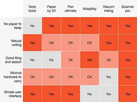
A good note taking solution needs to combine a number of things:

  1. No paper to keep
  2. Natural writing interface
  3. Good filing and search
  4. Minimal hardware to carry
  5. A simple user interface

See my highly sophisticated analysis below.

The new option is a smartphone-based scanner. Scanner Pro is a brilliant app. It takes photos, and lets you easily crop the image. You can keep the image as a photograph or flatten it to bold, fax black and white. Then upload the scan to Dropbox or Google Drive where you can store and search things.

So the best note taking might be scribbling on a piece of paper, scanning it, and throwing away the paper.

PS: earlier review of the Inkling, Penultimate,Paper and styli (?) for iPad.

·Colors

Fix the PPT for Mac colour bug

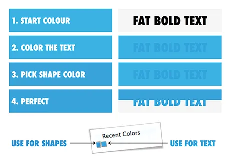
The colour rendering bug in Microsoft PowerPoint 2011 for Mac is highly annoying. Here is fiddly a trick to get around it. You basically need to goal-seek the text colour into something you like.

  1. Pick a colour you like, draw a shape and fill it with the colour
  2. Write some text in a big bold font and set it to the same colour: PowerPoint will render it incorrectly
  3. Here is the fiddly part: repeat steps 1-3 until you are happy with the TEXT COLOUR.
  4. Now, use the Apple colour picker to strip the colour of the text

Save your colour template with 1 accent colour for text, and one accent colour for shapes. In your drop down menu they will look different, on screen they will look the same.

Note 1: I tested the PowerPoint RGB colours as well in Photoshop and Illustrator, and it turns out that PowerPoint renders the shape colours incorrectly, the text is correct.

Note 2: There is a more analytical way to get your desired colour than simply trial and error. You can analyse the RGB codes of the background colour and the text colour. So, set the shape colour to something that you would like. Write down the RGB codes. Colour the text with that colour, and pick its colour with the colour picker. Write down the text RGB codes. Analyse the difference between the two colours and create a third colour by adding/subtracting the R, G, and B differences between the colours. This will be your text colour that renders the same as the desired shape colour. It all sounds more complicated than it is.

Continue reading →
·Keynote

Document standards

Here is an article from the Guardian, discussing how the UK government is thinking of getting rid of Microsoft Office in favour of open source software. The arguments 1) cost saving, 2) making it easier to share documents.

The article highlights an inevitable trend: the reduced importance of Microsoft Office as the standard for enterprise document creation. But I do not think that some open piece of software will replace Microsoft Office. Unfortunately, we will see increased fragmentation of document creation apps that - I think - will convert their output to PDF files for reading on any computing platform (including mobile phones).

I think that the majority of senior managers at the moment use PowerPoint to view presentations that subordinates send to them, but very few actually edit them themselves.

·Colors

PPT 2011 for Mac color bug

Microsoft PowerPoint 2011 for Mac has an annoying bug: when you apply a colour to a font, it comes out slightly differently than when you apply the exact same colour to a shape. One: it looks bad on slides, two: it gives surprises when you open a PowerPoint file created on a Mac on a Windows machine (which does not have the same issue).

When I posted about this somewhere on a Microsoft forum I got the response that this was done on purpose; to make text readable against a coloured background. This does not make sense, if I want to make the text readable, I will put in a different colour myself, and definitely not the one that Microsoft is using. See below, the letter colour is a completely different type of blue than the background.

(Geek alert). There is a complicated way to get around it. Type some text, change it to the desired colour. Now select the desired text (not the entire sentence) and bold it: the right colour appears… But, as soon as you do anything else to your text box, the wrong colour gets put in. Annoying…

·Delivery

Minority report screen

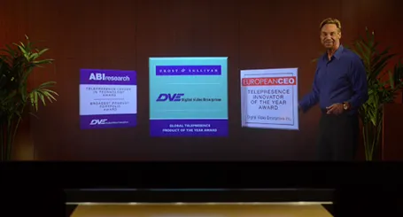
See this presentation screen by DVE Telepresence (auto-play alert), it allows you to move PowerPoint slide objects in the style of the film Minority Report. What do you think? I am afraid that more sophisticated screen technology will not turn humans into better story tellers.

What would be useful though is to have a technology that allows you to write on a transparent whiteboard in front of an audience where technology takes care of mirroring your writing, so it becomes readable by both you and the audience.

Secondly, having a camera hidden inside a screen is great for creating natural eye contact.

·Data visualization

Software needs design as well

I see many enterprise software application dashboards that look worse than the worst PowerPoint slides. My clients begin to ask me to give my input on them as well.

  • People have not thought about what information is important, and what is not
  • People have not thought about how to present the information: numbers are not rounded, column, bar, and pie charts are thrown in at random, colours are picked randomly

Consumer applications have gone through a big design revolution over the last couple of years, now is the turn for enterprise software.

·PowerPoint

Hidden megabytes

PowerPoint files can be very large, especially if you use high resolution images, or even videos. In the near future, all of us will have moved to a cloud-based storage solution, where we no longer email actual documents to each other, just a link. In the mean time, we need to try to keep our PowerPoint files below 10MB, the email architecture limit that was invented in the 1990s.

In the format pictures menu of PowerPoint is an option to compress images to save space, I usually go down to 150DPI. After compressing, always check what happened to the images in your presentation, the compression tool can do funny things (ruffle transparency borders, undo re-colouring, etc.)

If your files are still big after compression, or even when you do not use any images at all, have a look in the slide master (view, slide master view). There might be templates for title pages and/or separators there with full-size images. These get saved with the entire presentation. You can delete the template slides if you do not need them.