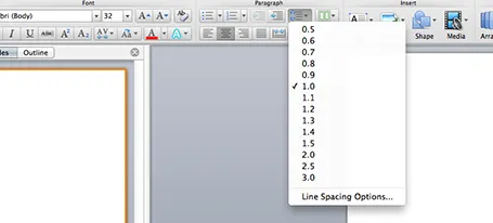
One of the typography elements I play with all the time is leading, the space between 2 lines of text. PowerPoint sets the leading standard to 1.0, or 100% of the typeface size. What leading looks good depends on:
- The typeface you use
- All caps, sentence caps or lower case
- And most importantly: the size of the font, bigger fonts need less leading
There is no general rule here, you need to fiddle and see what looks best. On a Mac, there is a button that controls the leading of your paragraph, see the screenshot below. It is one of the buttons I use most.