SlideMagic Blog

Frequent updates about all things presentations since 2008. Subscribe to never miss a post.

RSS
all posts

Category Software

·Keynote

The green Mac OSX + button

The behaviour of the green + button at the top left of a window is unpredictable. I found out that option-clicking it will maximise the window to the full screen, every time, completely predictable, at last for non-Apple software (Keynote does not play along).

This has probably all to do with Apple’s full screen mode, the two arrows at the top right side of the screen. I use it rarely because this feature does not work very well with multiple monitors.

·Keynote

Bunkr presentation design app

The presentation creation and sharing app Bunkr has not appeared on my radar screen until recently. The company raised EUR 1m in a recent fund raising round. In the not too distant future, I am becoming a player in the market myself, so I am watching developments with interest.

I clicked around a little bit in the application and here is my impression. Things I like:

  • Snappy, fast, clean user interface
  • Nice intelligent rulers to snap your objects against
  • Social technology integration (Disqus comments on slides)
  • Online image search integration (Google images, Flickr), but watch those usage rights
  • Easy sharing and embedding
  • Different objects for titles and paragraphs, not just a text box
  • No bullet point template when you create a new slide

My main comment is, is that all PowerPoint alternatives in the market, still stick with the same fundamental approach to slide design and drawing on a computer screen that has been around since the 1980s. And that is the problem I am trying to solve 24/7, and it is not easy…

·Keynote

Confusing Keynote?

Apple is known for making beautiful and easy-to-use software, but I am struggling with the new Keynote, especially with the simple task of colouring shapes, and the text inside them. I always pick the wrong colour box, and need to switch a number of different menus to complete very basic actions.

From a UI design perspective the user interface looks perfectly clean and organised. For power-editing at very high speed, it breaks down. This is the reason that the QWERTY keyboard was invented: the logical thing would have been to make ABCDEF keyboards, at high speed though they are less efficient.

Maybe it is me or is it that “the emperor has no clothes”? I got used to working in a certain way? I am in my mid-40s and my ability to learn new UIs slows down? I am not a typical Keynote user and it works perfectly fine for everyone else?

·Gadgets

Adobe Voice

Adobe launched a new iPad app, Adobe Voice, that enables you to create narrated story videos. There are many apps that help you build animated videos, but this is one of the best I have seen.

  • It is incredibly simple to use (unlike most of Adobe software), with a beautiful user interface that breaks the conventional approach to video editing
  • It comes with dozens of pre-set story lines: tell what happened, follow a hero’s journey, share a growth moment, promote an idea, etc. Once a story line has been selected, the app prompts the user on each slide with a question to answer (why did the hero set out on his journey?).
  • After recording the audio, you can add images, icons, or text
  • The app comes with a large library of background templates and sounds.

There is an 80/20 rule here, in 20% of the time, you get your video 80% right. Still if you want to get to 100% perfection (something that you are confident to share professionally), you need to get put in the other 80% of the effort. Prepare your visuals and images, and prepare your script.

It is cute that this app was developed for iPad, but for professional use Adobe should create a browser version as well for desktop. It can have the exact UI (except for resizing of images etc.). It is a bit tricky to extract your creation out of your iPad at the moment, and usually people do not have their image databanks stored on iPad.

Continue reading →
·Data visualization

Monthly reports in PPT

Many technology providers need to write some sort of monthly report with statistics for their clients. The bare output from their applications is too rough and does not contain conclusions, insights, follow-up actions and quantified $$$ savings.

So writing this report is a manual process: data gets uploaded into Excel, analysed, put in graphs in then all of this is put into: Microsoft Word.

Microsoft Word (or any word processor) is not a good tool for creating data reports. It does not have the page layout capabilities of Adobe Illustrator (have you ever tried to move a picture or graph around and see the surrounding text move in unpredictable ways?), and it does not have the graph editing capabilities of Excel.

The solution: create you monthly reports in PowerPoint: managing images and data graphs is much easier. And now that you have left word processing territory, why not cut the amount of blah blah text and force yourself to get to the point with fewer words. If people do not feel like reading long, dense presentations, do you think they have the energy to digest dozens of monthly report prose?

First, the type writer left the enterprise world, and now it is the time to say goodbye to the word processor and leave it to authors of books.


·PowerPoint

Microsoft Office Mix

Microsoft is working to add interactive features to PowerPoint presentations: real-time hand writing, audio/video of the presenter for off line viewing, analytics (who looked at what slide for how long), etc. A more elaborate description here on ZD Net. At the moment, Mix is just an add-in, but it could be a preview of what directions Microsoft will be taking future versions of PowerPoint.

Microsoft has opened Mix for preview, but it requires PowerPoint 2013 (i.e., does not work on a Mac).

My hunch is that the world needs simpler presentation software (working on it), not more complicated, but I am open to be convinced of the opposite.

·Delivery

Zooming without Prezi

If you save your PowerPoint or Keynote file as a PDF and use an iPad with a PDF viewer to project your presentation, you can pinch and zoom into slides without sophisticated slide design techniques or special tools such as Prezi.

PowerPoint for iPad does not support it (yet).

·Keynote

PowerPoint for iPad review

Yesterday, Microsoft finally released a full version of Office for iPad, including PowerPoint. Unlike a previous release for iPhone, this version allows you to create and edit documents.

I blogged before about the strategic mistake of Microsoft restricting its Office products for its own operating systems, and I think the recent change in CEO might have something to do with the sudden release of the iPad app which was rumoured to have been ready for a long time.

So what do I think? First of all, the design looks great. It is a good blend of the iOS environment with Microsoft-specific UI elements (ribbon). The app works fast/snappy and is intuitive to use.

The best thing is that finally PowerPoint will look normal when opening them on an iPad. Fonts work, no need for PDF-ing, or using specific apps such as SlideShark. This takes an important uncertainty out of business meetings. I had many instances where I needed to pull out a deck quickly and unexpectedly, and if an iPad is the only devices you have on you, you keep on apologising for the horrible look of your slides.

And I think this will be the main use of PowerPoint for iPad: showing presentations plus the occasional last minute text edit, or slide show re-order. Serious slide design work is not possible, first of all due to the small screen that is not comfortable to work on for a long time, and secondly because critical functions are missing when compared to the desktop app.

Continue reading →
·PowerPoint

PowerPoint for iPad - app store link

PowerPoint for iPad is out, find it here in the app store.

·PowerPoint

PPT for Mac colour bug workaround

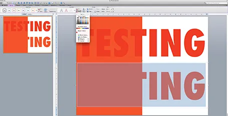
Microsoft PowerPoint 2011 for Mac renders colours of shapes and text differently, it has given me many headaches and inspired many blog posts over the years. So - finally - here is the simplest fix: create a thin outline in the same colour as the text around your characters, done!

The screen shot below shows how normally text get rendered differently even if you apply the same colour code to it (#!@$#@). Below that, the same text, with the same colour, but now with a tiny outline (same colour) around it. In the small preview window at the right you can see that the text and the shape have the same colour.You can see how I selected the text, and picked the line option from the format ribbon to do it.

Microsoft, please acknowledge this as a bug and not a feature (which you suggested in the past) and fix it in the next Office 2011 patch.