Making a transparent cube in PowerPoint
There is a 3D cube shape in PowerPoint, here is how you can make it transparent. The secret: rotate a copy of itself and paste them over each other.
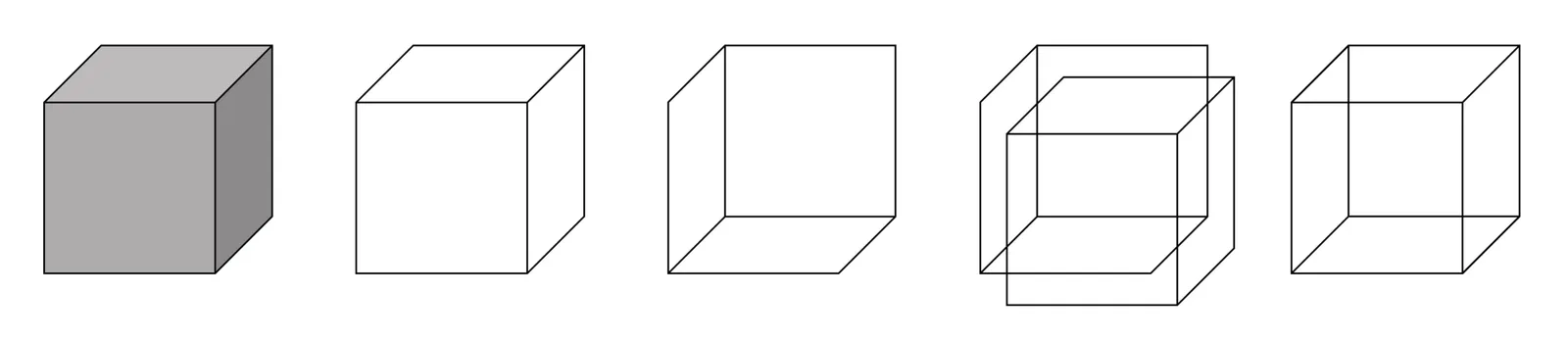
Image via WikiPedia


Frequent updates about all things presentations since 2008. Subscribe to never miss a post.
There is a 3D cube shape in PowerPoint, here is how you can make it transparent. The secret: rotate a copy of itself and paste them over each other.
Image via WikiPedia
Super high resolution images of small slide elements can inflate the size of your PowerPoint or Keynote file without you noticing. A common culprit is an innocent looking page with 30 customer logos. Compress your images often to keep file sizes in check.
Another common file size mistake is to include high resolution images in the slide master to make it easer for people to understand template slides that are meant for photos. As a result, even a simple text slide will create a huge file as the slide master gets saved as an integral part of the document. This can add up in a company with 10,000 employees.
Image compression in PowerPoint can sometimes produce unpredictable results, especially when you tick “apply to all” and you have a presentation with a lot of photographs. I often see cropped images going haywire, the only rescue is to compress images one by one. Always save a copy of your file before attempting to compress the file.
Handy link: how to reduce file sizes in Office
Image via WikiPedia
Recently, a client insisted on using Google Slides for our presentation design project, especially because of its good collaboration features. Instead of starting a presentation in PowerPoint, then converting it to Google Slides, I took the native approach, and created a presentation from the ground up in this application.
The design of Google’s office user interface has improved a lot over the years. Things look beautiful and work fast and snappy. Still, the Slides product is full of little issues that 1) slows down a pro-user like me, and 2) makes it harder for the layman designer to make good looking documents.
Because I invested my own hard-earned money in my presentation app SlideMagic, I feel a bit hesitant here to spoon feed a ready made upgrade suggestion list to a multi-billion dollar software developer with the world’s smartest programmers ready to implement them…
In 2017 - leaving minimalist SlideMagic aside - I think PowerPoint is again/still the best slide design software out there (also on Mac), better than Google, better than Apple Keynote. The main criterium here is not feature set, but workflow.
There have been many of these types of posts on my blog over the past 9 years, and I am sure there are many more to come as products continue to evolve.
Making a grid of images in PowerPoint is tricky. Images never have a consistent aspect ratio, and when you place a lot of them on a page, the guide suggestions always snap in the wrong place somehow. Here is a survival guide.
The above was a major consideration when designing the image grid system in my presentation app SlideMagic.
Everyday I see clients squinting at tiny slide images on their screens. No, you can’t do anything about the physical size of your screen, but you can fix the window arrangement.
The most obvious adjustment is to make the PowerPoint or Keynote application as large as possible. But the aspect ratio of slides and its implications is often overlooked.
If you design 16:9 slides the width of your screen is the bottleneck, minimize menu bars on the left and right of your slide (format panels, slide icons). If you design 4:3 slides the height of your screen is often the bottleneck, minimize slide notes boxes.
Image via WikiPedia
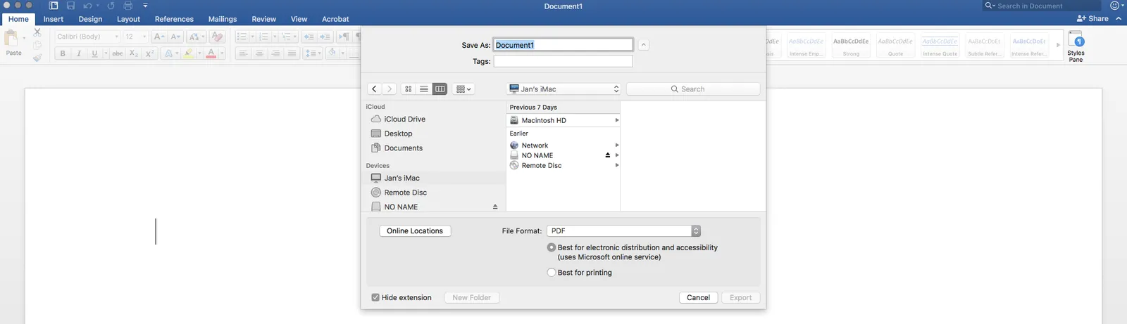
In a recent update of Microsoft Word (Mac version 2016), a new option has been snuck in when saving DOCX document as PDFs: “best for electronic distribution”. and it is the default choice. This will probably produce documents that are smaller, but it comes at a price: custom fonts are not embedded correctly. Pay attention which option you pick and do check the PDF document before sending it to see if all font renderings worked out correctly
Here are some slide make over suggestions for messy PowerPoint presentations that do not require any changes to content. They fix basic graphical hygiene:
That was presentation make-over V0.1, the content might be bad, the layouts could be poor, but it will look organized.
If you have been working in my presentation app SlideMagic, you will have noticed that is almost impossible to make the mistakes I am correcting in the above.
Be careful with sending PowerPoint presentations that could have left overs of confidential information hidden inside that you do not want outsiders to see:
It is best to share your presentation as a PDF file, but even then watch out with information that becomes visible when hovering over with your mouse (data points, file names of images, etc.)
Image via WikiPedia
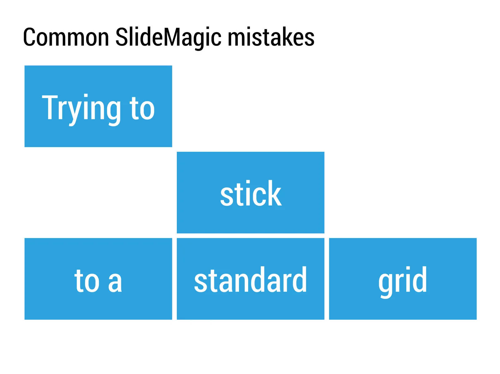
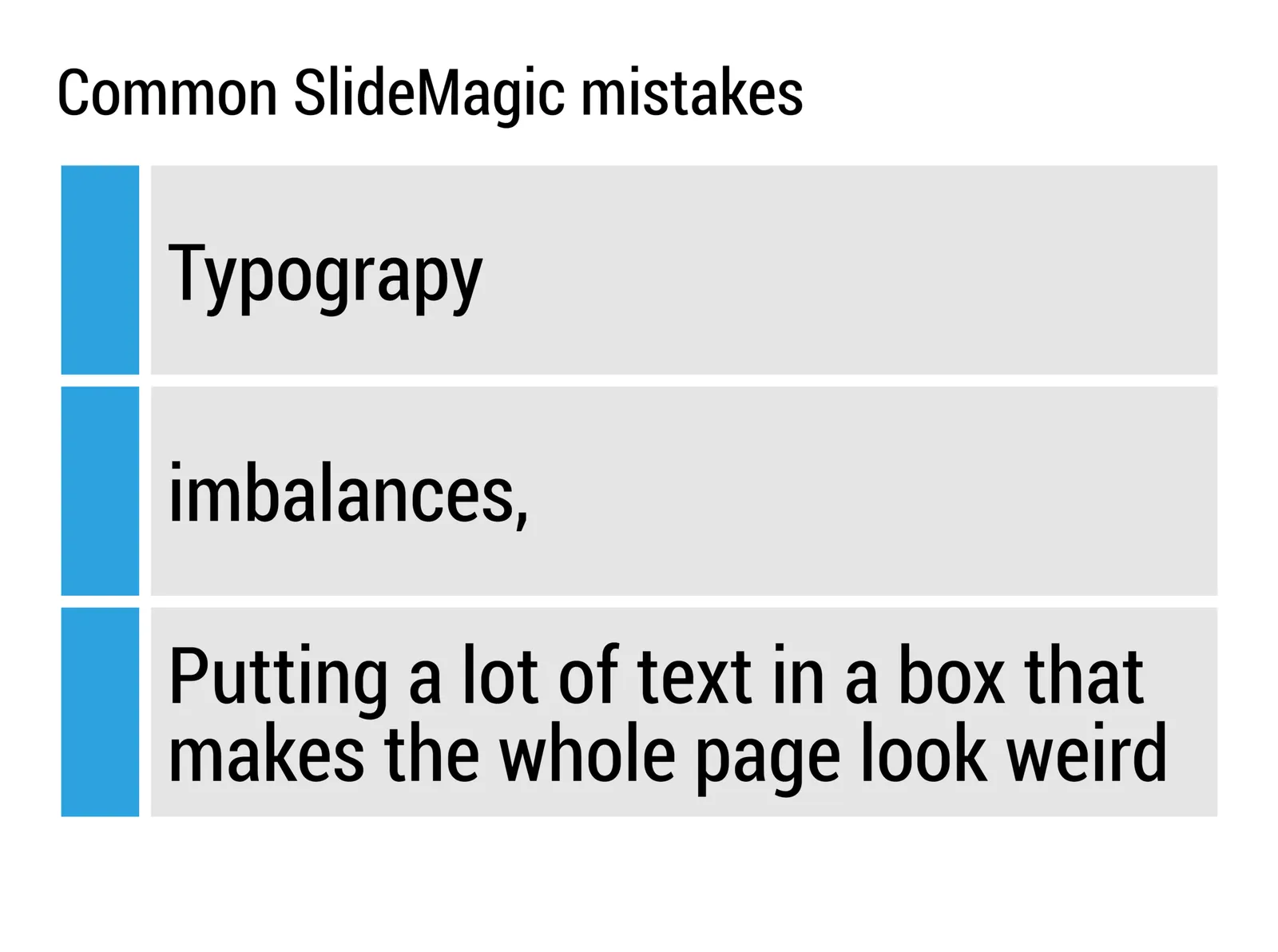
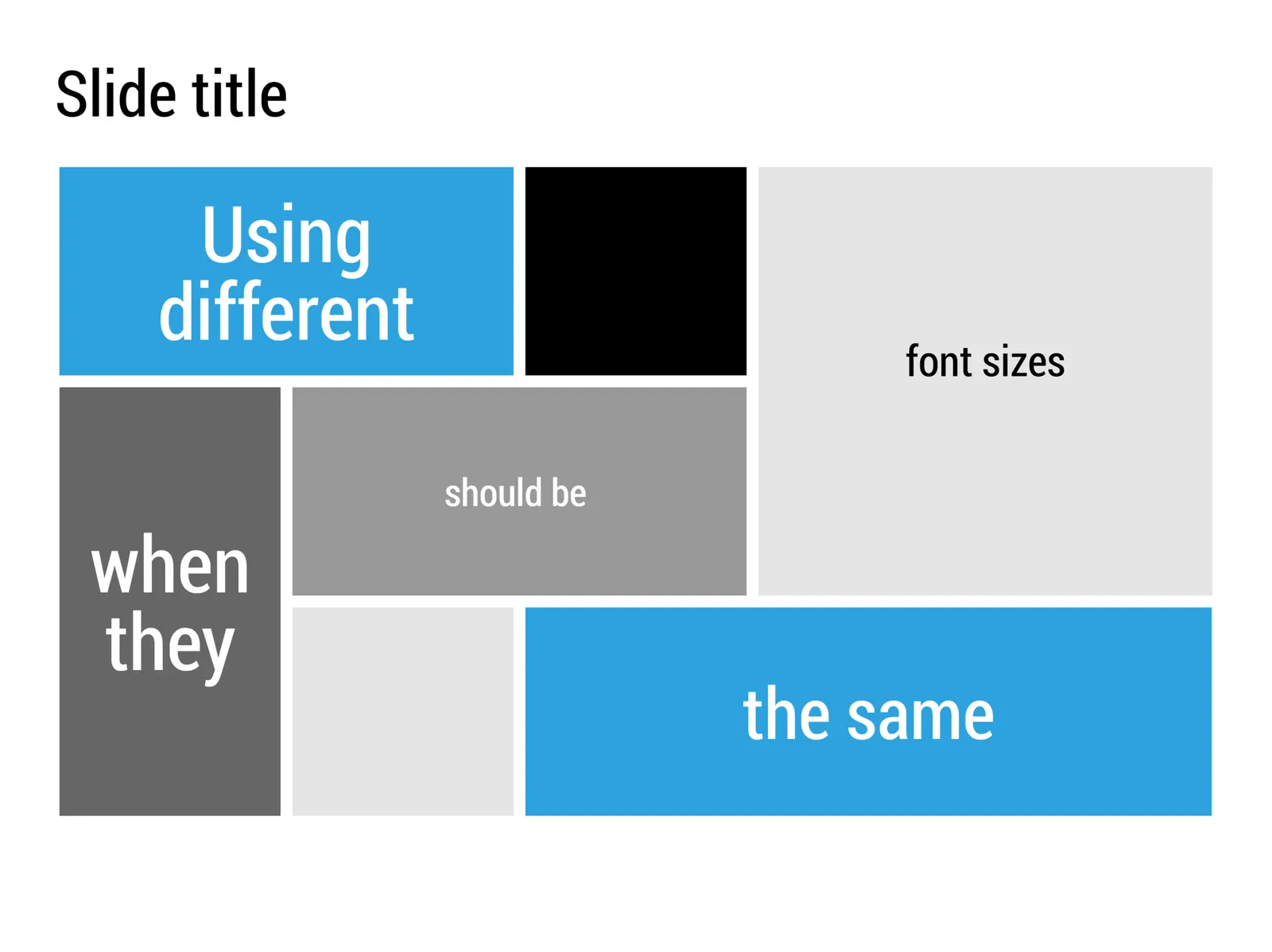
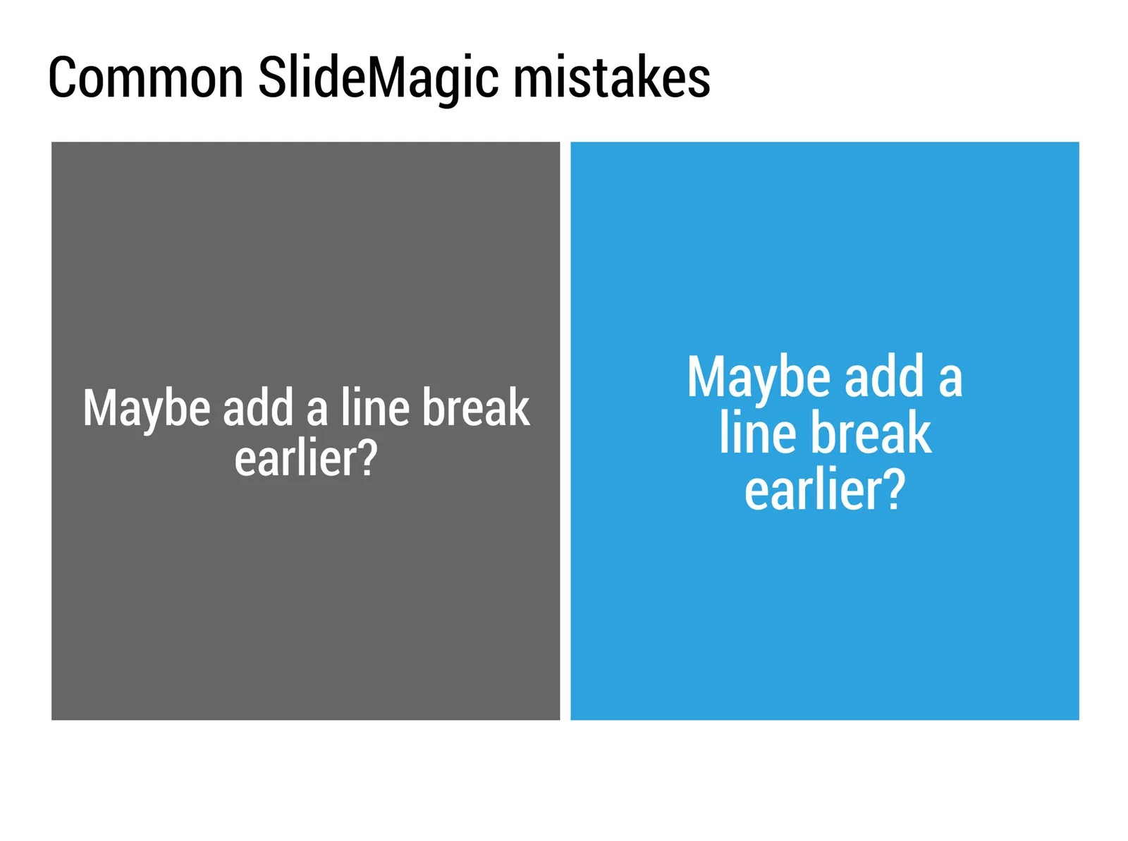
My presentation app SlideMagic will make life easier for every amateur designer. Still a few common mistakes sneak in that are hard to prevent with software. Most of them are related to the balance of typography on a page. Making sure that boxes contain roughly the same amount of text, and that signs are nicely balanced. See the examples below.
There are endless types of data charts out there: lines, bars, scatters, pies. Which one to pick depends on the type of data you have, and what message you want to convey. Here is a new handy tool that can make life easier for you: chart chooser.
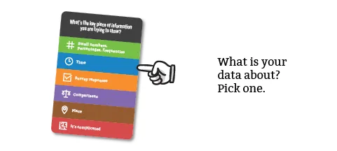
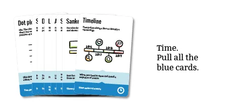
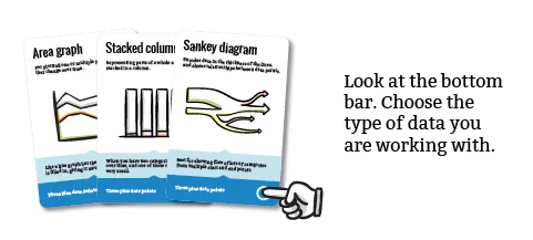
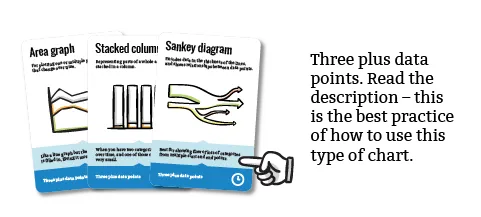
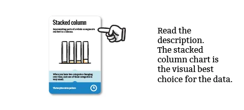
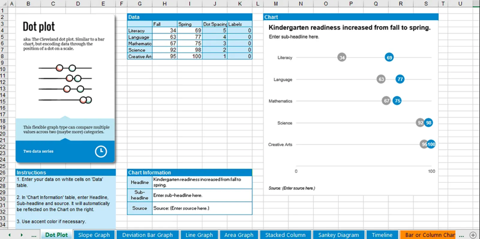
A box of handy cards that guide you step-by-step through a selection process. Excel templates are an optional add-on that could be useful, some of these diagrams are tricky to recreate.