SlideMagic Blog

Frequent updates about all things presentations since 2008. Subscribe to never miss a post.

RSS
all posts

Category Software

·Software

Struggling with Apple Keynote

I am currently doing a bespoke presentation design project for a client in Apple Keynote rather than my usual PowerPoint. Overall, Keynote is a great piece of software, but as a power user I seem to be hitting its limitations. Not in terms of features, but in terms of workflow.

In PowerPoint, I have developed a pretty rapid process to turn scribbled chart concepts in decent looking slides. (Confirmed by the occasional client who can look over my shoulder while I do some last minute edits close to a deadline). It is the simple things that you need quick access to: changing colors, resizing objects, aligning things.

In Keynote I am “tearing my hear out” to do a few things. I know this blog is read by many presentation design gurus, so maybe one of you can point me out what I am doing wrong.

  • Getting a shape color fill. I keep on clicking the rainbow circle, but it is not always clear whether it is active or not, and if it is, whether you are working on a font color, shape color, or outline color. The same with making things semitransparent: shape, text, line, or everything combined.
  • I can’t distort the aspect ratio of grouped items when scaling up or down. This is great for images, but not handy when you want to scale up an object composition to fit an entire slide exactly
  • When you select multiple items, you can’t scale up or down all of them together
  • You select items by “touching” them, not by including them in the entire selection box. As a result, you always hit objects such as the slide title by accident in your selection
  • I have not found a way to space out part of the columns or rows in a table evenly
  • For some reason, I cannot change the color of the left marker in a gradient. My solution is to put another marker on top of it. Again, this leads to frustrated clicking on the “fill” box.
  • In the full button, there is a nice arrow that activates a drop down menu with suggested colors, there is no way I can set these to some alternative color pattern.
Continue reading →
·SlideMagic

Smart row / column insertion

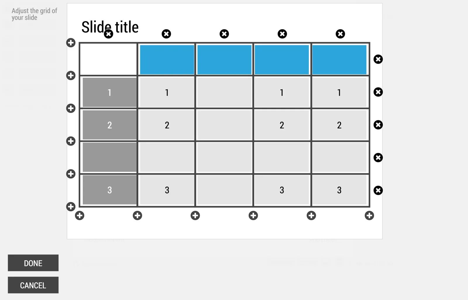
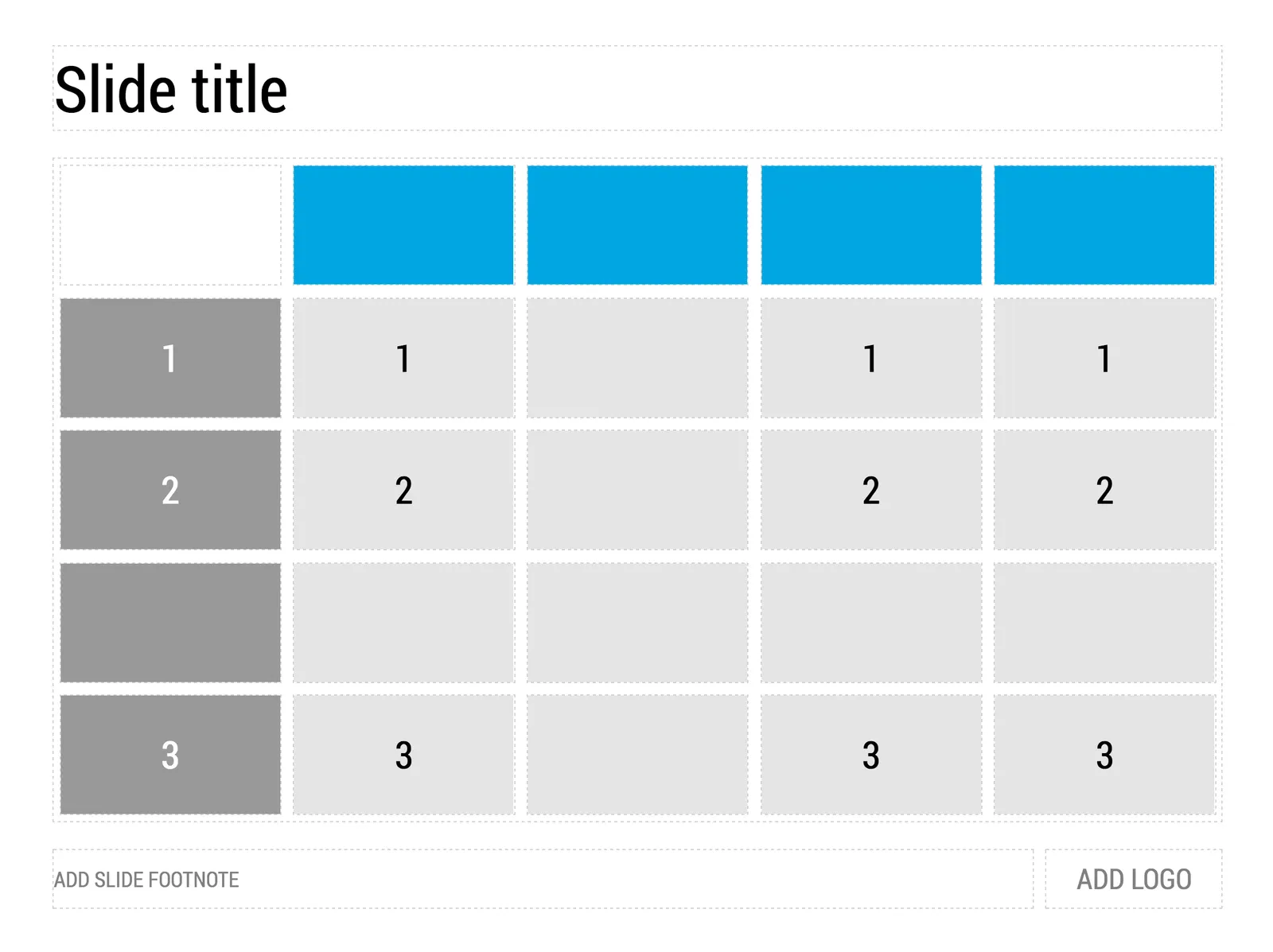
My presentation app SlideMagic is all about the grid. We have made some improvements to make the workflow (even) faster. Now, when you insert rows and or columns, it copies its design and structure from its neighbors. This will save you a lot of time in more complicated table layout with different background colors.

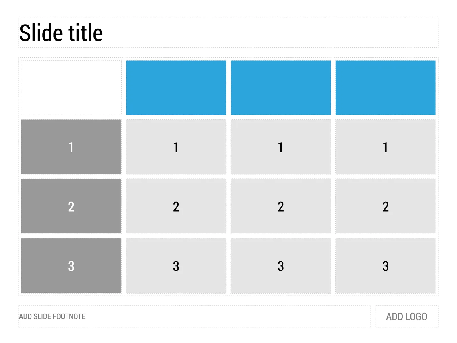
 1) Our starting point

1) Our starting point

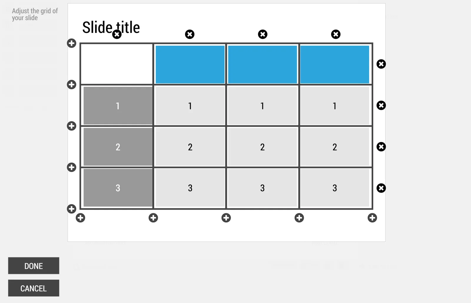
 2) Open the grid editor

2) Open the grid editor

 3) Add a row and a column

3) Add a row and a column

 4) The result

4) The result

Image via WikiPedia

·Software

One software, many uses

PowerPoint is used for many things in today’s corporations:

  • Quickly write documents for internal use
  • Maintain the competitor intelligence database
  • A tool to draw the system architecture diagram
  • Organize your thoughts, make a work plan
  • Brainstorm ideas live in a group
  • Logo / design concept prototype
  • A UI spec (that’s how I used for SlideMagic)
  • Big stand up presentation to outsiders - big audience
  • Big stand up presentation to insiders - big audience
  • Big stand up presentation to outsiders - conference room
  • Big stand up presentation to insiders - conference room
  • One-on-one “coffee chat”
  • Document for reading for outsiders
  • Document for reading for insider

To name a few. We get problems when we confuse the application and the target audience. A project status update on the overhead of the big annual industry conference, pretty pictures without explanations when you want your budget approved by the CEO.

·Software

How to brief a presentation template designer

The traditional approach is to hand the designer a blank slide and say “we need a fresh PowerPoint template”. You will get a slide back full of supporting graphics, logos, page numbers which shows that the designer added some value.

Here is the better approach: give an actual slide with content and ask her to improve that, including the template. The likely result is a well-designed slide. Now delete all the content and see what you are left with. It is likely to be an empty page… Here is your new PowerPoint template.

Oh, and the most important part of the template design project is not the template (i.e, the blank page). It is to make sure that the standard colors and fonts are programmed correctly. That’s a programmer’s job, not a designer’s job.

In my presentation design app SlideMagic, things are easier. Upload your logo, use the color picker to select your accent color based on the logo, and you are all set.

Image by john.schultz on Flickr

·Software

Searching slide libraries: Bitlasso Reveal

Most people amass a huge library of PowerPoint and Keynote slides on their computers. File search as a tool to find presentations is collapsing under the load, and searching for a specific slide inside a presentation is impossible. Most people are now using their email program as a document archive (“where is that deck I sent Sally last week?”).

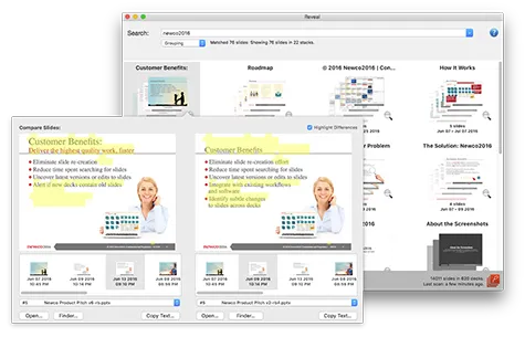
BitLasso’s Reveal is a new program that aims to solve this issue. After installation it builds a database of all your slides and makes them searchable by keywords. The first try is very impressive, you use a specific topic that you still remember from a long time ago, and pop: there are the slides!

Slides are grouped together if they are similar (with yellow highlighting the differences), you can group them by date, by title. It all works brilliantly.

As a graphic design nitpicker, I noticed that fonts are not rendered correctly. But, remember this is a search tool, not a presentation application.

For the average user, this tool works great. For me, a professional presentation designer who has an incredibly large slide library with presentation for many, many, clients there is still a problem. Common business search terms will return so many slides that it is still hard to find the one you need. This is not a problem of the software though, more a result of my profession.

One suggestion could be to allow the search results to be grouped by some sort of directory, or limit the search inside a specific directory, since most users will have a basic level of organization by project on their hard drive to focus the search.

Continue reading →
·Software

Status reports in PPT

This Tweet caught my attention:

Yes “status reports” are a distinct category of presentations. Some sort of weekly, monthly, quarterly updates, that follow more or less the same template. A lot of time is spent (wasted) on creating these. In the short run, you can do a lot with workflow automation. For example create the entire presentation in Excel, which has the same drawing and charting capabilities that PowerPoint has. And yes in the end, SAAS dashboards might replace them all together, if, and that is a big if, the dashboard is designed well.

The “other” type of presentation, the one in which you pitch an idea, a budget, an investment, is here to stay. Each story is different, each pitch is different. Still, people spend too much time on PowerPoint to create them (hopefully my presentation design app SlideMagic will change that), but the creative process will not be automated anytime soon.

Image from Wikipedia

·Software

Two new screen interfaces

Both Microsoft and Google launched new screen-based devices over the past few days.

The Microsoft Surface Studio is a desktop computer with a very large touch display. It can be used in regular upright mode, or folded down, which turns it into a giant, almost-horizontal tablet. There is a new interface gadget, a cylinder that you put right on the screen.

I think this might be the future of desk-based design interfaces. Portable tablets are too small. Upright touch screens are to cumbersome. This hybrid looks great.

Google introduced the Jamboard, a big touch screen that is meant for white boarding in meetings. The main feature is the collaboration supported by Google software. You can upload, edit, move things, and people not in the room can join the conversation remotely.

The features look impressive, the size of the screen might still be a bit small though to enable really productive group collaboration. Time will tell.

·Software

PowerPoint Designer - first impressions

Microsoft has been adding a number of features to PowerPoint recently. One of them is Designer. In the Design tab of the ribbon, a new button appears on the right “Design Ideas”. Clicking it generates alternative layouts of your slides on the right side of your screen.

The layouts are pretty nice. Microsoft has “automated” the design of 2 types of slides:

  • Image collages, multiple photos get put in different suggested grids, with place for a title
  • Process bullet points that can be translated to horizontally spaced out sequences of equally sized shapes.

Both are useful. Layman designers usually have no idea how to crop a nice photo collage, and translating that bullet list into a horizontal sequence looks nice, especially on wide 16:9 screen.

But here comes the but.

  • The algorithm only works on these types of slides, so layman presentations will look inconsistent as same slides cannot be improved by the algorithm
  • And in case of the bullet transformation, PowerPoint needs to analyze the text with language processing, to decide that you are describing some kind of process. I had a hard time to trigger the algorithm, and in the end typed the exact same text as was used in Microsoft’s explanation web post.

Microsoft is on the right path, these suggested layouts look a lot nicer than the SmartArt objects. And, getting layman designers to use some sort of grid is the biggest possible improvement you can create in slide design.

But I think it will take some time before language interpretation will be so sophisticated that PowerPoint understands the meaning of a slide and can pull a suggested layout from its library. That’s one step above asking Siri to book a movie for you.

Continue reading →
·Software

Keynote 7.0 - first impressions

Now that all my data is backed up constantly to the cloud, I have been become more daring when it comes to updating machine operating systems. So, over the weekend I upgraded my client production machine to Sierra, and I could upgrade the iWork applications (I only use Keynote) as well.

Keynote become “7.0”, a big upgrade number. PowerPoint and Keynote are both highly mature pieces of software, they work very well and have not changed that much over the years. The big new features in Keynote 7.0: realtime collaboration and live presentations.

Real time collaboration is the main advantage that web app Google Slides has over desktop applications Keynote and PowerPoint. Earlier, Apple launched an iCloud-based version of Keynote where multiple people could access the same file in a web browser. The problem with this format was that the iCloud version lacked a few crucial features compared to the desk top version. If you started out working in iCloud only, there are no issues. But in most cases, you would group-edit a document online that was originally created on a desktop. I struggled finding certain formatting coloring functions which made it hard to keep slides in consistent look, and missed certain table and data chart manipulation functions online (making it hard to edit existing tables and data charts).

In Keynote 7, collaboration is now done right from the desktop app, all features are supported. During the Apple product announcement (video) it all worked perfectly. I tried things, and it worked less perfectly, but maybe because I was trying to collaborate with myself (trying to edit a test presentation in parallel on my phone). I did not get to invite people via iMessage, the email link worked, but there was a significant delay in syncing of the edits, creating sync conflicts. I assume that Apple being Apple will iron these issues out (and they might not happen in a proper collaboration set up where I am not trying to trick the system in collaborating with myself).

Continue reading →
·SlideMagic

SlideMagic just got more minimalist

We deployed a new version of my presentation app SlideMagic that eliminated the TEMPLATES menus. It makes things even simpler. Templates are now more integrated in the workflow

  • When you click INSERT SLIDE HERE, you get presented with a number of pre-designed layouts in addition to the 3x3 blank grid.
  • In your file browser (the DECKS menu), you have access to a number of featured presentations at the top of the page. These are example presentations designed by me that you can duplicate.
  • In the STORY mode, you can import individual slides or entire presentations (including featured presentations) into your own presentations