SlideMagic Blog

Frequent updates about all things presentations since 2008. Subscribe to never miss a post.

RSS
all posts

Category SlideMagic

·Investor presentation

Makeover of the Buffer pitch deck that landed them $500k

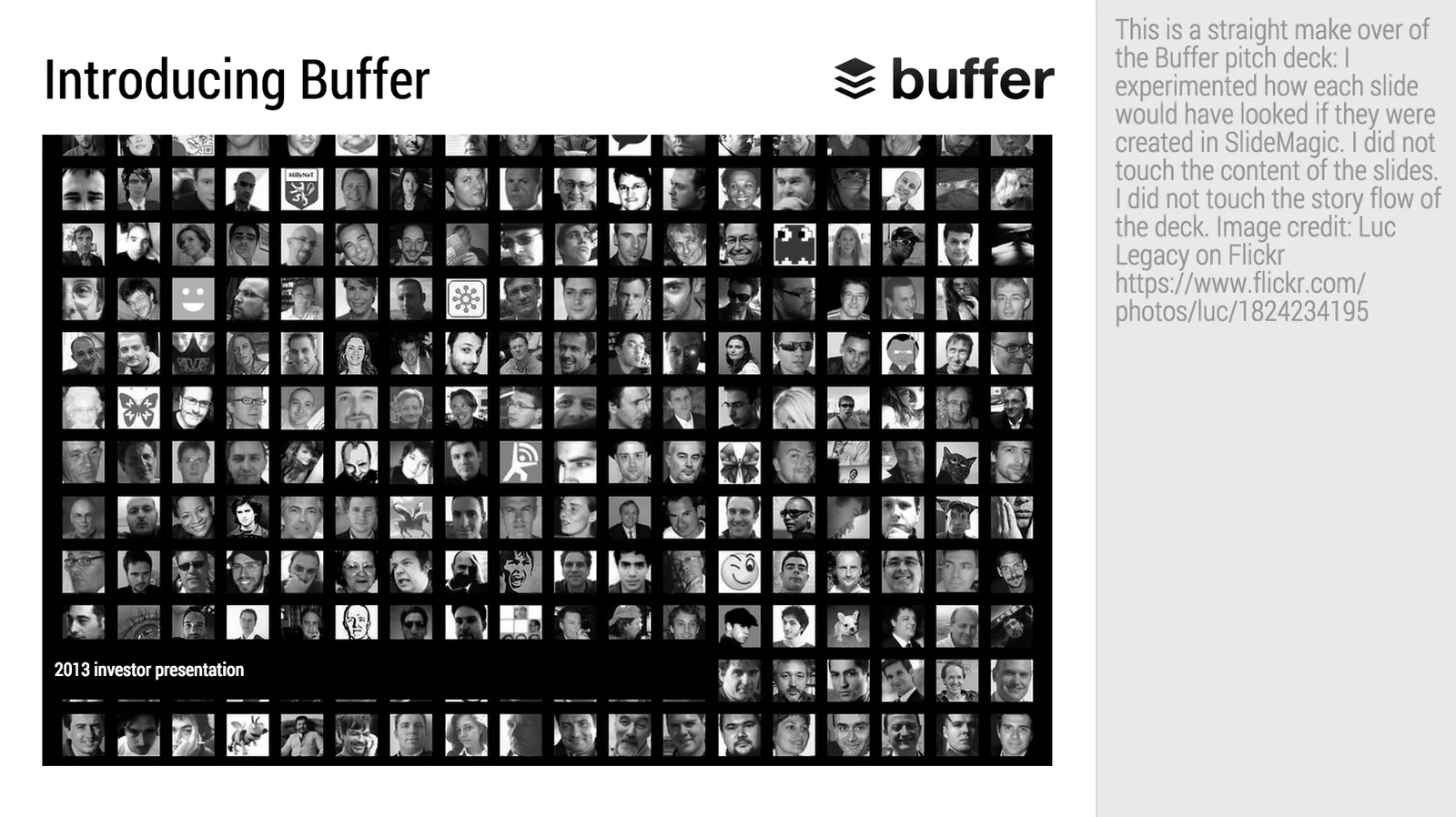
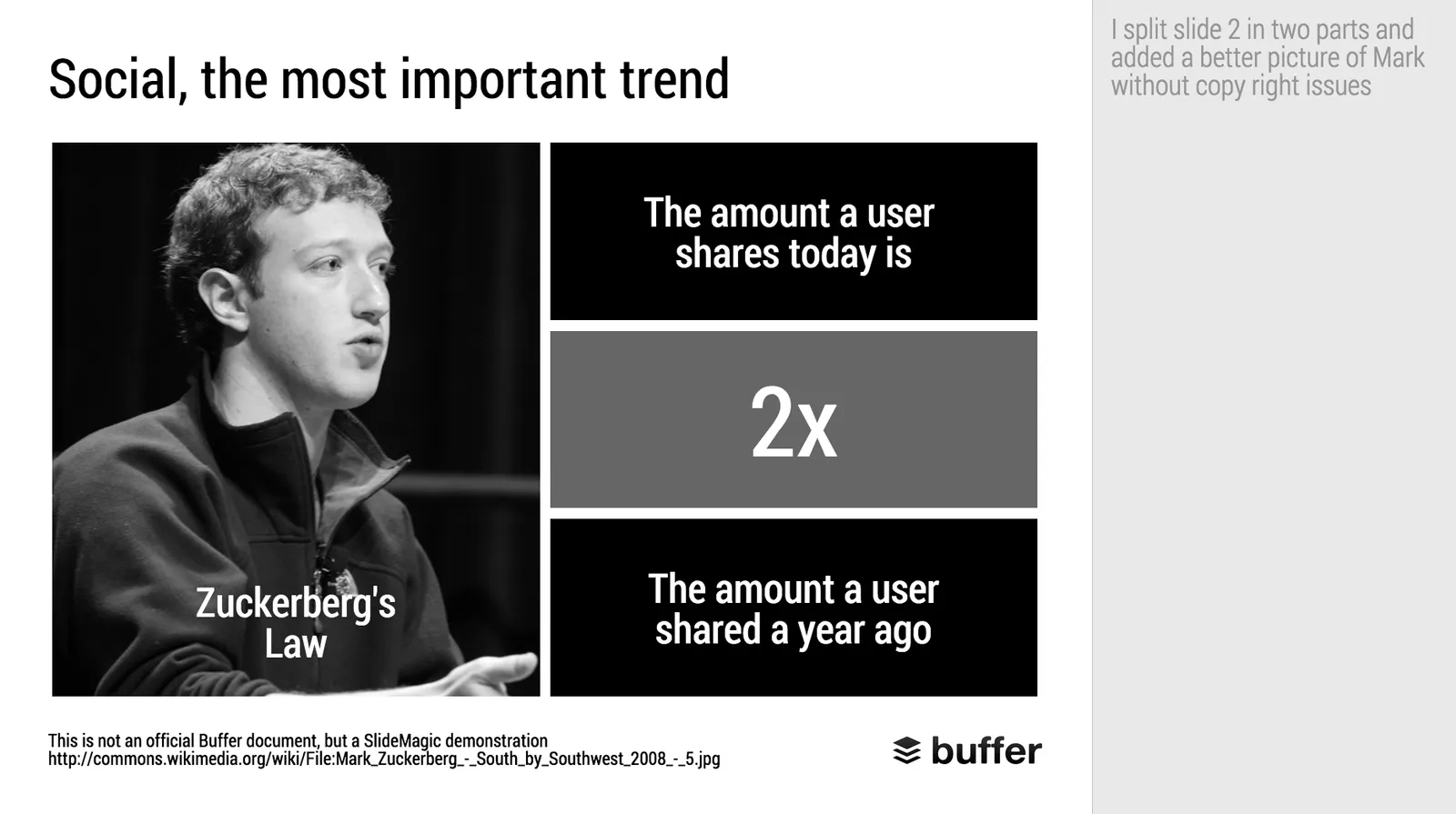
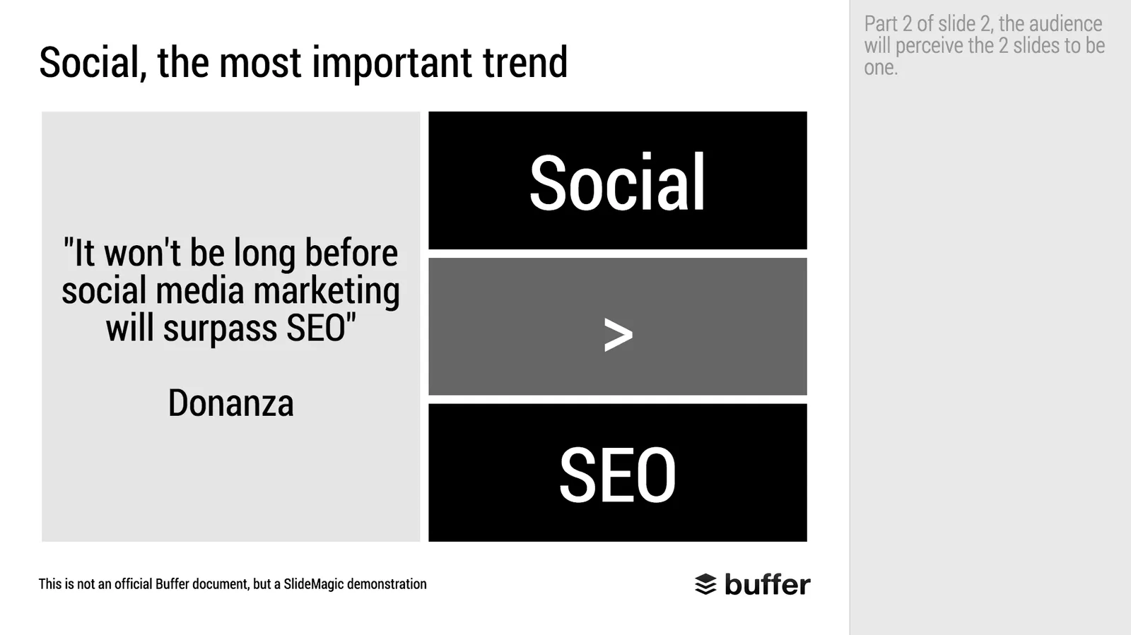
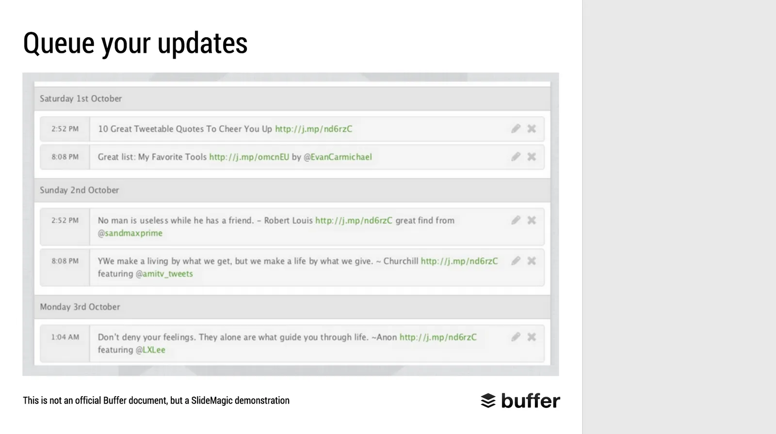
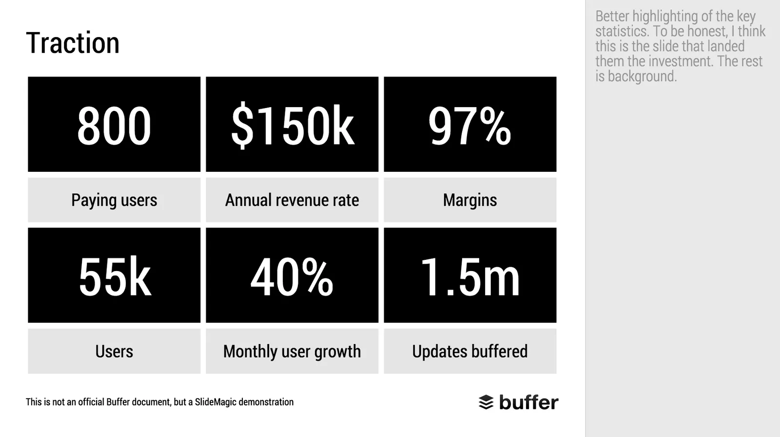
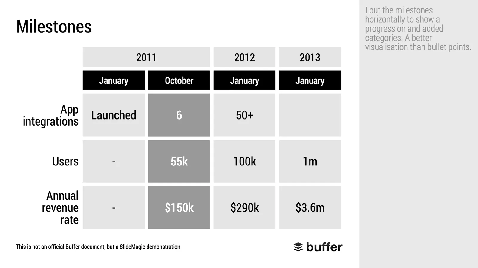
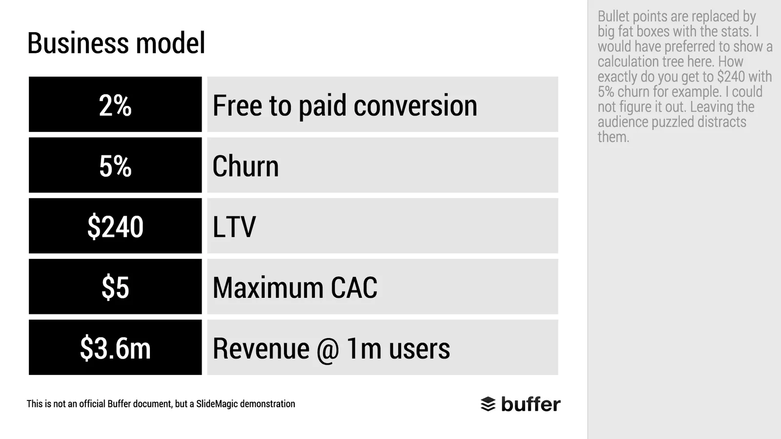
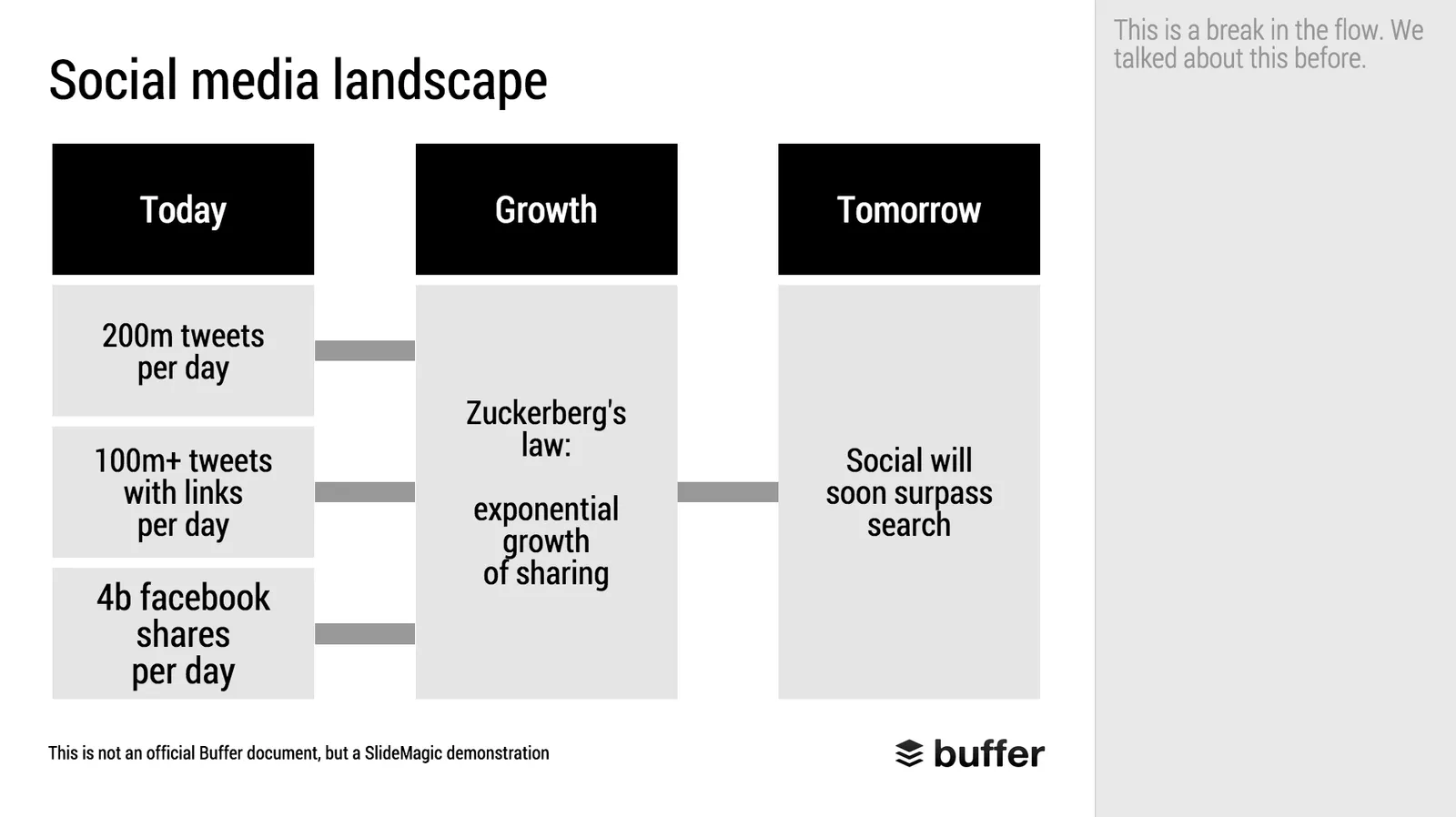
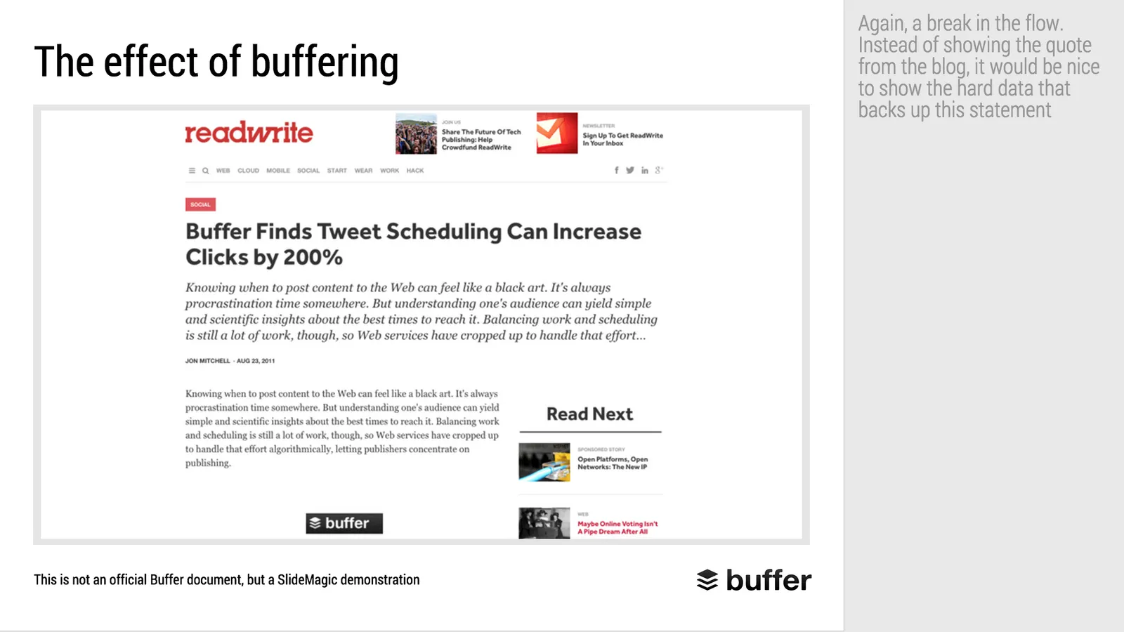
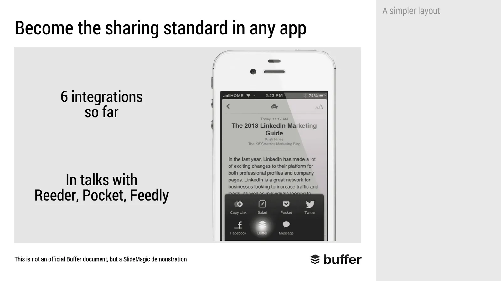
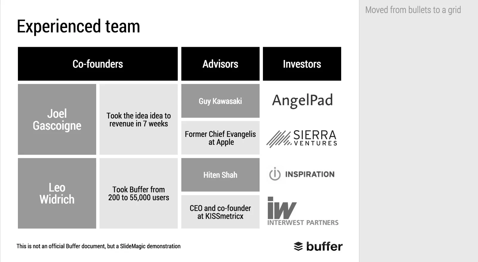
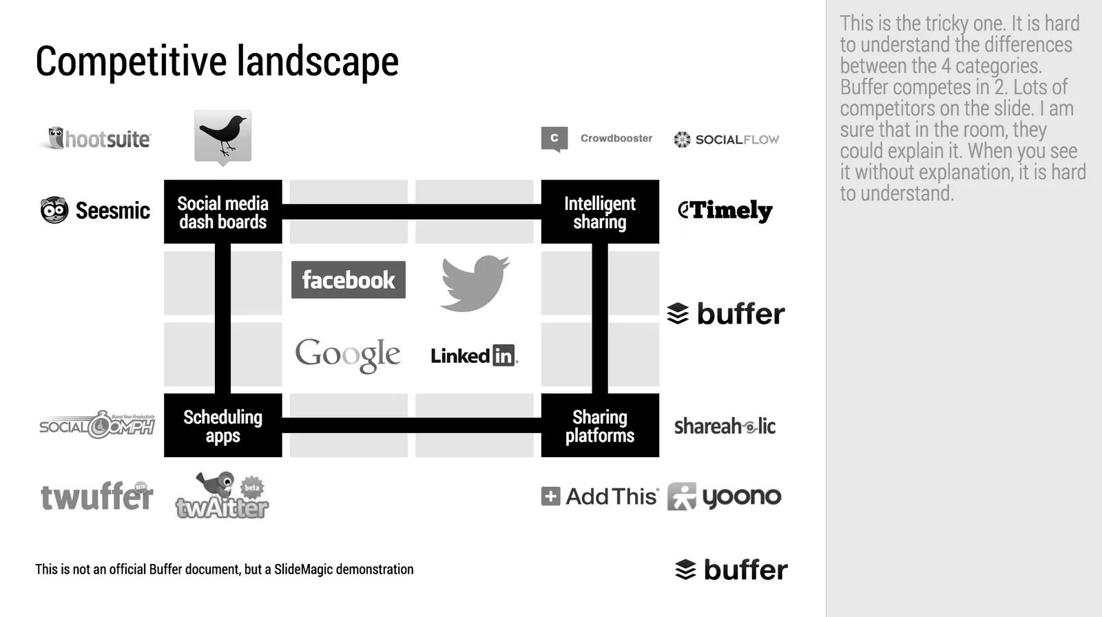
When Googling for examples of VC pitch decks, the on that Buffer used to raise $500k in 2013 ranks high. I decided to give it the SlideMagic treatment: how would the deck have looked when the slides would have been created in SlideMagic.

  • I changed the slide design to fit SlideMagic
  • I did not change the slide content
  • I did not change the story flow

I have a few comments on the slides that I have put in the SlideMagic explanation boxes.

Here is the original:

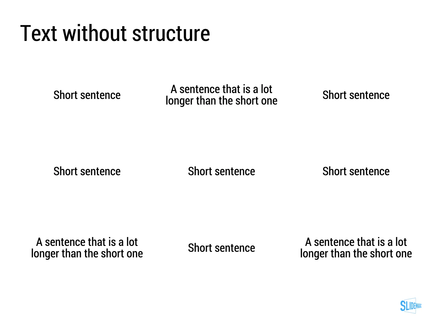
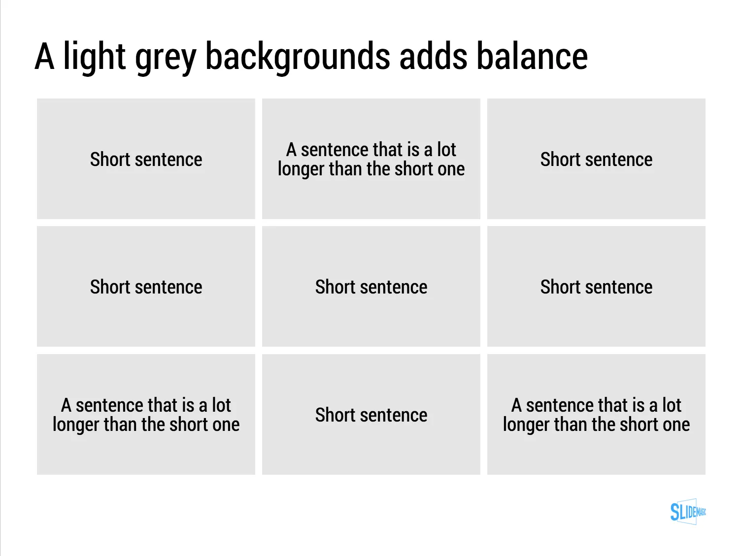
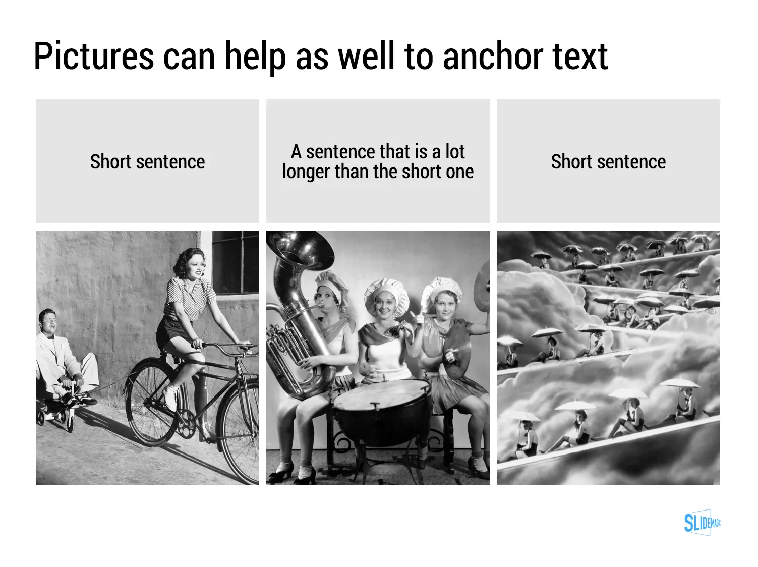
Here is the same deck in SlideMagic. You can clone this presentation to your own SlideMagic account by **clicking this link**and use some of the slide concepts in your own presentations. I have also added this presentation as a template in SlideMagic’s template library.

Art: Johann Zoffany paints a group of Englishmen in Rome for the Grand Tour, united only by their wealth and love of art; unlike most conversation pieces, this was not a commissioned work

·SlideMagic

SlideMagic bugs fixed

Presentation software needs to be absolutely bug free. Unlike a social media mobile app, where you can wait with grazing your news feed for a few hours, the presentation app needs to be ready for that critical 20 minute slot for the all-or-nothing presentation.

That is the reason I am keeping SlideMagic still in beta as I iron out all possible glitches. Here are some we fixed recently. If one of these caused you to stop using the app, give it another try.

  • Fixed: small (but annoying) differences in font size rendering between what you see in PDF and what you see on screen, causing words to drop to the next line when you don’t want them to.
  • Fixed: erratic font size behaviour when rapidly increasing or decreasing font sizes
  • Fixed: enabling multi-edit of cells to manage colours, font sizes of more than one cell in one go.
  • Fixed: no need to leave and re-enter the shape format menu to work on another cell
  • Fixed: Windows/Firefox UI freezes
  • Fixed: story mode drag and drop issues

SlideMagic is moving closer to production stability.

B.t.w, I updated the SlideMagic marketing site yesterday, making the positioning plain and simple: it is easy to make business presentations. Easy, that’s it. Also made the images a bit more daring.

Art: Scène d’été, or Summer Scene, is an oil on canvas painting by Frédéric Bazille, completed in 1869

·SlideMagic

SlideMagic example

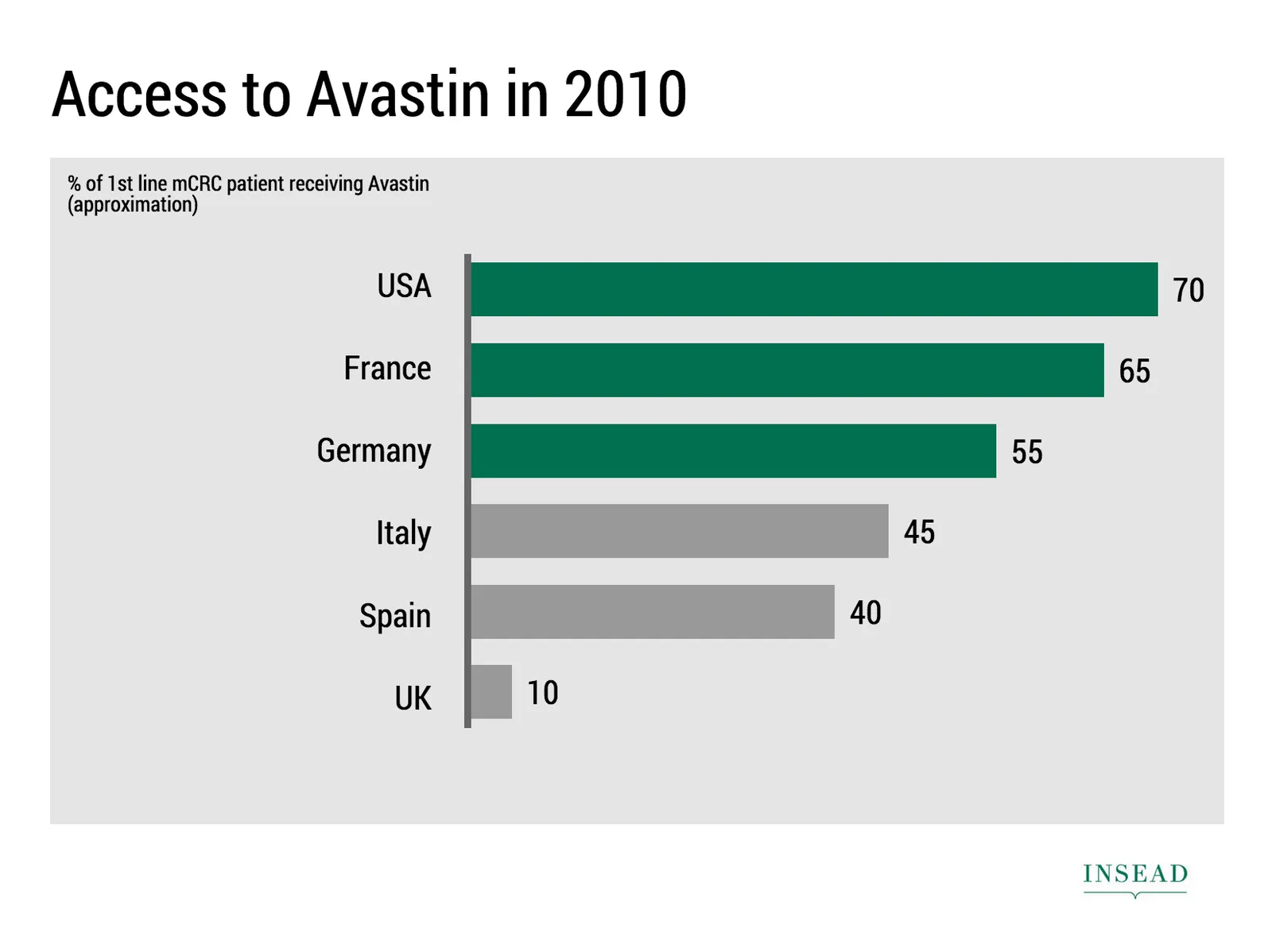
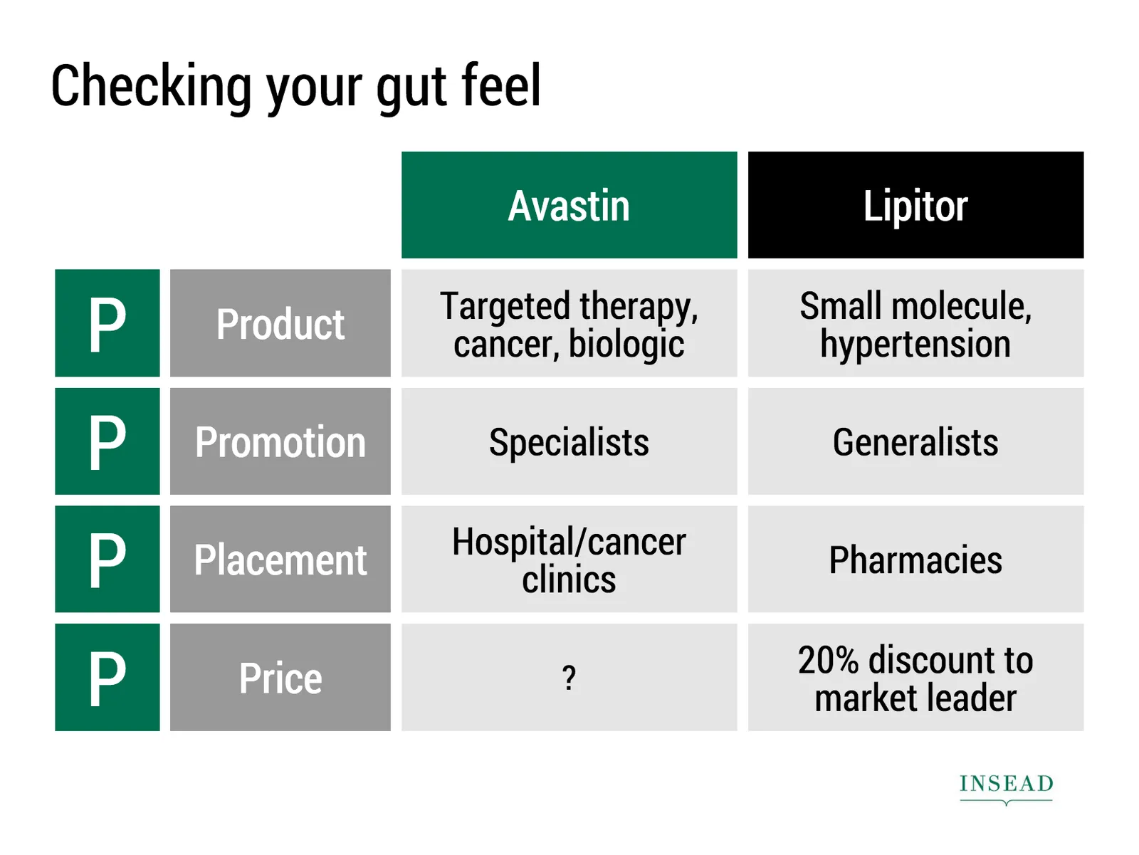
Ramzi Mrad is entrepreneur in residence at INSEAD and used SlideMagic prepare his presentation of business case: how Roche Pharmaceuticals set the price for its Avastin cancer drug in Europe. This type of presentation is exactly how I envisioned SlideMagic being used. Without any professional support, a layman designer can come up with something pretty decent. You can see his presentation here.

Art: Pierre-Denis Martin (1663–1742), Vue du Château de Fontainebleau (1718-1723)

·SlideMagic

Dumbing down

Seth Godin believes that:

I have been thinking about this a lot, since it applies to the core idea behind SlideMagic: making a simpler presentation design tool. Usually, Seth is right, and he urges people not to avoid the inevitable critical feedback.

So, I am a dumbing down PowerPoint? I do not think so. These are two different things:

  1. Get people to adopt a different approach to presentation design
  2. Get people to use a different tool, but continue to follow their current presentation design habits

I try to do 1, and the SlideMagic tool supports the approach.

  • SlideMagic is a new corporate visual presentation language
  • It always looks aesthetically pleasing
  • 90% of your time can be spend on your idea, 10% on jotting it down at a computer

So I think I am “smarting down” business presentation design. But hey, maybe I am biased and do not see things as they really are…

Art: British war time propaganda poster

·Layout

"All presentations will look the same"

I get this feedback from early SlideMagic beta testers. SlideMagic supports one accent colour, one font, and encourages you to work in a strict slide layout grid. For certain presentations, this feedback is valid. I think we will not see any Apple product launch presentations designed in SlideMagic (yet).

For 99% of presentations though, it is actually precisely what I tried to achieve:

  • When the software tool you use for presentations is incredibly simple, you spend most of your time worrying about the content rather than searching support web sites how to align the second line of a bullet point paragraph. I want 90% of SlideMagic users to master 100% of its features.
  • If all presentations use more or less the same visual concepts to show trade offs, contrasts, sales over time, etc. then people will be able to read and understand them quicker

Today, I would argue that PowerPoint presentations look more similar to each other than the SlideMagic decks: lists of bullet points on a white background using the standard Microsoft Office (olive, blue, red, green) colour scheme.

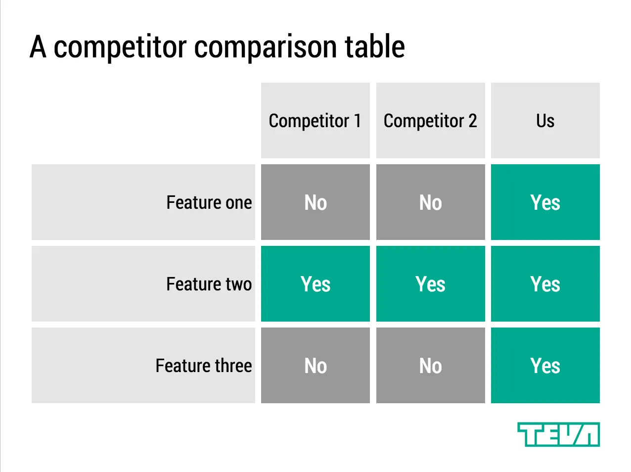
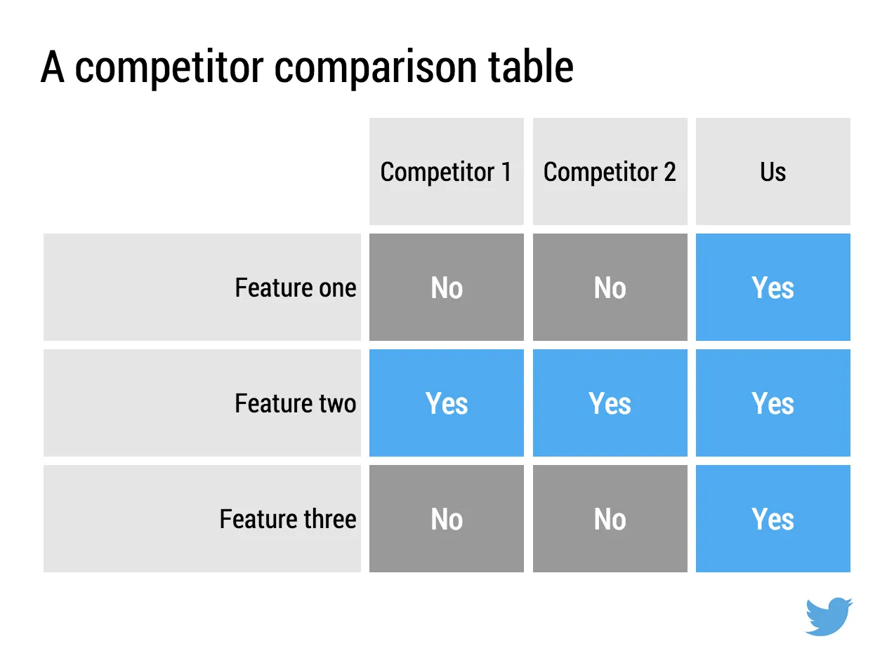
Below are examples how the same SlideMagic chart would look when used in different companies. You see the impact of consistent use of colours. All SlideMagic charts will be updated instantly after a colour and logo change.

If you want to try SlideMagic for yourself, you can sign up here as a beta user.

Art: Salomon de Bray, The Twins Clara and Aelbert de Bray, 1646

·SlideMagic

Send me your template requests

Presentation templates in SlideMagic have 3 big advantages:

  1. They are very easy to customise: adding rows, columns, boxes can be done without destroying the slide layout. Colours and fonts are adjusted instantly, so templates look never out of place with the rest of your slides
  2. You get them straight from a professional presentation designer
  3. New templates and updates get pushed instantly to all SlideMagic users

I want to add more templates.

Let me know what templates, concepts, you need. Put requests in the comments are send them to me at [email protected]. You can even send me PowerPoint slides if you want. If you have not done so, I will strip the slides of company specific information before publishing them in the SlideMagic template library.

Art: Henri Toulouse-Lautrec, Sescau photographe, 1896

·SlideMagic

Be less busy with presentations

This memo that was sent to the team behind Slack before its preview release resonated with me.

We are unlikely to be able to sell “a group chat system” very well: there are just not enough people shopping for group chat system (and, as pointed out elsewhere, our current fax machine works fine).

I love the “be less busy” tag line of Slack. I love the stress relief that search provides in Slack (you can always find things if you have to).

The more I think about it, SlideMagic might actually not an alternative to PowerPoint, it is a broader concept of change in how people in enterprises should communicate, and how they spend their time preparing for this communication. My tool enables this, but it is not the main thing of what it is all about.

SlideMagic enables you:

  • To be less busy with meetings: you can have short, to the point meetings where ideas can be communicated clearly, and decisions can be taken quickly. Documents are simple and clear, and more or less standardised. It becomes a very efficient corporate language.
  • To be less busy with preparing for meetings, Most of the time will go into forming your idea. Once you have your idea, it only should take an hour or so to jot it down in beautiful slides. And a powerful keyword search function across all your slides ensures that you will never have to do double work, rework slides.
  • To lift the spirits of a company by eliminating poor design. Employees work better in a beautiful office. Seeing depressing dense bullet point presentations on every screen, on every printer, on every fax machine, on every projector, in every email inbox, does not add to employee morale.
Continue reading →
·SlideMagic

Little productivity hacks in SlideMagic

Recently, I have focussed most of the development work for SlideMagic on improving the workflow. It is the small differences that can make a big difference. Here are two features that you might not have discovered yet:

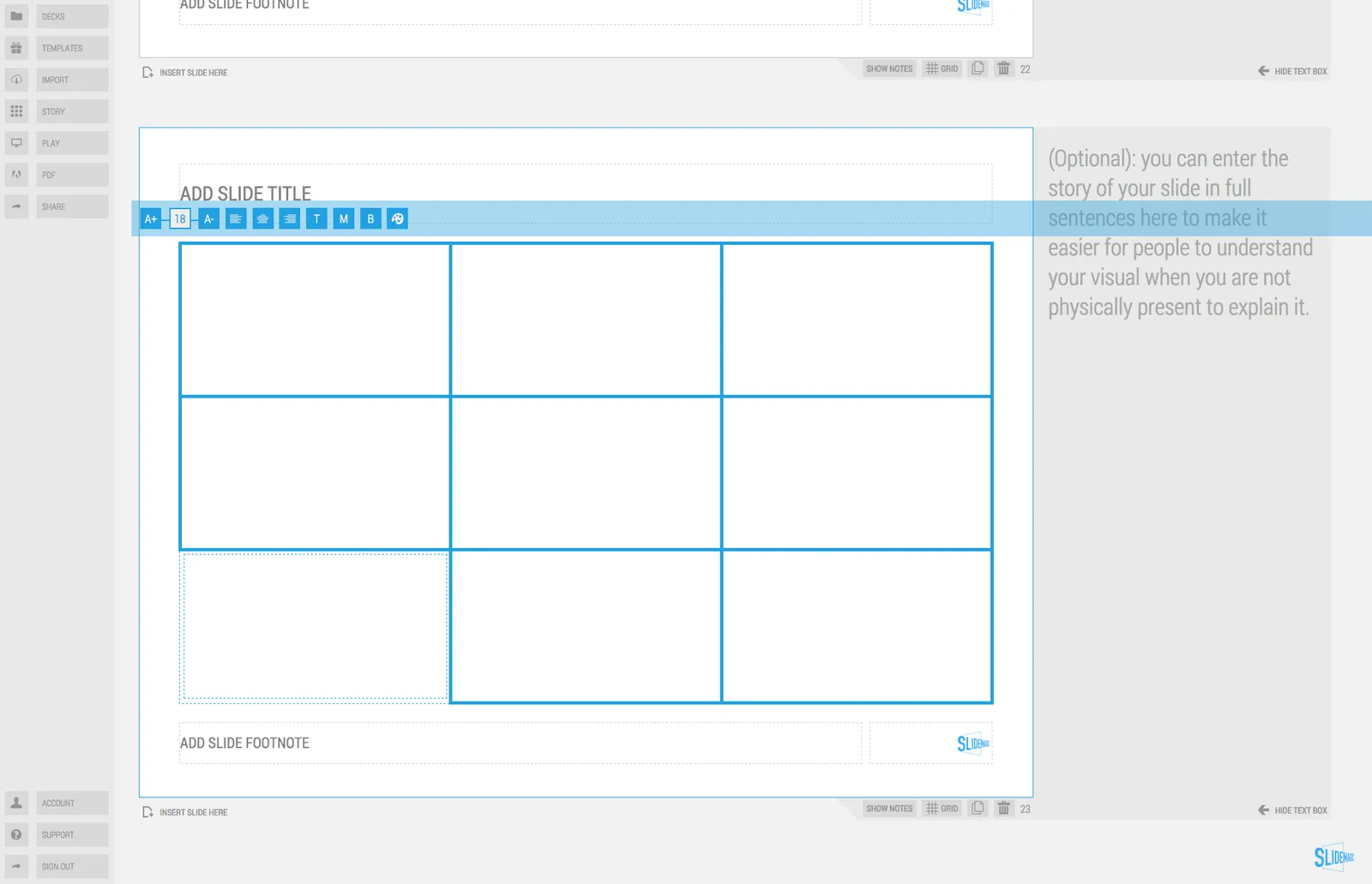
You can select multiple boxes and edit their design (colours, font size, etc.) at the same time. Great for creating tables quickly or clean up inconsistent font sizes.

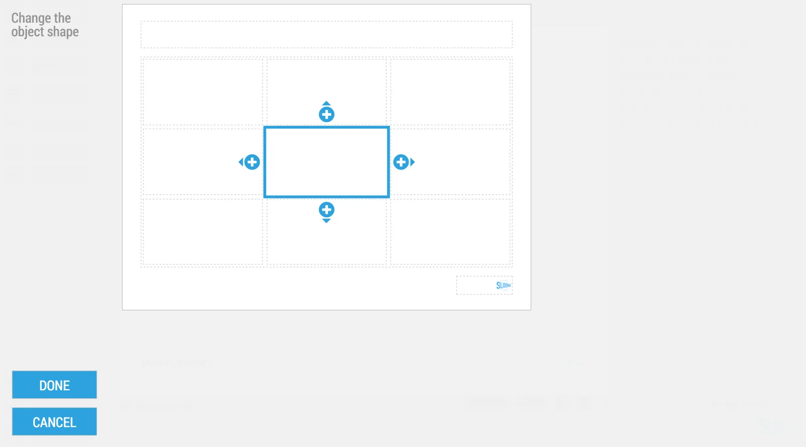
In the shape change menu you can tackle multiple shapes in one go. Click another shape and you can adjust its perimeter as well without leaving and re-entering the menu.

You can give SlideMagic a try yourself, the beta version is free to use. Sign up here.

Art: Rabbits by Johann Georg Seitz, subscribe to this blog, follow on Twitter

·Software

New PowerPoint 2016 for Mac can beat Keynote

The preview of the new Microsoft Office 2016 is out (finally) and I have installed it on my production machine letting it do all my presentation design work for clients. (You can download the Office 2016 preview here)

  • It looks beautiful. PowerPoint 2016 for Mac looks exactly the same as PowerPoint 2013 for Windows. A calm flat user interface. Working in a beautiful software environment always encourages you to create beautiful presentations.
  • The whole interface feels faster, snappier, and smoother, somehow. This is especially true for Excel. The current version of Excel for Mac has a highly annoying latency when entering data in cells.
  • Subtle changes to the default colours and fonts. Gone are the boring olive greens of the old PowerPoint colour scheme. Calibri light looks great on Retina displays. Gone are the default gradients and drop shadows. Gone are the tick marks in data charts.
  • The commenting infrastructure is nice for collaboration with other people
  • Full integration with OneDrive cloud storage (if Microsoft has guts they should add Dropbox as well, and maybe even Google Drive).
  • Now PowerPoint gives suggested snap lines to place objects, automatically distributing and aligning things on your screen.
  • The grid behaves more normal with a centimeter ruler. If you accidentally move a grid line (yes, this still happens) it is easy to move it back to the right position.
  • Now text and shape backgrounds have the exact same colour rendering, an annoying bug in PowerPoint 2011, where despite selecting the same RGB value, colours on text and shapes would render differently.
Continue reading →
·SlideMagic

SlideMagic is in public beta, anyone can sign up

Two years after having the first idea about creating a PowerPoint alternative from scratch, I now have taken the invite wall down on presentation software SlideMagic. Anyone can now sign up for the beta version.

Here is how to get hooked:

  1. Go to the “templates” tab and clone one of the template presentations to start
  2. Customise your own accent colour and logo
  3. Go all the way to the end (beyond playing around) and create one real presentation for your next meeting. It can be a short presentation. It can be low-risk presentation.

Step 3 is the important one. You will see how incredibly easy it is to create a presentation, especially when you think you should go back to PowerPoint for your next presentation.

Let me know your thoughts and share SlideMagic with like minded people who you think might enjoy it as well.

Art: Claude Monet, La rue Montorgueil à Paris. Fête du 30 juin 1878. Subscribe to this blog. Follow me on Twitter. Sign up for SlideMagic