

I get this feedback from early SlideMagic beta testers. SlideMagic supports one accent colour, one font, and encourages you to work in a strict slide layout grid. For certain presentations, this feedback is valid. I think we will not see any Apple product launch presentations designed in SlideMagic (yet).
For 99% of presentations though, it is actually precisely what I tried to achieve:
- When the software tool you use for presentations is incredibly simple, you spend most of your time worrying about the content rather than searching support web sites how to align the second line of a bullet point paragraph. I want 90% of SlideMagic users to master 100% of its features.
- If all presentations use more or less the same visual concepts to show trade offs, contrasts, sales over time, etc. then people will be able to read and understand them quicker
Today, I would argue that PowerPoint presentations look more similar to each other than the SlideMagic decks: lists of bullet points on a white background using the standard Microsoft Office (olive, blue, red, green) colour scheme.
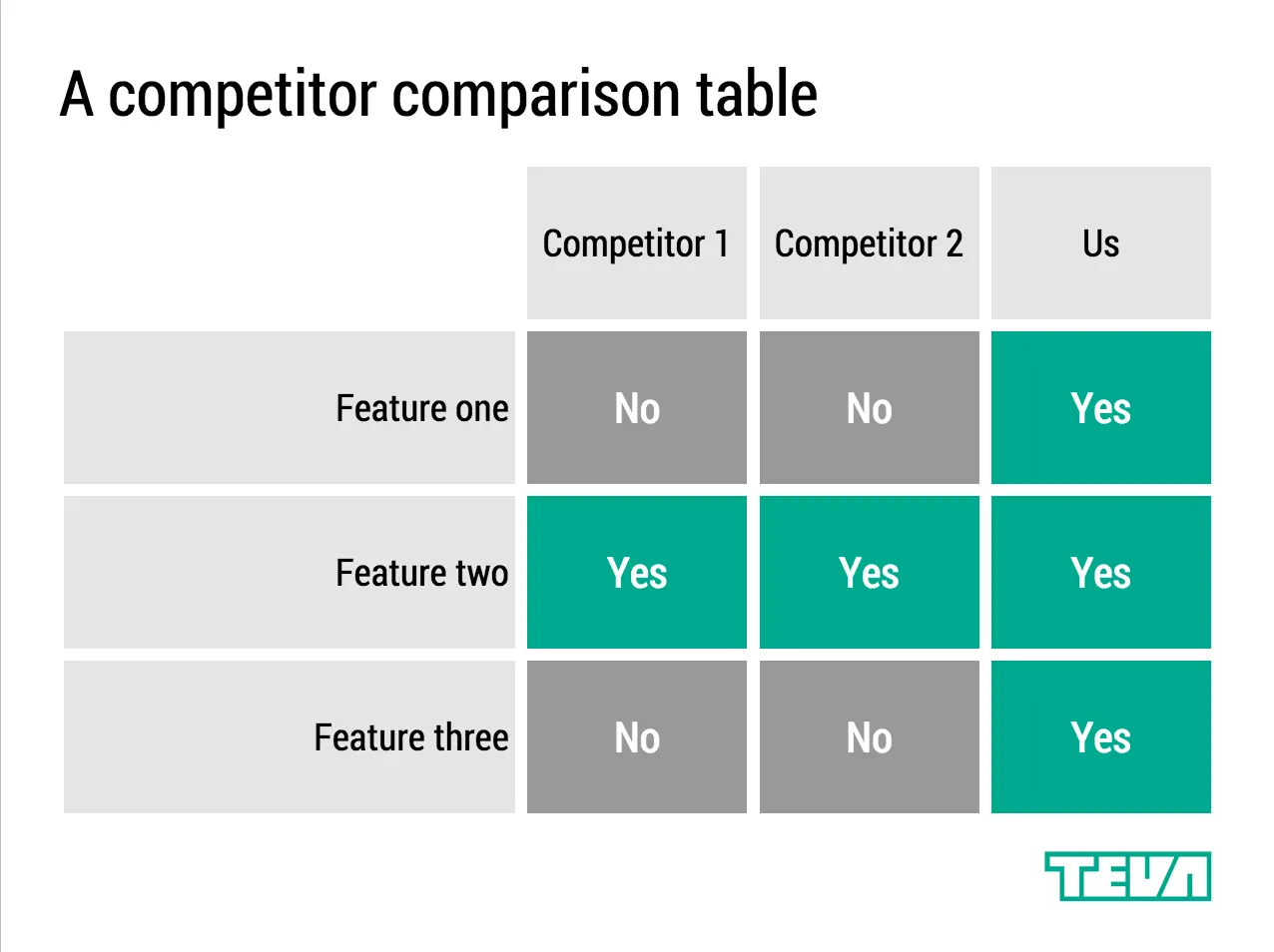
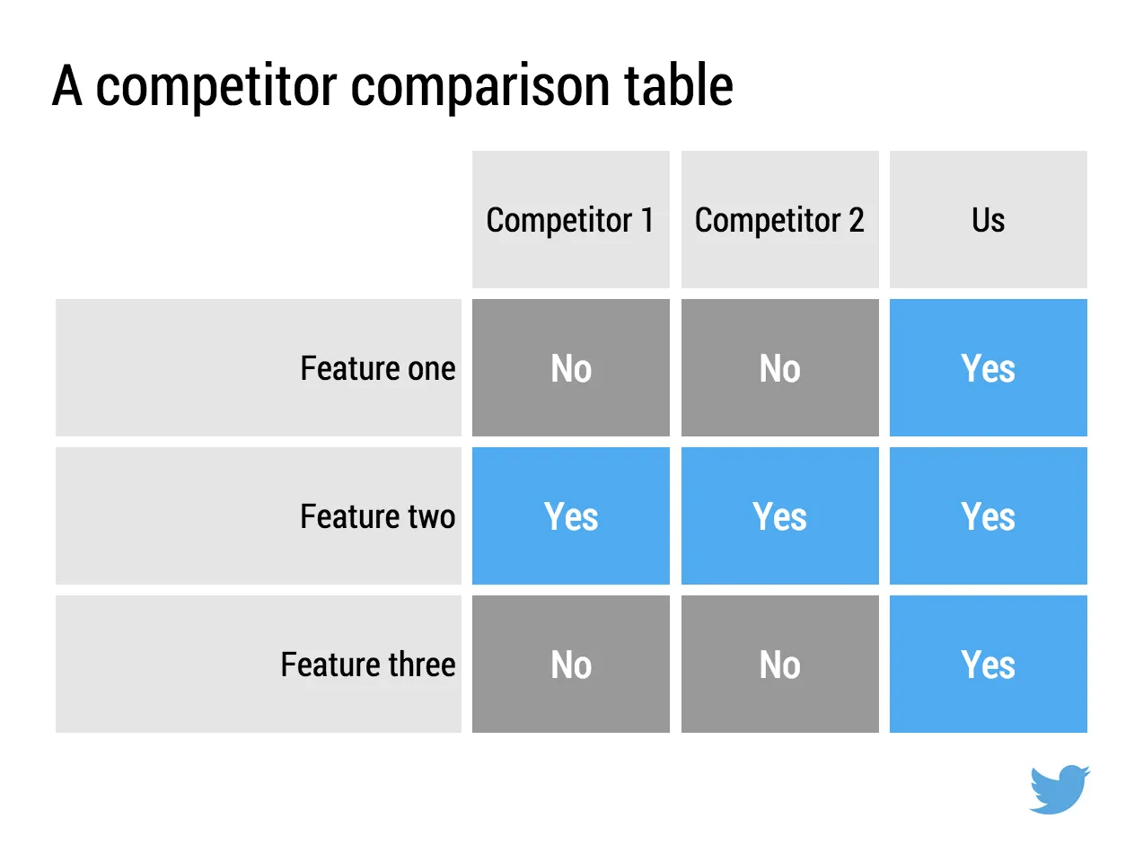
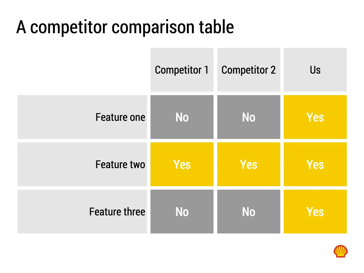
Below are examples how the same SlideMagic chart would look when used in different companies. You see the impact of consistent use of colours. All SlideMagic charts will be updated instantly after a colour and logo change.

If you want to try SlideMagic for yourself, you can sign up here as a beta user.
Art: Salomon de Bray, The Twins Clara and Aelbert de Bray, 1646
