SlideMagic Blog

Frequent updates about all things presentations since 2008. Subscribe to never miss a post.

RSS
all posts

Category SlideMagic

·Images

Working on improved image cropping

Working with images is turning out to be one of the most powerful uses of SlideMagic. The built-in image search gives access to an endless flow of great images, and the grid makes it really easy to layout these photos in a beautiful and consistent way on a slide.

Aligning images has always been difficult in presentation software (it is only worse in word processors), and that bit is solved by the SlideMagic grid. Next up is image cropping. Most design tools use some sort of overlay that allows you to mask/reveal an image. Even as a professional designer, I still struggle with this.

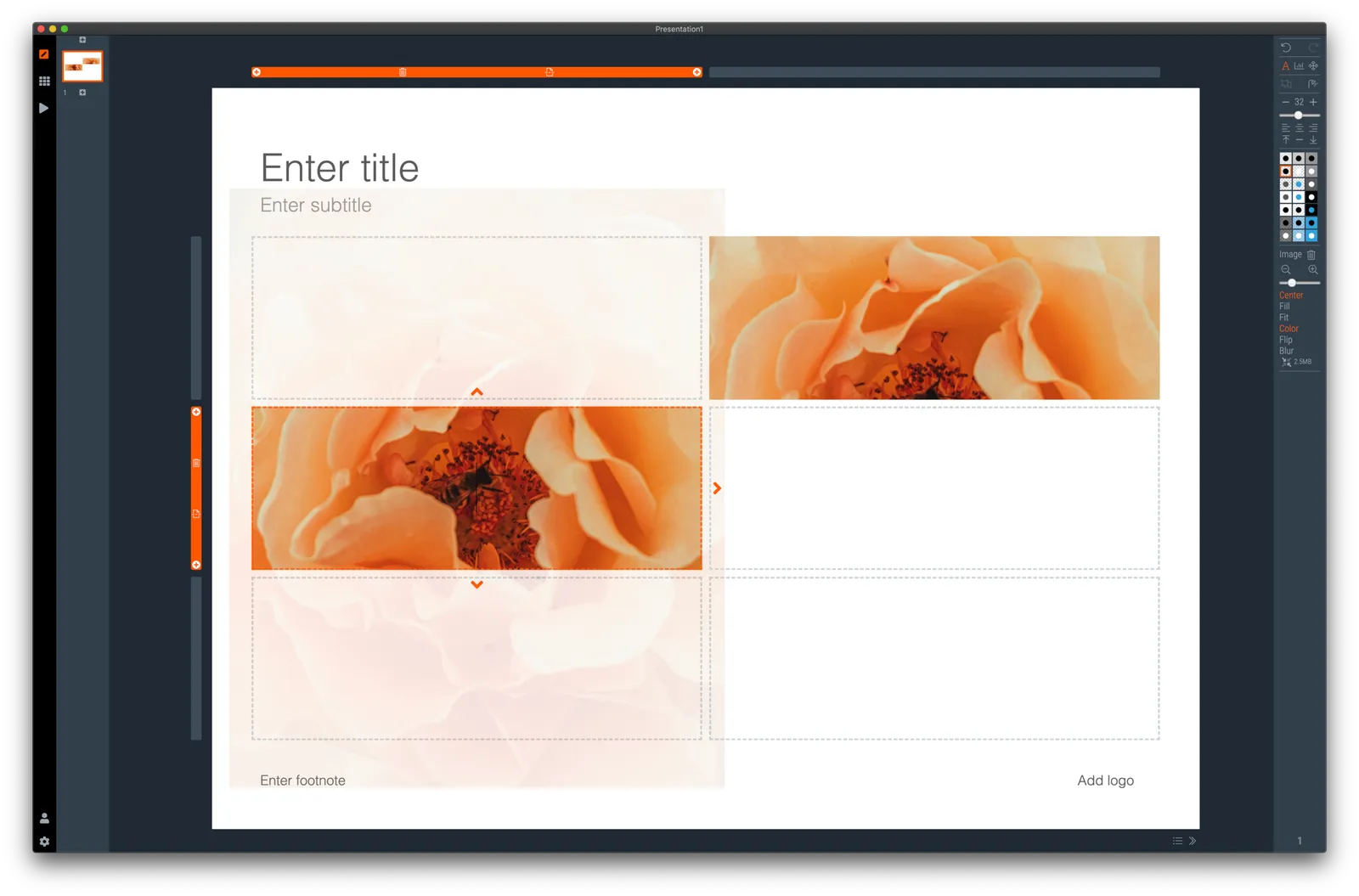
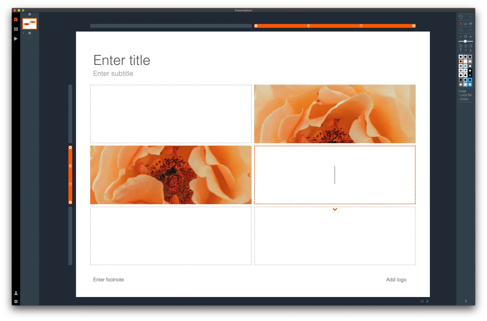
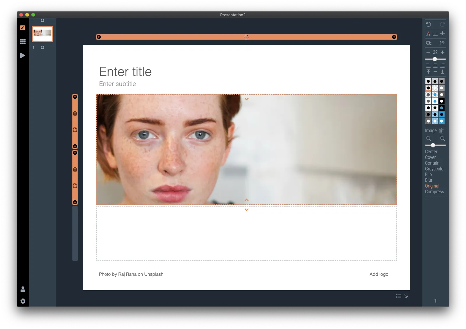
In SlideMagic, you simply drag an image around in a box to decide what part of the photo you want to reveal. I am working on 2 improvements:

  • Showing the entire image in semi-opaque when you are editing/dragging it around to give you. a better orientation of what you are doing
  • Creating a way to keep the image focused on the most relevant part regardless of changes to aspect ratios or zoom levels of the photo. At the moment, I store to image positioning versions (one for 16x9 and one for 4x3), but in future releases I want to automate this

The challenge here is to offer something that works without turning SlideMagic into a complicated photo editor. Work in progress.

·Concepts

Organisation charts

Organisation cultures are changing. Traditional hierarchies becomes less important, and project teams often become the engine of doing things. Also outsiders such as freelancers do not fit in nicely in big structures. At my time in McKinsey in the 1990s, we could have full meetings about whether a line should be dotted or not, and who would have to be drawn slightly higher than someone else on a page. Mistakes here were especially painful in a presentation to the management team.

Organisation chars in presentation are tricky for two reasons: it is hard to get all the boxes right on the page from a technical point of view, and it is hard to make everyone happy that the hierarchy and lines of the boxes reflect reality.

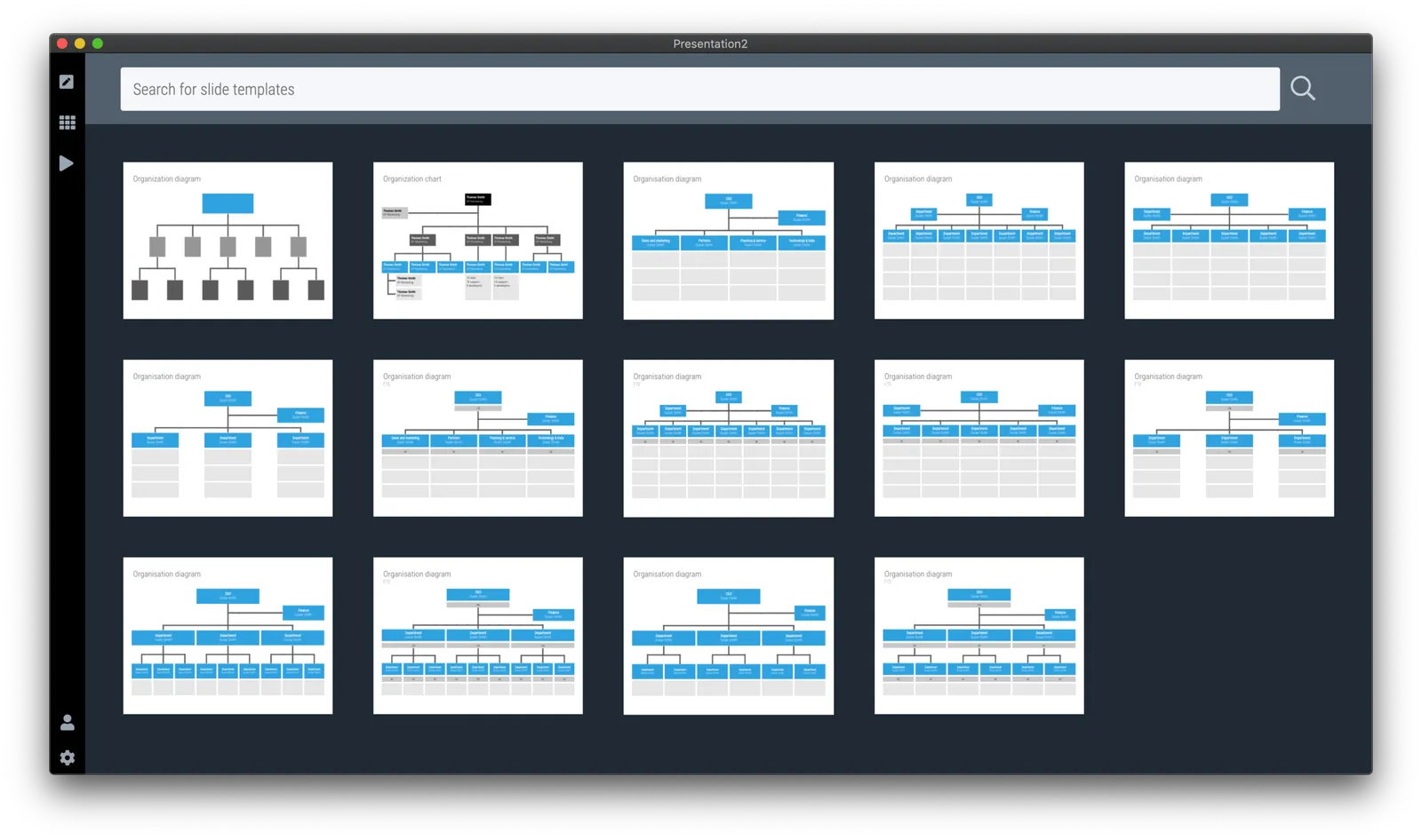
At the request of a user I have added a few more organisation charts to the SlideMagic slide template database. Complex organisation diagrams are not SlideMagic territory (if they are. hard to draw, the audience must also find them hard to understand). Instead, I created a few simple templates that can lay out the structure of an organisation in simple way, cutting the amount of lines, and increasing the size of text boxes.

If you present your chart as a a rough summary of the organisation rather than an exact reflection of hierarchy, you might just get away with it. If you pretend to be precise, people will nitpick…

The “connector” element in SlideMagic is still the weakest drawing tool and I am thinking about a new diagramming user interface now that my front end HTML design skills have improved significantly over the past year. As usual, the problem is not technical. Also in PowerPoint with its more sophisticated diagramming interface, it is hard to get connecting. lines to do what you want. They always angle and bend in a different way than you want them to.

Continue reading →
·Software

Some UI improvements

Version 2.3.18 went up with a few improvements including 2 noticeable ones:

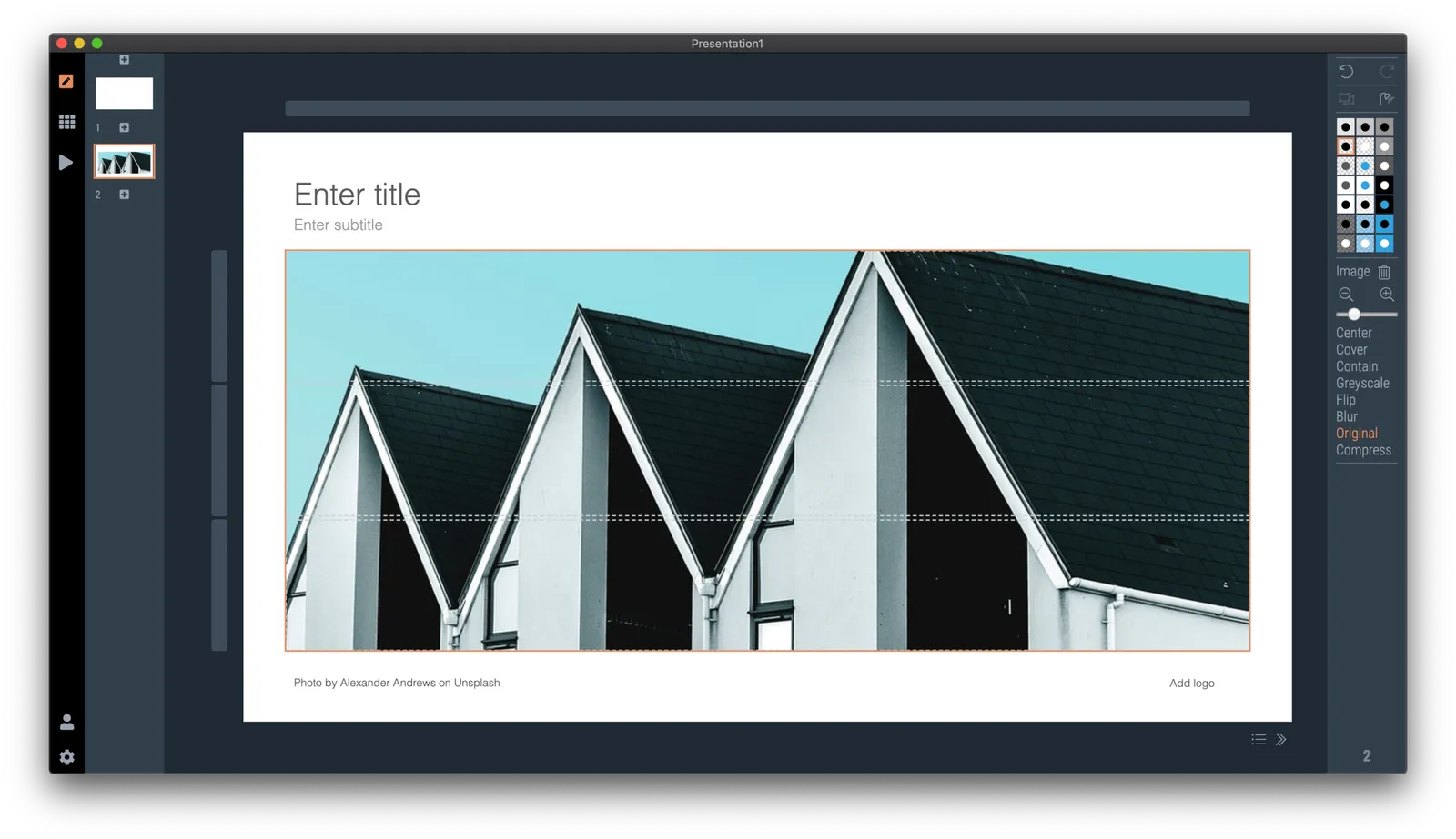
  • A much brighter app user interface colour. As you know, SlideMagic mirrors the colour you use in your presentation: if your presentation uses blue, the SlideMagic app accent colours (to show things you selected for example) will turn to its complement: orange. Up until v2.3.18, this was the exact colour opposite, creating problems for users with muted, very dark accent colours. In the latest version I forced up the brightness and saturation of the app accent colour so that it clearly stands out in all cases. Look how that orange is now popping out for my SlideMagic blue colour.
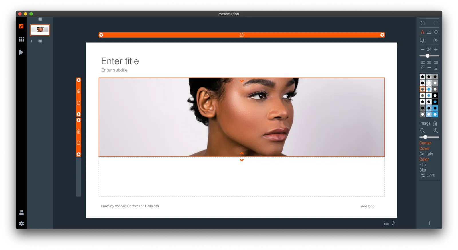
  • An improved image user interface, where the crop modes “center”, “contain”, and “cover” are now clearly highlighted. Also, SlideMagic now shows the mega bytes an image consumes as soon as you select it. Sometimes, a very large image is actually not that big in storage, but the opposite happens as well, that tiny image on your slide takes up 10MB of space and as a result you are compressing down the entire slide deck. Now it is easy to catch these memory eaters quickly and compress the image if needed. Compression no longer “flattens” the image effects (greyscale, blur, flip), so you can re and undo these on the compressed image as well.

Download the latest version of SlideMagic for Windows or Mac to try it out.

·Software

Preserve image positioning when switching between 4x3 and 16x9

SlideMagic swaps instantly between traditional and widescreen aspect ratios. The slide content stays nicely in the slide frame, everything stays aligned and you can revert instantly.

Because SlideMagic does not distort aspect ratios of images (no stretching or squeezing), the positioning of an image changes slightly if you switch between a narrow and a wide screen layout. This can be annoying for images where positioning is a big deal (compare the lined up eye lines of a series of portrait images versus a long-distance shot of a mountain range). If you switch aspects 5 minutes before your meeting, your presentation is misaligned. (This is obviously still a lot better than PowerPoint where everything would stretch and move to unpredictable places when picking a different screen format)

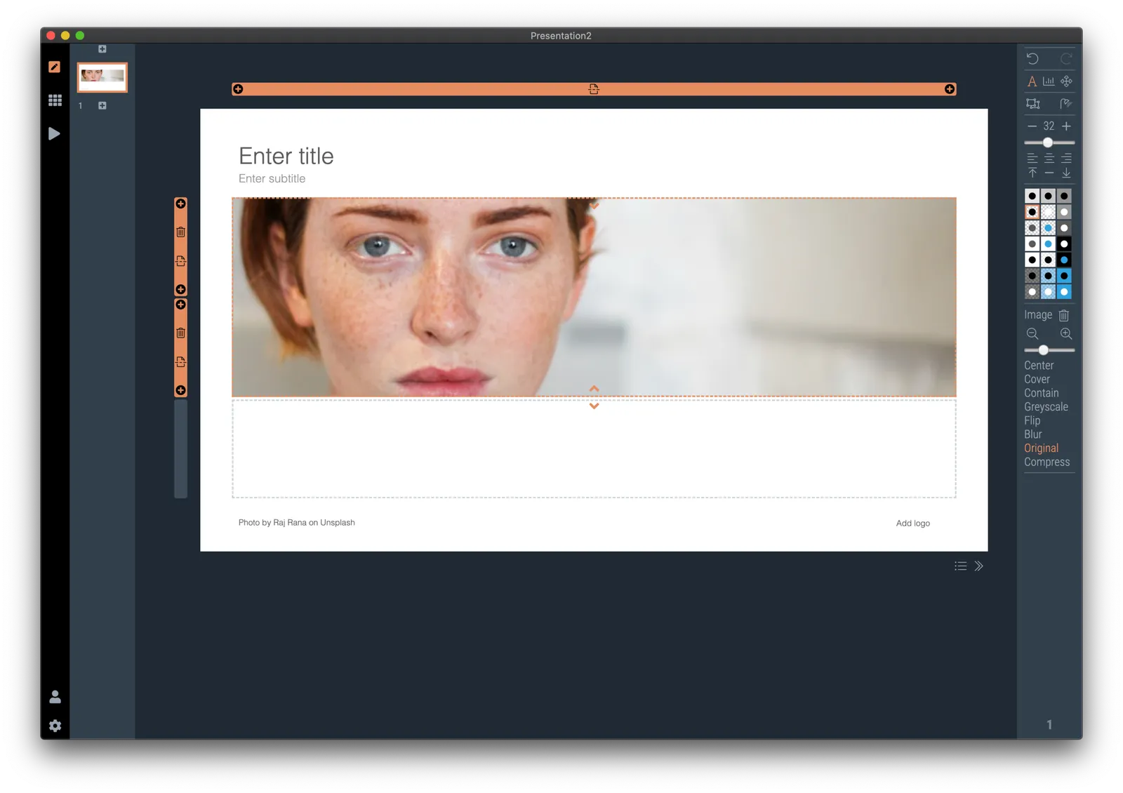
Well, SlideMagic fixed this last hitch as well. I just released V2.3.17 (download SlideMagic here for both Windows and Mac) which now keeps 2 sets of image size and crop frames, one for each slide aspect ratio. You switch back and forth, so will the image positioning. Make sure to double check each image once in both aspect ratios, and the settings will be saved together with the presentation.

For future releases I am studying more advanced image analysis, where I could automatically recognise a face in an image for example, and lock in the position of the eyes (maybe the first true “AI” application in SlideMagic).

·SlideMagic

Dynamic slides generated on the fly

Version 2.3.16 of the SlideMagic presentation app went up last night (download it here for either Mac or Windows). The major new feature in this release is the dynamic generation of slides (at least, the first steps).

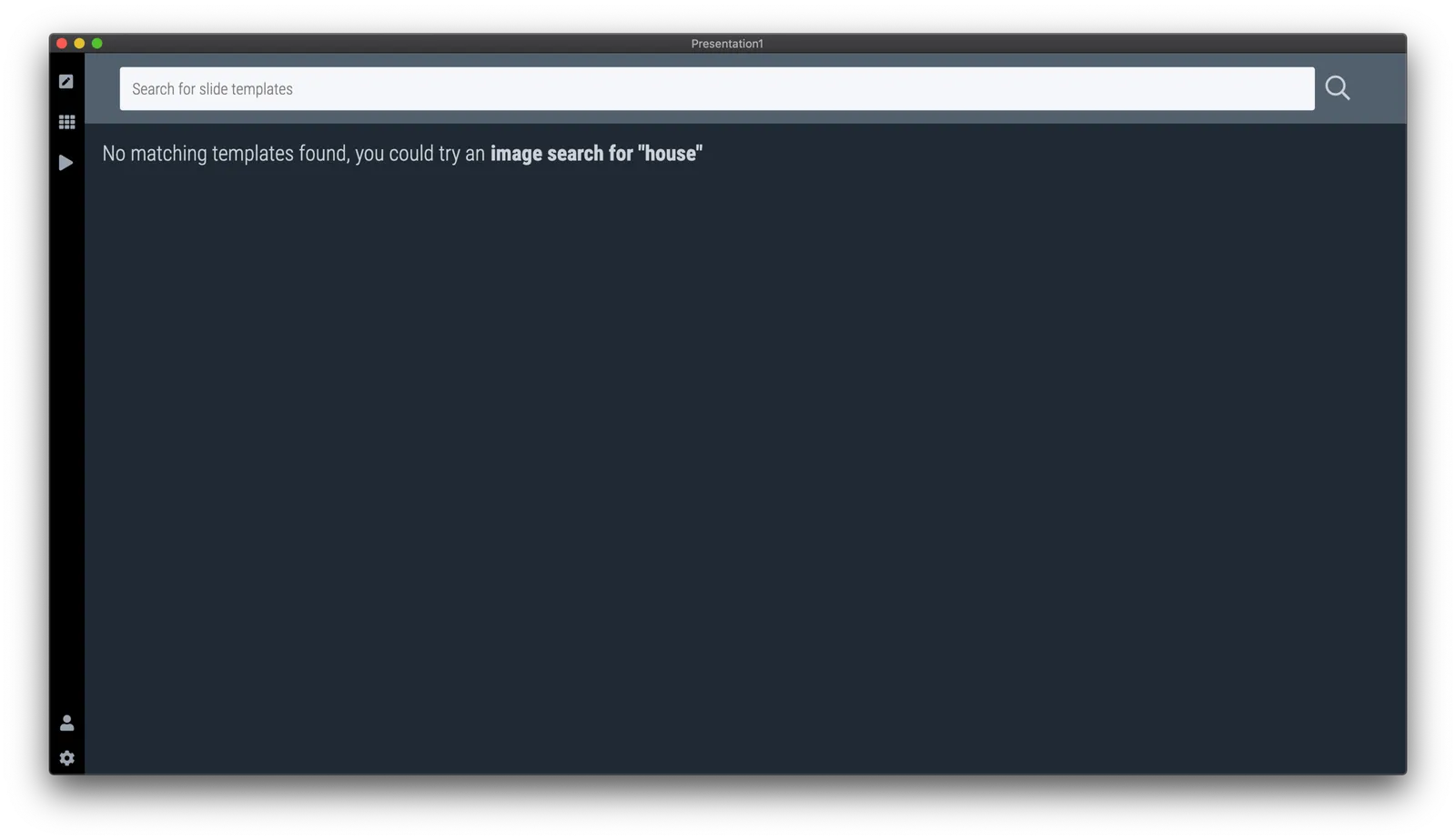
There are different types of template search queries entered on the SlideMagic server. People look for a specific framework (e.g., ‘BCG matrix’), a specific layout (‘3 bullet points’), but then there is a whole lot of more descriptive queries to are a better match for an image search site (‘house’ , ‘diabetes’). While I could populate the database with hand-made slides for each of these terms, it is more efficient to let technology do the work for you.

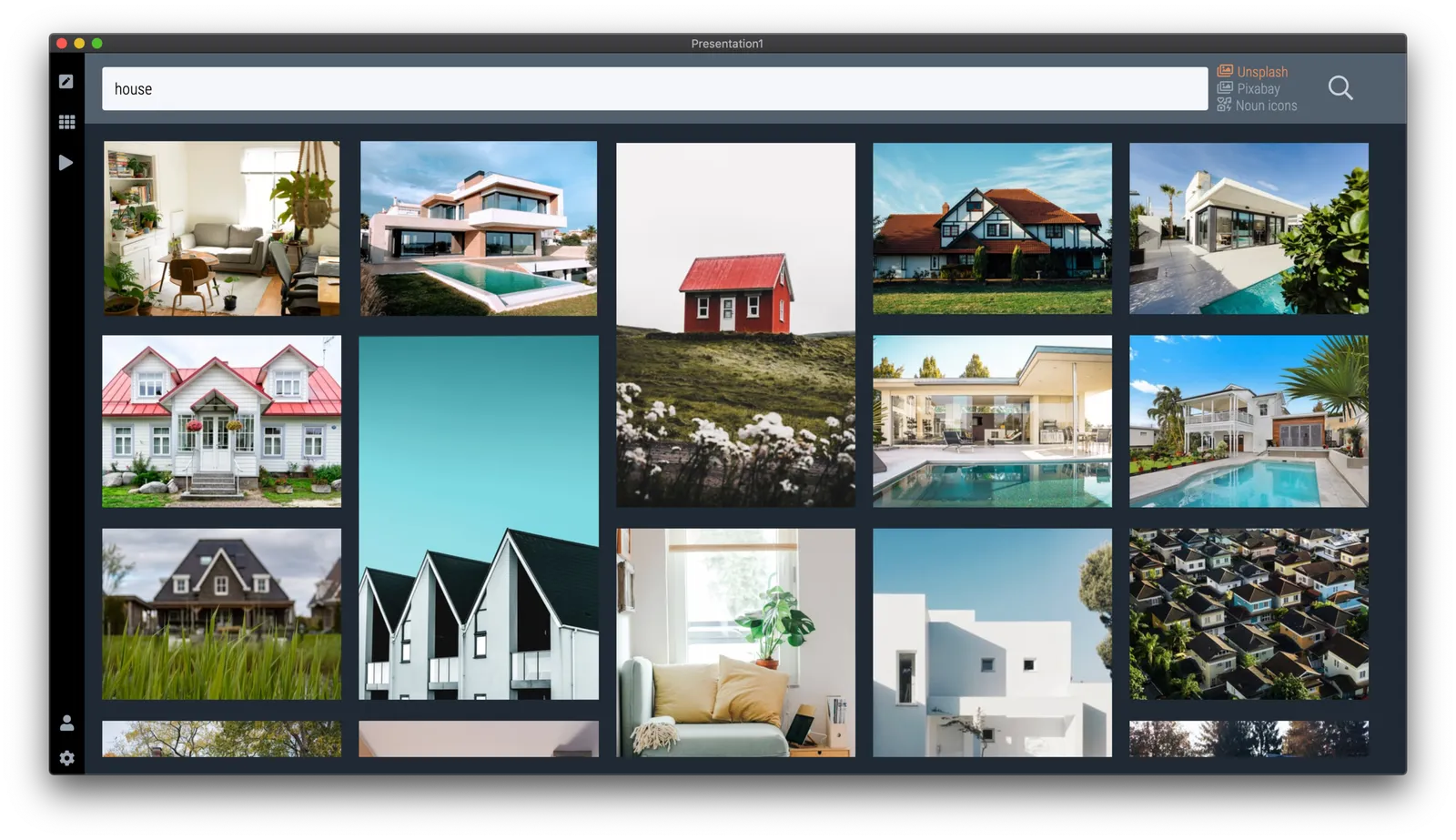
So at the moment, when the server gives up and returns a “no slides found” message, the user gets offered the option to run an image search instead with the same keywords. After picking an image, the SlideMagic app turns it into a framed slide with proper image credits that can form the basis for a new slide design. This slide is created on the fly, without the need to store templates on my server. So the number of slides that SlideMagic can produce now goes into the millions rather than hundreds.

The screen shots below give an overview of the flow as it stands at the moment:

Obviously a slide with a simple image is still pretty basic. I am looking into expanding this approach with colour matches, and more interestingly analysing images for white space, with suggested pre-population of text placeholders on the image.

Continue reading →
·SlideMagic

All the way back to 2008

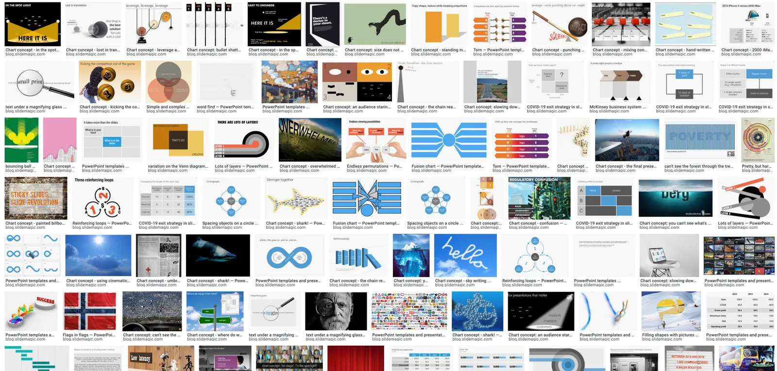
Now and then I dive back into the 12 year archive of my blog and see some or the early slide layouts I made. This Google image search pops up many of them.

While many of these layouts are now still available as templates in SlideMagic, some of them, especially the early ones are a bit different:

  • “Slides that stick” orange and brown
  • Lots of hand written fonts
  • Unusual visual analogies
  • Most of them are definitely not for the layman designer…

Yes, I made have been a bit more “daring” back then (and remember, most of these designs actually were taken from actual client work), but I still think that I am on the right track with my current sober, simple, easy-to-make layouts. Less artistic, but far less time wasted by smart people that can use their energy to do more useful things that creating presentation slides.

·SlideMagic

How to make a CV slide

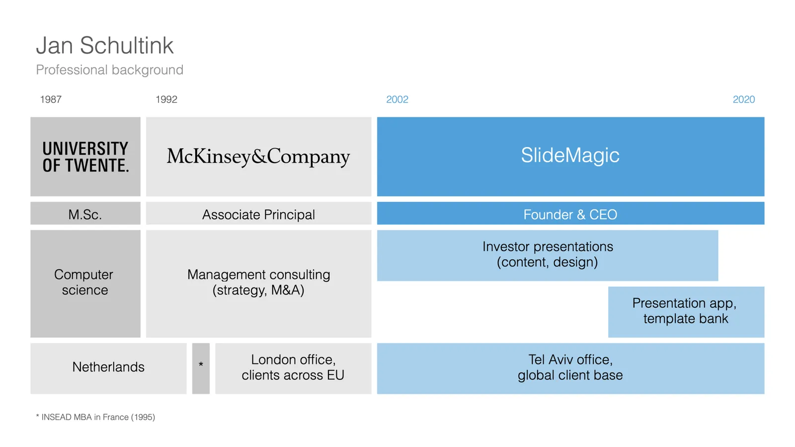
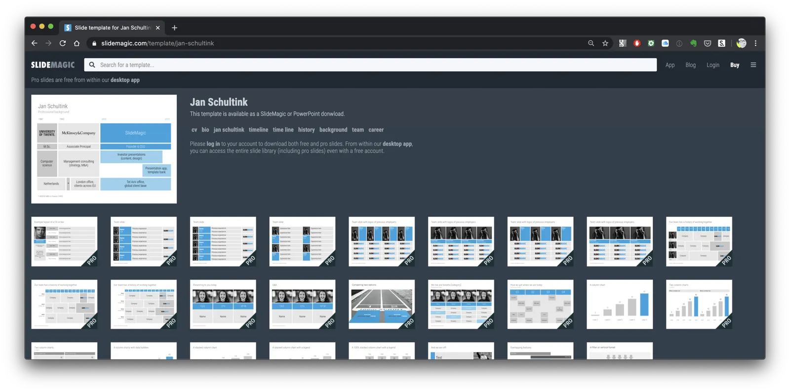
I am starting to work on a standard slide deck to present your CV, with me as the test subject. The first page is done. I like these type of time lines, because they communicate a lot of the basics about a person (years, employment, locations, education, etc.) in one slide, without making it too crowded. The rest of the presentation will cover more background.

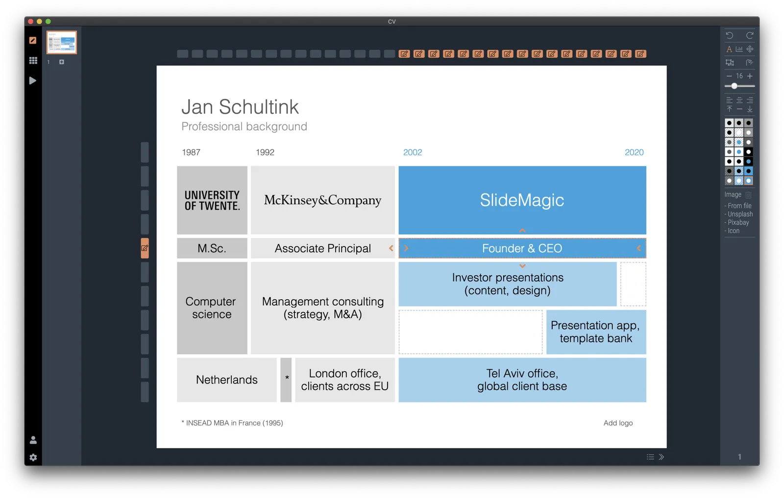
They way to set the slide up is to start with a fine grid, create the major divisions based on your professional work history, then start refining. Notice how I left the consulting-style table labels (‘Employer’, ‘Role’, ‘Location’, etc.) out because it is very obvious from the chart what the rows mean, and these labels would take valuable space/destroy the balance of the layout.

In general, I think 4x3 slides look better than 16x9 ones. 16x9 is made for movies, 4x3 has a more pleasing balance for graphic design. These type of timelines are an exception though, the amount of left-to-right information makes the 16x9 format very useful. SlideMagic switches back and forth at the press of a button.

You can find the slide here in the template store, or simply search for “CV” in the desktop app.

You see how the search algorithm recommends other slides for highlighting career backgrounds and teams.

There is more work coming up on the CV slide deck, stay tuned.

·Layout

New slide templates

A busy day today: i completed a 2nd submission for the PowerPoint plug in, hopefully ticking all the boxes (well, except one that is actually an issue with the Microsoft Javascript API). Let’s hope for the best.

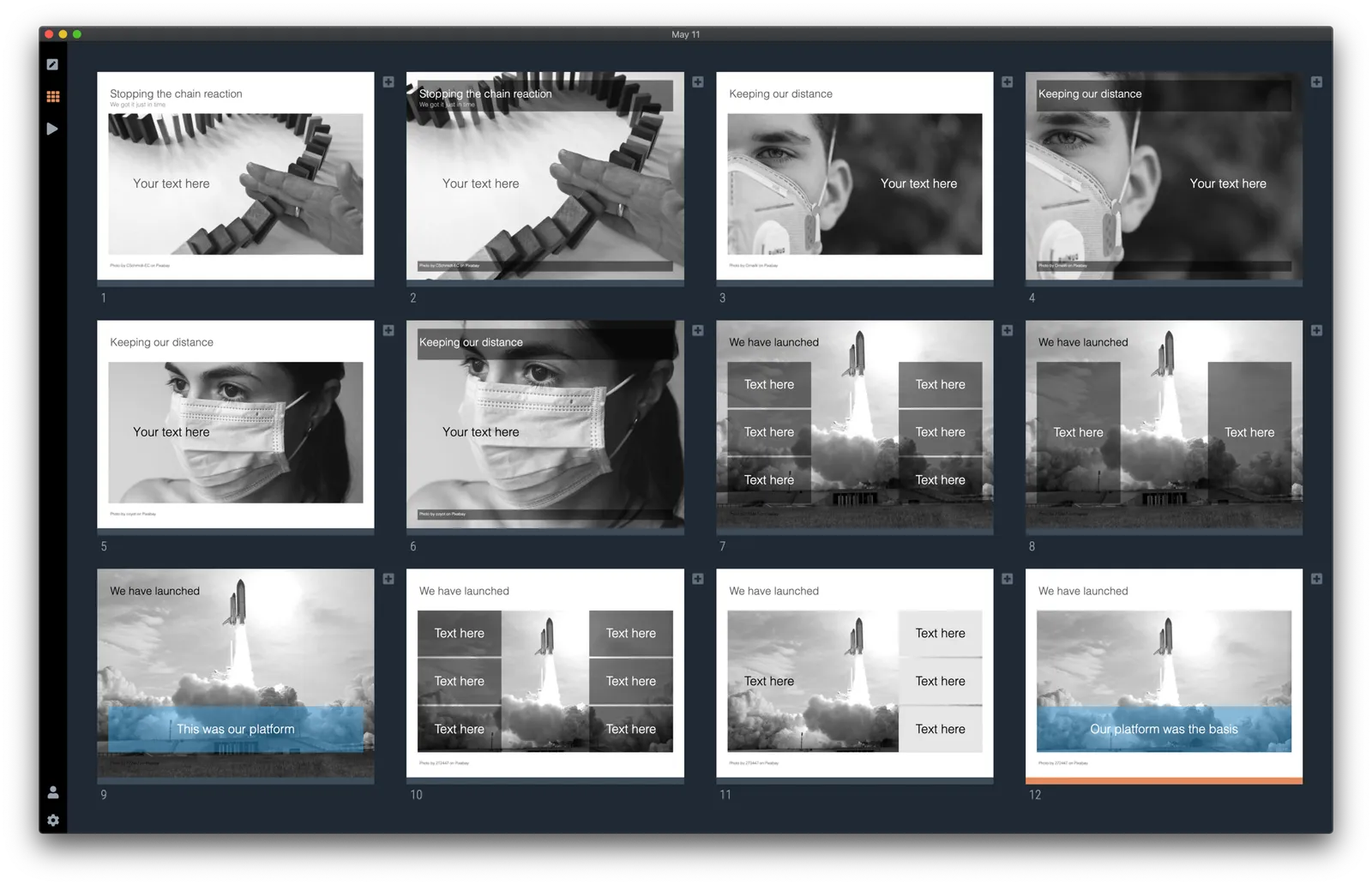
So no long-read, deep blog post today, still I found a few minutes to upload some new slides into the database. Soon, I want to get 1,000 layouts in the database, and we are making good progress towards to that goal.

Here are today’s additions. Remember that you can bring the colour of the images back once you download them into the desktop app.

Image by 272447 from Pixabay

·Concepts

COVID-19 exit strategy in slides

Uri Alon and other researchers at the Weizman Institute just south of Tel Aviv here in Israel have been working on an innovative idea for a COVID-19 exit strategy: intermittent working: let people work 4 days, and go into isolation for 10 days. Even if someone gets infected on day 1 of the work shift, the person will only become infectious during the isolation time, after which symptoms will appear. In that way, the economy can get going, while the infection rate of the virus will come down.

I think the idea is great, but I cannot see it adopted at a country level by politicians. For a specific sector (education?), or a specific company (a retailer with lots of client-facing staff), it could get adopted. Another (maybe even likely) application is to combat a likely second wave of the virus towards the winter. Rather than slamming the full brakes on the economy, go for the intermittent approach.

Communication of this idea is hard though. The researchers started with their scientific paper. Lots of graphs and analysis that shows the statistical impact of their research, including all kind of variables such as the percentage of people that actually stick to the rules. Next up is a video that explains the concept in a much more intuitive way.

I am constantly looking for new charts to the SlideMagic template database, and made a few simple charts that communicate this idea. All of this is done in the spirit of SlideMagic: very simple charts that are really quick to put together. Nothing fancy, but looking decent and doing the job of getting your message across.

Continue reading →
·PowerPoint

PowerPoint plug in update

An update on the development of the SlideMagic PowerPoint plugin. One of the main reasons my first submission to Microsoft was rejected is that the current version of the plugin does not run on PowerPoint 2013 and the Windows 7 operating system, largely because I pretty much ignored Internet Explorer as a browser option. Microsoft itself does not really support Windows 7 anymore. The other problem is that it is actually hard to debug a plugin for Office 2013, I tried actually buying a copy, but you cannot get it anymore… On top of that, it turns that you cannot run multiple versions of Office on one computer. The strange situation is now that in order to develop add-ins for the latest versions of Office, you actually need to do that on a super old machine. If there is anyone reading this who can help, please reach out.

But OK, challenge accepted. I will begin to ‘dumb down’ the server response to calls from within Office applications. I can test the rendering of the screens in Internet Explorer 11 (just installed it), and have to hope that rest works in Office 2013 without testing. Hopefully the second submission will get accepted.

The current version still works but requires some level of computers skills and courage to get it to work.

Image by Masaru Kamikura