SlideMagic Blog

Frequent updates about all things presentations since 2008. Subscribe to never miss a post.

RSS
all posts

Category Shapes

·Images

Aspect ratios and image fills

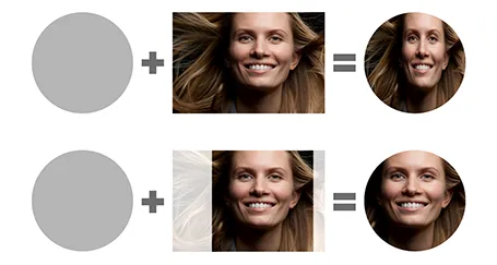
PowerPoint distorts the aspect ratio of images when you use them to fill a shape. To work around the issue, you need to crop the picture in the aspect ratio of your target shape. In the example of the circle below, that is a square.

I use PhotoShop to crop my pictures. You can also use the PowerPoint crop function itself and right-click, save as image.

·Images

Open clip art

I am not a fan of 1990s-looking presentations full of childish Microsoft clipart, but this site Open Clip Art can still be useful resource for presentation designers. Firstly, clip art designers are moving into full illustration designs. Secondly, the site is a good place to find icons for your presentation. All material is free to use. As with all user generated content sites, there is no professional reviews before designs get posted, you need to select the poor from the great yourself.

·Concepts

Concept: a third way

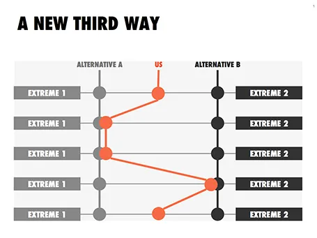
This slider chart is a great way to show a comparison between multiple concepts across multiple dimensions. I recently used it for a hedge fund with a new innovative investment process.

UPDATE: this slide concept can now be downloaded from the SlideMagic store

·Concepts

Bullet points can be OK

Some readers of my blog have become paranoid to use bullet points in a presentation (a good thing), but there are actually situations where putting 3 short sentences on a page is inevitable, or even a good solution for a slide.

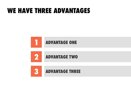
These situations are when you want to express that something has a number of components. Breaking up those 3 advantages and give them one slide each enables you to explain them clearly individually, but the audience loses the overall perspective of how they are related.

In those cases - yes, it happens to the best - I revert to 3 short bullets.  But there are a few things you can do to keep things interesting:

  • A massive visual anchor (like a big 1, 2, and 3) to show that you are talking about an overview slide
  • Really, really short descriptions just to introduce the ideas. The full explanations come in subsequent charts
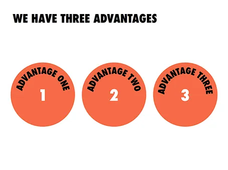
  • Also, you can deviate from the traditional list and come up with other geometrical shapes ore layouts to make your three (short) points.

·Concepts

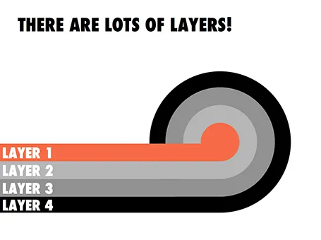
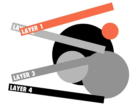
Lots of layers

Here is a concept to label lots of layers in a circle without bending text, the second image shows with which components the first chart was created.

·PowerPoint

Changing PowerPoint shapes

Another hard to find feature in PowerPoint. It is possible to change a shape, for example turn a rectangle into an oval. Select the rectangle, go into the SmartArt menu, select the shapes button, and the select the shape you want instead.

·Images

Keynote discoveries

I am a PowerPoint veteran who only recently started to design presentations in Keynote. Here are some of the little things that were hard to find:

  • Connecting shapes with a line: select both shapes go to the insert menu and select connecting lines
  • Remove an image background: go to the format menu and select instant alpha
  • Edit an image (make it B&W for example): select the image and click the tiny button with the levers (next to the stroke buttons).
·PowerPoint

Re-discovering Smart Art

Smart art inside PowerPoint is a semi-automated template engine for diagrams. It easy to add and remove boxes/bubbles, edit text. The idea is good, but I have not used them a lot:

  • The standard out-of-the-box formatting is ugly
  • Although there are many frameworks to chose from, none of them usually really work for my particular presentation problem
  • I have seen them too many times in presentations where designers simply dump in a smart art graphic to replace a bullet point chart (the result is still a bullet point chart that looks a bit different)

Recently, I have started to use smart art in my presentations, but in a different way. I use them to position objects on a slide by picking only the very basic configurations and reformat the slide items heavily so you can hardly recognize it is a smart art object anymore. An example below:  
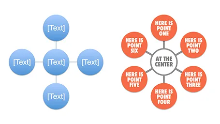
Well, I said before: your PowerPoint is really good PowerPoint if your audience cannot tell it is PowerPoint…

More about smart art on the Microsoft site, or over at the PowerPoint Ninja blog.

·Concepts

Look at these synergies!

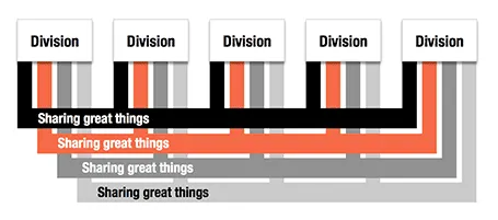
Here is an alternative to a circle-like composition of a holding company and its subsidiaries.

·Concepts

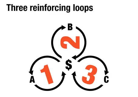
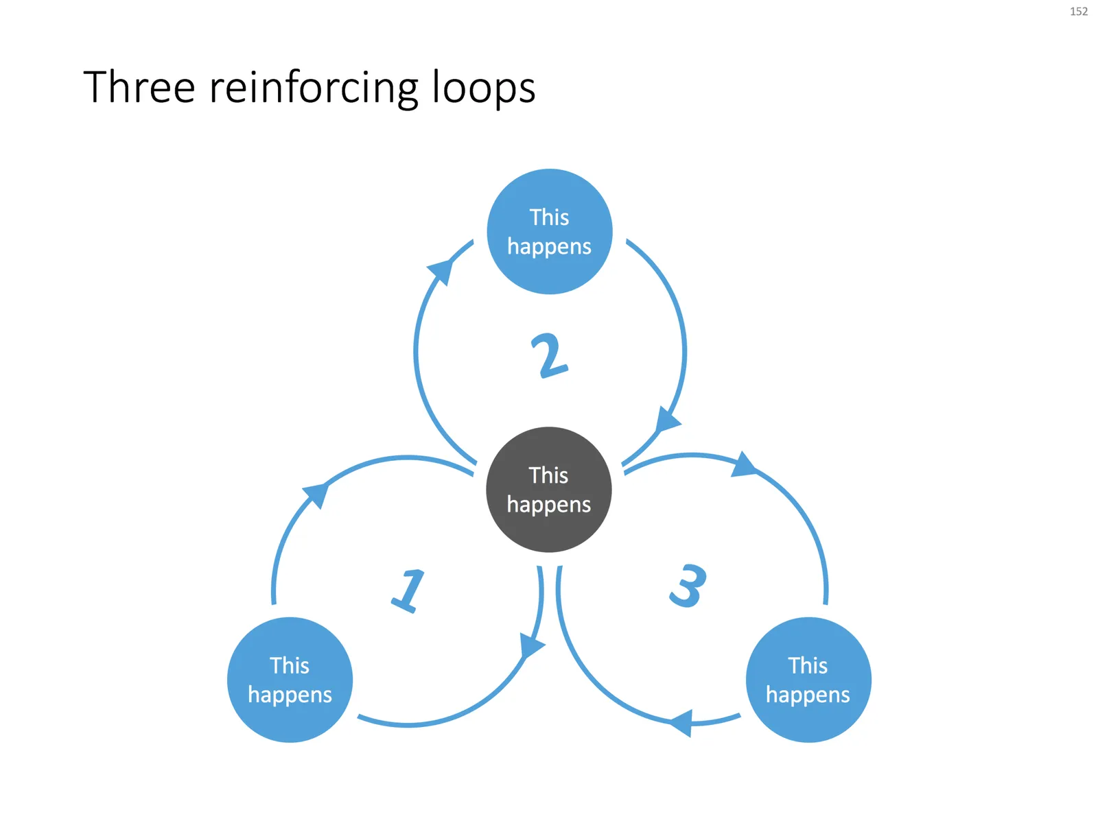
Reinforcing loops

At McKinsey, we used to call this Business Dynamics, mapping reinforcing and opposing forces using arrows. The concept is borrowed from systems theory in mathematics and physics. These circles can make a great chart to show the main growth drivers behind your business.

The notorious US army spaghetti chart is a more complicated execution of the same principle. Contrary to many critical review, I actually liked it as a visualization of the incredibly complex situation over there.

UPDATE: There is now a PowerPoint slide template with 3 reinforcing loops available in the template store.