SlideMagic Blog

Frequent updates about all things presentations since 2008. Subscribe to never miss a post.

RSS
all posts

Category Presentation

·Data visualization

Relating the oil spill to your city of choice

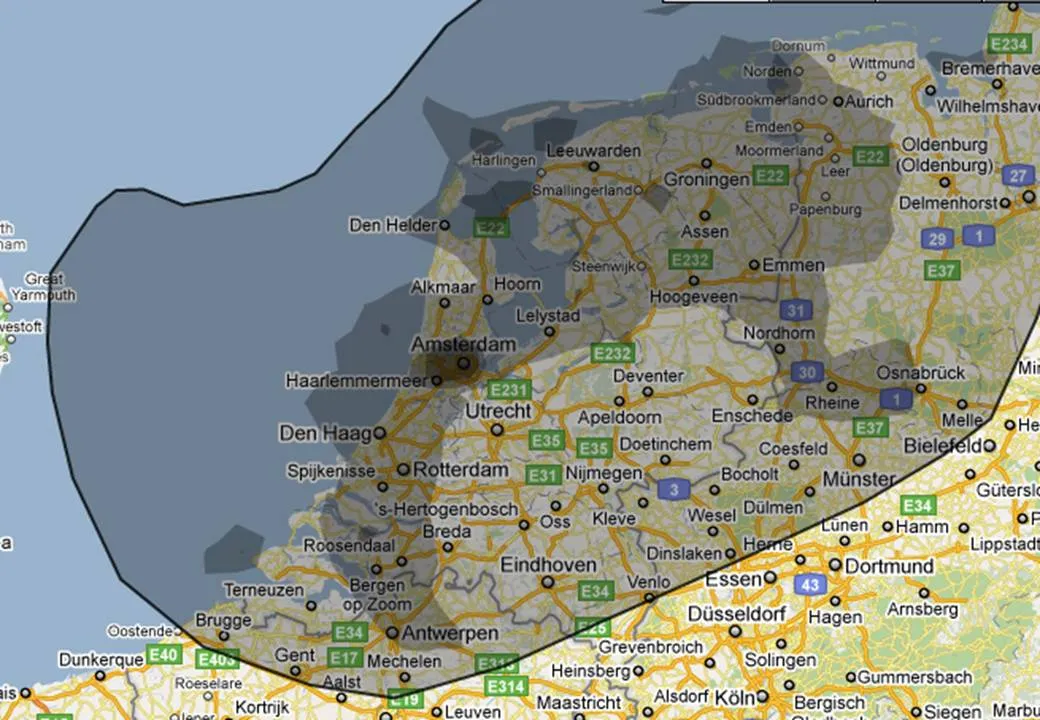
More maps today. This simple site ifthiswasmyhome puts the size of the oil spill in perspective… using a town of your choice. It would cover pretty much the entire Netherlands (the country where I grew up).

An excellent visualization, making people internalize what big numbers mean.

·Design

We need a good document browser

A week with an iPad has shown me how poor presentations and other documents get rendered on a PC (or a Mac). Leaving the touch screen aside, and even for a PDF viewer, navigating between pages is incredibly slow and the borders of the screen are packed with distracting menus.

Maybe this can all be brought back to the roots of these applications: they were designed for editing text line by line, changing data cell by cell. Each page is built up real time from its components. Editable text gets pet in the right font, the right size, aligned, images are scaled to the right size, colors added. All this takes processing time. The iPad (I think) converts the whole document to some sort of image and caches this image into memory. The result is lightning fast scrolling between pages in a document.

There is no reason why this cannot be implemented on a PC/Mac as well. It is bit like the revolution of the Firefox and Google Chrome browsers that were specifically designed to render content as quickly as possible.


·Design

OK - I ordered PowerPoint 2010

I decided to upgrade to PowerPoint 2010 (affiliate link) not because of the features that are discussed in most reviews, what interests me is the ability to create customer complex shapes (adding, subtracting), something that until now only was possible in Adobe software. Although I would be interested in the video functionality as well (the complexity of video editing software prevented me from getting serious with motion graphics).

On a separate note, the world of office software is changing. I used to be a loyal buyer of the “Professional” edition since the early days. Not any more. Excel has become so powerful that I see no need for Access anymore (99% of my clients do not know how to deal with this software), and I still get Outlook bundled with my Excel and PowerPoint, although I will probably never open it now that I have moved completely to Google for email, calendar, and contacts. (Another reason not to take the Professional suite: Microsoft has abandoned their upgrade pricing scheme.)

I will post my experience with PowerPoint 2010 in future posts.

·Design

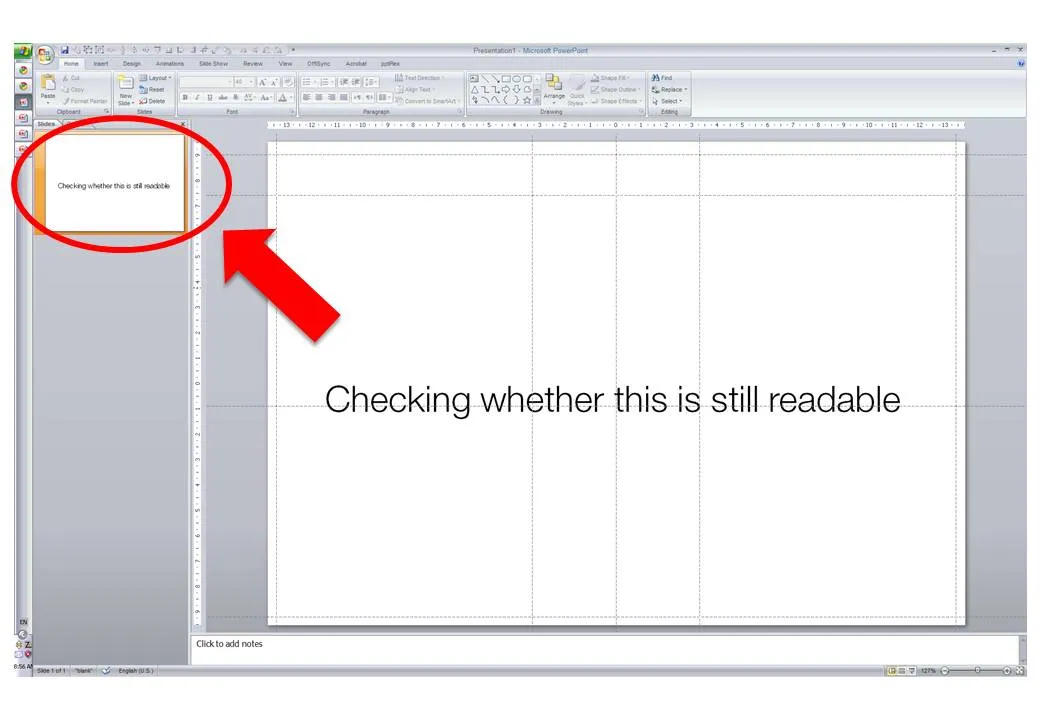
Constantly checking readability

When I design my slides I usually leave the outline pane open on the left side of the screen, so I get a sense of what an audience member sitting in the back row might see when the slide gets presented.

·Design

Clip art comeback?

I have been avoiding clip art for many years in my presentations. The graphics look clumsy and cliche compared to a high quality stock image. (Sometimes I am longing for that screen bean though).

After reading a few posts on Tom Kuhlmann’s Rapid e-learning blog I might change my mind though, maybe. All these big image, big text slides start looking sort of the same. Some ideas by Tom:

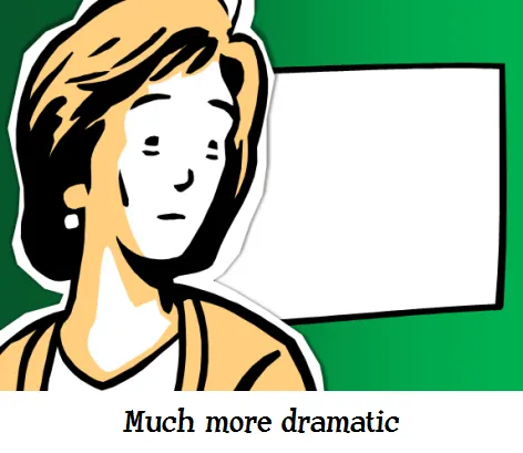
  • Edit your clip art to make it interesting. Dramatically scale them up, so they become huge on the slide. Ungroup the object and remove items you do not need, or even swap heads on characters.
  • Keep the style of your clip art consistent. I did not know that you can search for specific consistent clip art styles, this one for example: style 802. More examples here.
  • Clip art is a good source to make black silhouette characters.

Add Tom’s blog to your RSS reader if you are interested in this.

·Data visualization

Telling a story with an interactive map

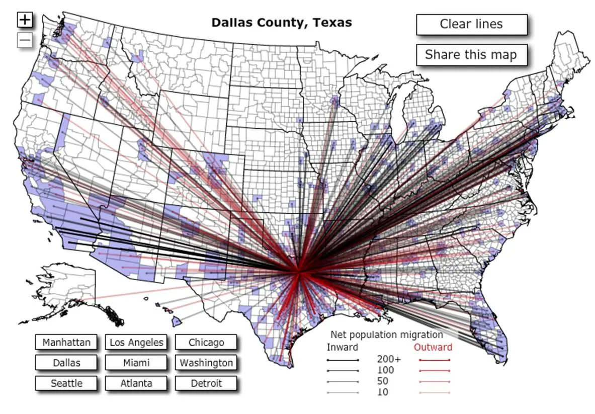
This interactive map is amazing: click a US county and it shows you were people who live their move to, and from where people are moving into this area. This is a (very cool) tool, but some serious DIY analysis is required to tell the story though.

I clicked around a bit and discovered some patterns:

  • Lots of people are moving back and forth between big cities
  • In the mid west, people move within a short radius
  • Upper east coast people move (retire?) to Florida
  • Etc.

To use this in a presentation there is no avoiding to going back to a series of screen dumps to take people by the hand through the data. (I am not a big believer in live demos during short presentations.

·Data visualization

Condensing dozens of pages of market research into one

Some market research agencies must be paid by the page. Reports are filled with pages of text describing the market: United States: segment 1, 2, 3, volumes, revenues, pricing, Asia: the same, Europe: the same. All in long full text sentences (“The U.S. segment 1 market was $1.345bn in 2009, up 3.125% compared to the year before. On the other hand, segment 2 declined by 3.54% versus 2008 and is now $2.675bn in 2009”).

Text is not the right way to convey this information. A simple one-page table with rounded figures can replace the entire document. And hey, you might even be able to put it on one slide in your presentation.

·Data visualization

Maps: an increasingly important visualization tool

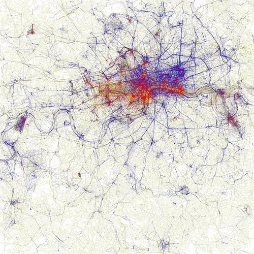
Look at this beautiful visualization of images taken in London. Blue: images taken by locals, red: ones by tourists (more cities here).

I am using maps more and more in my presentations. A map with color-coded segments is a much more powerful way to visualize data than a bar chart with a ranking of variables. I am still struggling to find good tools. There are very few good editable PowerPoint maps available, and Google maps screen shots are a bit cumbersome for large volumes of data points. Suggestions?

·Cartoons

Google assumes you are smart enough to understand their technology

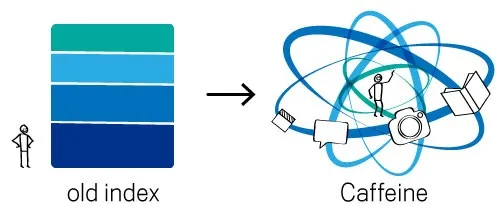
The recent post on the Google blog about an update to the search algorithm is an excellent example of how to explain technology:

  1. No apologies or “I will not bother you with the detail”, or “this is kind of complex and only an engineer (read someone more intelligent than you) will understand”. No instead, explain things clearly, but without oversimplifying.
  2. A simple graphic supports the verbal/written explanation

In case you missed, an earlier post on how Google uses cartoon characters to explain why its Chrome browser beats the competition.

·Design

A dense presentation that's actually good

Mary Meeker is a well-known Internet analyst. Every few months she updates her presentation about the state of the online world. Usually, dense slides are boring and fail to communicate a message. Not when every slide is packed with interesting data like in Mary’s decks. This presentation will not fit a Steve-Jobs-style keynote address, but it contains a wealth of insights well worth digesting.

Internet Trends 2010 by Morgan Stanley Research