SlideMagic Blog

Frequent updates about all things presentations since 2008. Subscribe to never miss a post.

RSS
all posts

Category Presentation

·Design

Brilliant: image cut outs in PowerPoint

PowerPoint does not have the rich image clipping and cropping tools that PhotoShop has. To take the background out of an image, you can set its background color to transparent and hope that the image edge come out reasonably clean.

Jose Arriaga recently started blogging about presentations on PowerPoint Symphony. He discusses an original alternative method: drawing a shape similar to an image and then fill it with the source picture as a background. Full details in his post here.
·Colors

Setting the colors for Excel 2003 users

Increasingly, I use color schemes in Excel models as well. While I am about to switch to Microsoft Office 2010, I find that the majority of my clients (especially the large corporate ones) are still on Office 2003. Buried down in the Excel menus is a feature to set the colors that Excel 2003 users will see when they open files created in Excel 2007.

  1. Click the office button
  2. Go to the bottom and select “Excel options”
  3. Select “save”
  4. Click the “colors” button under “preserve visual appearance of the workbook”
·Design

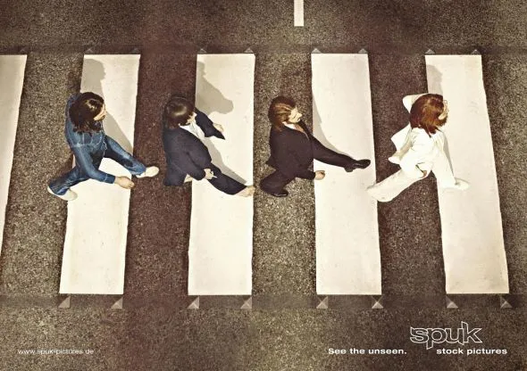
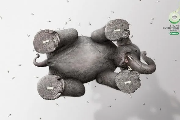
A different perspective

Most images have the perspective of someone who, well, stands up and look around. These 2 different ads (one here, and another one here) reminded me to look out for unusual compositions to keep your slides interesting.

Via Ads of the World.

·Design

"She"

The majority of presentations I see use “he” when referring to a customer, an employee, a user, a patient. I decided to use “she” whenever I can to compensate for this. Maybe you can as well.

·Design

More work in the public domain - Qelp

Most of my work is confidential, but there are some exceptions. An example is this presentation by Qelp, a startup based in The Netherlands that offers an online, picture-based, mobile phone support engine for operators. The people of Qelp have good presentation skills themselves, so I work more on a coaching basis: they deserve part of the credit for this presentation.

Smartphones and 3G internet: the perfect storm?

·Delivery

No point in arguing

Watching the disputes between players and the referee in the soccer worldcup reminds me of corporate negotiations. After the pitch presentation people start discussing the terms. Often, they are so preoccupied with their own viewpoint that they forget to listen or try to understand what the other party is saying. The same points get repeated, and repeated, and “let me explain to you one more time…”. Nobody is listening, everyone gets annoyed.

·Design

Some RSS feeds with images

A reader asked me in the comments of my post on the Pulse News iPad app what feeds I put in there. Here are some sites for daily creative inspiration:

Please let me know what sources I am missing here.

·Design

But what is it?

Here is a big sentence on the front page of a new web site targeted at iPhone users:

[Company] develops real-time personal discovery and contextualization technologies that leverage semantics and social attention to make social streams more relevant.

Industry insiders might understand what it means, but most people will not. I am not a big believer in mission statements. Often, the big wordy sentence that covers all will be the most compact way you can describe your business to yourself, but as you suffer from the curse of knowledge, other people will not get it.

·Design

Immersing yourself in images with an iPad

Every day I like to browse through an enormous amount of images from photography, art, design, and advertising sites to get inspiration for my presentations. The iPad is making this a whole lot easier.

Applications for the iPad are still in their infancy. Many RSS reader applications are popping up, partly driven by the fact that Google Reader does not work very well in the iPad browser (scrolling down is hard).

One iPad RSS reader app, Pulse News, is making an effort to mimic the iPad user interface by rendering content “iPad-style”: creating a stream clean headlines with images ripped from the RSS feed. For your regular feeds, this is a nice gimmick, but the draw back of the app is that you can only put in 20 feeds, by far not enough.

But for my image feeds this is brilliant. I follow less than 20 feeds and with the touch of a finger I can fly through days of content in a few seconds, just images! Try it if you own an iPad.

·Art

Unstretch that screen

More and more presentations are given on plasma/LCD screens with a wide aspect ratio. Most PowerPoint presentations are designed for a narrow 4:3 ratio (a traditional computer monitor). Most of the time, the screen will automatically stretch you image to create a bigger picture. I never understand this habit: the distorted proportions look horrible. (Judging by my own experience, this is how most people watch TV nowadays as well).

My advise: set the screen back to the narrow aspect ratio. Doing this on your computer is often tricky, the best way is to take the remote control of the screen and fix it there. A smaller picture is much better than a distorted picture.

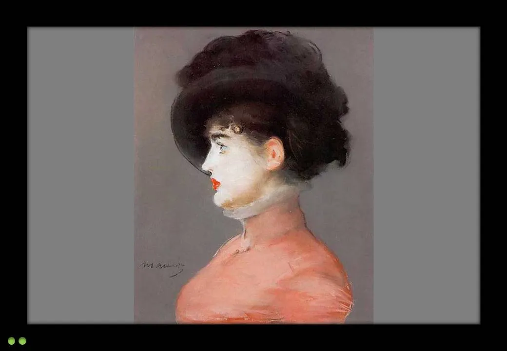
The painting is Manet’s Portrait of Irma Brunner.