SlideMagic Blog

Frequent updates about all things presentations since 2008. Subscribe to never miss a post.

RSS
all posts

Category Presentation

·Design

One more post about the closing slide

OK, the comments on my post from 2 days ago showed that I should think a bit more before writing about the last slide in a presentation. Here we go:

  1. A good story does not need a slide that says “that was it, please applaud”, the story flow in itself should let the audience feel that you have come to the conclusion of your talk. (And what if the audience does not applaud when you ask them to? Awkward.

  2. It is good to recap what you discussed though. But recapping does not mean telling the entire story again. Rather think of it what you want people still to remember 4 hours after the presentation. Leave out the buzzwords and the fluff.:

  • "Every teenager sends 3,339 text messages per month.
  • No teenager would want to miss out on our new service"
  • [re-display of stunning key graphic]
  • “Please invest in our 3rd startup that we will bring from PowerPoint to IPO”.

Much better than:

  • "The market is big,
  • there is no competition,
  • we have a solid business model,
  • there are interesting exit opportunities in this ever-changing mobile communications landscape that will transform the way young people communicate with each other".
  1. It is good to put the “killer graphic” back on the projector, since the brain can anchor an entire discussion/story to an image. People will remember. If you get a lot of questions, this slide will stay on the screen for a long time.
Continue reading →
·Design

Paul Graham on trends in startup fund raising

Many of the readers of this blog are - like me - designing investor pitch presentations. This 30 minute talk by Paul Graham of Y Combinator gives some interesting perspectives on how the competition between “super angels” and regular VCs has an impact on startup valuations and the startup fund raising market in general. If you are here just to learn about slide design, skip the video.

Watch live video from c3oorg on Justin.tv

·Design

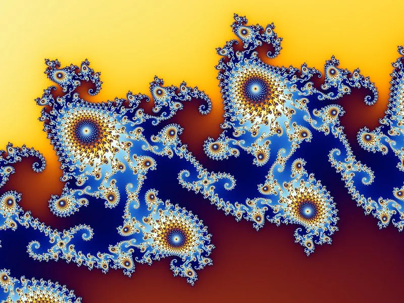
Benoit Mandelbrot 1924 - 2010

Benoit Mandelbrot passed away. He coined the term “fractal”, an endless shape that can be characterized with a relatively simple numerical pattern, leading to some very beautiful visualizations. It always fascinates me how shapes in nature can be defined with a strikingly simple code.

Image credit Wikipedia.

As an example, an artificially created leaf (Wikipedia source):

·Design

The last slide in your presentation

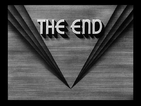
I came across this closing screen of an ancient King Kong movie (via FFFound).

  1. Vintage closing screens actually make a nice final slide of a presentation, you Google lots of them
  2. Always close your presentation with a sentence that makes it clear that the presentation comes to an end. “End that is how…”. Don’t say explicitly “well, this is the end”. Let questions come up spontaneously, and don’t say: “OK, I have time for 5 questions”, there just might be chance that no questions will come up (a bit awkward). I have seen many great presentations without questions.
·Books

Learning from ancient folk stories

I was just reading some stories from Nelson Mandela’s Favorite African Folktales(affiliate link) to my kids and realized how much you can learn from them to create short anecdotes that fit inside your bigger presentation:

  • Very short
  • One to three simple (almost stereotypical) characters
  • Something happens at turn 3. “On the 3rd day…”
  • An unexpected twist at the end: “and this is why monkeys became so good at climbing trees”

These tales were designed to be remembered and passed on for generations. How long does your slide deck stick?

·Data visualization

Two pies - too much

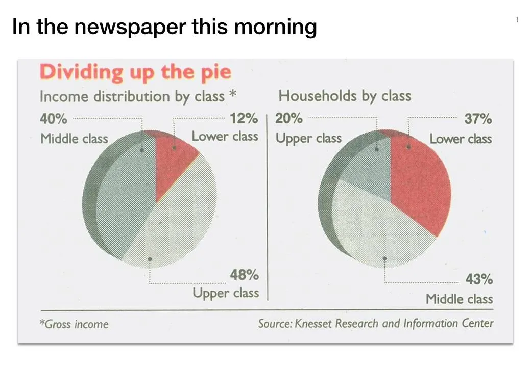
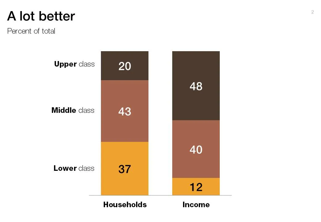
Pies are great to show relative sizes of surfaces, better than bars or columns. When it comes to comparing breakdowns on multiple dimensions though, the column chart cannot be beaten. See this example taken out of Haaretz this morning. What did I fix:

  1. Two columns instead of two pies
  2. Get rid of the 3D effects (earlier post)
  3. Use consistent coloring for data series
  4. Use consistent ordering for data series
  5. First the chart with the number of households, then the chart with the breakdown of income

·Concepts

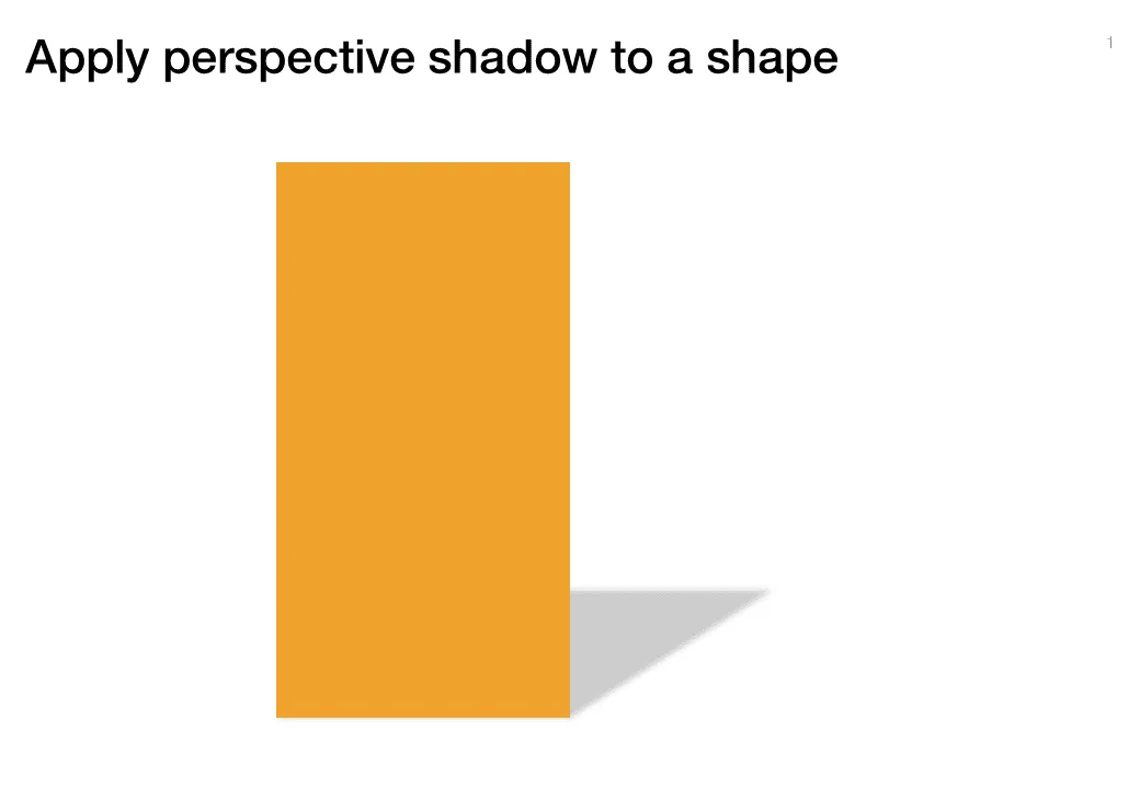
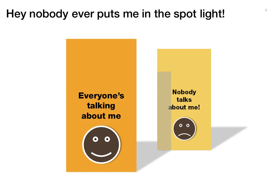
Chart concept - standing in the shadow

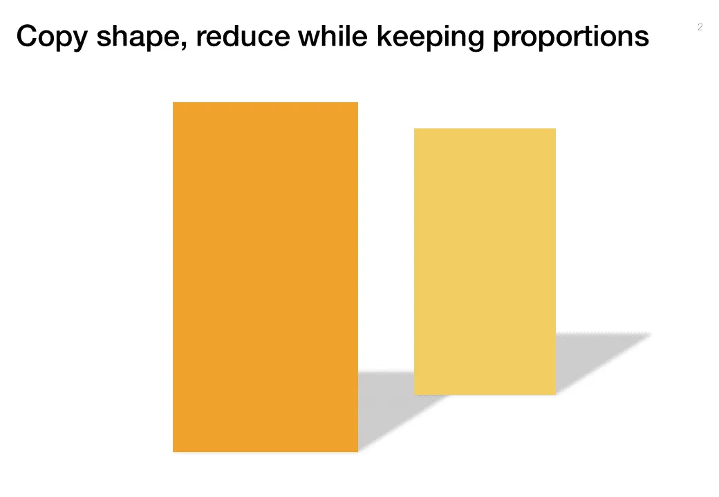
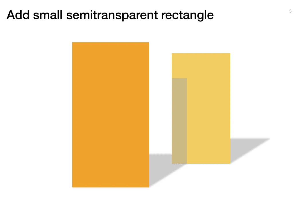
Some issues/people get all the attention, while others never get discussed. The chart below looks a bit like a child’s drawing, but the point is to show how you can play with shadows to create the effect.

·Design

Fundraising dialogue going wrong

Highly amusing video of a fund raising discussion. In many pitch discussions, people talk at each other, but are not really listening, talking to each other. Created by ITHAYER.

·Data visualization

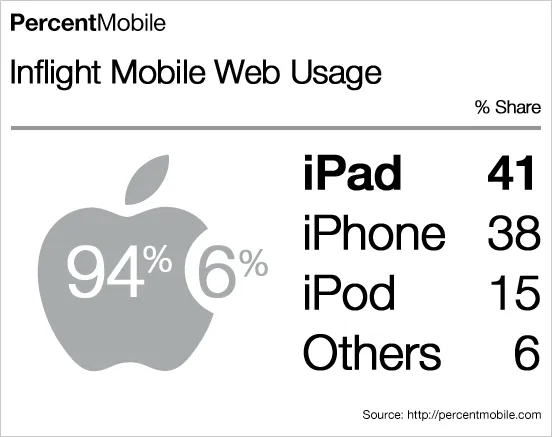
Blending data and typography in a chart

What a nice chart by Mobile Analytics. Perfect blend of data, logos/icons, and typography.

·Design

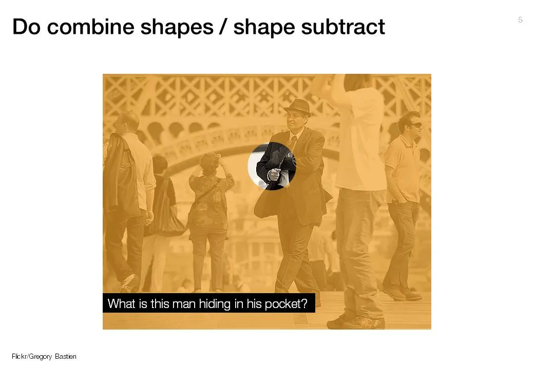
Making cut outs using shape subtract in PowerPoint

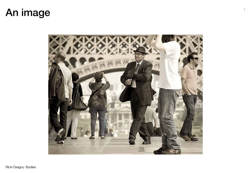
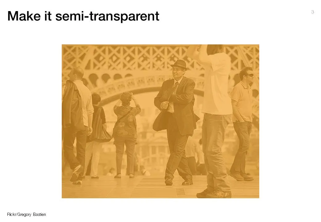
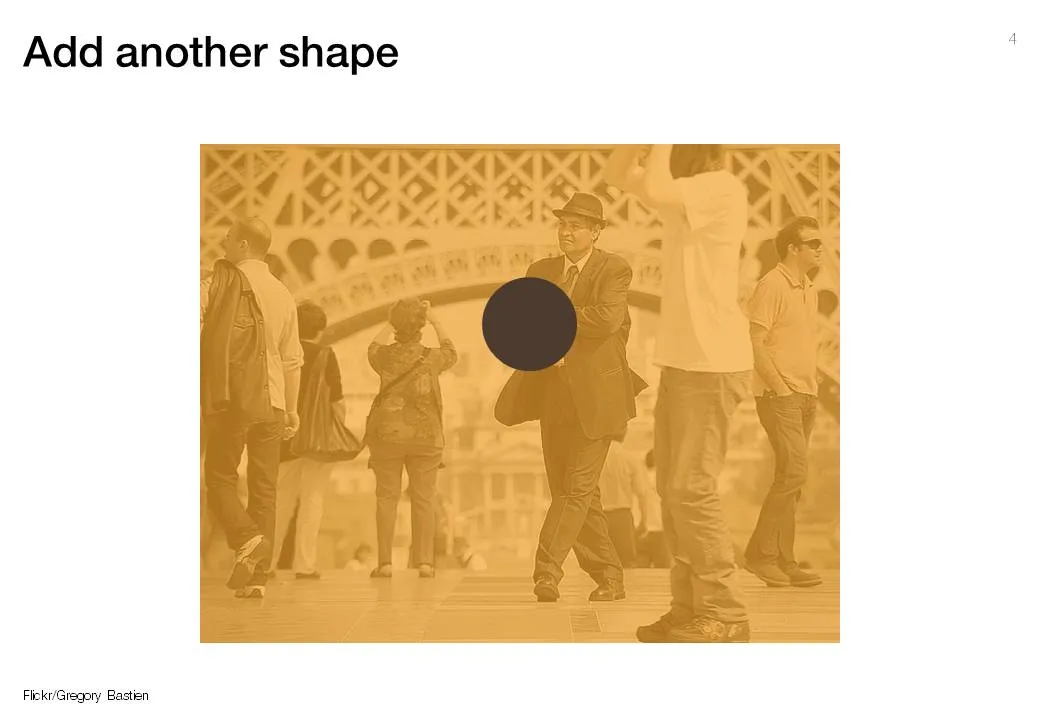
The new shape subtract feature in PowerPoint 2010 (review) enables you to make shape cutouts in a more elegant way than before (see the old approach here). A step-by-step guide using a great image by Gregory Bastien.