SlideMagic Blog

Frequent updates about all things presentations since 2008. Subscribe to never miss a post.

RSS
all posts

Category Presentation

·Design

Showing versus describing

Describing is an indirect way to convey a message:

  • We have systems in 3 countries
  • They are maintained on different time schedules
  • Five different departments are interfering with maintenance

In short, it is a mess. The bullet point chart above does not convey the message very well. Why not show the mess and create a chart with boxes for each of the countries, the departments and connect them with arrows color-coded by time to show what’s going on.

The chart will be busy, the chart will be dense, the chart might even be incomprehensible, but hey, you wanted to convince your audience that it is time to do something about this? No better way to do it.

Image credit: Mr. P
·Design

Do fonts display correctly?

I have changed the fonts on this blog to Helvetica Neue, they look great on every computer/browser that I have tried even if you do not have these fonts installed on your computer. Every, except for one computer/browser combination: my own Chrome browser on my own desktop (IE works fine)… Please let me know if you are experiencing garbled fonts on this site.

·Design

Graphics design overload?

I have been browsing through a number of books on contemporary graphics design recently and I must say: “more is better” seems to be the motto of many designs. Adobe Illustrator is powering complex gradients, elaborate ornaments and sophisticated hand-drawn effects. Maybe graphics design is ready for a “Zen revolution” similar to presentation design? (Or I simply have been reading the wrong books?).

·Design

Original PPTX files from my posts

Now and people comment that they would like to receive the original PPTX files of the slides I discuss here on the blog. I am hesitant to put them up on a regular basis, but will respond to a request by email or in the comments.

·Concepts

Chart concept - negative lettering space

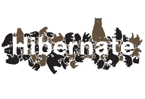
Here is a cute idea for a slide: negative lettering space. Computerarts.co.uk has a full tutorial how to create this effect here. It is easy to copy in PowerPoint: start with a word in a huge font on a page, set the font color light grey (or another color with a light contrast to your background), fill the page with the images you want, and as a final step delete the text or color it the same as your slide background.

Here is a search for earlier posts with a “can’t see the forest through the tress” type of concept.

·Design

Getting the best creative commons images via Flickr

Stock images are often staged, not natural, lacking spontaneity. Images with a creative commons license on Flickr are an excellent alternative, with one drawback: it is a bit harder to find the right image.

Here is what I do. Now and then I take a Flickr “deep dive” and just randomly browse/search images not using a functional key word such as “chair”, “pilot”, or “apple”. Rather use characteristics that a photographer would use to describe an image. As an example, see what a range of beautiful images comes up when searching for “focus”.

Browse through the images and bookmark them or save them to a tool such as Evernote for later use. An example, a very detailed image of the Manhattan Bridge by See-ming Lee.

·Design

Simple diagrams creates well, simple diagrams

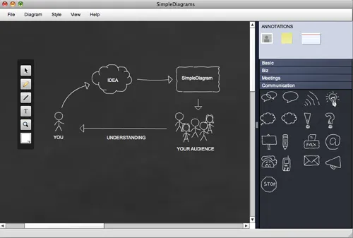
Simple diagrams (link) is a nice little tool to create simple sketches in the spirit of Dan Roam’s book “The back of the napkin” (review). You can either use it as a sketch tool to develop ideas, or as slides in your presentation. The extreme scenario would be to create an entire presentation out of these types of diagrams.

The program uses aggressive pop up messages to get you to use the full version. There are more subtle ways that will get to the same effect.

·Design

$10m - 3 companies - 5 slides

An interesting post on TechCrunch today: Socialcast founder Tim Young explains how he raised $10m for 3 companies using a 5-slide PowerPoint presentation. Some of the points that stood out (please read the full post for the complete picture):

  • In 1-on-1 meetings you can try to avoid the confrontational both sides of the table setting by sitting next to each other and sharing a laptop screen
  • Remember what the objective of your 1st VC meeting is: get to the 2nd one, it is - not yet - about trying to tell the potential investor everything you know about your business in the hope that he will sign the check after 30 minutes. Getting to the 2nd meeting is all about avoiding “rat holes”.
  • Focus your slides (in come the 5 slides he used), but have the 45-slide backup in your back pocket in case you need to lift out a slide.
  • Use (real) images of faces wherever you can to introduce people that are involved with the business (instead of names). When he says faces, faces, faces, he obviously is not referring to anonymous models that are too often found in stock images.

I agree with this approach, I just would like to give a word of caution/some comments. Each startup has a different set of 5 slides. Don’t just copy the ones Tim used. Rather look through the slides and see what Tim is doing.

His 5 slides have no story in themselves, they are pact with facts. Tim is telling the story himself, without slides. Only when he needs facts he reverts to slides. “Look at the credible team and investors we have” [Very dense slide packed with names, photos, and logos]. “See that there at the bottom? 75,000 i.s.o. 5,000 users per server, let me explain” “We’re on a roll” [Very dense slide with performance metrics], etc. The exception is slide 3, an abstract graphic that you can almost draw on a napkin to explain the key idea behind the business.

Continue reading →
·Concepts

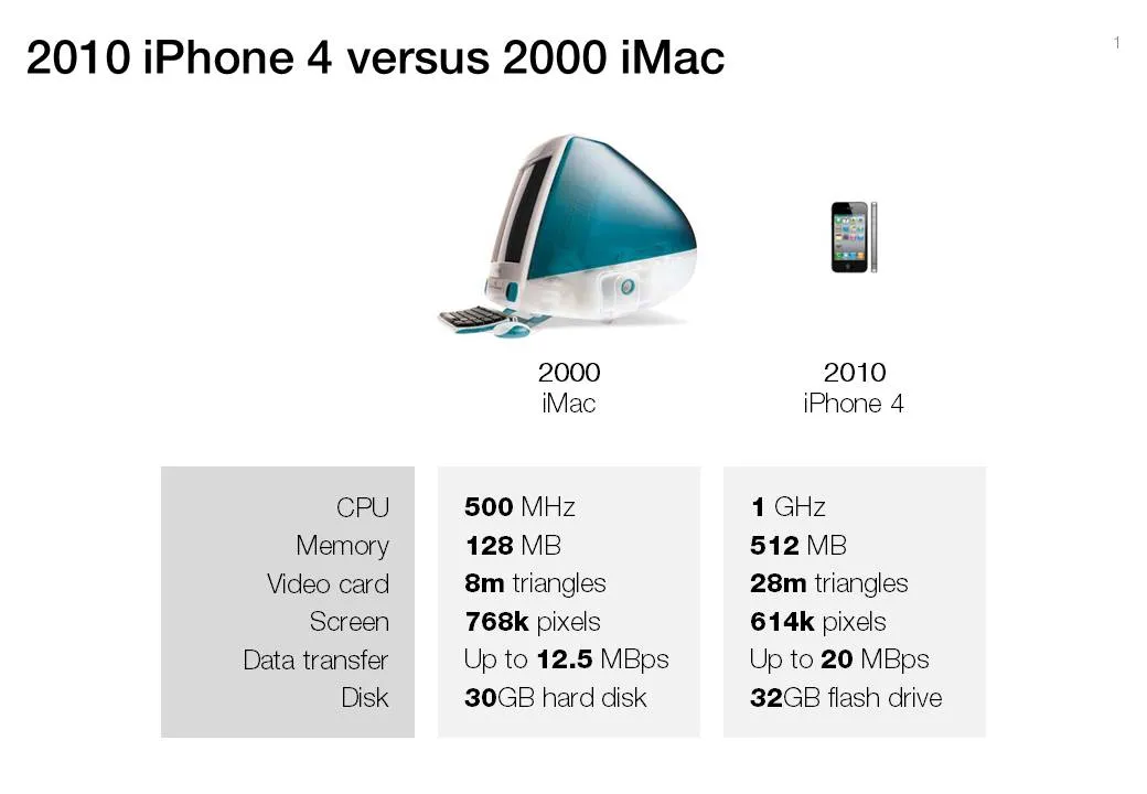
Chart concept - 2000 iMac versus 2010 iPhone 4

A chart concept I used yesterday in a client’s presentation to demonstrate the progress of personal computing technology over the past decade (technical details taken from this post by AdamH).

There is no point to construct complicated bar charts to compare the values of the technical specifications, they are similar (the point of the chart). Rather what is important, is to shrink the image of the iPhone so that it’s more or less to scale with the much bigger iMac.

·Art

Review: Art Authority for iPad

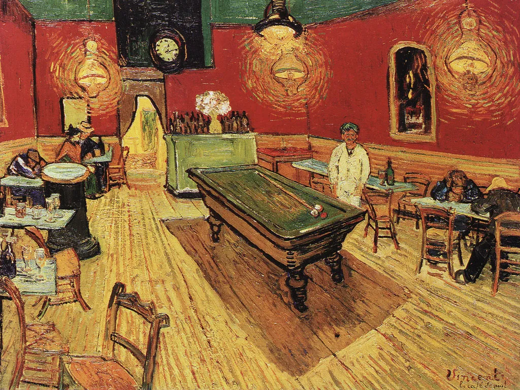
I often use paintings as an inspiration for slide design. Sometimes you can actually use the actual painting itself, but more often, I use a painting to borrow a color scheme (earlier post).

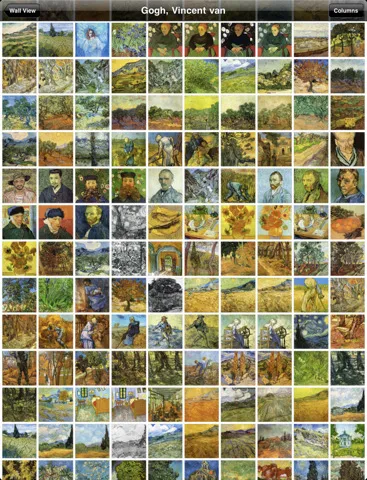
There is  a big problem with art books: it is hard to browse vast quantities of images quickly, slice and dice art works by artist, time, genre. A good painting requires time to appreciate, once you found it. However, the finding is the difficult bit.

The iPad is a wonderful device to navigate huge image data bases (earlier post). I am a bit late to discover Art Authority for iPad, an application that make this a reality for art. Over 1,000 (Western) artists, with each painting properly documented plus links to Wikipedia for more information.

Most art books show the same “greatest hits” paintings, not spending paper on less well-known works by artists, paper publications cut off the long tail. Not with Art Authority that shows works beyond the beaten path.

$10 well-spent.