

One of the things I find the most difficult in presentation design is to get a consistent look and feel across all slides in the deck. It is tempting to come up with the killer chart for each concept that you want to communicate. Each slide is great, but if you look at your slides in the slide sorter, nobody would guess they are taken from the same story.
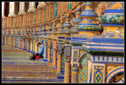
So, we have to add one more constraint to the design process: consistency. Some visualization ideas might just not work given the overall context of the presentation, sorry.
In the design process, I always start with the most important slides that convey the heart of the message. Brainstorm, sketch these, and then freeze the look and feel of the entire presentation based on these few slides:
- Fonts
- Colors
- Position of titles
- Type of images (cartoon, nature, vintage, people, color)
Think of your presentation as a movie that runs in the background, it is set in a time, a place. You pick them all, but stay inside the world of your presentation.
Image credit: Copeau,
1 comment
Cheers, Greg.