SlideMagic Blog

Frequent updates about all things presentations since 2008. Subscribe to never miss a post.

RSS
all posts

Category Presentation

·Colors

Lighten up

It can be tempting to splash on the colours in a slide design, especially if you have a colour palette with 3 or more colours. The result: highly colourful slides that still look very “PowerPoint”.  Why does the work of a professional designer not look like PowerPoint?

The secret: only use colour or highly contrasting greys (dark on a white background, light on a dark background) when you want an object to pop out. Use one base colour frequently, and reserve all the others for accents. Use light shades of grey, rather than filling a big slide object with a very dark grey. Consider using dark grey for your font colour instead of pitch black.
·Delivery

Minority report screen

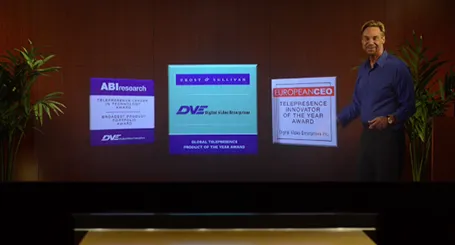
See this presentation screen by DVE Telepresence (auto-play alert), it allows you to move PowerPoint slide objects in the style of the film Minority Report. What do you think? I am afraid that more sophisticated screen technology will not turn humans into better story tellers.

What would be useful though is to have a technology that allows you to write on a transparent whiteboard in front of an audience where technology takes care of mirroring your writing, so it becomes readable by both you and the audience.

Secondly, having a camera hidden inside a screen is great for creating natural eye contact.

·Investor presentation

The investment banker

Investment bankers use presentations that are documents for reading, they are even denser than the slides a management consultant typically produces. And whereas a management consultant usually can be convinced easily to change a presentation approach, investment bankers stick to their traditional approach. I have been thinking why this is the case, because I believe that a more visual presentation approach also works in the world of finance. Possible reasons:

  • Finance is a conservative industry, and a different looking presentation might give the impression that you are not serious.
  • Bankers are actually good sales people and do most of their sales pitches verbally, they put up the confusing and dense slide with all the facts, but when you listen to the audio track, the story is quite clear. The slides are for reading after the meeting, the presentation is for listening only
  • Bankers work under very strict time pressure, so there is simply no other practical way than to produce a deck by writing bullet after bullet.
  • Bankers usually do not get very deep in to the strategy of a company (like a management consultant does), a company is a company with sales, growth, margins, PE multiples, and leverage. As a result, the presentation will look more generic.
  • Bankers are used to reading/interpreting financial ratios: a EV/adjusted EBITDA ratio of 6.8 instantly rings a bell. A less financially savvy audience might need more than a bullet point to be impressed by this.

In most of my projects with a conservative investment banker, I try to negotiate a highly visual summary deck that goes in front of the dense appendix. Over time, we iterate the summary deck more and more, and the appendix gets used less.

Continue reading →
·Keynote

The joy of tables

Tables in PowerPoint are a great basis to set up a slide in PowerPoint. Everything is instantly lined up in a grid, it is easy to add and remove boxes (lines). I often use tables with a very light grey fill and fat white lines.

·Images

But it is the same image?

Sometimes I get this question when using the same image multiple times in a presentation. I re-use it on purpose (not to save stock image costs, or for lack of inspiration). Throughout the presentation, an image can become a brand, or a logo, for a complex idea. Putting up the image again (either in full size, or a smaller icon) communicates that complex idea in a nano second.

·Concepts

On the way to average

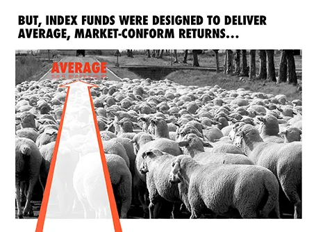
I designed the chart below for a sales presentation for an asset manager who is about to go on a roadshow to pitch a new investment fund to potential distribution partners. Yes, you saw that right, I did use a reflection effect.

·Keynote

Demos are stories, not feature lists

A 20 minute presentation is usually to short to carry a live product demo. You might run into technical difficulties, and you are losing time/attention with banal product features such as logging in, etc.

In those cases it is better to use application screen shots, rather than the real thing. You can still point at your computer and say that there is a working prototype, and that you are more than willing to take people through in a separate, longer meeting.

The next level up is to crop/magnify the screen shots and focus only on those aspects you want the audience to see. Your Skype window, menu bars, and all other unnecessary screen real estate can be cut out.

Next level up: put big, bold, explanation arrows explaining what the user should see. Say that it is a really minimal UI, if it is minimal.

Now here is the big difference. Do not just structure your product demo alongside the feature list of your app. Instead, create a user story and let the app screens flow with the story. You can also include visual images that are not screen shots into this story board. Even better, link back to story elements you have used elsewhere in the presentation.

A product demo is a user story, not a list of features.

·Keynote

What I really want to say, is this

In many draft/briefing presentations I see, there is a page 1 that was inserted after the full presentation was finished. It contains the things the presenter really wants to say.

Do not feel guilty to discard almost the entire presentation (slides 2-50), take page 1 as a story board to build up the entire presentation from scratch, focussing just on the things you really want to say.

The three weeks of work you invested in page 2-50 where necessary to get you to write page 1, which you can now turn into a full presentation in less than a day, because the full picture is crystal clear, very different from where you were 3 weeks ago.

·Design

Leading

One of the typography elements I play with all the time is leading, the space between 2 lines of text. PowerPoint sets the leading standard to 1.0, or 100% of the typeface size. What leading looks good depends on:

  1. The typeface you use
  2. All caps, sentence caps or lower case
  3. And most importantly: the size of the font, bigger fonts need less leading

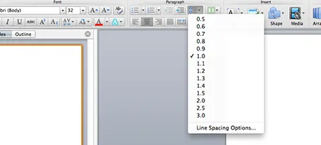
There is no general rule here, you need to fiddle and see what looks best. On a Mac, there is a button that controls the leading of your paragraph, see the screenshot below. It is one of the buttons I use most.

·Design

Designing a good logo page

Most sales presentations contain some logo page to show off your impressive client list. Make sure that the page looks impressive from a graphics point of view as well. An unstructured clutter of low-res logos makes an impression of an amateurish startup best to be avoided for serious business.

  1. Check whether you got the latest logo of a client (visit the home page)
  2. Use high resolution images
  3. Where possible, use the logo that has a white background
  4. Do not distort aspect ratios
  5. Make sure the logos are more or less the same size
  6. Distribute things evenly horizontally and vertically in a nice grid
  7. Keep the page simple: just logos
  8. If things look too busy, you can consider moving all the logos to black & white