

SlideMagic Blog

Frequent updates about all things presentations since 2008. Subscribe to never miss a post.

RSS
all posts

Category Presentation

·Keynote

Web site = company presentation

Now and then I get stuck on the border of web site design and presentation design. And increasingly, the border is blurring. I am not talking about big eCommerce sites or sophisticated web applications here, I deal with a straightforward web presence for a high tech startup.

How can a presentation designer be helpful here?

  1. There is hardly any need for extensive technical content. Viewers are looking for a simple and professional looking page that quickly answers a few basic questions: what do you do and who are the people behind the company. If your page looks like a 800-pixel wide website from 2002, your company is probably from that time as well. If I cannot find details and names of the management team, nor a postal address then the company might actually not be real.
  2. Web-based presentations and web sites have the same audience: click, click, click-ing to find out what you were looking for. Elaborate text, buzzwords, spectacular videos, auto-play music all distract and delay in exactly the same way as animation and bullet points do in a PowerPoint deck.
  3. There are great what-you-see-is-what-you get tools out there for novices to build web sites. Wix has a very consumer non-professional feel, Webydo is like Adobe InDesign put online, and my favourite is Square Space. My own web site is still based on Wordpress, which missed a great opportunity I think to become a simple web site creation platform.

Basic web presence design will become increasingly standardised, but I still encounter many web designers who continue the bespoke route of the past decade. Prediction: something similar will happen to presentation design and enterprise communication: you can instantly recognise two types of presentations: 1) the bullet list by the non-designer, 2) the presentation that is prettied up by a professional graphics designer (icons, banners, logos, effects). I am working hard to eradicate both.

·Keynote

Feature laundry lists

Many tech presentations contain have the feature laundry list table in them: 15-20 great things your application can do. Here is how to make them better:

  • For reading: reduce the font and add more text to make the feature and its benefit explicit: from “historical overview” to “Compare usage levels over the last 30 days and spot unusual drops in demand”
  • For presenting: Option 1: if you only want to show that you have lots of features, keep the text short and put 20 boxes in a nice 4x5 grid on the slide, do not even bother to go into the specifics. Option 2: if you want to go into the specifics, create 20 slides addressing one feature/benefit each, make sure you can present each slide in 10 seconds while at the same time being specific enough so people can understand things beyond a vague description.
·Gadgets

Is the tablet love affair over?

A partner in VC firm Andreesen Horrowitz confesses that his love affair with the tablet is over. People will stick to a desktop device the laptop and a pocket device, the phone (which will get slightly bigger).

Putting things in context of presentation design (leaving the consumer world aside for a minute):

  1. I think tablets are here to stay for managers that need to view documents, but do not make edits beyond small corrections
  2. Serious presentation design work will never work on a small touch screen (maybe a similar statement to that of IBM estimating the world market for computers). One, there is the physical constraint, but more importantly, I think you need that space, that big screen, that calmness, to think/focus and create beautiful presentations
  3. One thing that the tablet has done is change user interface design forever: I predict most new desktop software will slowly migrate to a tablet-like interface (simple, big buttons).
  4. I think we are likely to see another big innovation in laptop user interface design. Either very large touch screens (still, the distance to the screen will be an issue for a workable user interface), or giant touch pads (maybe integrated with a keyboard) that allow us to scroll through information Minority Report-style.
  5. Document creation and design software is too complicated and a left-over of ideas from the 1980s. Enterprise documents can be much simpler/uniform while still being effective and distinctive (watch this space). So the innovation in enterprise computing/communication might be in software, not hardware.
Continue reading →
·Keynote

Two ways to keep it short

Option 1: lots and lots of benefits, but each one is described in just one, really short bullet point (i.e.: “A flexible solution”) Option 2: Only 3 benefits, but each is described with rich and elaborate stories

The same amount of words, but guess which option will be remembered best. Too many benefits equals no benefits.

·Keynote

Making the story bigger

In projects, I typically help out with 2 things:

  1. Making things look pretty
  2. Lifting the story, making it bigger

I rarely do major surgery in fixing the flow of a story (this is where all time was spent when writing McKinsey documents). In a short 20 minute pitch the sequence of the messages is usually more or less right. What I see often though is that people do not pitch their story big enough, they take out the big picture of how their solution can really change things in a fundamental way. For you, the expert, it is obvious, for the outsider it is not.

·Delivery

How the Fed learned to talk

An interesting piece in the NYT: how the Federal Reserve is moving to communication as the core of its strategy to steer the US economy.

More, and more bastions of corporate waffling are being torn down as journalists, analysts, bloggers, and the audience itself becomes more ruthless in cutting to the chase of what is actually being said.

Historically, there were probably two reasons for people to waffle:

  1. Status: lawyers, politicians, doctors, scientists, priests, CEOs used their jargons to re-emphasize their authority towards us, the ignorant masses.
  2. Cover up: if you get an unexpected question, waffling is the default strategy to gain time

Reason 2 is probably here to stay. Reason 1 is no longer an excuse.

·Colors

Fix the PPT for Mac colour bug

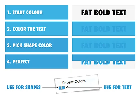
The colour rendering bug in Microsoft PowerPoint 2011 for Mac is highly annoying. Here is fiddly a trick to get around it. You basically need to goal-seek the text colour into something you like.

  1. Pick a colour you like, draw a shape and fill it with the colour
  2. Write some text in a big bold font and set it to the same colour: PowerPoint will render it incorrectly
  3. Here is the fiddly part: repeat steps 1-3 until you are happy with the TEXT COLOUR.
  4. Now, use the Apple colour picker to strip the colour of the text

Save your colour template with 1 accent colour for text, and one accent colour for shapes. In your drop down menu they will look different, on screen they will look the same.

Note 1: I tested the PowerPoint RGB colours as well in Photoshop and Illustrator, and it turns out that PowerPoint renders the shape colours incorrectly, the text is correct.

Note 2: There is a more analytical way to get your desired colour than simply trial and error. You can analyse the RGB codes of the background colour and the text colour. So, set the shape colour to something that you would like. Write down the RGB codes. Colour the text with that colour, and pick its colour with the colour picker. Write down the text RGB codes. Analyse the difference between the two colours and create a third colour by adding/subtracting the R, G, and B differences between the colours. This will be your text colour that renders the same as the desired shape colour. It all sounds more complicated than it is.

Continue reading →
·Keynote

Keep it fresh

The beauty of a verbal story is that it forces you to stick to one sequential story line. In a direct dialogue you need to weave your big thoughts together on the spot, right there with the instant feedback of the eyes of your audience signalling “Uh oh, I am losing the plot here”.

When writing prose, this clean story line can go missing. You write a sentence, go back, edit it, add a buzzword, put in a tangent/exception, copy and paste the section somewhere else. Soon, the clear, instant, on the spot, story line is gone and replaced by a page out of a business school text book.

In visual slide design something similar happens. You start with an idea for some visual concept, but then things get added (ROI, customers, social engagement) and before you know it you have a diagram that is really useful for you, the designer, as an aide memoir of what your business is all about, but the audience is losing the plot.

When designing a presentation, try to stay as close as possible to that fresh, on the spot, story line with which you started out with. Stick to very basic visual compositions (a trade off, best of both worlds, elimination of a layer) and visualise your story around that. Add distractions and complications later, after the big idea has settled in.

·Keynote

Nitty gritty

One of my clients has a technology that can save cost for a retail business. They did a pilot implementation at one retailer and have a lot of cost saving data as a result.

You can present this data to other potential clients (sanitised of course) in 2 ways. Approach one is the absolute number: we helped save $x,000 in costs. But this is hard to relate to for other retailers with different types of businesses. Better is to do it relatively: “we shaved 10% of the cost of item x.”, but it is still a bit generic, any startup with a cost saving technology has a sales pitch deck with these types of numbers. A credibility issue here.

Even better is to go into the nitty detail and highlight simple case examples of things that go wrong every day in a retail store, and how the solution helps to prevent it. It shows that you know what you are talking about, and lends instant credibility to your story.

At McKinsey we used to say: retail is detail.

·Colors

PPT 2011 for Mac color bug

Microsoft PowerPoint 2011 for Mac has an annoying bug: when you apply a colour to a font, it comes out slightly differently than when you apply the exact same colour to a shape. One: it looks bad on slides, two: it gives surprises when you open a PowerPoint file created on a Mac on a Windows machine (which does not have the same issue).

When I posted about this somewhere on a Microsoft forum I got the response that this was done on purpose; to make text readable against a coloured background. This does not make sense, if I want to make the text readable, I will put in a different colour myself, and definitely not the one that Microsoft is using. See below, the letter colour is a completely different type of blue than the background.

(Geek alert). There is a complicated way to get around it. Type some text, change it to the desired colour. Now select the desired text (not the entire sentence) and bold it: the right colour appears… But, as soon as you do anything else to your text box, the wrong colour gets put in. Annoying…