Not just bold
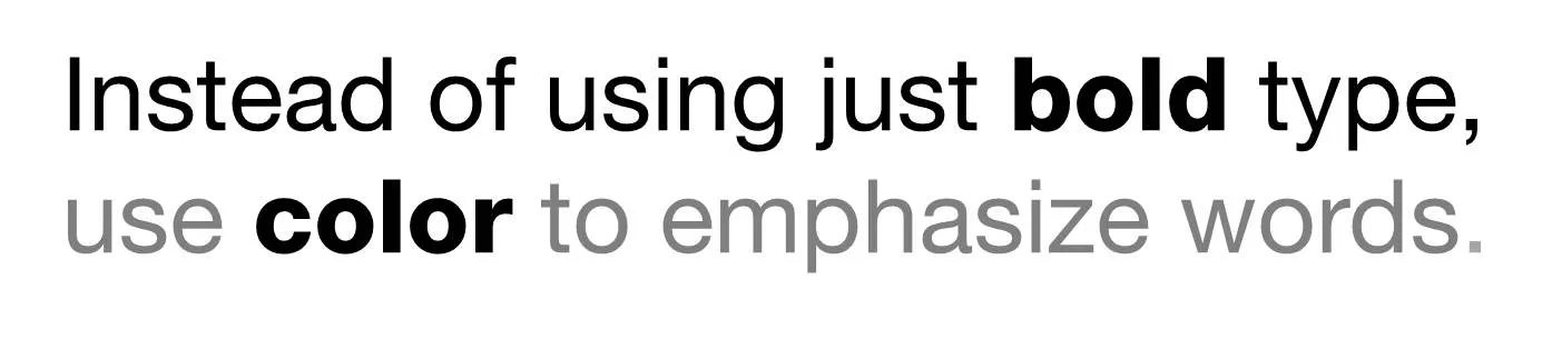
Putting body text in a slightly lighter color gives you opportunities to emphasize words beyond putting them in bold.


Frequent updates about all things presentations since 2008. Subscribe to never miss a post.
Putting body text in a slightly lighter color gives you opportunities to emphasize words beyond putting them in bold.
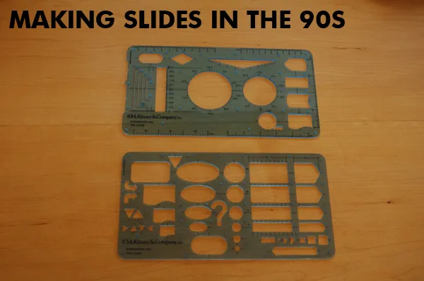
Look what I found in the box with drawing tools of my children: my old McKinsey exhibit rulers! I would carry these with me 24 hours a day in the 1990s. All charts were sketched by hand before being handed over to graphics assistants who would convert them into computer visuals (first overhead slides, then PowerPoint slide shows).
The sketching by hand is a really good thing. But the limited number of available shapes restricted the creativity somewhat, all charts looked very similar as a result. See that big question mark? In case you did not know the answer (yet) :-).
I am not sure to what extent people who read presentation design blogs also have a large number of fashion design feeds in their RSS reader. I follow one: The Sartorialist, the blog of Scott Schuman who wanders around city streets with a camera, taking pictures of regular people wearing interesting creations.
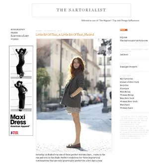
Browsing through his site will show you how poor staged stock images are, and how much more emotionally powerful images of real people can be in your presentation.
To the left is a small screen shot of the web site. Photography on The Sartorialist is under copyright, so you can use the site only for inspiration. Use Flickr to search for relevant images with a creative commons license.
Update: below a mini documentary that came out just today.
I have frankensteined (what?) together a slide deck of around 50 slides that were used in blog posts here on Sticky Slides over the past 2.5 years. All completely unrelated, and out of context but maybe good enough for some creative inspiration.
PowerPoint designers are struggling with big file sizes that consume storage and make it hard to email documents. I have discussed solutions such as YouSendIt and Google Docs before (here). Recently, I switched to Dropbox:
The Dropbox pitch to venture capitalists from 2007 pretty much still holds.
YouSendIt requires sign in all the time, and all the advertising and branding does not look very professional. Google Docs is still hard to integrate with Microsoft Office. Office Live does not integrate fully with the Windows operating system. It also suffers from feature overload: I do not always want to create a full virtual team room with calenders and contact lists, just sharing files is enough.

If you sign up with this link for your free 2GB account, you get 250MB of bonus space (disclosure: and I get another 500MB). You see, they know how to market as well. The regular link is here.
The last word probably has not been said about this subject, I wonder whether the conclusion still will be the same in January 2012.
I find it easier to create visuals in PowerPoint than Adobe software. However, the image export functions in PowerPoint are not very sophisticated. It is hard to set resultion/DPI, choose format, set the exact image size, and/or control the naming of the exported files.
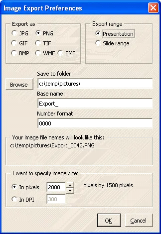
PPT ImageExport does all of this. The software creates an add-in in your ribbon. This is not a very sophisticated piece of software, but it has proven very useful for the design of my new company web site. A full license costs $30.
Here is the post to close 2010 and wish you all the best for 2011: Angry Birds fonts in PowerPoint.
And you are done!

There is a stunning statistic in this interview with the developer of Angry Brids by Hilz Fuld: More than 200 million minutes every day is spent on playing Angry Birds. This sounds like a lot, but it is still hard to put the figure in perspective.

Statistics need to be put in some form of context. Pick the one that is most useful in your presentation.
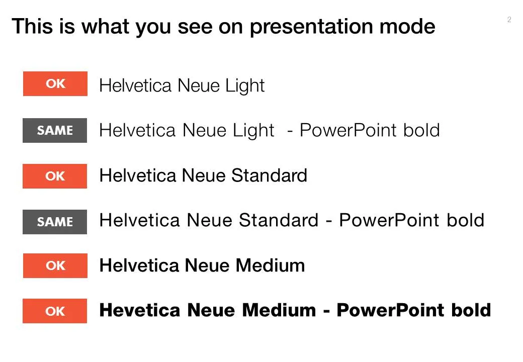
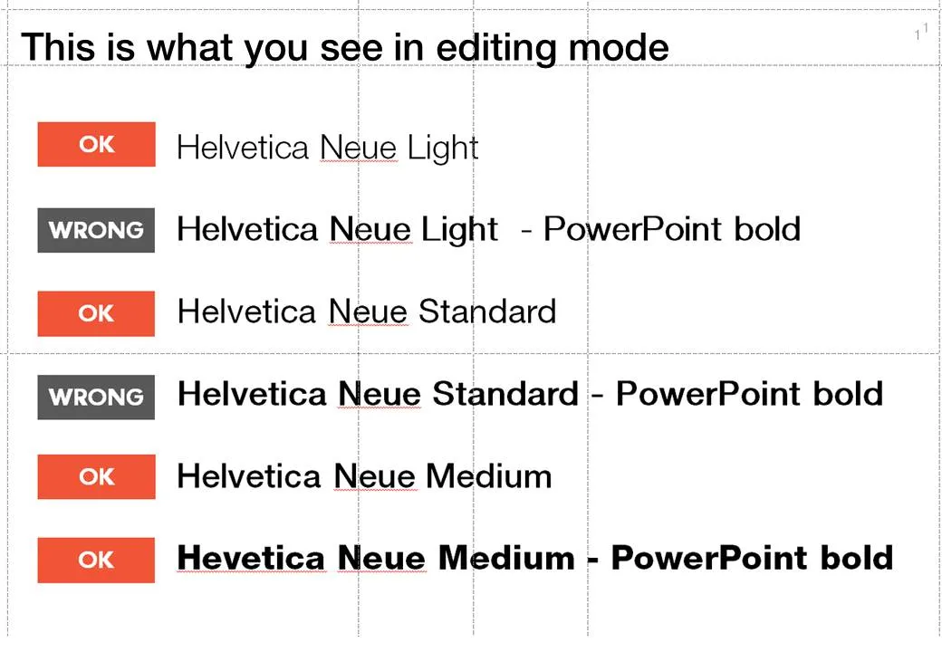
When PowerPoint does not have the right bold or italic font variation installed, it tries to emulate the real thing. For example in the case of bold, it plots slightly overlapping version of the same letter next to each other to make the characters look heavier.
But when you install the correct fonts they get put in slightly random places. Look at the editing screen below (click on the images to see a larger picture). You can see where things go wrong as PowerPoint tries to fill in the missing gaps. Strangely enough in presentation mode, it displays these fonts as regular type.
Secondly it takes some tweaking to get the right font you want:
Fonts remain mysterious.
Most of my charts start with a pencil sketch. I burn literally through piles of paper when designing a presentation (a good use of those 1-sided print outs you do not need anymore). So what are my favorite pencils?
When I started at McKinsey, the Pentel P205 was my initial favorite. Per pencil, it is actually very cheap. That was exactly the problem, people considered it cheap enough to borrow it all the time. I kept on buying new ones.
I experimented with various much more expensive pencils only to discover that these are actually pieces of jewelry rather than sketching instruments. Beautiful to look at, but not very useful. Check out the site of Joon Pens in New York to see some examples.
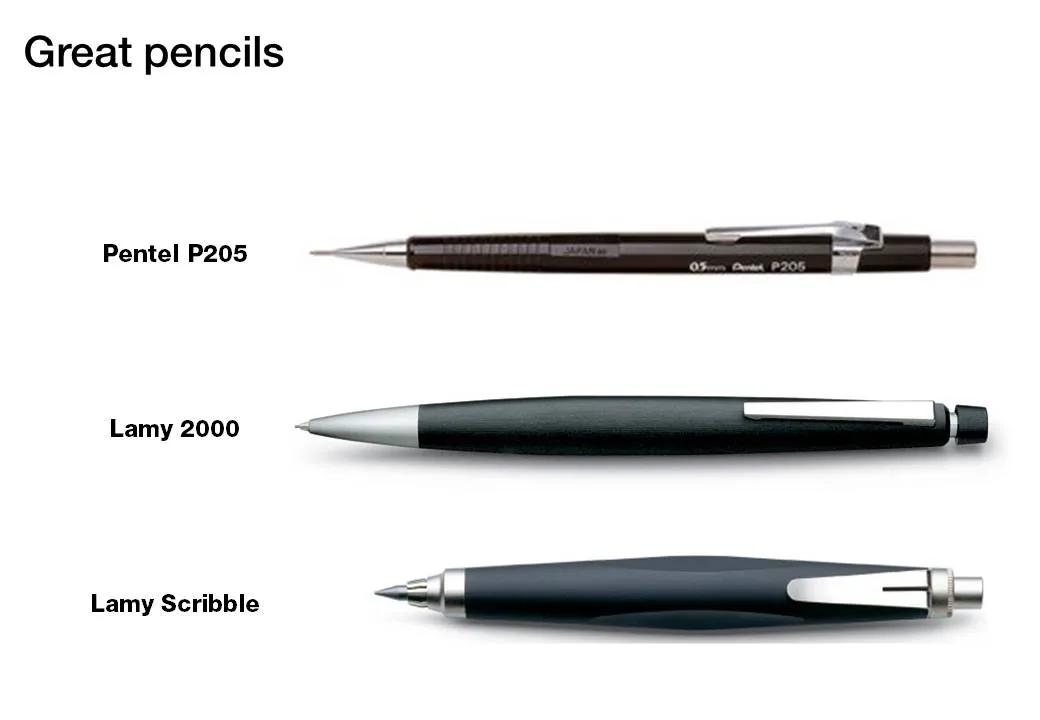
Recently I discovered Lamy pencils as the perfect in-between. Two pencils are my favorite. First there is the classic Lamy 2000. Designed at the end of the sixties, and still in production pretty much unchanged. A beautiful minimalist look, very light and a nice, almost wood-like feel. People say that over time the mat finish will wear off at those spots where you hold the pencil though.
I use a 0.7mm pencil for regular writing. But when it comes to sketching a wider pencil is much better. The Lamy Scribble comes in a version with a 3.15mm fill. It has a very nice grip and is beautiful to let your creativity go.
(All links to Amazon are affiliate links).