

When PowerPoint does not have the right bold or italic font variation installed, it tries to emulate the real thing. For example in the case of bold, it plots slightly overlapping version of the same letter next to each other to make the characters look heavier.
But when you install the correct fonts they get put in slightly random places. Look at the editing screen below (click on the images to see a larger picture). You can see where things go wrong as PowerPoint tries to fill in the missing gaps. Strangely enough in presentation mode, it displays these fonts as regular type.
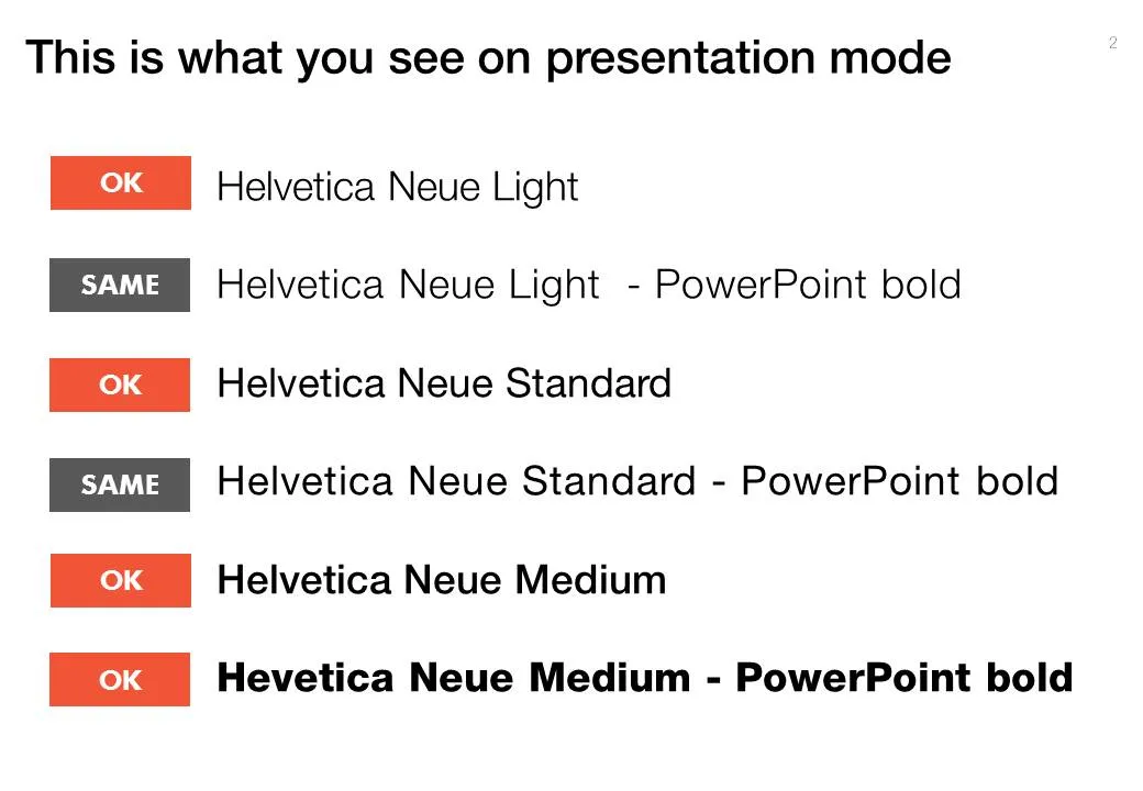
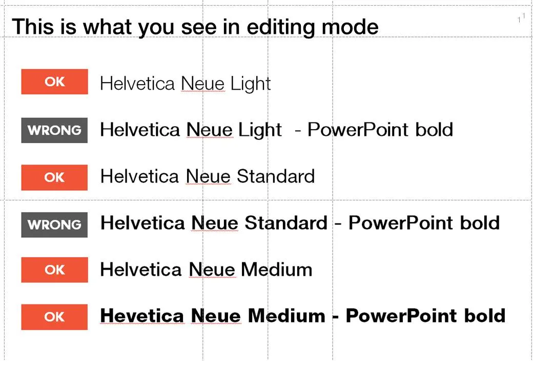
Secondly it takes some tweaking to get the right font you want:
- A bold version of standard Helvetica Neue is the medium variation that I have installed
- To get the heavy variation (which I also bought) I need to take the medium variation and have PowerPoint set it to bold.
Fonts remain mysterious.
4 comments