My top 10: most popular posts of the year
Here are the blog posts written in 2010 that were most popular in 2010 according to Google Analytics:

The Presentation Secrets Of Steve Jobs


Frequent updates about all things presentations since 2008. Subscribe to never miss a post.
Here are the blog posts written in 2010 that were most popular in 2010 according to Google Analytics:
The Presentation Secrets Of Steve Jobs
Here is a picture taken from my window on December 23, you see that winter has not really arrived in Tel Aviv yet. A wonderful holiday to all of you.

Many presentations start with the about slide. It is useful to give the audience some background about who you are, where you are from, when you were founded, and what your company does (more or less), that your company is financially stable and not about to go bankrupt. But don’t overdo it:
I used to recommend to stick to standard Windows fonts in order to avoid compatibility issues when presenting on other computers than your own. I am changing my mind, the risk of technical issues is still there, but the benefits of custom fonts is much greater.
Standard PC fonts (Times roman, Calibri, Arial, etc.) just do not look good. In dense body text, this is not such a big deal. But as PowerPoint slides get fewer and fewer text, their design start to look more like a poster with big headlines. And in posters, typography is a huge deal.
This post on the PowerPoint Ninja blog explains how to overcome compatibility issues by embedding your custom font inside the presentation. When you send it to someone else, she will see the correct font.
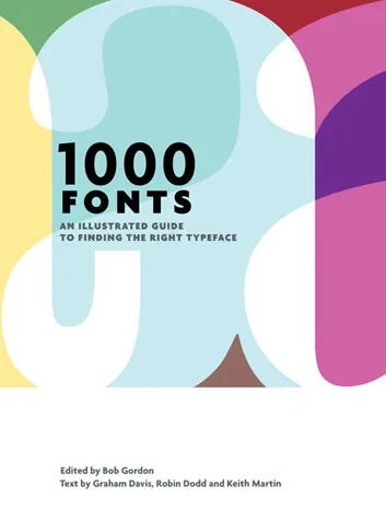
You can find your inspiration for fonts on one of the many fonts web sites, paying close attention to the small prints in books (they often mention which font was used) or through books like this one that I picked up in a Tel Aviv book store: 1000 Fonts (affiliate link).
Recently, I have picked up a lot of books about graphics design and typography. Design Elements: A Graphic Style Manual (affiliate link) is a book that takes all the basic principles of graphics design one by one. It is built around 20 reminders for designers. Reminders and not rules, because designers have the opportunity to break them (see the cover of the book with 2 paragraphs of text put on top of each other).
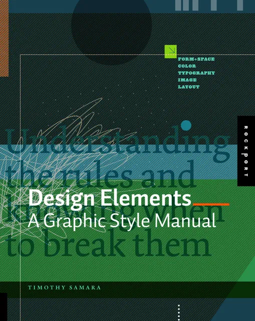
Most books about graphics design use an incredibly complex language to describe visual concepts. This books is no exception. Rather than try to translate the text into concepts, I skimmed the prose and focused on the many beautiful illustrations, images, examples, and their explanations.
Things that I was reminded of (not as a graphics designer, but as a designer of business presentations in PowerPoint):
You think hard about that perfect opening sentence that encapsulates it all: what the company is about, what you sell, what customer problem you solve, when you were founded. You write it down, change it, discuss it with your team, edit it, and memorize it by heart.

Then you use it for a live audience: all key messages stashed in just 10 seconds of beautiful prose. All your audience has to do is register this, and they can basically skip the presentation. All that has to be said, has been said.
But hey, it did not stick?
While you were uttering your first sentence, the audience was looking at the woman in the picture of your opening slide (I want a jacket like that), trying to figure our your accent (Canada?), wondering when the next coffee break would be (11:15 on the agenda, but we are behind schedule). In short, all but pay attention to that perfect sentence.
Gear up your story slowly and give the audience time to familiarize themselves.
Image credit Markus Bollingmo.
The winners are announced of the 2010 edition of the Slideshare World’s Best Presentation Contest. Here are the #1, #2, and #3. Congratulations to each designer:
Some lessons we can learn from these presentations:
Remember, these presentations are made for SlideShare/online viewing. In other contexts the style used would be somewhat different.
Overhead: “We completed this extensive business plan for our startup 3 months ago. Check! It is a lot of work, but hey potential investors want it, so we churned it out.”
Here is what investors really want:
None of these require a long, text-loaded document. Text is the worst way to deliver 1., the exciting investor presentation. And text is not the best vehicle to deliver 2. and 3.
There is a reason why management consulting reports are written in PowerPoint, in a style that is somewhere in between the Steve-Job-style-keynote and the densely written marketing text book.
Somehow, this big bulldozer looks scarier after a treatment with PowerPoint 2010’s blur filter. If you do not have PowerPoint 2010 installed, you can find it in Photoshop as well. The second advantage is that a blurred image is more friendly to put text on.

I have been testing Slideboxx over the past day (Windows-only). Slideboxx is a tool that crawls all PowerPoint files on your computer (it counted more than 5,000 on mine…) and stores visual thumbnails and keywords of all the slides in a searchable database. You type in a keyword, you get instantly served icons of matching slides with options to refine your search, find similar slides, and even “frankenstein” (what?) a new presentation from old slides.
First of all, there is a real need for a tool like this. The legacy Windows filing system based on file names and application icons is useless for visual files such as PowerPoint slides. I am now using Gmail to track down presentations (“where is that file I sent to [x] a month ago?”) because a date, a keyword, and a person is a better clue to what I am looking for than a location on a hard disk.
There are more companies developing professional solutions to dig through data stored in enterprise networks, not just PowerPoint, but including spreadsheets, PDFs, databases, etc. BA Insight is one for example.

Back to Slideboxx. The software is easy to install, the interface is nice and clean, and the program is very powerful to dig up long-forgotten slides.
For someone with a lot of slides who makes presentations for one company, or related to one subject area, the tool makes a lot of sense, and could actually be a significant time saver.
For my 5,000+ files the search results are sometimes a bit too broad, I would love to have an option to narrow searches actually by a folder on a hard disk. Another approach would be to add generic presentation tags to all slides in a presentation. For example the company name on the front page of the deck, the name of the presenter, the subject of the presentation, the items of the agenda, each of these are relevant to all the slides in a presentation, while they might not be written down explicitly on each slide.