SlideMagic Blog

Frequent updates about all things presentations since 2008. Subscribe to never miss a post.

RSS
all posts

Category Presentation design

·Delivery

How to report the news

Late again in discovering an amusing video (1.3 million people saw it before I did over the last 3 weeks). Charlie Brooker is making fun of your typical TV journalist video report.

Some presentation lessons:

  • Professional journalists rigorously stick to the focus-on-one-message-only rule. The introduction summarizes the message, the question already contains the answer (the message), and the wrap up repeats the message. I am all for clear messages, but sometimes you run the risk of insulting the audience with over-simplification. I am not a big fan of the “tell what you will tell them, tell them, tell what you just told them” structure.
  • See how the background visuals are actually distracting: you switch off mentally, go in remote control TV mode, and start paying attention to “what street in London is this?”, “where is that accent from?”, you hardly notice that some of the interviewees are speaking Gobbledygook.Your visuals should be good, but not claiming all the attention (earlier post).
  • Videos can be great at conveying messages in a short time frame. This “boring” video took 1:59, but see what a different approach can do in 1:30 here.

Thank you Joe Mako

·Design

In defense of clichés (sort of)

I came across two interesting links about clichés last week.

  1. Seth Godin: point to a cliché and do the exact opposite (blog post). From a presentation perspective the most interesting tip is the “secret weapon” he points to: a book full of clichés: Dictionary of Cliches (affiliate link)
  2. Nikki Smith-Morgan pointed me to this wonderful list of 101 cliché images.

I now realize that I have been reinventing the wheel over the past few years. I am guilty of using many of visual concepts, and even have posted many of them on this blog. I agree that some of the images are really worn out (#1 example the handshake), but not all 100 other images are equally bad in my opinion.

Especially in everyday corporate presentations, getting people to use images instead of bullet points is a huge win, even if the images that are picked are somewhat obvious. It is the beginning of a path moving away from bullet points. I was there 5 years ago, but every day more and more people join the movement. Clichés are a good way to start. A cliché is a visual shortcut that can prove useful in corporate presentations when used wisely. “Wisely” means picking a beautiful image. (Yesterday I was guilty of a tunnel with light at the end for example).

Obviously, the big keynote address is a different story from tomorrow’s management review meeting.

·Design

Overlaps in PowerPont (redux)

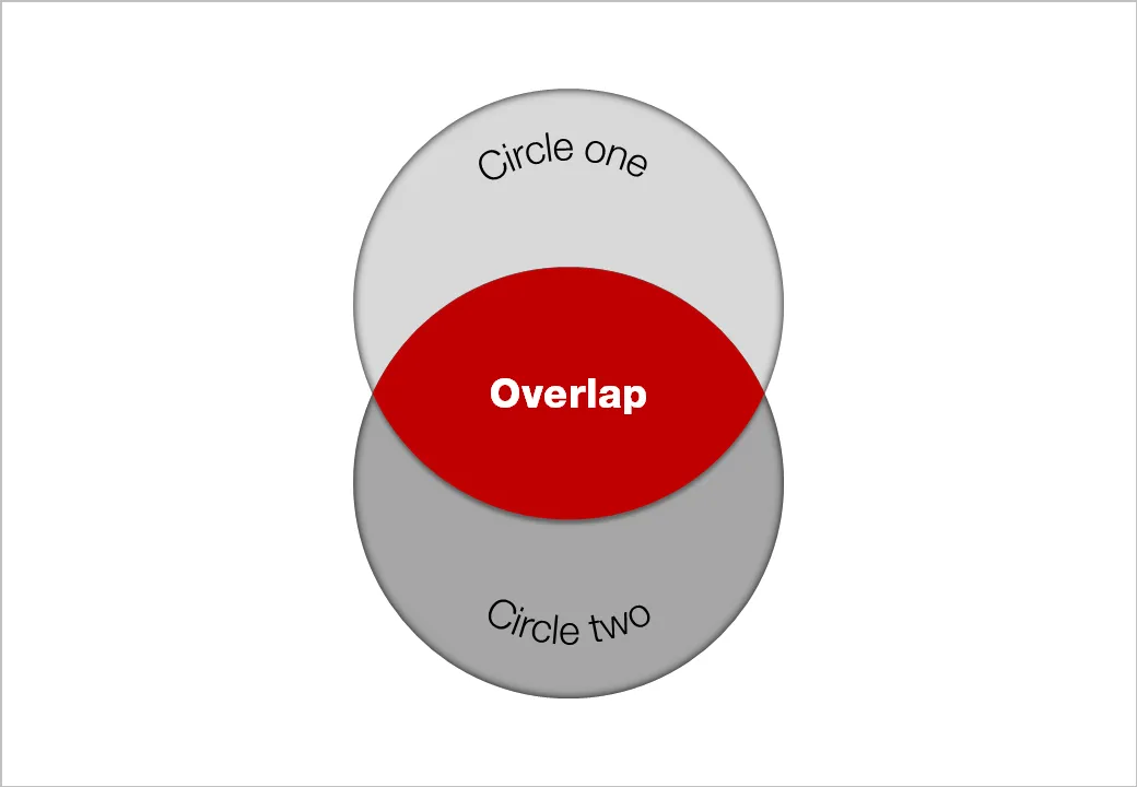
Another technical post today, giving another approach to creating Venn-like diagrams without the color limitations of semi-transparent shapes.

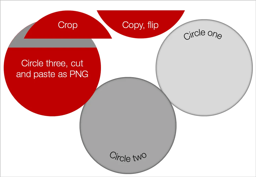
  • Draw an extra shape exactly the same size as the others, in the color you want
  • Ctrl-X it away and paste it back in as a PNG (paste special, PNG)
  • Crop excess bits away
  • Overlay them

Blog visitor AdamV provided a link to this Microsoft PowerPoint 2010 feature that will make it very easy to combine, intersect and subtract shapes.

UPDATE February 2018: I have now added several designs for PowerPoint Venn diagrams on the SlideMagic template store that make use of PowerPoint’s shape intersect function.

·Design

Immerse yourself in photography

As a child I already loved flicking through magazines, just to look at pictures. The Internet makes it so much easier to absorb vast quantities of visuals. Simple add a huge amount of photography-focussed RSS feeds to your Google Reader and hold down your finger on arrow-down, only to lift it when an image instantly touches you.

Not that I am hunting for images to use in presentations, often they are not right, often they have copy right restrictions. But still, immersing yourself in images improves your slide design skills. It is a bit like the best way to learn a language: surrounding yourself with it (maybe Hebrew is the exception to the rule though).

The most interesting images are often not the most professional ones. Stunning sun sets, volcano eruptions, can be beautiful but do not touch you on an emotional level.

I recently added the RSS feed for ffffound to my Google Reader: a community image book marking site with a large readership. Images are picked by random users (most of them with a good eye for photography), as a result you get a frequently updated image stream full of surprises. As an example, here is an image I found today on the site:

Yay!Everyday is another example of image highlighting site, worth following.

·Animations

The sort of animations we need in slideware: zooming

Most of the animations and slide transition effects currently available in PowerPoint do more damage than good to a presentation (an earlier post on the subject). The video below is guilty of some of these mistakes, but it also contains some effects that would be very useful to have in PowerPoint 2010 (preview in an earlier post):

  • Very slow moving zoom
  • Extreme image zooming
  • Image blurring
  • Zooming inside data charts

See how often I used the word “zoom” here. In the current version of PowerPoint you cannot control zooming enough: effects are blunt. Either via devices like the iPad, or via a breakthrough by software innovators like Prezi, or via improvements in Microsoft’s/Apple’s slideware, eventually we will get to advanced zooming capabilities in presentation software.

Video credit: Dan Meyer’s 2009 Annual Report from Dan Meyer on Vimeo. Found via Fubiz

Further reading: an excellent post by Garr Reynolds about slow zooming and photographer Ken Burns.

·Design

Picking the correct logo

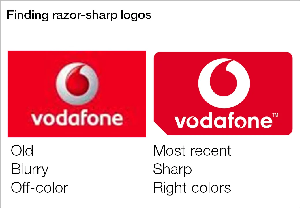
Many investor and sales presentations include logo pages. Improve the quality of these slides significantly by not picking the first image that pops up in Google image search:

  1. Visit the company’s web site to see what the latest logo of the company in question is, logos get updated frequently
  2. Set the Google image search options to large format
  3. Pick a correct, huge logo
  4. Paste it in your presentation, reduce to the correct size, hit compress images

Companies with a good PR department have high-resolution images of their logos on the web site. Use them.

·Design

Leave some room for your chart title

The space allocated to the slide title in a PowerPoint template is constantly under threat:

Please give the title some space:

  • It is virtually impossible to win the battle against dense bullet point charts in big corporates. However, giving people some space to write the conclusion in the title of the chart might be one of the easiest ways to overcome this problem: read the title, ignore the chart content. A similar effect to how Twitter is educating people to write more concise email subject lines.
  • I find a title that runs on 2 lines hard to read: if you do not give people space they will simply add a line, and maybe even another one.
·Design

Turning any image into concrete

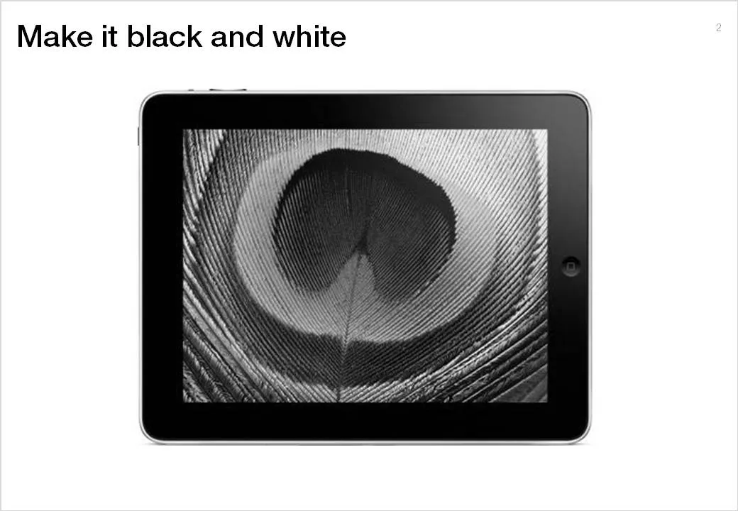
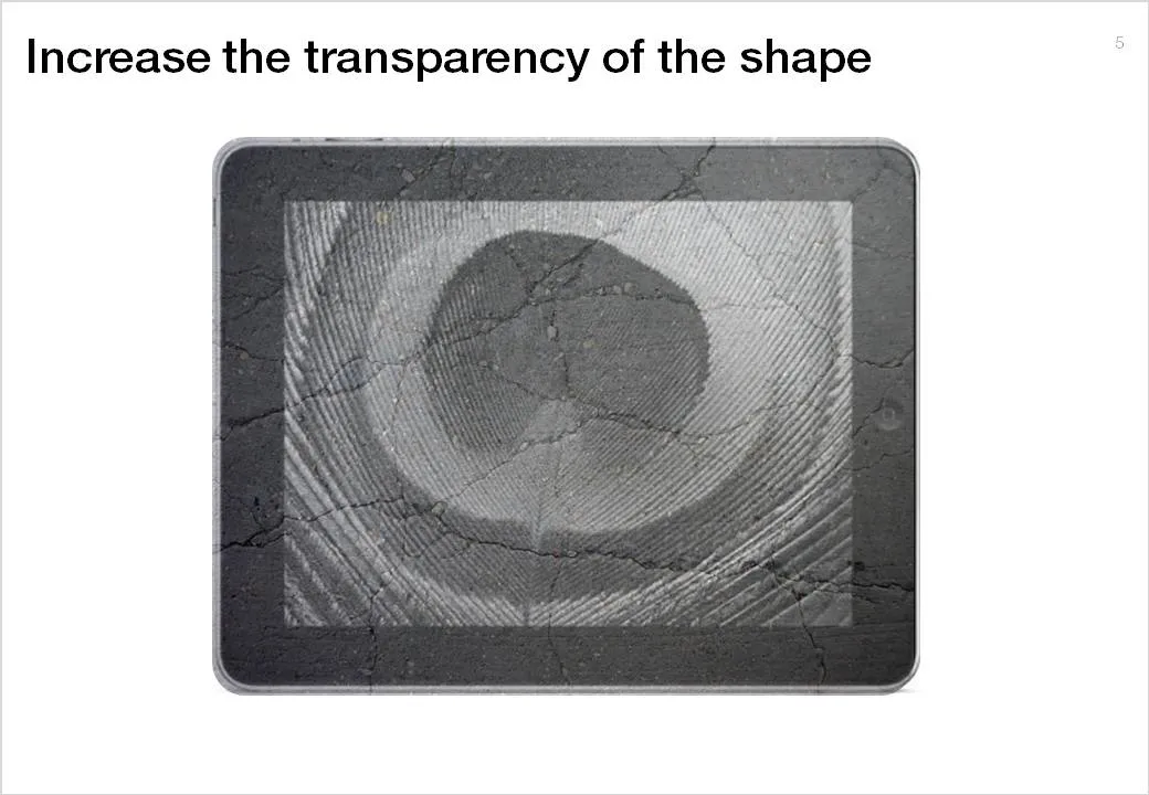
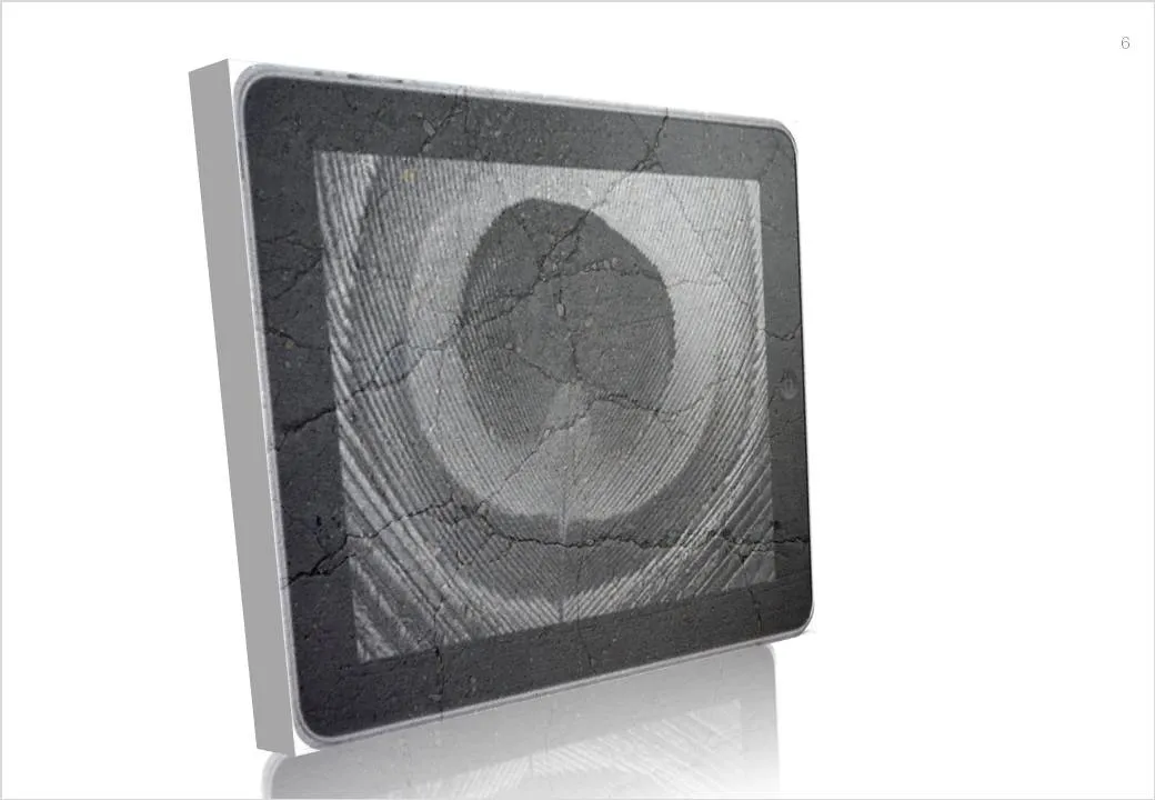
Here is a simple trick to turn any image into concrete. As an example I took an iPad and turned it into an iSlate, but it might actually work better with other images (you can turn portraits into statues for example).

To do this in PowerPoint without the help of advanced image manipulation software you need to add a shape on top of the target image, fill the shape with an image of a concrete texture (available on any stock image site) and make that shape with the concrete texture semi-transparent.

·Colors

Lighter shades for bright colors

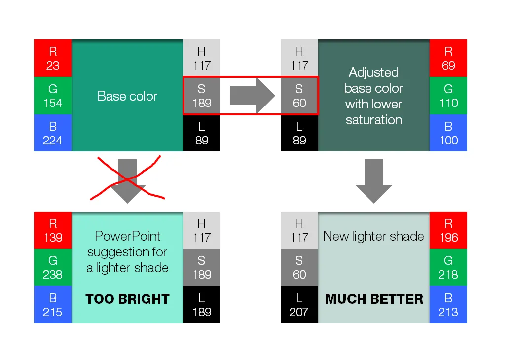
PowerPoint 2010 gives you the option of a spectrum of different shades of the same color. This is great to design charts with a consistent color scheme.

However, if your template contains colors that are highly saturated, the suggested lighter shades of your color will be too bright to use as neutral color nuances. Here is how you can fix it. (Click on the image for a larger picture.).

  • Create a new base color by reducing the saturation (in laymen’s speak: make it more grey).
  1. Open the color in your color template (format shape/fill/solid fill/color/more colors)
  2. Switch the color model from RGB (red, green, blue) to HSL (hue, saturation, luminance).
  3. Reduce the (S)aturation value, while keeping all other variables the same.
  • Use a lighter shade of this new base color instead and save this as a new color in your color template.

If you are interested in learning more about color theory, you can browse through some earlier posts on the subject of color or go straight to this one.

·Advertising

Message arrived - nobody understood it

My attention was drawn to this Vodafone ad that uses the NATO alphabet to say C-O-M-M-U-N-I-C-A-T-E  C-L-E-A-R-L-Y. An excellent example of the difference between delivering a message (i.e., writing your bullet points on a slide) and getting someone else to understand/internalize what it says.

I am not sure yet how to use it yet, but this NATO alphabet is a good thing to remember when thinking about chart concepts.

Via Ads of the World.