

A follow-up on yesterday’s post about avoiding bold fonts whenever you can. Sometimes, reducing font sizes can actually help you increase the readability of a point. See the example below.
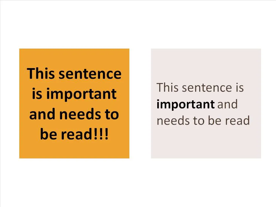
Why is it easier to read the box on the right? (At least I find it easier to read)
- There is (empty) white space around the text, drawing my attention to the sentence that now sticks out. On the left side, the sentence blends into the very loud background noise of the slide. The text now looks like a coherent piece of information that can be interpreted by the brain in one snapshot, as opposed to the left side where we need to read out each word left to right, top to bottom to see what’s written there.
- The proportion of the text block is more rectangular, close to the 16:9 aspect ratio of a wide screen TV, a shape that is more natural for the brain to absorb information
- Removing the bold font except for one word makes the whole typography more calm and easier to read
- Taking out screaming exclamation marks and left-aligning the paragraph improves readability further
Less is more.