

PowerPoint 2010 gives you the option of a spectrum of different shades of the same color. This is great to design charts with a consistent color scheme.
However, if your template contains colors that are highly saturated, the suggested lighter shades of your color will be too bright to use as neutral color nuances. Here is how you can fix it. (Click on the image for a larger picture.).
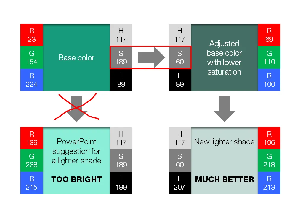
- Create a new base color by reducing the saturation (in laymen’s speak: make it more grey).
- Open the color in your color template (format shape/fill/solid fill/color/more colors)
- Switch the color model from RGB (red, green, blue) to HSL (hue, saturation, luminance).
- Reduce the (S)aturation value, while keeping all other variables the same.
- Use a lighter shade of this new base color instead and save this as a new color in your color template.
If you are interested in learning more about color theory, you can browse through some earlier posts on the subject of color or go straight to this one.