SlideMagic Blog

Frequent updates about all things presentations since 2008. Subscribe to never miss a post.

RSS
all posts

Category Presentation design

·Delivery

The audience wants you to succeed

Fear of public speaking often stems from the speaker thinking that the audience’s main objective is to criticize her performance. The opposite is true: the audience wants you to succeed. First of all because of selfish motivations; nobody wants to be bored.

But there is an emotional driver as well. People (in the audience) do not like to subject themselves to an embarrassing situation. Watching this movie clip from the film “About a boy” creates that exact feeling in your stomach (I cannot embed it for some reason).

The book “Confessions of a public speaker” has a great section on public speaking anxiety. Seth Godin thinks that fear of public speaking is the a prime example of our lizard brain at work.
·Books

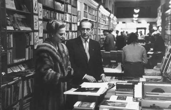
Browsing for books about design

The Internet and the place I live (Israel) have cut me off of those great large book stores where you can browse endlessly for books you did not know you missed.

Presentation blogs (this one included) often talk about the same limited set of books about public speaking and presentation design. Here is a list of design books compiled by graphic designer Jason Santa Maria full of titles that look really interesting.

Found via SwissMiss. Image credit Google LIFE, an excellent source of images for non-commercial use.

·Delivery

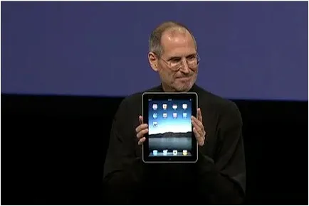
The entire Jobs' iPad speech in 180s: passion

Presenting is not a casual discussion, it is a performance. When you are not passionate about what you are presenting yourself, do not expect your audience to be. This short video compilation of Steve Jobs’ iPad launch speech shows how he packed his talk with enthusiasm. Something to learn from, but also to make you smile.

·Design

You should follow this blog

Mark Suster is a venture capitalist (VC) who is quietly building one of the world’s most-read blogs about entrepreneurship and VC investing. I suspect most people who read my blog subscribe to other blogs in areas such as (graphics) design and public speaking. Most of these blogs (including this one), are run by people who write presentations. Mark’s blog is different.

  • Most of the time he sits in the audience listening to people trying to pitch a venture to him, but in an earlier stage in his career he was an entrepreneur himself sitting at the other side of the table (hence the name of his blog)
  • He talks a lot about presentations and pitches, but these are mere tools to achieve a bigger goals: building a successful venture

I think anyone who is interested in presentation design should follow his blog. See his impressive list of posts about pitching to a VC. Or read his most recent post about not failing when presenting to large audiences. Full of great lessons for presenters and presentation designers, that are not only relevant in the world of VC fund raising.

Pitching to VCs is a great case example to learn about presentations in general:

  • The stakes are incredibly high ($ millions)
  • Each startup is a story that wants to change the world
  • The story and ideas are highly personal (the entrepreneurs’s “baby” is on the block, people are judging the idea, but mostly the presenter herself)
  • The audience is not captive (in most corporate presentations, the audience is required to sit it through, because the boss says so, a VC will not waist her time to listen to a poor presentation)
·Advertising

Chart concept - word find

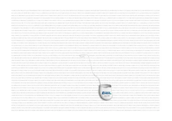
The concept of this ad for a dental care product can be very useful for a slide conveying “solution x helps you see the forest through the trees”. It is a bit tedious to generate rows of random words, but the end result will be effective.

A larger image can be found on here on Ads of the World.

I discussed similar concepts earlier here and here.

·Delivery

"Why are TED presentations so polished?"

This question was asked by David Semaria on Mark Suster’s excellent blog “Both sides of the table”, a must read for anyone who needs to pitch to VCs.

Here is my take on the question why TED presentations are so “polished”:

  1. A tough pre-selection: you need an interesting story even before the PPT slideware is opened to create the presenation
  2. A ruthless 18 minutes cutoff makes you practice
  3. Peer pressure of a good speaker line up makes you practice
  4. The “threat” of a global video audience makes you practice

You can argue that it can be hard to sometimes to meet point number 1. Number 2, 3 and 4 are all about practice, your presentation can benefit from it too. There is no excuse not to practice, practice, and practice.

·Advertising

Let your audience's brain fill in the missing pieces

Highly graphic and gruesome ads that should stop you from smoking or driving dangerously are not only not pleasant to look at, but also often fail to achieve their objective (according to books like “Influence”).

This U.K. “wear your seat belt” ad shows that you can communicate these messages in a different way. I like the way it triggers the brain to fill in the missing pieces in an emotional way. (Books such as “Brain Rules” show that your mind is very good at this).

Watch the full 90 seconds of this ad, it is very powerful.

Via Ad Freak.

·Design

First thoughts on the Apple iPad and presentations

Apple launched the iPad yesterday (watch Steve Jobs present here): a device positioned in between a smart phone and a laptop computer. The big differentiator is a very large screen and a user interface that can be manipulated using the touch of a finger, exactly the same way you interact with an iPhone.

Would could this new device mean for presentations? My first thoughts:

  • The iPad runs the iPhone operating system, which means that you cannot simply port PC or Mac applications on it. Apple announced a version of iWorks (including Keynote) for the iPad, but for now it is impossible to run Microsoft PowerPoint on it.
  • The devices seems like a great presentation tool for one-on-one meetings. A bright, big screen and an informal user interface enable a dialogue-style presentation.
  • The need for an application like Prezi becomes more urgent. Prezi seems made for the iPad: easy zooming in and out of slides, and a non-linear way to move between slides. I have not seen the details of iWorks for iPad, but I assume that Apple is going down the track of creating a Prezi-style user interface for office productivity applications.
  • It would be great if you could use a virtual marker during your iPad presentation: drawing circles to emphasize elements, adding comments, pretty much in the style of the napkin presentation I talked about a while ago.

I am very excited about the iPad. The geek reviews might have found technical imperfections (no multi-tasking for example), but the fundamental revolution is the big touch-based user interface that have brought computing in general and presentations specifically a bit closer to a natural human interaction.

·Books

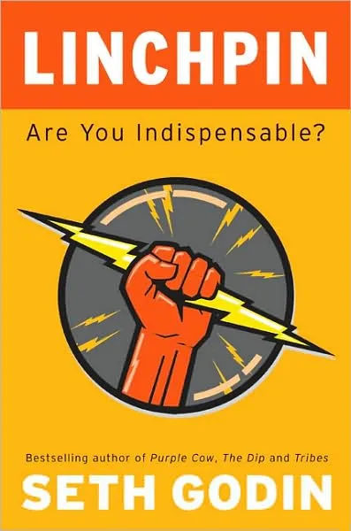
Seth Godin's Linchpin: "the good guys can win"

This post will be slightly off-topic: Seth Godin published his latest book yesterday: Linchpin (affiliate link) and I think it is important that as many people as possible absorb the ideas that it contains.

Seth’s books have evolved over the years. What started with insights about marketing (he is the one who opened up our eyes to the fact that anonymous spam email campaigns are not effective), is now moving into the area of leadership and in Linchpin even broader: what is the purpose of the time you spend day in, day out. 

If there is one unifying theme in all his books it would be: “the good guys can win” (came up with this while listening to Leonard Cohen’s song “Everybody knows”). You can be successful by doing remarkable things, without a need to cheat, interrupt, or lie.

The book opens with a grim analysis of history. Over the past 100 years we have built a society (education, advertising) that trains people to be cogs: cheap, willing, replaceable, numb, insecure people that man the production lines and purchase the stuff that the factory churns out.

It is time to escape the trap and change. It’s urgent. Not changing will get you fired, and/or bore you to death, and/or rob you of your dignity, and/or paralyze your abilities and talents as you live and work in constant fear. On top of that, all of us own so much stuff that we do not even know what to do with it anymore.

Continue reading →
·Data visualization

Measurements that people can visualize

Mathematics has given us the ability to perform complex calculations, reducing real world quantities to simple numbers and variables that can be manipulated without interpreting what they actually mean.

In your presentations, try to go back to the stage of a child before the first mathematics class. Describe measurements and quantities in a way that they can be visualized, internalized.

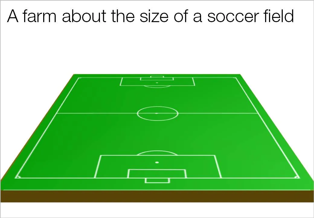
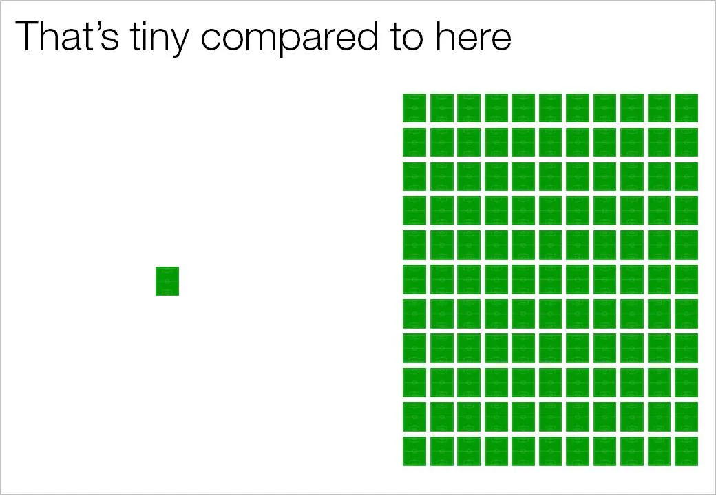
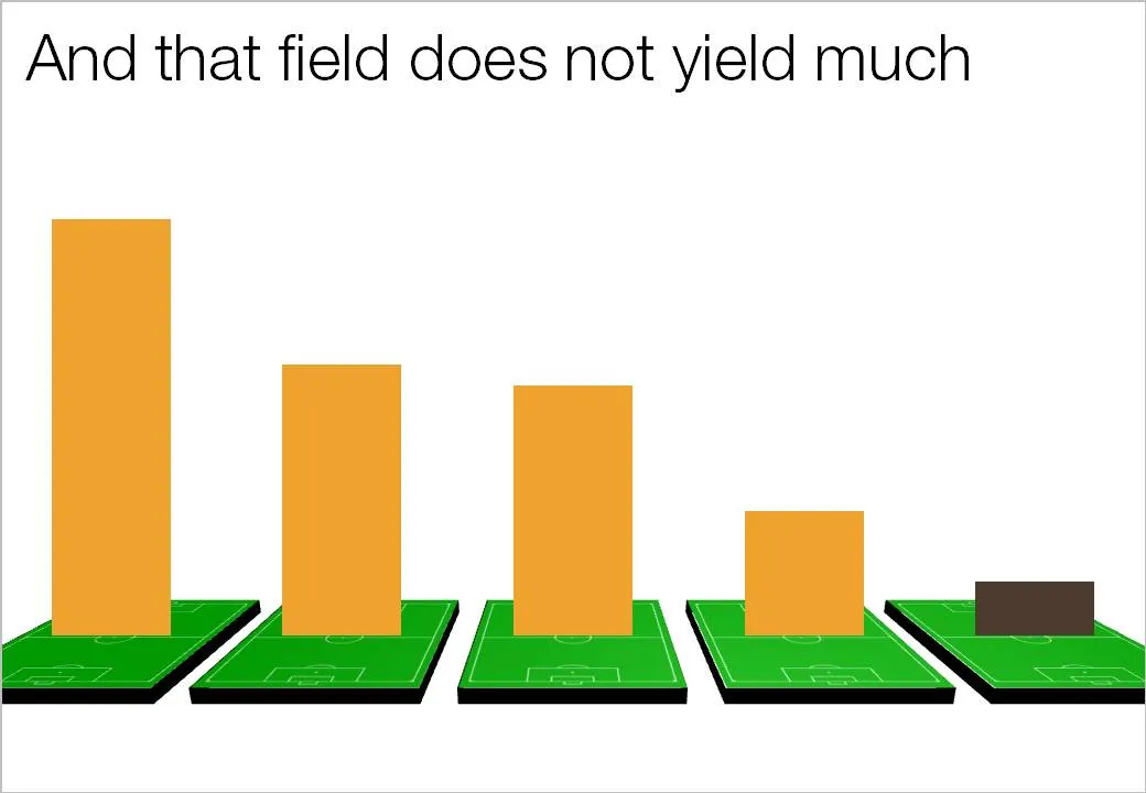
Recently, one of my presentations covered agricultural land yields in emerging markets. Rather than using abstract hectares and tons, I decided to use the soccer field analogy. It is easy to re-calculate figures from tons per hectare, to tons per soccer field, and maybe even going further: truck loads per soccer field.

You can even use the visual of the soccer field: