SlideMagic Blog

Frequent updates about all things presentations since 2008. Subscribe to never miss a post.

RSS
all posts

Category Presentation design

·Design

Beyond images that just show things

Most stock images are descriptive: search for “ice cream truck” and you get what you asked for. The position the image puts the audience in, is at least as important (maybe even more important) than the object it represents. Look at this image of the inside of the Notre Dame cathedral in Paris (Wikipedia link). Six images stitched together to create the sensation of small child looking up to the ceiling of this vast place. It puts the audience inside the image.

Image credit: eso-teric, visit his site for a larger picture. I linked to these images as a source of inspiration (earlier post), check copy right restrictions before using them in an actual presentation. Found via TwistedSifter.

·Animations

It is still hard to do it right in Prezi

Here is a Prezi-presentation (see earlier posts) with some facts about the growth of data sent over mobile networks. Praise for Byte Mobile to experiment with different presentation formats. Here: Prezi is used in the following way:

  1. Animated slide transition
  2. Zoom in on the title with the message of the chart
  3. Zoom in on the data in the chart
  4. Zoom in on the foot note with more detailed explanations

Bytemobile Mobile Minute Metrics - Feb 2010 on Prezi

For me, this is not yet the best way to use the power of Prezi. But if you ask me what is the right way, I must admit I do not have an answer yet.

·Animations

More motion graphics about the size of the Internet

Another motion graphics video, again about the size of the Internet. This time by graphics designer JESS3. My opinion remains unchanged:

  • Beautiful graphics, and a beautiful color scheme
  • But (moving) text is not the best way to visualize the billions and millions

I do however like the slowly moving time line with the launches of social networking sites over the years towards the back of the video.

Found via Nancy Duarte.

·Advertising

Subtle light effects in fonts

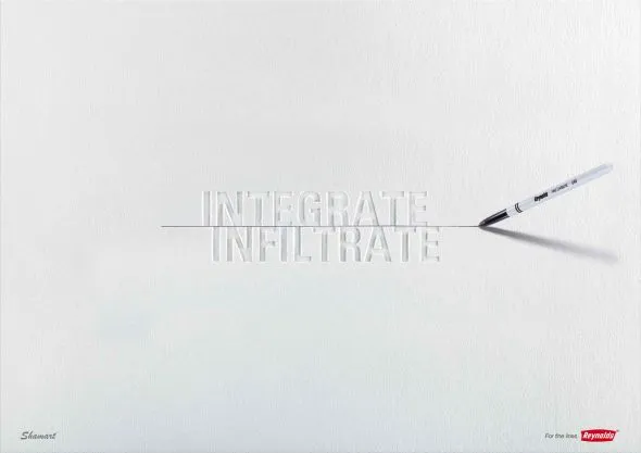
Inspired by this ad, here is how to create the effect of fonts that seem sunk below the surface in PowerPoint 2007 (as shown in the last 2 images).

  1. Choose a background color
  2. Enter text, preferably in a fat font (I used Helvetica Neue Heavy in this example)
  3. Select the text, go to format, text effects, shadows, and pick inner shadow with light from the top
  4. In text effects, pick a text fill that is just slightly darker than the background

Via Ads of the World

·Design

Off topic - amazing Rube Goldberg-style video

I have always dreamt of using a Rube Goldberg-style animation in a presentation (earlier post). Watch this video.

·Delivery

Gaining the confidence to tell your story, your way

The more you practice, the more you rehearse, the more you get on top of your story. And the more comfortable you get with your material, the more confident you get in delivering it. Confidence goes beyond getting rid of fear of public speaking, confidence enters chart design and story telling as well.

  • The confidence to get rid of “business school”-style structuring frameworks: let’s talk about the market, let’s talk about the competition, let’s talk about the distinctiveness, etc. and only spend time on those issues that really matter for your particular story, in the order that best fit your specific situation
  • The confidence to use personal stories and case examples to illustrate your point
  • The confidence to make your charts more minimalist and more abstract
  • The confidence to insert blank/black/white slides inside your presentation to have the audience just focus on you

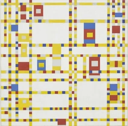
It is a bit like the abstract painters of the last century: having the confidence to communicate emotions and ideas without relying on realistic techniques. For example Piet Mondriaan’s Broadway Boogie Woogie painted in 1942-1943.

The pulse of a Jazz beat, and the energy of the New York traffic squeezing its way through the city’s grid all captured in one painting without showing Jazz bars, Times Square neons, and/or New York traffic jams.

·Advertising

Iconic images

What a wonderful advertising campaign: if 4 pixels can tell a story, imagine what millions can. Here is one example, but there are lots more on Ads of the World (click the previous and/or next buttons).

I like using iconic images in presentations, an endless repertoire of visual shortcuts stored in the brain of almost any person on the planet.

·Concepts

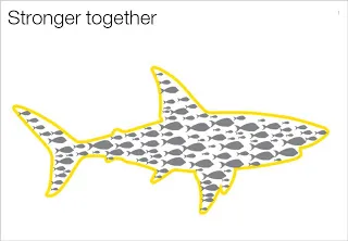
Chart concept - shark!

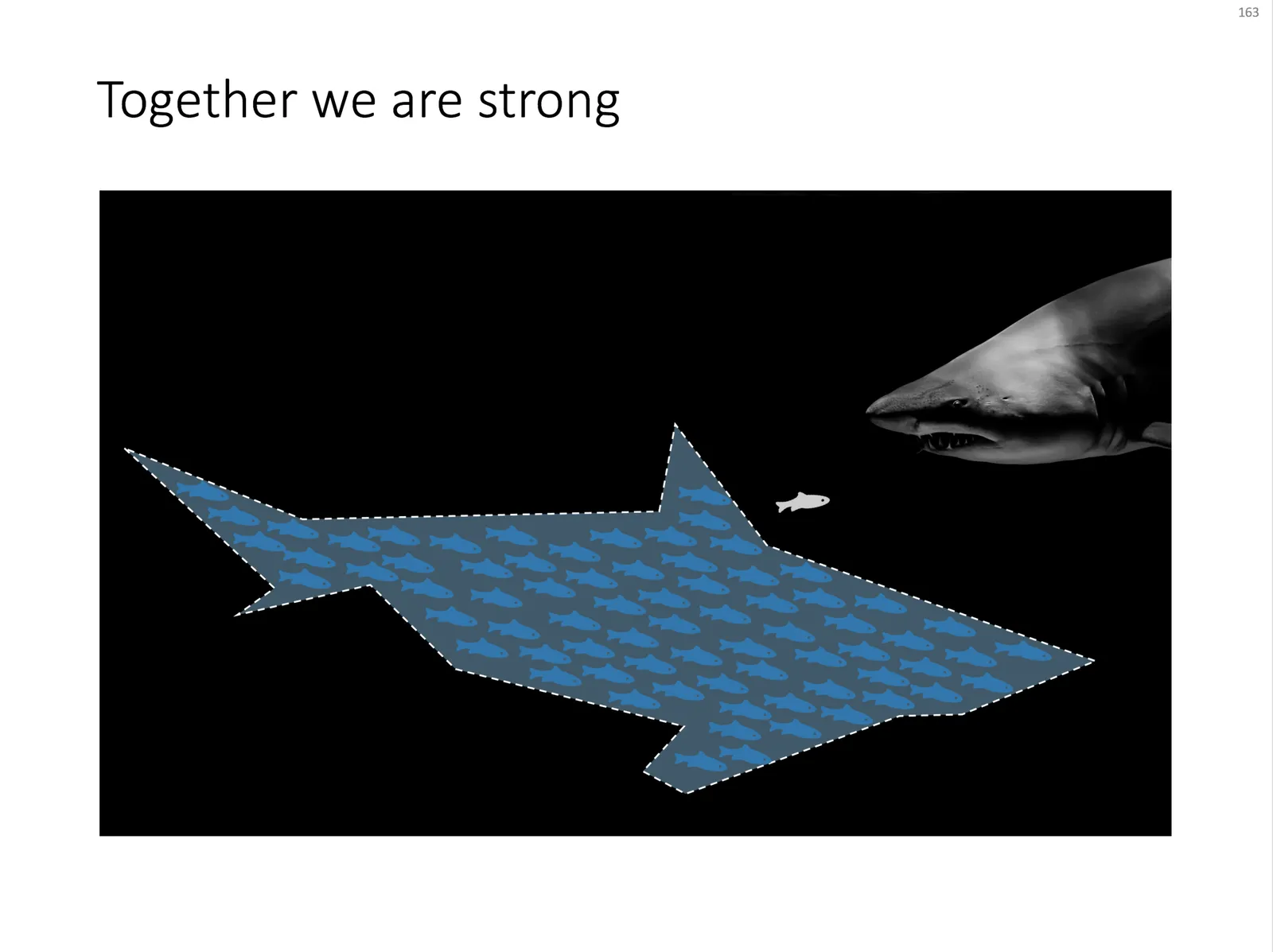
Some might consider it a cliché, but I found it still useful: the school of fish swimming in formation to create the illusion of being a shark. For when you need to visualize how many smaller/weaker entities can work together to become very strong as a group.

An image like this can easily be created by searching for “fish silhouette” or “shark silhouette” in a stock photo site. Resize the small fish, paste them over the shark’s silhouette, and off you go.

Inspired by a scene from the movie Finding Nemo:

UPDATE: I have now added a slide with many fish forming a shark on this concept in the SlideMagic template store.

·Design

Adapt your "presentation interface" to every presentation setting

This presentation that I found today on SlideShare is not about about presentations, but about application design for the iPad. Still, it deserves a mention on this blog because of the fundamental philosophy of the designer: each user interface deserves its own kind of design approach: the iPad is not an iPhone, is not an iPod.

Stanford CS193P - Designing for iPad

The same is true for presentations, different audiences, different settings, require a completely different presentation (earlier post): cosy meeting room, big audience keynote, SlideShare document for online viewing, one-on-one with a venture capitalist, etc.

I think iPad-like user interfaces (like the one Tom Cruise uses in the movie Minority Report) could turn the world of presentation design upside down. Early thoughts here.

·Data visualization

Obama infographic and picking the right metric

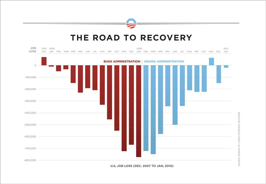
The infographic below released by the Obama administration (here) is a good example of using the full arsenal visual techniques to make your point stand out.

  • Use fat columns to make the trend stick out (much better than a thin line, earlier post here)
  • Use recognizable, contrasting colors
  • Pick a metric that is favorable (monthly job loss)

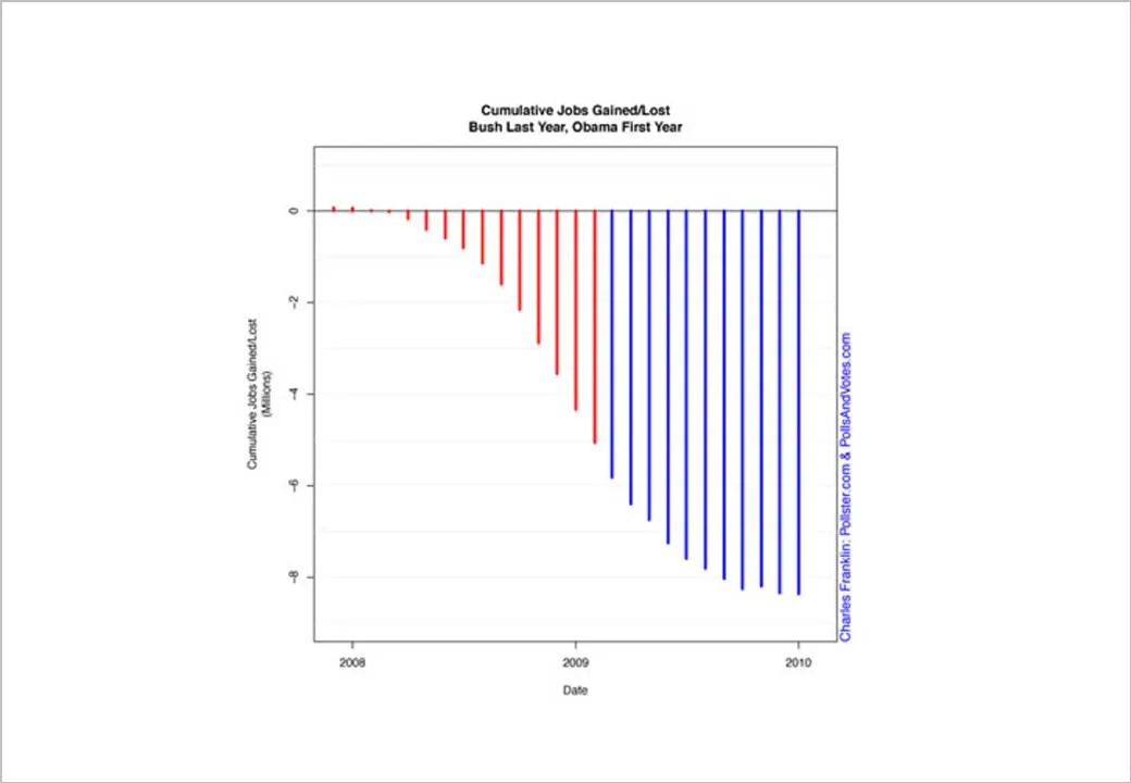
On the Fast Company site, Prof. Charles Franklin put out a second graph depicting exactly the same data, but using a different metric, cumulative job loss:

The formating of the graph is a bit improvised, but it shows the power of picking the right metric. Someone speed-reading a newspaper first notices the sea of blue, and a trend that does not seem to reverse.

Fast Company seems to have taken down the story, so I had to source Franklin graph from Google chache. Thank you Ellen Daehnick for pointing me to this.